8 Steps to Creating an Efficient Variance Report
Every company uses a variance report to compare the budgeted (also called baseline) amount of expenses and/or revenue with the actual amount.
The problem with variance reports
The internet is full of different variations of variance reports. The issue with these examples is that they're poorly designed and as a result, can be difficult to read. This can severely reduce a manager's efficiency as they do not have the time to read through all the numbers row by row and column by column in order to figure all those tables out.
Here are just some examples:

Instead of so many different types of designs, colors and formatting, is it possible to create a standardized form of variance reports?
While variance reports do contain a lot of information, there needs to be an optimal way of displaying this information so that managers can quickly and efficiently get the information that they need.
How can we do this? By using Zebra BI for Office, we can take one of these examples and turn it into a clean, easy-to-read report that a manager can efficiently get their data from. All it takes are these 8 easy steps.
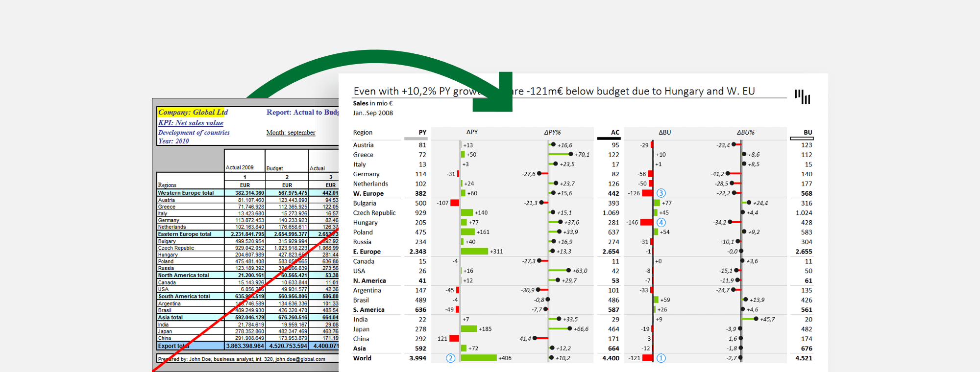
Here's the report we're going to start with in order to improve it:

Step 1: Remove background colors of your variance report
Remove the background colors as this can create more of a distraction and is no longer necessary when using Zebra BI. IBCS dictates that colors should only be used to direct focus to the important parts, which is exactly what Zebra BI does out of the box.

Step 2: Remove the borders
Remove the "jail bars" (black grid) as this makes the report look too busy and can be confusing.

Step 3: Align values properly
Align everything correctly for a more uniform look. This will help a manager to easily identify data and find the information that they need quickly.

Step 4: Prepare the formatting
Remove unnecessary text, add some essential formatting (light borders - where necessary, the title area, "scenario markers" at the top of the columns for PY, AC, BU).

Step 5: Insert absolute variance charts
Insert variance charts to properly highlight the two sets of differences ΔPY=AC-PY (actual minus previous year) and ΔBU=AC-BU (actual minus budget).

Step 6: Insert relative variance charts
Insert lollipop variance charts to your variance report to highlight the relative changes from PY and BU.

Step 7: Write the key message
Write your key message to help easily identify the main findings of your variance report.

Step 8: Add comments to the variance report
Add comments to support your key message for a quick reference, for a manager to easily find the information that they need. The final result now looks like this:

As you can see, Zebra BI enables you to present your data to managers in a clean and efficient way so that they can easily identify important data and make quick decisions. Interested in learning more? Take a look at the top 3 ways to report your variance analysis in Excel.
Like what you see? Try it yourself!
Would you like to take your variance reports to the next level? Make sure you give Zebra BI a try here:
Good night, thank you for yours.
I will start performing for Reporting and Analysis Variance, Actual vs Budget, do you recommend any template format chart or table ? also to write feedback or comments ?
Best regards
Juan
Hi Juan, thanks for your question! Our visuals are responsive and they will respond automatically. Regarding comments, we recommend checking out this webinar: https://zebrabi.com/dynamic-commentary-power-bi-webinar/. We also have some useful content available in our Help Center for Power BI: https://help.zebrabi.com/.
Thank you