Mastering Variance Reports in Power BI
PRO Trial
One of the most important features in any business dashboard is the ability to present variances in a clear and easy-to-understand way that makes an impact. In this article, we explain the different types of variance reports and how to set them up in Microsoft Power BI.
Essentially, variance reports show the difference between the planned or past financial outcomes and the actual financial outcomes. No organization can expect to make informed decisions without having this insight and variance reports are all about providing it.
When you are working in Power BI, the default set-up lacks some of the features you need to create variance reports. However, Zebra BI has worked really hard to create Power BI custom visuals that help you tell the most convincing story. Variance reports are a big part of that and we will look at how to use Zebra BI to create them since many users still have issues creating them.
Simple variance report and selecting the right type
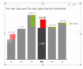
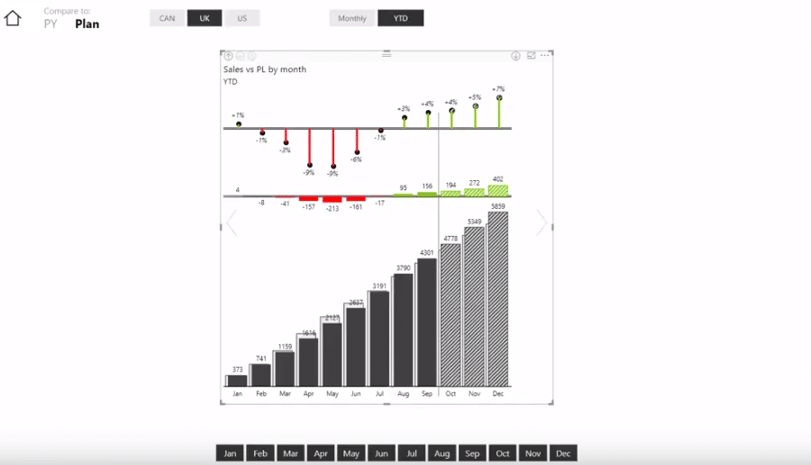
Let's take a look at a simple variance report first. Below is a waterfall chart showing the variance between actuals and the plan until September. As you can see, the company has been underperforming until May and has then picked up steam.
The image above shows a waterfall chart. I recommend that you use a waterfall or column chart if you have a small number of categories, like a 6 or 12-month series. When working with a larger number of data points, like a weekly time series or multiple years, you should use an area chart like this:
TIP: Click on variance values to show relative or absolute variance or both at the same time.
It is easy to create a variance chart like the one above in Zebra BI visuals for Power BI. Start with a simple bar chart comparing actual results to budget by month:
Since Zebra BI charts are fully responsive, they'll be shown in a compact form if there is not enough space. If you have more space available, expand the chart to provide more detail showing relative and absolute variances, like shown below:
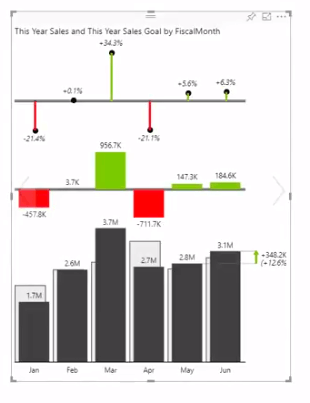
Use the slider arrows to select the right chart type. You can select between waterfall, bar, area and line charts. Select the one that is the most meaningful to your data.
Adding forecasts
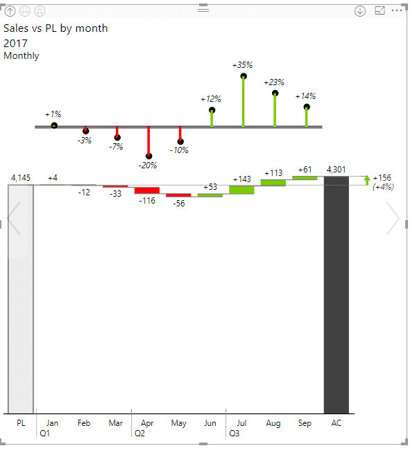
Now, you should add forecasts. I recommend that you always try to add forecasts to your data models. Variance reports should not just look into the past but also to the future, which is why it is imperative that you include forecasts into your report. It is no wonder that questions about adding forecasts are some of the most common. Zebra BI visuals for Power BI has great support for forecasts - you just drop the forecast values from your model to the Forecasts segment and Zebra BI will do the rest. What you get is a bar chart report with a forecast shown in a striped pattern.
By adding a forecast, you don't just have the planned values but the actual forecasts compared to the planned numbers. This gives you a powerful tool to make decisions about your business in the coming months. In short. a variance report without an included forecast is just not living up to its potential.
As it stands, you have a serviceable visualization. However, you can also play around with chart types. A waterfall chart is a nice choice for reviewing this type of data - it shows total budget and forecast with variances. The look is clean and the main benefit compared to a bar chart is that you can easily discern how monthly values contribute to the yearly total
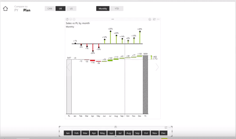
TIP: You can cut off the axis in a waterfall chart by simply clicking on one of the total columns. However, you should note that this might make monthly contributions seem larger than they really are.
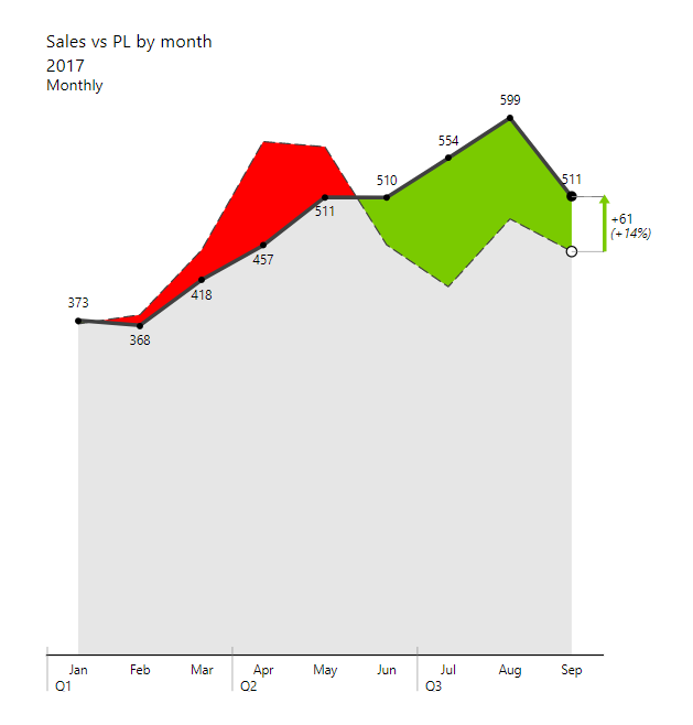
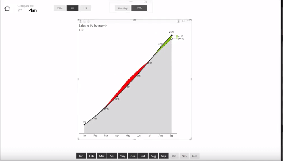
Another option is an area or a line chart. If you look at the bar chart above, you can see that there is a lot of ink used as the bars grow over the year. The best practice is to use minimal designs like the below area chart or a line chart. This way, your eye is drawn to the actual variances and not to the overall chart size. In the area chart below, you can even get rid of the grey area by setting opacity to zero to just view the variance in a sparse but effective display.
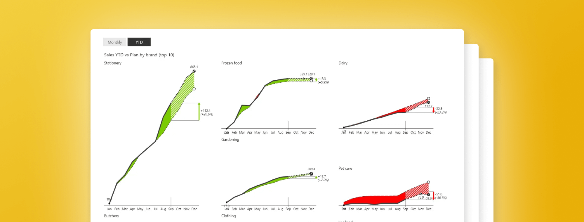
Small multiples for powerful reports
Of course, your variance reports with forecasts can be much more detailed. For example, you can use small multiples to show the performance of individual product groups instead of just the total. The below chart is showing year-to-date values for individual product groups like stationery, frozen food, pet care, etc.
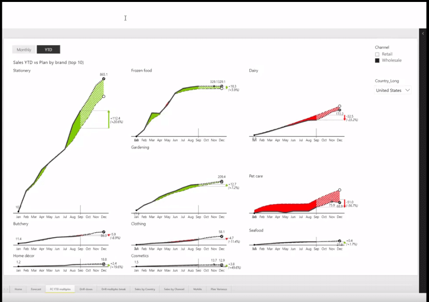
Putting all the charts on a single page like this is a powerful way to understand your product categories. You can see at a glance, which are the most important categories, which represent an issue, and which require your special attention. All charts are scaled, so it is even easier to understand the relationships.
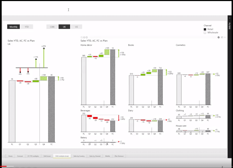
You can also combine different charts. For example, you can focus on the total value for a single country and then break it down on the right with small multiples for individual categories. The example below shows the big picture for a single country on the left side of the report. It then breaks it down into detailed individual categories on the right.
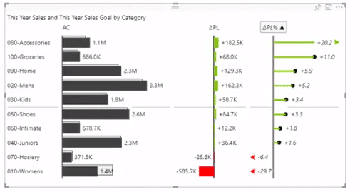
Moving away from time data
When you are working with data other than a time series, like different product groups or countries, you should use a vertical chart. If you are reporting on product groups, use a chart like this:
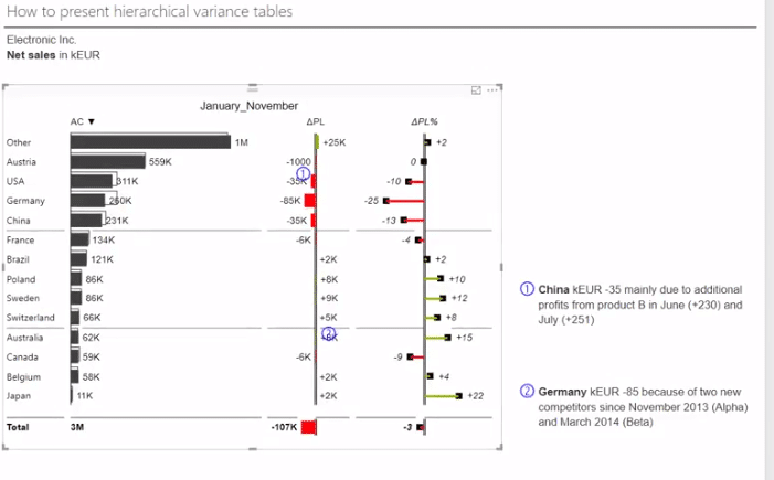
Variance reports from hierarchical data
Now let's take a look at data that is hierarchical in nature. The below chart groups data into individual regions, like Asia-Pacific, EU and Americas. The hierarchical approach allows you to still see the detailed data for individual countries while also providing insight into groups of countries to better allocate your efforts.
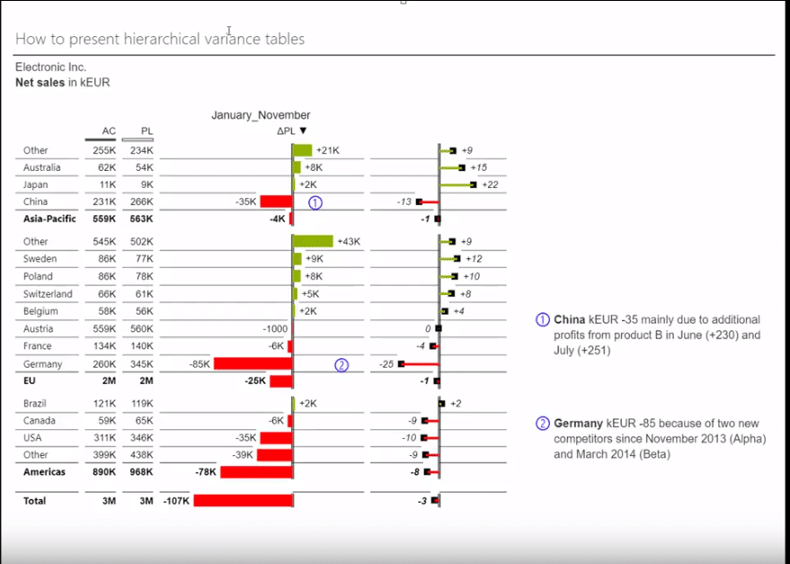
This chart only shows simple values of variances. However, you can make it more meaningful by switching to the waterfall chart view that still shows individual variances but also shows clearly how individual countries contribute to the total result for individual regions. The second option makes it a bit clearer how each country contributes to the result of the entire region. You can even switch to the display that shows how each country contributes towards the grand total.
You start making this report by selecting countries as the category and then turning on actual results and plan values to show the variance. The first step to making it a more readable chart is to turn on the grand totals and add Region as the grouping element.
If you then move the region into Category section, it will show a hierarchical dataset - the region becomes a part of the data set and the chart will show totals for individual regions. You get a table and chart combination with three levels of information - the country, region and total.
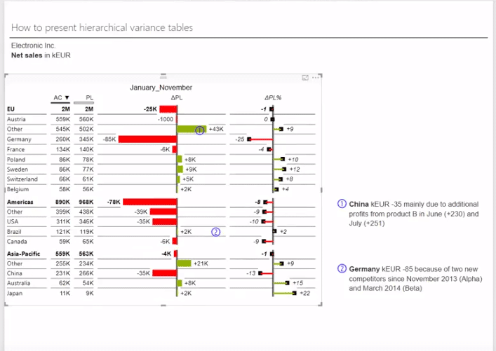
TIP: Totals can be shown above groups or below. Personally, I believe the more standard approach is to have it below.
Profit and Loss statement
Finally, we arrive at the income statement. At Zebra BI, we have seen a lot of attempts how to present P&L statements in Power BI and it appears that it is a huge problem, so we have paid special attention to this aspect of our custom visuals to make it as easy and as powerful as possible. Even though this is one of the basic financial statements, it can be tricky to present the numbers in a meaningful way. We found that users of Power BI in particular have difficulties with this concept.
Why are they hard to make? If you take a look at the example below, you can see that we have different types of KPI's. Some are positive and contribute to the bottom line, while others are negative and subtract from the result.

Now, when you look at the cost of goods sold (COGS), you see that it has increased by 6 million. The software by itself does not know that this is a negative development, so we need to mark it as such to show that it contributes negatively to the total result. The visual is clear about this as it shows the KPI in red even though it is growing, which means it needs an inverted meaning.
To make the statement meaningful, you need to define whether you are dealing with a positive or negative KPI or a total for each row. The best approach is to turn off sorting and focus on creating meaningful groups. The best thing is that you can have mixed KPIs within the same group. This means that instead of just expenses and revenues, you can use more logical groups that tell a better story.
Try it yourself
The above Power BI dashboards and reports were created using Zebra BI custom visuals. They are designed to help you build extremely clear, detailed and insightful business reports and dashboards in Power BI.
Special attention and a great deal of effort have been invested into making the process of building even the most complex business dashboards a straightforward, extremely fast and enjoyable experience.
You can download Zebra BI custom visuals for Power BI here: