The fastest way to insert lollipop charts in Excel
Lollipop charts are a great data visualization technique. Data visualization professionals and business analysts like them for a good reason. They can be used in similar situations as bar charts and column charts, but they have the advantage of producing a cleaner-looking picture.
The sticks of the lollipops are thinner than the bars/columns, which allows the chart to "breathe", while the lollipops force the reader to focus on the most important part of the chart - the values.
Jon Peltier, Stephanie Evergreen and Jon Schwabish all wrote their own guides on how to produce lollipop charts in Microsoft Excel - "the primary data visualization tool for most of the world", according to Schwabish. These kinds of guides are necessary because lollipop charts are not included in the default set of charts found in Excel.
All of these guides work well for producing lollipop charts in Excel, but they all have one flaw: they take time to complete.
Ideally, you wouldn't need a guide to produce a lollipop chart in Excel...
A better way
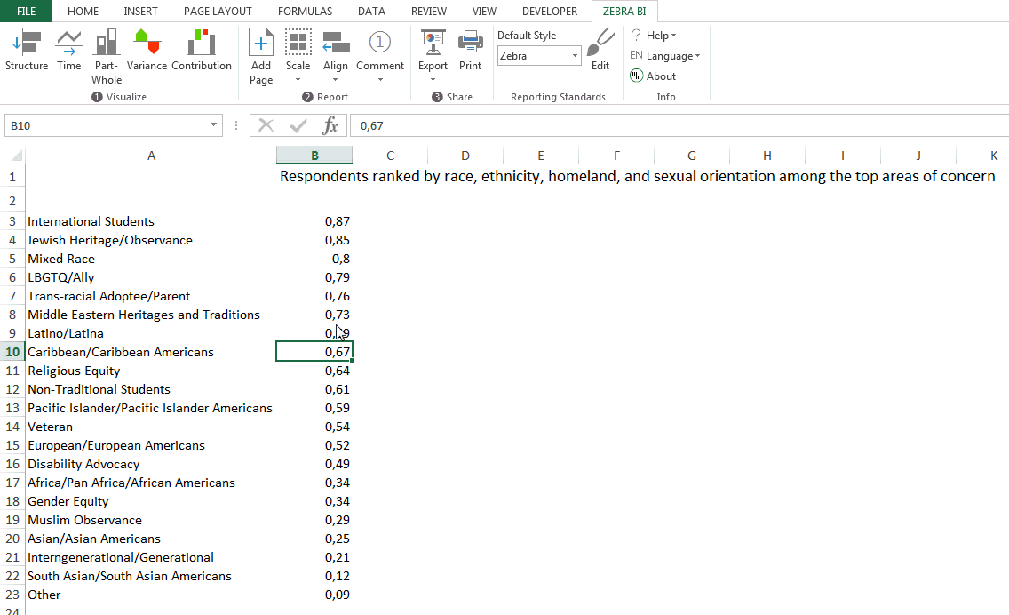
Want to insert lollipop charts in two clicks, just like default Excel charts?
This is where Zebra BI Excel add-in comes in. With it, all it takes to produce a lollipop chart are two clicks, exactly the same as with the default Excel charts. Horizontal or vertical charts - it doesn't matter. Here's how it looks like:
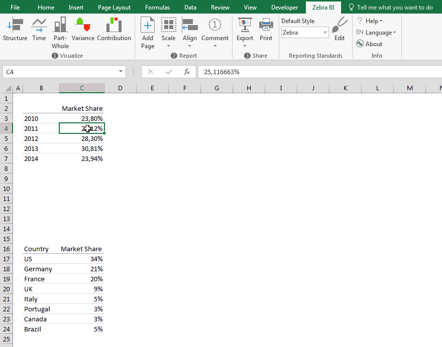
Variance charts
Want to display variance with lollipop charts? No problem. Below you can see how to insert a relative variance chart from raw data, without any formulas or programming.
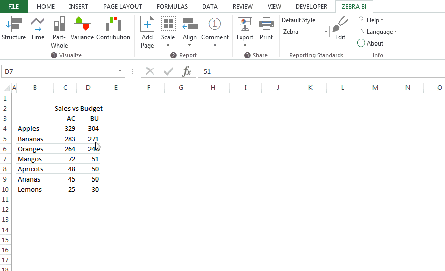
No need to write any formulas or apply strange tricks to Excel charts. Even the actual vs. budget variance is calculated automatically, either absolute or relative in %.
On top of that, Zebra charts offer other features for real-life situations, such as cutting the outliers if a relative variance is huge, adjusting the label density, inverting colors for "negative" KPIs like costs, control the number format in the simplest way possible, etc.
Pretty neat, huh?
Six charts with two clicks
Yes, you can also create small multiples! Here are six (scaled!) lollipop charts inserted, still with just two clicks. If you wanted to do that manually with default Excel charts, it would take you an hour. Umm, probably more.
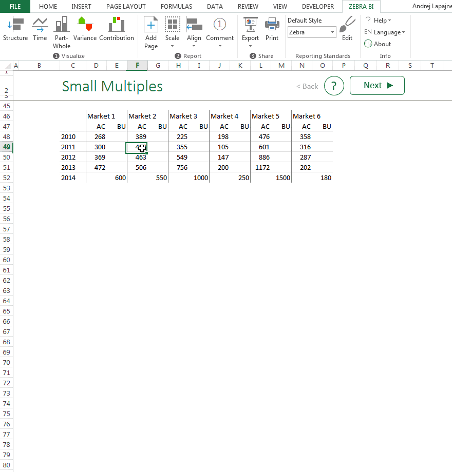
Of course, 6 charts is not the limit. You can insert 12, 16 or even more exactly in the same way - in two clicks.
Jon's example
Finally, here's the example from Jon's post. Note that the data labels are automatically added by default and you have several options for formatting the numbers:
Tired of producing lollipop charts by following guides? Give Zebra BI a try: