Share this
 September 8th
 February 22nd
 04 Jun 2026
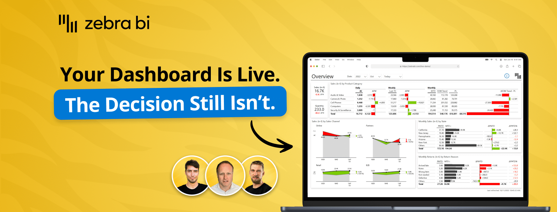
 Tired of messy spreadsheets with bad visualizations? Make them a thing of the past!
Watch this webinar to learn how to present the most important insights fast, saving yourself a ton of time and money.

You can have more than one visual per sheet and if your data is comparable you can use your data as Small multiples so this way you get all your charts with correct scaling.
The 2 Zebra BI add-ins: Zebra BI Tables for Office and Zebra BI Charts for Office are available in the Microsoft AppSource and you can add them to your Excel/PowerPoint with a few clicks.
Yes you can customize the colors (you have some pre-defined styles) but you can also assign your custom colors.