 September 8th
 February 22nd
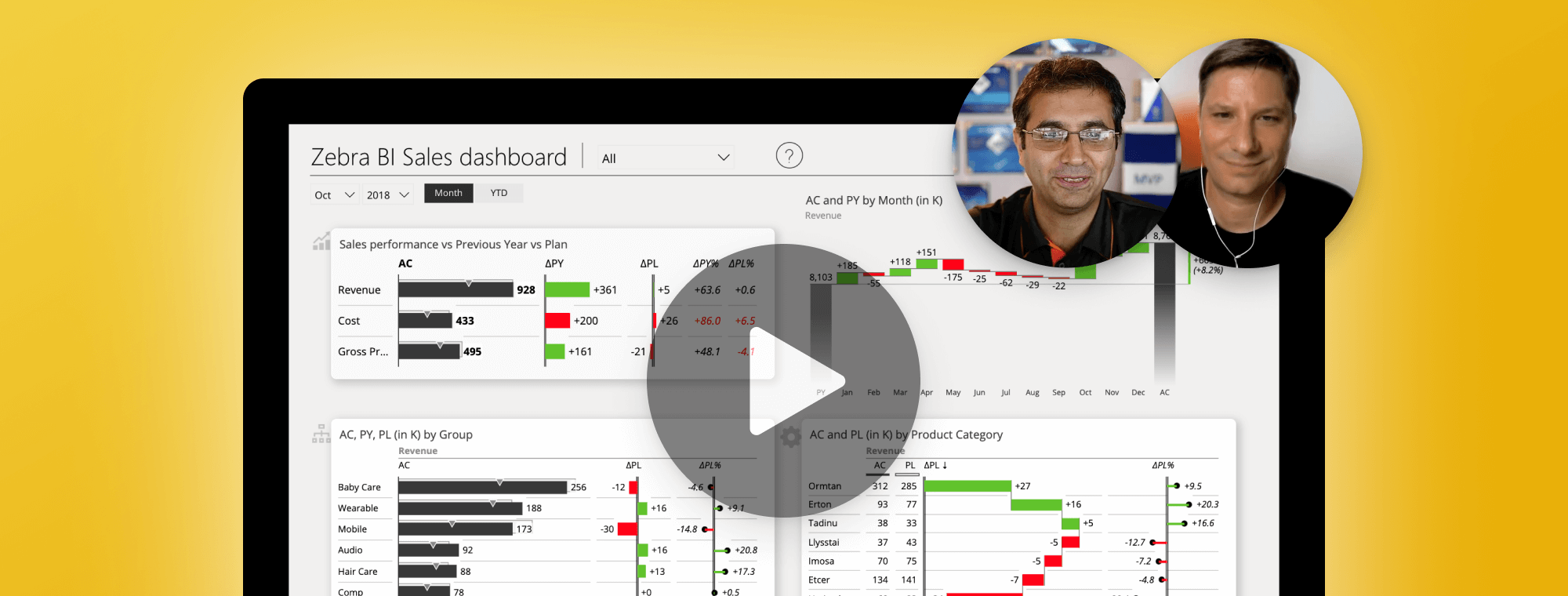
Design best Power BI dashboards [Youtube Live Stream]
On Friday, June 6th, Our CEO Andrej Lapajne was a guest at the live Youtube session hosted by Reza Rad. Reza is a Microsoft Regional Director and has more than 20 years experience in data analysis, BI, databases, programming, and development. He is also a co-founder of RADACAD, the channel on which the session was held at.
On the stream, titled Best practices in designing Power BI dashboards, Andrej showed how even with outstanding business intelligence tools such as MS Power BI, your dashboards can fail. Often the end-users simply lose interest and do not check the dashboards anymore. This happens for many reasons, mostly due to wrong chart types and similar data visualization issues, confusing page layouts, lack of comparisons, poor information density, counter-intuitive interaction design, etc.
How can you prevent these worst Power BI mistakes? What one must do, is to always make sure the reports and dashboards you deliver are understandable and actionable! But that is easier said than done, if you don't know where to start.
Watch the whole lesson bellow:
Tell us in the comments what your favorite part was. Should we do more sessions like this?