Share this
 September 8th
 February 22nd
In this live session, we'll guide you through the 3 fundamental rules that you should always follow when creating charts. By learning them, there is a good chance you will get it right no matter what the context of your data is.
We’ll dive deep into the different chart types, from most basic to advanced, and analyze real-life examples in both native Power BI and Zebra BI visuals.


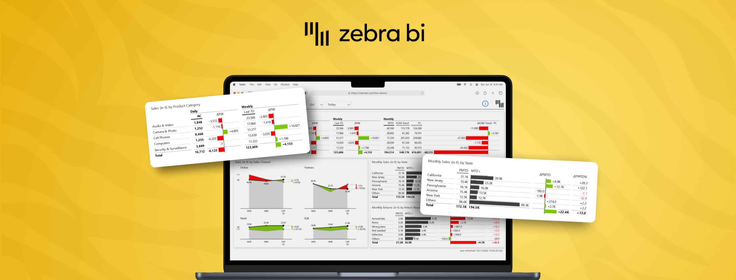
In the visual here, you have four placeholders, so you can add the actual versus previous year versus plan and forecast. At the moment you can add one measure for the previous year, one measure for the plan, one measure for the forecast. But you can add your secondary plan, forecast 2 also here behind, and then you will get it in the table as well. Of course, you can also visualize it. You can even scale it. Put it in the same scaling with the first group and you can move it around like with all the other measures or columns within the Zebra BI table. If it was the question about this type of visualization, you can add up to 20 additional columns like this.
It's four basic scenarios, plus 20 additional measures in columns. But with version 5.2, we will deliver an option. We will allow you to put multiple measures into the plan bucket and also into the forecast bucket. You will be able to show multiple forecasts with automatically calculated variances and also multiple ways how to visualize them. Right now, according to the IBCS, the forecast is like this, but then if you have multiple forecasts, you will also have multiple patterns for that, and you will have multiple veterans for multiple plans as well.
Marimekko chart is basically the same thing as the treemap. You can add multiple measures. But in Power BI, it's basically always just a breakdown. It's always breakdown by the group and then by the subsequent, either measures or by a hierarchy. It's very hard to compare elements here because they are different. They're always encoded in the area. That's the problem. It's hard to say which element is bigger and what are we looking at. The problem is also with the labeling. You cannot get labels inside. There's no place to show whether it's going up or down and so on.
There are a few better ways for the market shares, in my opinion. You could use the small multiples with just the percentages of market shares by market, and you display all the markets. And then there are other things like marketing examples.
They're typically used for some kind of relations. There's actually not a good network visual to display networks in Power BI, but there are custom visuals for that. It's usually to display relations for example you want to display your social network. How many friends do you have? What are the relations? How close are you to certain friends? And so on. It's basically just network visualization. Sometimes, this is useful in business for certain reasons when you have certain resources and then you want to analyze how are they connected, where are the connections, and how strong are the connections, and so on. Typically in business reporting, it's more about charts. But as I have explained, try to avoid the circular charts altogether, just use the vertical axis and so on. The less you invent, the better because consistency is the key.
The problem with this map visual is that the visualization has a life factor. It has a cutoff point where all the bubbles are the same. The minimum circle size is limited. Even that some of them are very, very small, almost nonexistent, you will get the same size. Otherwise, showing bubbles on a map, that's fine. That's good. This is much better than coloring certain countries. Just using shades of color, that is bad practice. If you are doing any kind of visualization on a map, make sure that you use charts on a map, like circles or pie charts, or better even columns on a map.
This visual is very limited in Power BI, to the extent that I would not use it in production for any serious reports, although maps are needed. What I do recommend if you need maps, to use the S3 map. It has more options. It has proper data visualization without the life factor and more control over the display on the map. You can use also floor plans or other things similar to maps. Basically, you geocode a floor plan instead of a map of the world or a country. It's basically the same thing. You just put things in two dimensions, like latitude longitude, and this works nicely for floor plans, for some operational reports, and so on. The problem of those types of visualizations is always the life factor. If you don't use proper charts, but instead you color countries or regions, you will fail.