Watch video recording & Get follow-along PBIX example
If you'd like to try all of this yourself, enter your data below to get immediate access to the PBIX example used in the this tutorial and the full 1-hour video recording of the webinar.
 September 8th
 February 22nd
With the wealth of choices offered by modern BI and visualization tools, it can be hard to select the right chart for the job. We’ll help you communicate your data clearly and effectively with a selection of tips and best practices for selecting the correct chart. This tutorial looks at different criteria you need to consider and lists the most suitable chart types along with examples.
Let’s talk about our favorite thing about data visualization - how to select the right chart. To visualize data successfully, you need to choose the right visual to represent your data and we will show you how. Or you can simply choose the correct one using our interactive Zebra BI Chart Selector tool.
First of all, the examples we'll show will be in Power BI, currently, the number one tool on the planet, but the principles apply to any other tool, such as Excel, Tableau or whatever you are using.
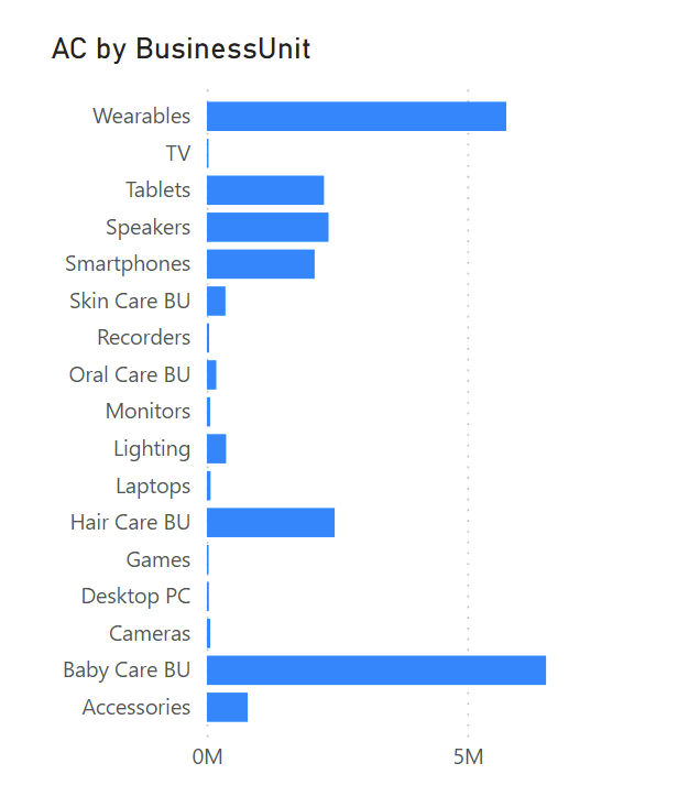
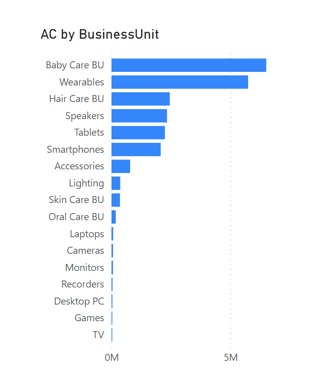
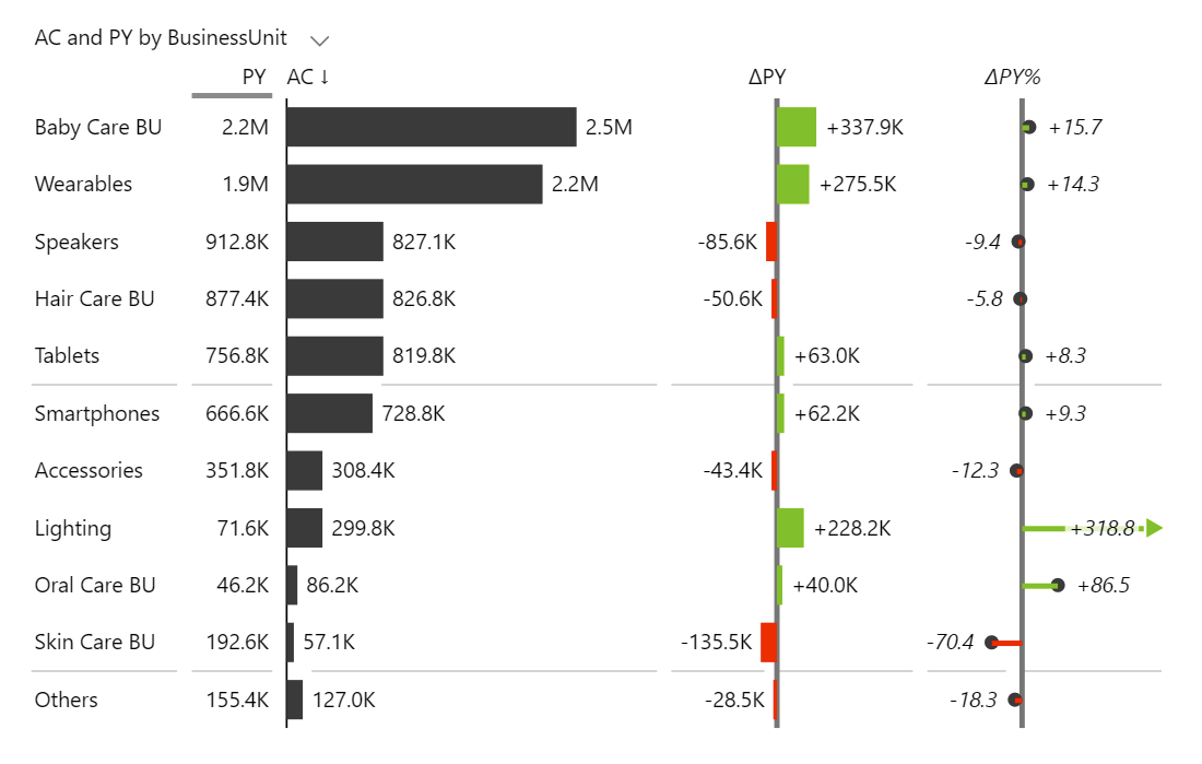
To mix things up, let’s start by looking at the way chart selection can go wrong. Here’s one of the most frequently used charts in Power BI, at least judging by the number of Google results and the number of times it shows up in Power BI presentations.
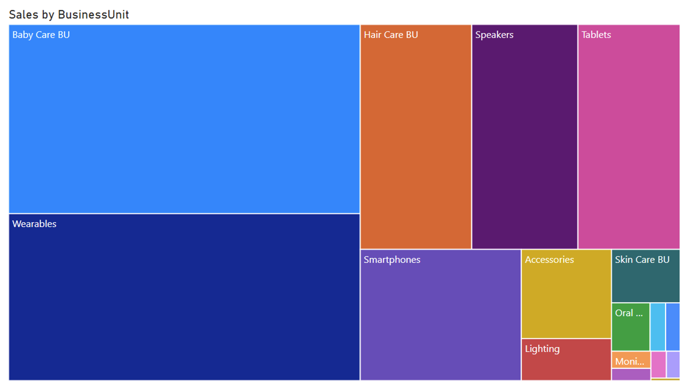
People love it. It’s colorful and looks attractive. But what does it tell us? At first glance, it shows a breakdown of sales by business units. Baby care products and wearables bring in about half the revenue while the other categories make up the other half. That’s about it.
Any serious sales manager would start asking tough questions. For example, is the overall sales performance good or bad? How does it compare to the plan? Are we doing better than last year? How are the sales of speakers doing?
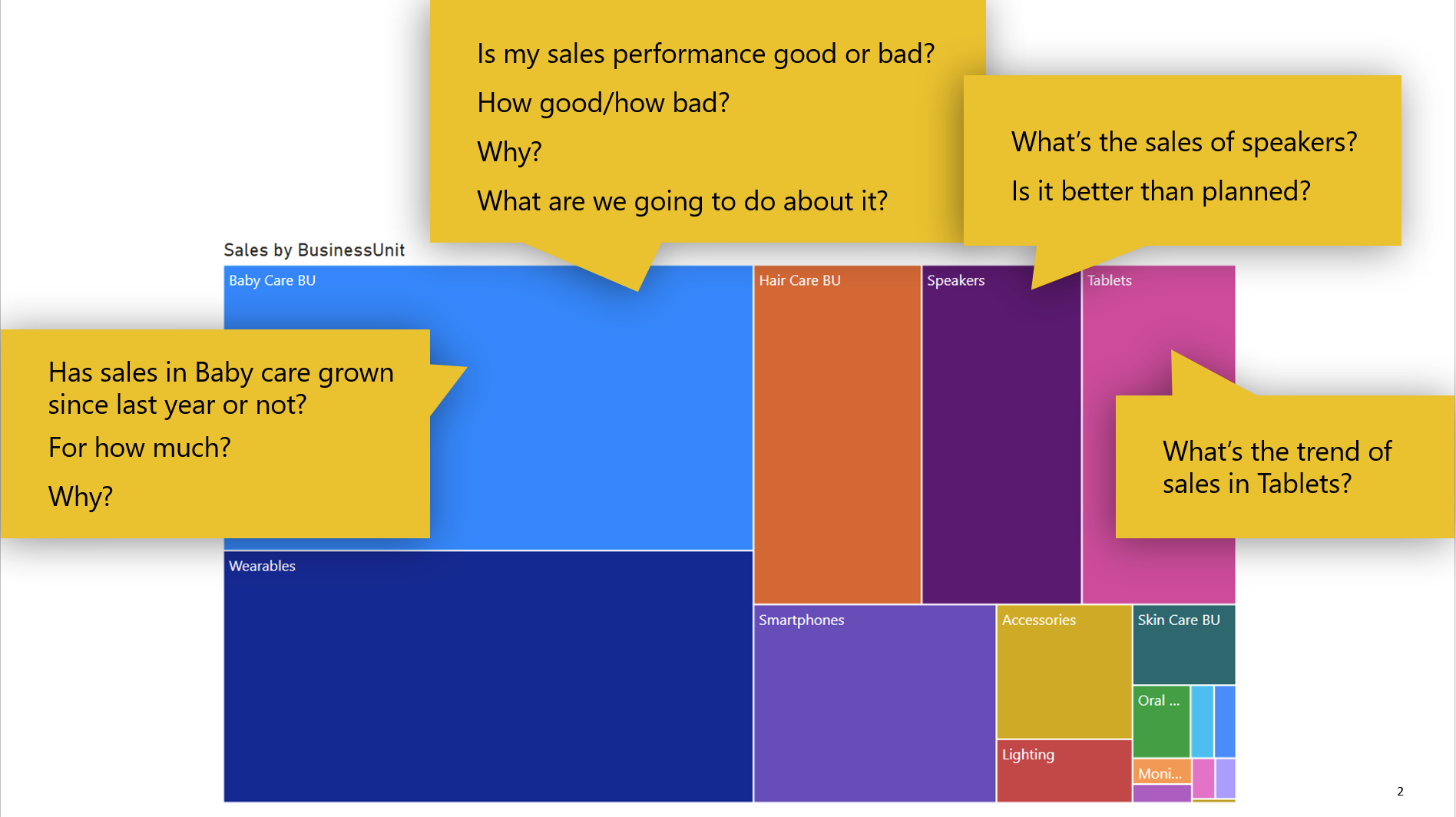
By looking at just this chart, we have no idea. It gives us a rough breakdown of sales by business units and that’s it. All these colors and all this space say very little. See the most common mistakes people make when creating their dashboards.
This is simply not an efficient chart for finding answers to these questions.
So what makes an efficient chart? Here’s a quote by Jacques Bertin, one of the best authors in the field of data visualization:
An efficient chart requires the shortest period of perception in order to obtain a correct and complete answer to a given question.
So this is the basic principle that will guide us.
It’s no wonder that it’s hard to choose a visualization. Out of the box, Power BI has charts, maps, tables and KPI cards as well as other visuals while its marketplace offers 300 additional custom visuals, including Zebra BI. This gives you many options to visualize your data.
To frame the talk about visualization, first take a look at a visualization wheel, a concept introduced by Alberto Cairo. It shows different dimensions of visualizations clearly.

Put simply, this wheel shows that you can either have a very original visualization or a visual that will be familiar and easily understandable by the reader. You can have a dense chart or one that is light on information. A chart can be decorative or functional.
Looking at the wheel, the visuals with the properties on the right are usually infographics or information art that is used to entertain readers. On the left side are the properties of functional charts that are easy to understand and efficient. Charts that should be used in business intelligence, business reporting, and dashboarding.
When choosing visuals, you should always consider your audience. If we’re talking about business intelligence, you are usually talking to the management. These people are usually short on time and you want to get to the core of your message as quickly as possible.
This means you should use tried and tested charts. You need charts that are consistent, easy to understand and actionable. You need charts that do not overwhelm but are deep enough to provide the answer to their question. Learn more about the importance of consistent reporting within your company.
Here are the properties, you should aim for in your visuals:
Insightful. Once your reader looks at the data you presented, they must be able to glean insights into things they care about.
Information rich. This means that there should be no trivial information included and there should be enough information on your dashboards so people can use them to make decisions.
Clean and truthful. Charts can be used to lie or deceive. It’s easy to omit labels or fudge around with the axes to make them show a skewed version of the truth. You should not do that.
Familiar. The reader should be able to quickly recognize the type of chart and the information it is trying to convey.
Consistent. This is the key word here. If you're always doing it in the same way, the charts will become familiar and people will read them like traffic signs. They'll understand everything very quickly.
What types of charts meet these criteria? We have prepared a taxonomy of business charts, which is essentially a table with all the charts that we believe are useful in business reporting.
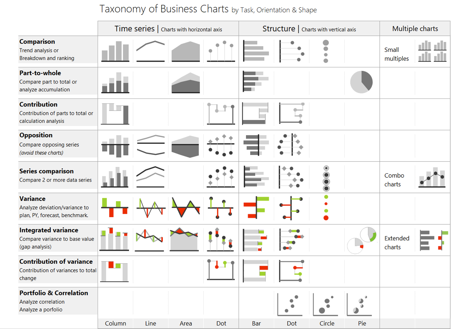
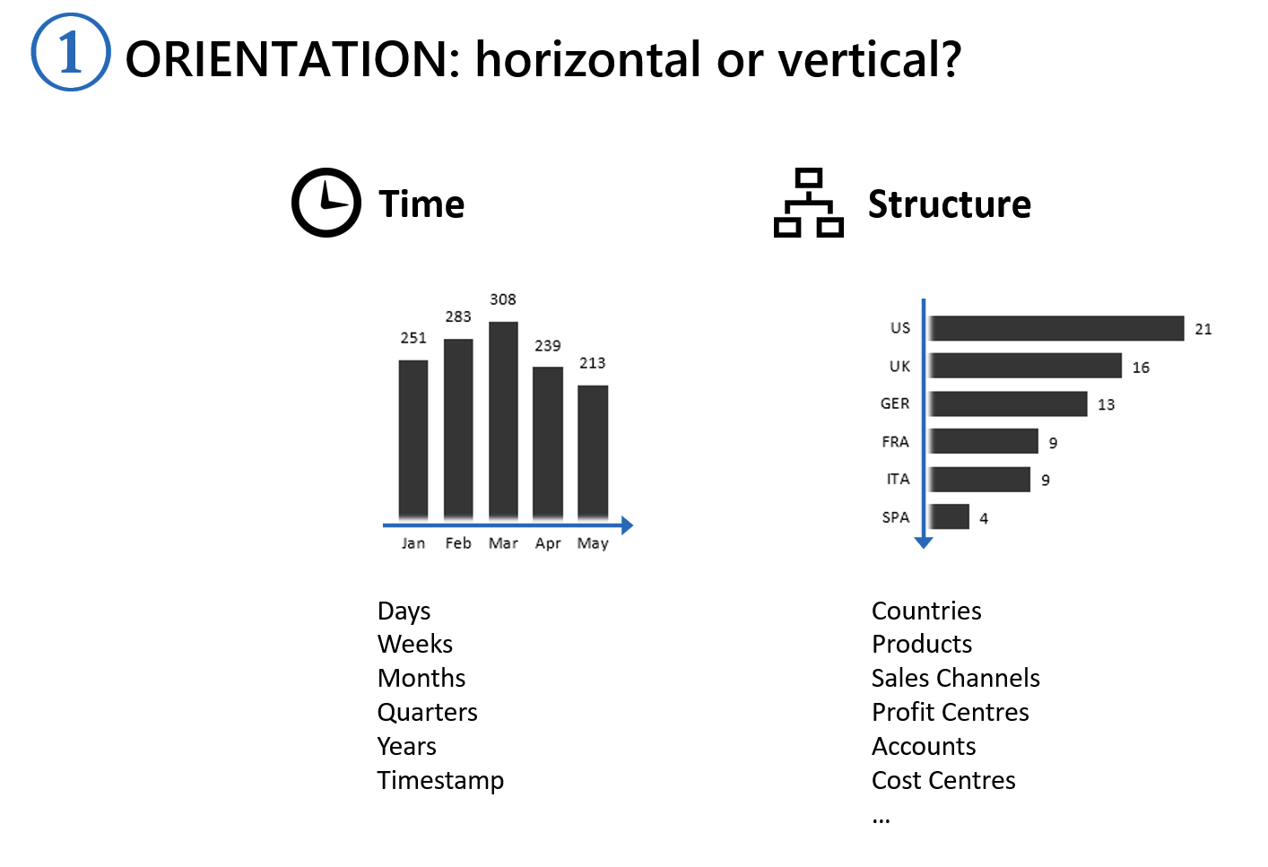
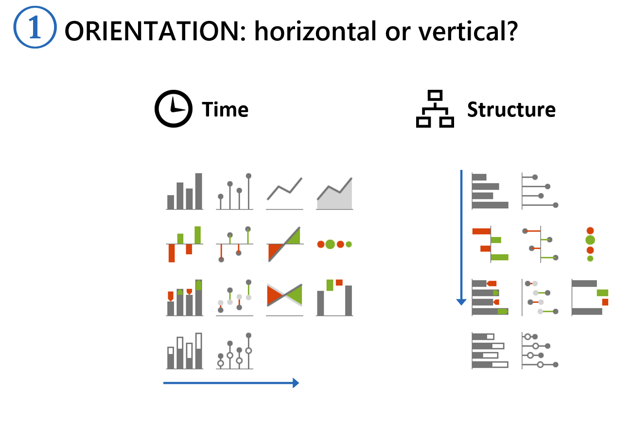
The charts are organized based on three criteria. The first one is whether the chart is presenting a time series or a structure or a breakdown by something else. As a rule, time series charts have horizontal axes and all other charts have vertical axes.
The second criterion is the task that a user can actually perform based on the chart type. It could be a comparison of data points or parts or an assessment of the contribution of individual elements to the whole.
The third criterion is the shape to show what type of data you are trying to visualize. You might use a column or a line chart or an area chart.
Today, you also have to consider some extra data visualization methods. Let me mention just three:
Get the full overview of Zebra BI charts and visualizations with Zebra BI Chart Selector. It includes explanations and instructions on how to create a certain chart type.
We start by orientation, which is very simple. If you are presenting time (days, months, quarters, years), use a chart with a horizontal axis that runs left to right. If you are not showing time, use charts with a vertical axis, going from top to bottom. This means products, business units, cost types and so on.
This is true for any type of chart. It doesn’t matter whether it’s a bar chart, a line chart or an area chart.
In practice, this is really important and I’d like to show you why:

The chart on the left shows revenue by business units which are displayed on the horizontal axis. This is the default option suggested by Power BI. However, the labels are too long and are displayed tilted, which is a good sign, you should switch them to the vertical axis. This makes it much easier to read.
An interesting thing about Power BI is that you have more options for charts with horizontal axes. While you only have two types of bar charts for showing structure, you have column charts, line charts and area charts for time series.
To come up with the task for your chart, ask yourself a simple question - what does the reader need to know? What is the single most important thing I want them to see when they open the chart?
We will start with a simple comparison of business unit revenues. Dropping data into your Power BI dashboard creates a simple chart that shows some small and some large values.
A simple operation like sorting will give you a better insight into what is going on.
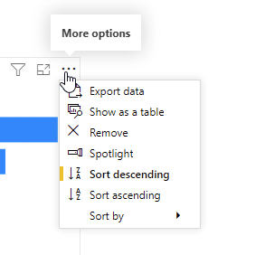
When you sort by actual results, you can now quickly identify which business units contribute the most revenue.
While you could use other chart types, such as a pie or donut chart, you will quickly see that the bar chart is the most suitable. Even the ever popular breakdown or marimekko chart, shown at the top of this post, is not very good at showing this.

The thing is that the visual system in humans is designed so that we can easily assess the height or the width of certain elements and compare them. We are most precise when comparing lengths and much less precise when comparing areas.
The next option is to show a time series analysis. You can select from a column chart, a line chart or an area chart.
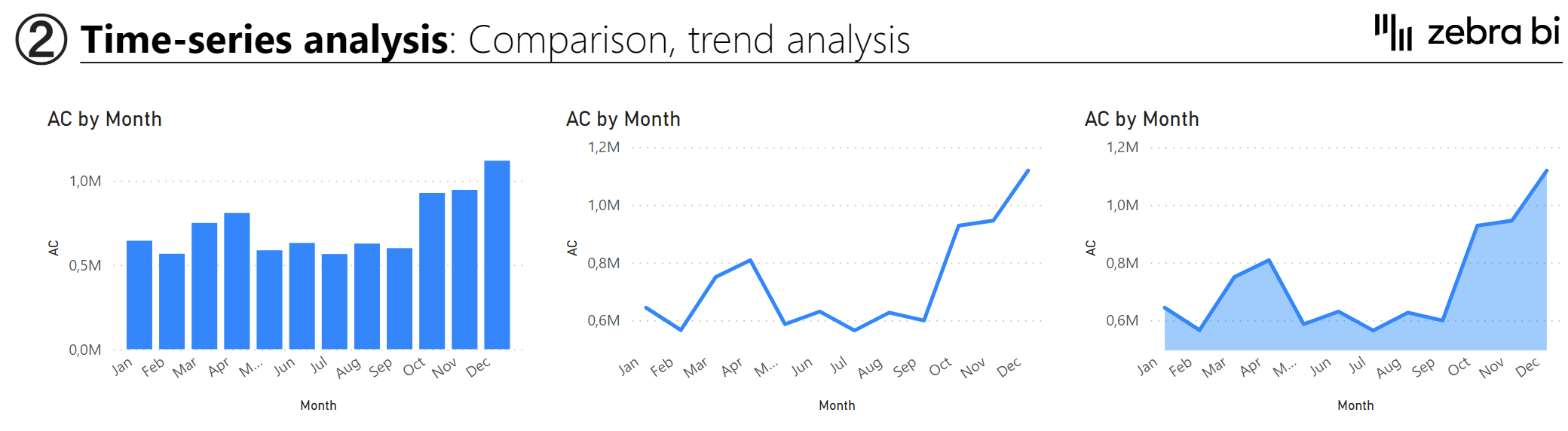
Which is better? A general recommendation is to use columns in situations where you have a very small dataset. The purpose of the columns is to allow people to compare the values. You can show the 12 months and the user can compare April to May or August.
With the line chart, on the other hand, your eye follows the line and assesses the angle of the line. This makes it much more useful for displaying global trends. You can see whether it is going up or down and by how much. The line chart (and area chart) usually works better for dense data sets.
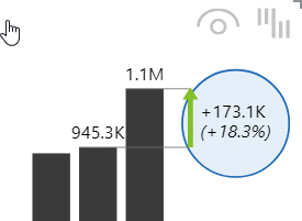
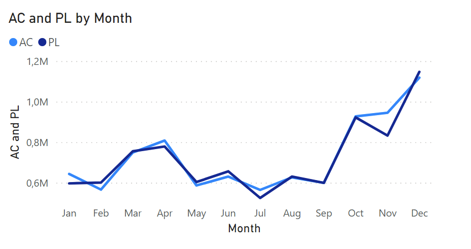
A word of caution. When using line charts in Power BI you need to be careful, because Power BI automatically breaks the axis, which exaggerates values and results in a less than truthful chart. Compare the default column chart with the default line chart:
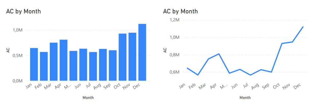
Both are based on the same data but the line chart makes it seem like revenues in some months were almost zero. The column chart shows a much more realistic situation.
You can get more options by using custom visuals, such as Zebra BI. This will give you access to more styles, such as the pin or lollipop charts (shown on the right). There is also the hills and valley chart that emphasizes whether the value is going down or up relative to a specific data point.
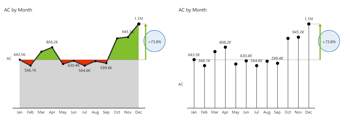
Both of these charts have a difference highlight integrated, which is something that is not available in native Power BI charts.This difference highlight can show by how much the final value has increased relative to another data point in the set. For example, it could be a comparison to the preceding month or the starting month.
But showing just one chart might not be enough. The solution might be small multiples - multiple charts on a single page. Zebra BI has excellent support for this feature, although Power BI has added it recently as well.
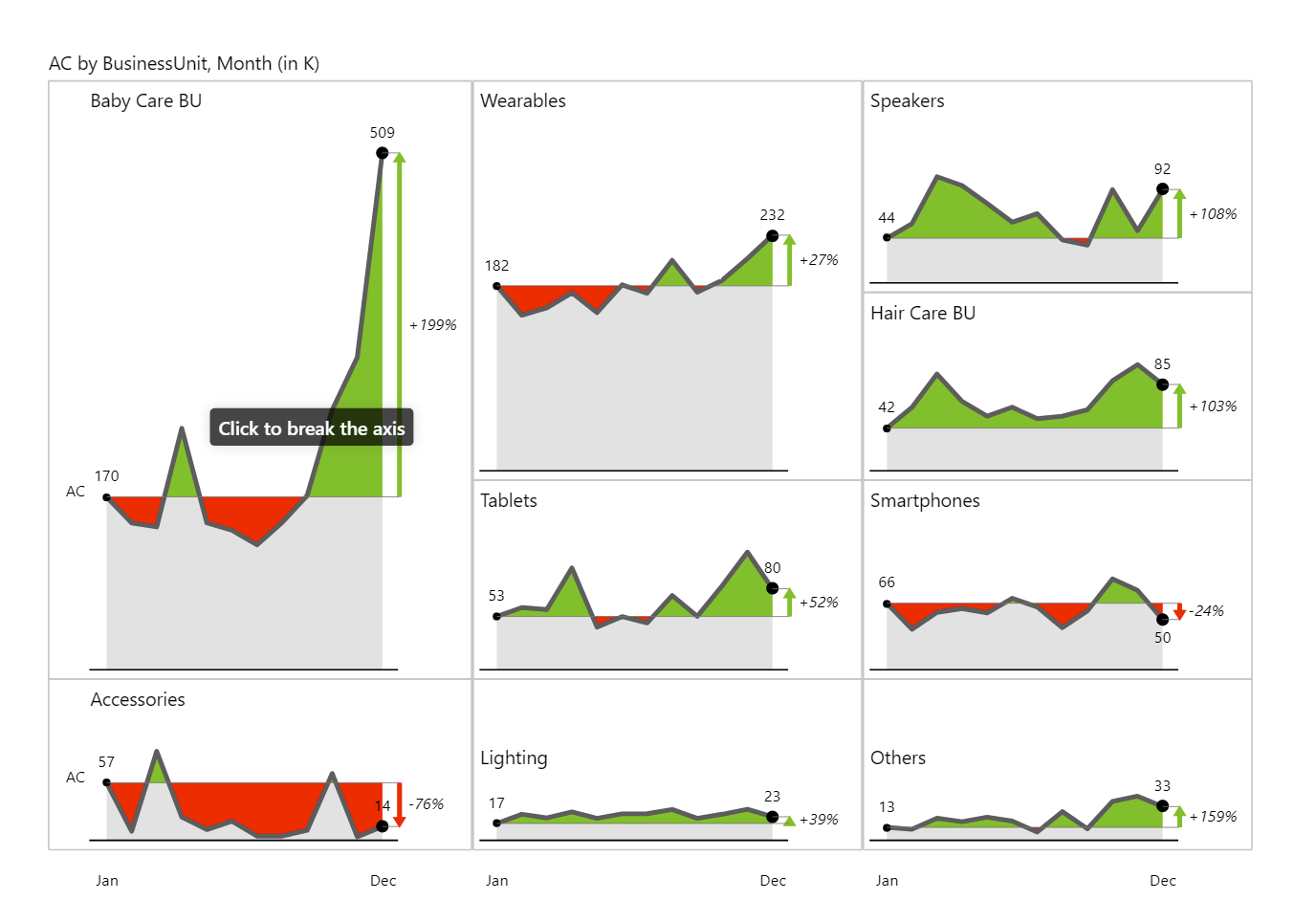
These charts all use the same scale and the size of the charts represents their significance. Here, the Baby Care BU is by far the largest unit. To make sure the page doesn’t get too cluttered, Zebra BI offers a fantastic feature that displays just the top eight most important elements and everything else is combined into the Others chart.
You can use a stacked chart to show part-to-whole comparisons. For example, Zebra BI allows you to highlight individual categories in a stacked chart to make sure you see how they contribute to a whole during a specific month.
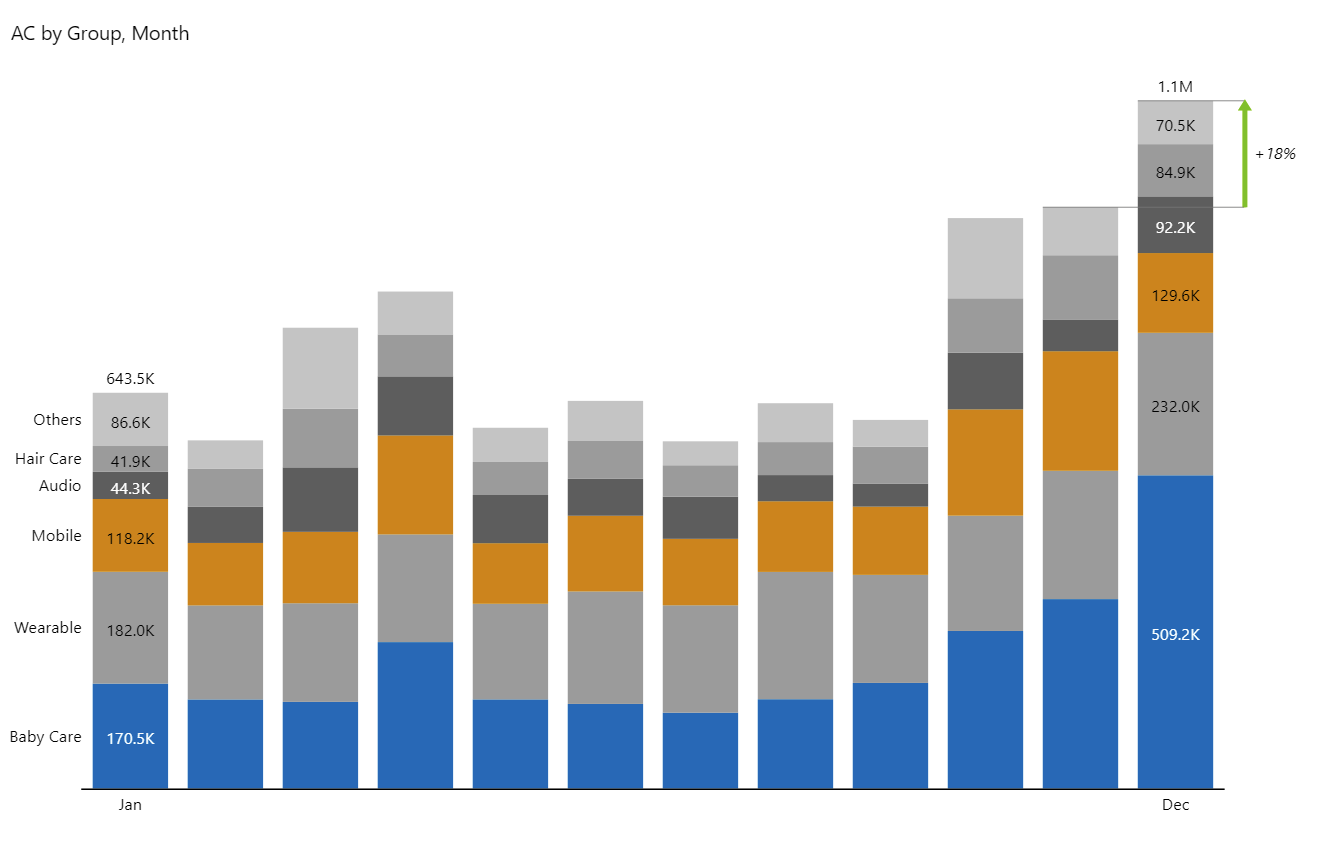
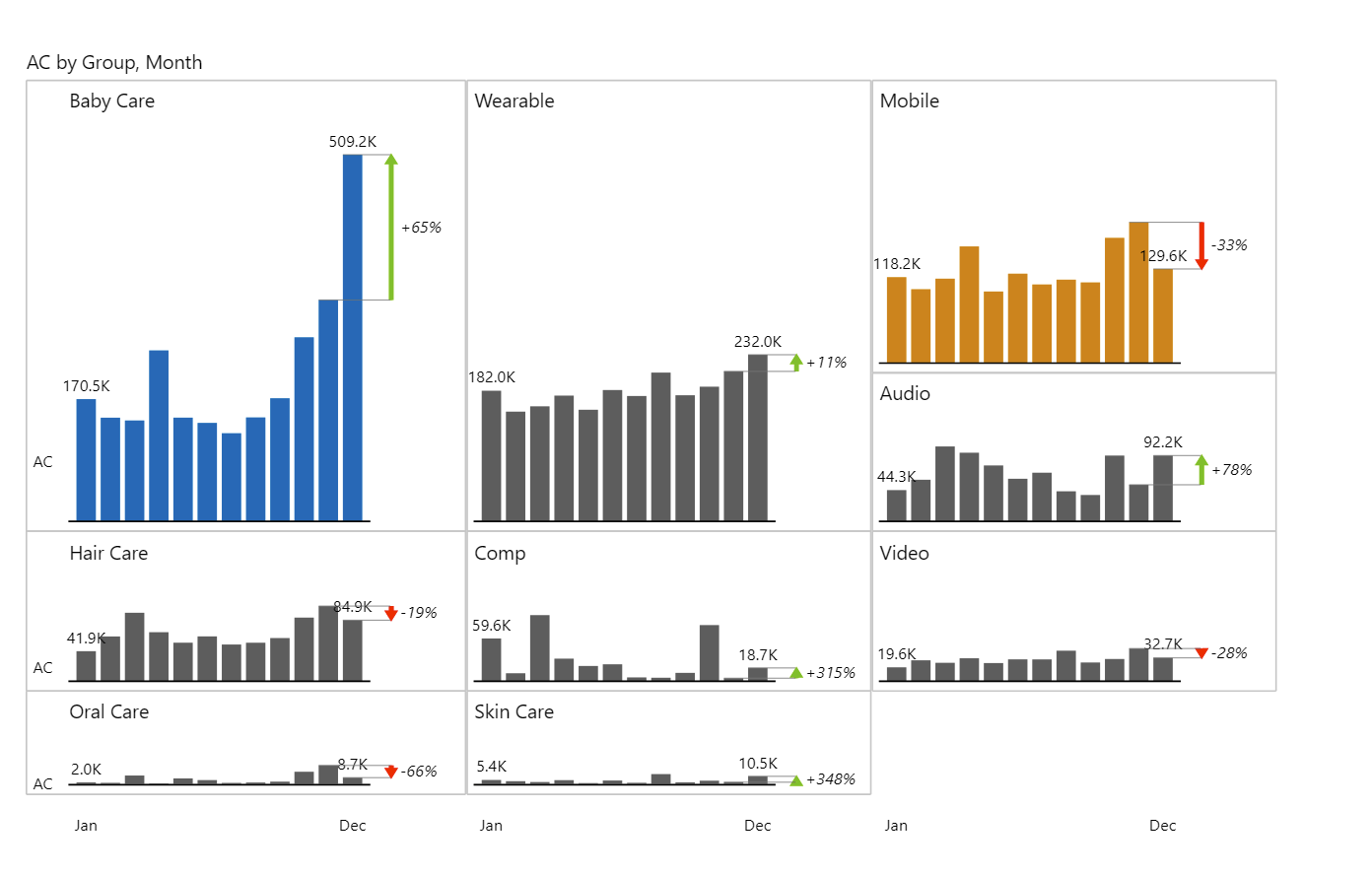
However, this is not the optimal way to show how individual business units are growing or shrinking by month. To do that, you could always switch to the small multiples view and analyze the trend there.
Our advice is to avoid stacked charts as much as possible. While they are very decorative, they can quickly become overwhelming and obscure useful information. Zebra BI has some options that make them better, like highlighting or reducing the number of categories, so the clutter is not as bad.
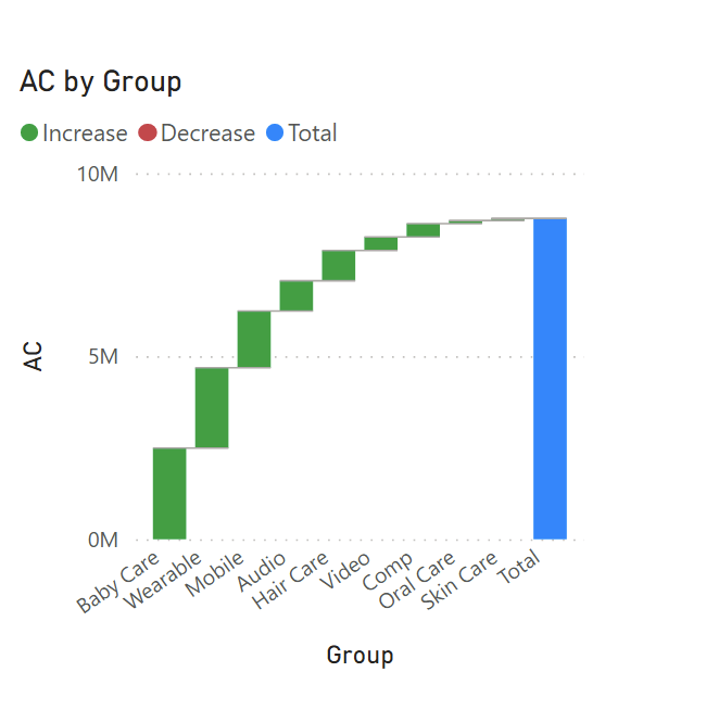
This is an important thing that is missing from most BI tools. Let’s say you have a series of data points that you put in a vertical bar chart. You might also need to understand how these individual categories contribute to the grand total. You can do this with a waterfall chart.
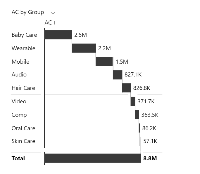
Power BI has waterfall charts as well but you are limited to charts with the horizontal axis only. This makes them far less useful and versatile.
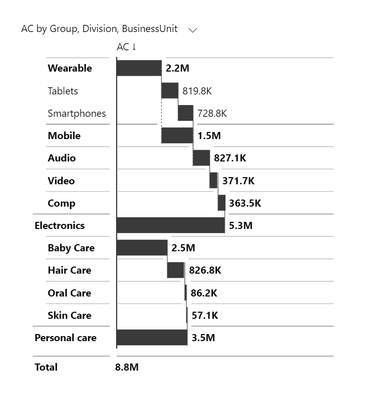
Waterfall charts are also great for showing hierarchies. You can add another field to the chart to create a hierarchy of values. Our example chart now has two divisions that are separated into business units and then further classified into individual product groups. In our example, tablets belong to the Mobile business unit and the Electronics division.
Calculations can be done with waterfall charts that have some extra features. Let’s say we are working with an income statement, where individual items can either contribute or subtract from the total.
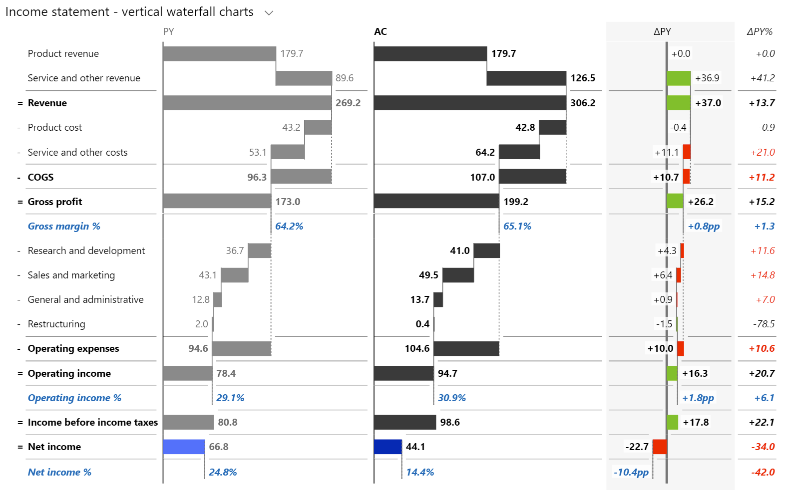
In Zebra BI, all you have to do is to invert the categories that reduce the total (for example, product or service cost or R&D expenditures). Also, you can mark individual values - for example, gross profit - as subtotals to ensure they do not contribute to the final result.
These visuals are great for things like income statements, balance sheets or cash flow statements.
When you want to compare multiple series, you can use a cluster chart or overlapping charts, which are similar to cluster charts.

These are not really good options and if we are talking about two unrelated data series, like apples and oranges, you could use a line chart to show the trends of the two.
However, when you are working with two related series of data, such as actuals versus plan, or actuals versus previous year, you are more interested in the variance. In this case, you might want to visualize the gap.
Instead of using two bars for the two values, you can use integrated variance, which integrates the variance directly into the chart. It looks like this:

You cannot do this in most BI tools, but it is available in Power BI with Zebra BI custom visuals. We made this completely interactive, so that when you increase the size, the variances pop out as an extended visual.
In order to show how variances contribute to a change between two values, you should use a bridge chart.

Looking at this chart, you can see how a good first and great fourth quarter contributed to the total 8.2% variance between actuals and previous year results. Find out more about presenting variance in a clear and easy-to-understand way.
Choosing the shape is just as important as anything else. There are a couple of essential rules.
Bars for fewer values, lines for more. As we mentioned when covering the time series, you should use lines or areas to indicate trends where you are working with more data elements. If you have just a few columns, then you can use.
Choose certain shapes for certain purposes. Be consistent in the use of shapes. For example, you can always use bars for revenue and lollipop charts with dots for percentages. This will allow users to quickly identify what data they are looking at.
Similarly, you can use patterns to code data scenarios like Actual, Budget, Forecast and Previous Year.
Selecting the right chart can be a daunting task even for experienced analysts. Zebra BI offers a wealth of advanced visualization options, such as integrated variances, tables, small multiples and stacked charts that allow you to tell your data story clearly and easily. Try Zebra BI for Power BI and see for yourself.
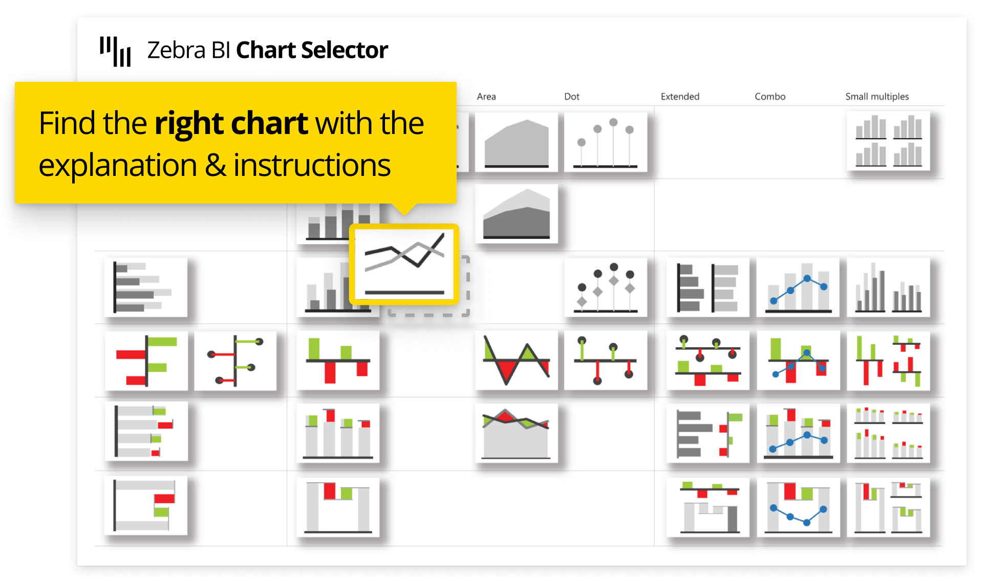
To make things easy for you, we created Zebra BI Chart Selector. It's a completely interactive and easy-to-use tool that follows all of the described practices and IBCS guidelines. You can make sure you're using the correct chart for your data with just a few clicks. In addition, you will find explanations and instructions on how to create a chart. Play with Chart Selector and explore the power of Zebra BI visuals.