September 8th
 February 22nd
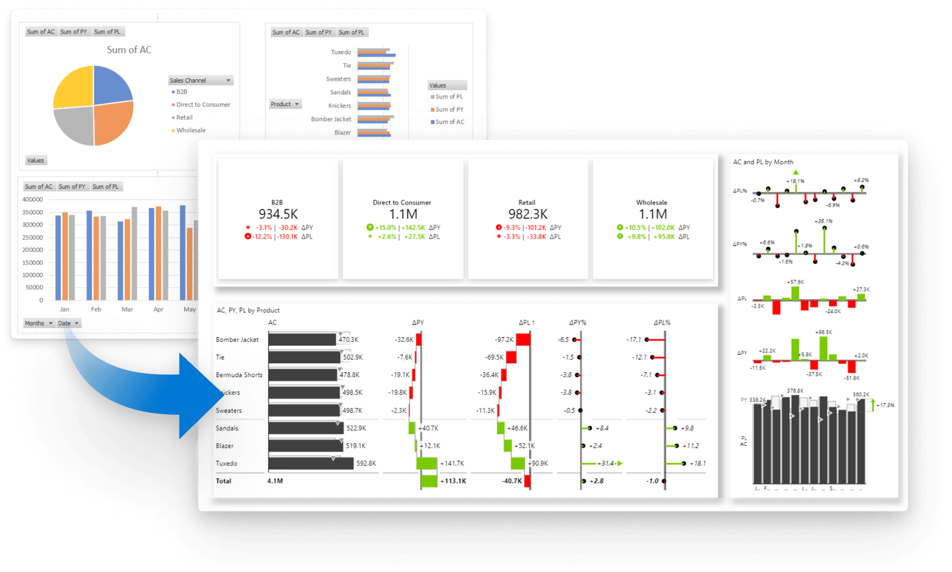
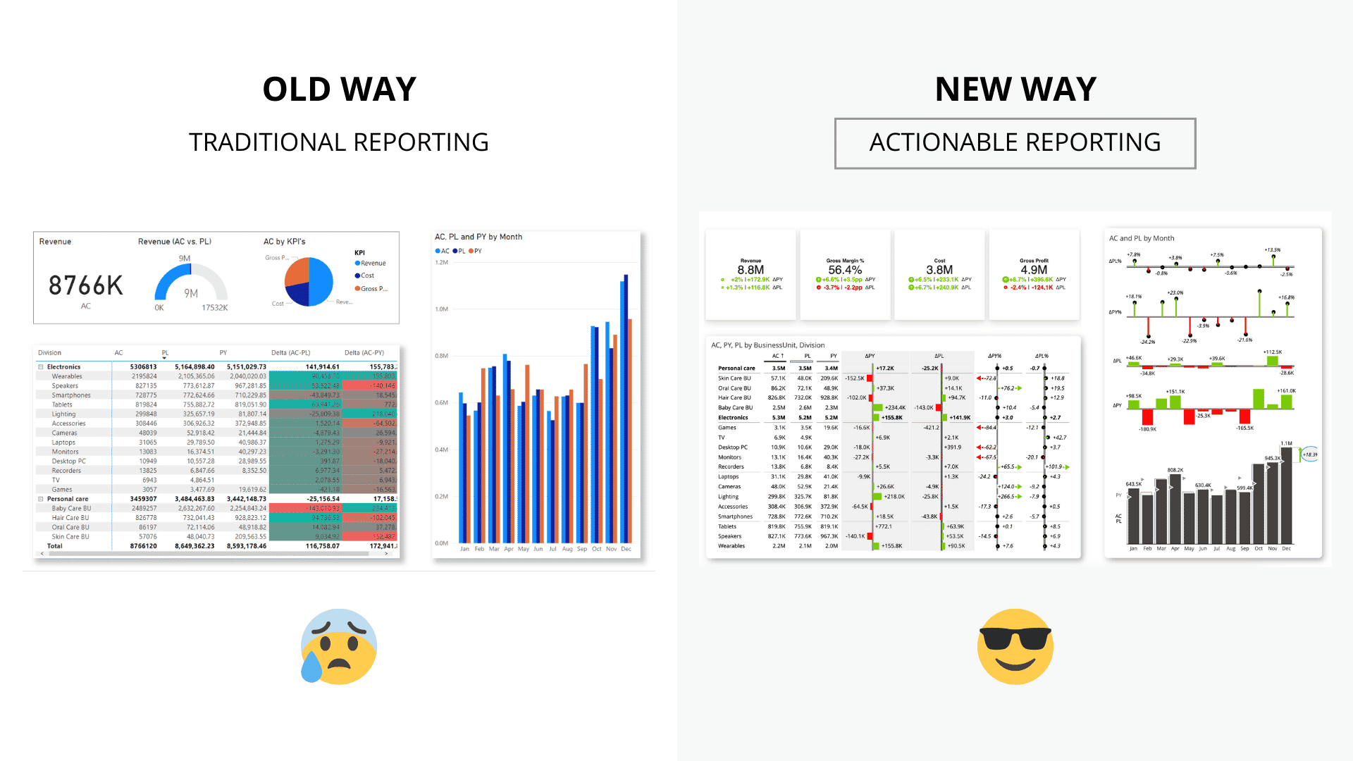
The way we've been thought to create reports is no longer enough in today's reality.
As you've likely noticed, we live in the age of information explosion. And if you think there is an incredible amount of consumer data being gathered, watch out: enterprise data is projected to grow even 2 times faster!
The problem?
Our brains have not evolved to process such large amounts of information. On top of that, our attention is severely limited.
In a world that is bombarding us with information, we must be careful about which pieces of information we choose to consume. Especially when our business depends on them.
But how do you know when your report is good?
If you Google 'best practices' then you're most likely to find examples of reports with flashy colors all fighting for attention, various different shapes of charts, and other elements that most of the time don't even make any sense.
At Zebra BI we came up with an easy 4-Question Insight Test that immediately shows the quality of a report. Look at your report and check whether it answers the 4 key questions:
Okay, let's take a look at what this means in practice.
Actionable Reporting is all about getting to insights fast. The faster you learn what's happening with your performance, the faster you can decide what to do next.
These are the top 7 rules to achieve clarity in reporting:
It’s time to finally stop using pie charts, donut charts, speedometers, confusing stacked charts, and so on.
There are better visuals that are clear, show changes, emphasize things that are really important, and clearly visualize structures and calculations.
Switch to better charts!
This is a huge problem today - sometime labels are missing, sometimes they are redundant, some are turned in the wrong way and need to be placed horizontally so that everyone can read them, and sometimes precision is not enough.
Color legends? Just get rid of them.
When you achieve proper labeling with the right precision, with all labels being short, and placed horizontally, then complex reports with many charts will become clear and understandable.
Most reports consist of way too many colors. Having too many colors means the attention is all over the place and a viewer cannot decide where to focus.
Colors should be used for highlighting important things, important changes — variances.
Start with neutral, desaturated colors and add colors only where it's really needed.
Variances are one of the most important elements of a good business report. They help us answer questions such as "Are we on the plan with our revenue?"
Always display variances. Visualize them. Don’t just put them side by side with a comparison chart. What’s really important is the gap between (e.g the PL, benchmark, etc). Do we have a gap or not? That’s the main question.
Qualitative information adds huge value to dashboards and reports. That way the viewer can understand not just the numbers and trends, but also the reasons behind them.
But when adding comments, it's absolutely necessary to make them dynamic. That means when someone changes a filter on the report, the comment changes accordingly. Because you need the right comment in the right place.
Most dashboards today focus just on the past. What happened in the last month, the last year...
But with so much data available, we can do better. We can prepare forecast data. And it's forecast that guides our decisions, so it only makes sense to have it right there on the same visual.
When adding charts to your reports and dashboards, make sure that people can actually gain the proper understanding by comparing them.
When you have a situation when two bars look the same, have exactly the same length but represent completely different numbers, this is simply wrong.
Make sure that the charts you put on your report are rendered to the same scale.
This is how you can display more information and still enable people to compare data and understand it.
And last but not least: we live in a hyper-connected, collaborative environment. We have lots of online meetings where we share information via MS Teams calls.
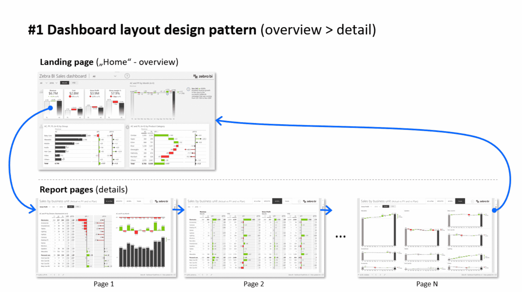
It's crucial to always design the user experience of your reports according to modern workplace needs. This means enabling viewers to click on a chart or a table to dive deeper into more details while making it easier for them to return to the main overview page. And this is how Actionable Reporting is facilitating a discussion around insights that actually matter.
If there’s no action, then all reports, all data warehouses, are just costs. Only when a decision is made and action is taken, data gets the real value.
Make sure that you design the whole structure accordingly. Start with the overview page and create landing pages with more details.
That’s how you’ll create understandable and actionable dashboards that your managers will love.
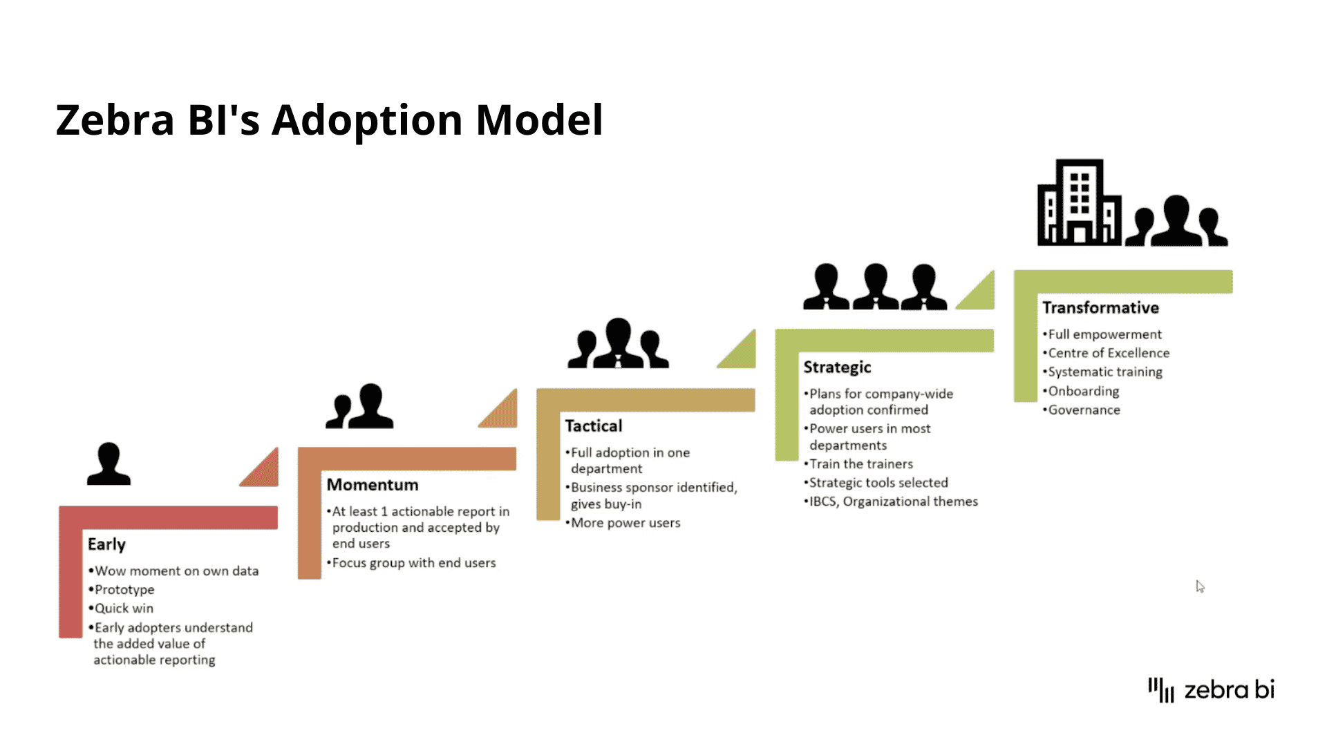
Based on experiences with thousands of customers, we broke down the whole Actionable Reporting adoption process into 5 steps. Following these steps makes it easier for every organization to upgrade its reporting systematically and successfully.
STEP 1: EARLY
If you're right at the beginning of transforming your reports, start with early adopters who really understand the value of Actionable Reporting. Build initial prototypes, and show some quick insights on your own data.
STEP 2: MOMENTUM
Gain momentum with one report that you redesign and wow your colleagues.
STEP 3: TACTICAL
Bring in the business sponsor to get the internal buy-in, get more power users onboard, and start talking about the benefits of Actionable Reporting with a wider audience.
STEP 4: STRATEGIC
Once a strategic level company-wide adoption plan is confirmed, the next step is to start talking about consistency, maybe even explore standards like IBCS (International Business Communication Standards). Go for it and explain to your colleagues that this is the way you do reporting & analytics in your company, and what are the strategic tools for that.
STEP 5: TRANSFORMATIVE
The final step is when you achieve the whole transformation, full empowerment of all users, and full self-service BI. By now you've created a center of excellence, developed systematic processes for onboarding new users, and ensured governance & security on the highest level.