September 8th
 February 22nd
It's time to say goodbye to static reports and presentations. It takes too much time to collect data from multiple data sources which leads to unreliable and often outdated numbers in reports. In addition, meetings in such cases are ineffective and boring.
That's why the team at Bayer decided to change that. Their corporate controllers have made a leap towards providing relevant insights to the board of management and other fellow analysts at the company. How have they done it? By introducing the Bayer Finance 360 App.
Hear it directly from Matthias Eisenack and Max Kunzke, Portfolio Managers at Corporate Controlling at Bayer, and be inspired.
Bayer is one of the world's largest life science companies with three divisions: crop science, pharmaceuticals, and consumer health. Their mission is to actively contribute to solutions to some of the biggest challenges of our time.
The company is represented by 374 consolidated companies in 83 countries and employs more than 99,000 people. In 2021 they made 5.4bn € investments in R&D and achieved 44.1bn € in sales in FY21.
Imagine being a CFO at such a large company. If there is not one unified place to gather all data and information it is almost impossible to answer all the questions and gain the necessary insights.
Due to rapid business evolution, Bayer's needs changed accordingly. The CFO was looking for a centralized location to access business-critical data. This would enable him to improve the overall efficiency and effectiveness of board meetings. As a consequence, this would lead to better-informed strategic and financial decisions.
With this goal in mind, the team of corporate controllers identified 4 design principles that were the foundation of the Bayer Finance 360 App:
All of this makes the Bayer Finance 360 App a one-stop shop for superior insights for the CFO.
In practice, this means that when our CFO has a discussion with the board members, he doesn’t bring paper, he shows the app.
At the beginning of this project, Bayer's team consisted of 4 controllers. They had already built dashboards to monitor data for customers, products, and suppliers. These dashboards were built around their central data warehouse called data.one. But this approach had a few drawbacks as the CFO missed more interactivity, more advanced analytical possibilities, and the ability to quickly incorporate new data.
The team decided to build the new application around Microsoft's Power BI. They established some blueprints and a timeline… and quickly realized that the initial plan wouldn't work.
We underestimated the importance of prototypes to support our learnings and to win stakeholders.
As they worked without an IT background, they found helpful material about building Power BI dashboards online.
The Zebra BI webinars, charts, and templates inspired our report design.
Shortly after they managed to create the first working prototype the world was hit by the global COVID-19 pandemic. Many uncertainties arose both in private and business life that resulted in fast-changing analytical requirements from the CFO. The team addressed his immediate need to monitor all pandemic-related data and insights by developing the Corona Radar app in just two weeks.
At the time, they already had working meetings scheduled with their CFO. In just 6 weeks they expanded the initial app with other missing content and the Bayer Finance 360 App was born.
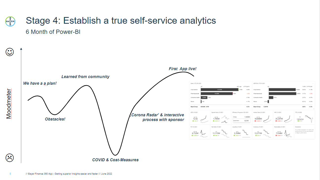
They finished half a year earlier than anticipated.
Matthias points out that the app is never complete. After the successful implementation, they needed to learn how to operate all processes within Power BI. At the same time, they needed to support Bayer's rapidly growing data community. They opened a special Microsoft Teams channel where within a year the number of members doubled from 500 to 1,000. Together they share ideas and best practices which is very helpful and inspiring for future updates.
At the beginning the Bayer team started with one goal in mind: to know & understand the content they wanted to include in the app. The first version only consisted of the Bayer Finance 360 and Deep Dive categories.
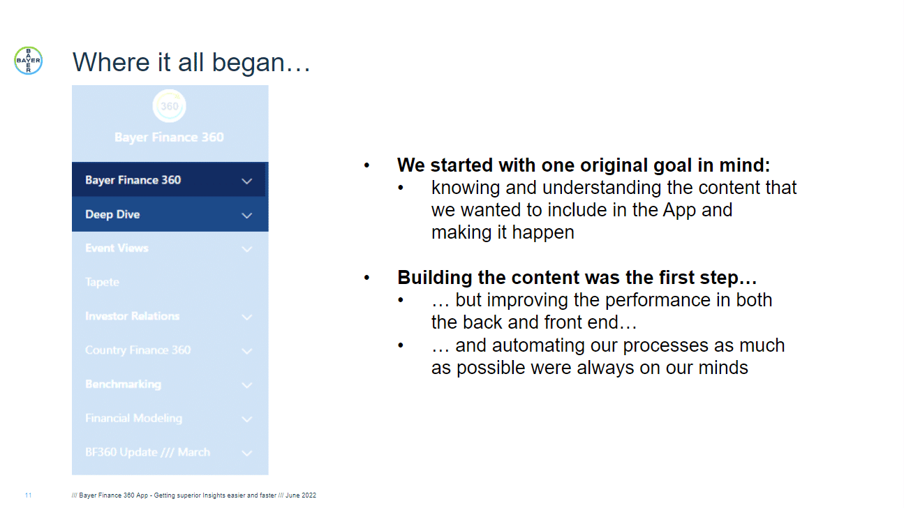
After the initial goal, they didn't stop. They wanted to improve performance in both the back and front end and automate processes as much as possible. Additionally, they enhanced the app with more content.
More content is not always good. It is more about the quality of the content than the quantity.
To get insights faster they further optimized the dashboard with better visualizations using Zebra BI for Power BI.
After all the updates and optimizations, the Bayer Finance 360 App really became a one-stop shop for their CFO as it contains all the relevant information.
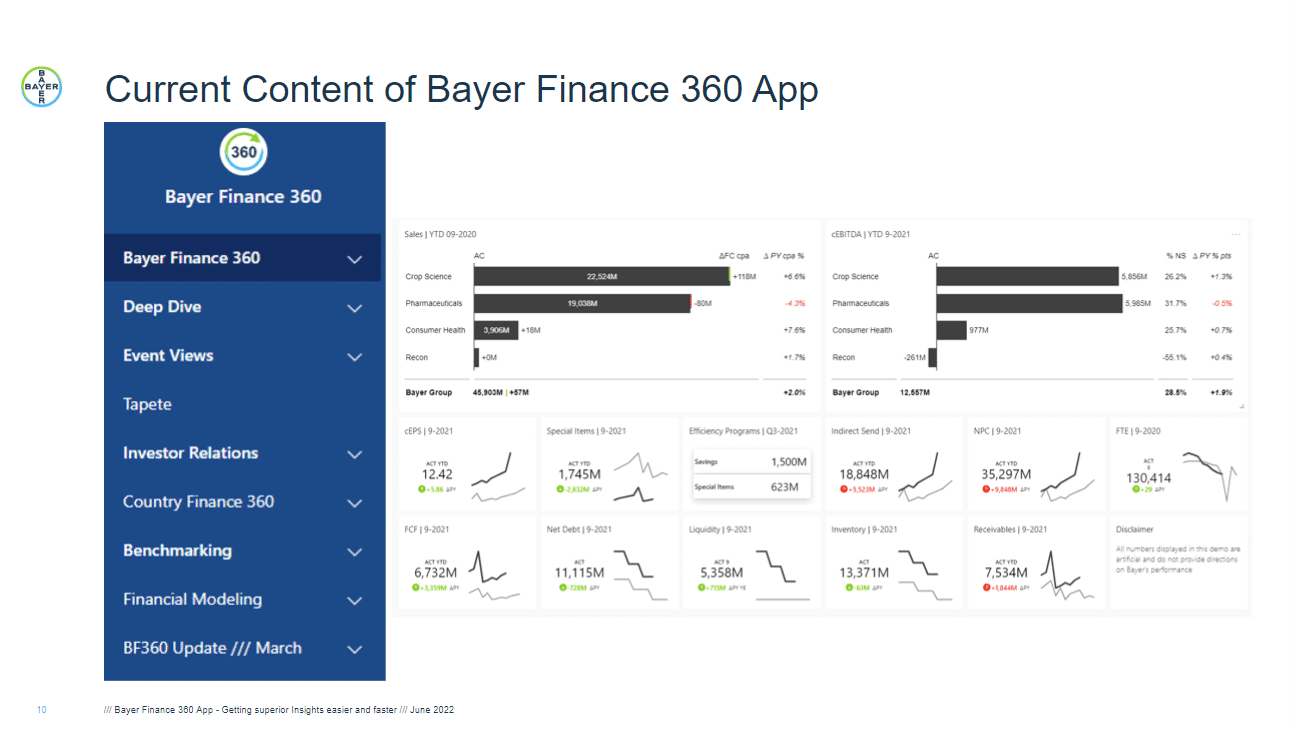
On the left side, there are several layers or chapters of information users can find in the app. It is a collection of various dashboards, reports from other groups, and links to other tools or systems. It includes four reporting packages:
The first page of the dashboard provides a holistic overview of the 13 most important KPIs from sales to P&L, core earnings per share, cash flow, net debt, inventories, receivables, headcount, etc.
At the top of the page, Zebra BI Tables visual was used to visualize sales performance and EBITDA per division. Both visualizations show actual values compared to the previous year or forecast and a total row.
Below, each KPI is presented on its own card. The Bayer team used Zebra BI Cards visual which enables faster rendering & loading times as no matter how many cards you represent, they are always just one visual. Additionally, by looking at a specific card you immediately get specific details and an idea about trends and comparisons to other periods. Once a KPI is selected, the user can drill into more details or open a focus mode to get more detailed information.
This layout allows steering by showing drivers and dependencies between KPIs and within the business. With all the relevant information in a single location, this is a rich one-stop shop for financial and non-financial data. For example, on one page you can see:
To demonstrate how much data is available on the dashboard with just a few clicks, Max also showed the detailed sales report. To access it he just clicked on the sales table at the top of the first page which opened up another page. This way, they don't overwhelm the first-page viewers with too much information, but if somebody wants to dive deeper it is just one click away. Double win.
The sales report features different visuals based on what the Bayer team believed is the most relevant information to show.
At the top, there is an enhanced table from the first page that shows sales performance per division. But on this page, there is a lot more information. The relative variances to comparisons are visualized in a lollipop chart. Bayer's team also appreciates the integrated dynamic comments. Report viewers can just hover over the comment marker and read the content to really understand the why behind the numbers. The progress of each division is shown by adding year-to-date (YTD), to-go, and full-year (FY) data.
The team also appreciates that there is no need to recreate the reports and visuals for each division. The interactivity and cross-filtering of the visuals allow one report to be used by everyone leading to more condensed and comprehensive reports.
Additionally, they added more information at the top: the plan, the forecast, and the last estimate. The same applies to the daily, monthly, quarterly, and year-to-date filters. The data in the visuals changes with the click of a button leading to increased interactivity of the reports.
What are some of the main insights the CFO can get from such a report?
When looking at the variance versus the prior year in the top table, he will immediately see that the pharmaceuticals division is underperforming by 4.3%. Why? The comment informs him that there are some issues in the Asia Pacific region. To dive deeper into this division's performance, he can click on it in the table. The rest of the page will filter out data for just this division.
In the hierarchical table below, he can expand the Asia Pacific region. The data shows that the biggest issue is Japan with a 7.8% decline compared to the prior year. To narrow the analysis further, he can filter out Japan by clicking on the country name in the table. Another table by brand shows that in Japan Eylea has a 10.5% decline. By hovering over the actual value of the brand a tooltip appears with an enhanced deviation analysis that illustrates the effects on price, volume, and currency. By looking at the waterfall chart in the tooltip it's immediately obvious that the decline is driven by price reductions despite selling more volume and having a positive effect on the currency.
All of this was known to the viewer in less than 2 minutes.
This is the beauty of interactive reports which allow us to dive into details and gain a better understanding of what is happening.
Looking at this, the dashboard has proven to be a big stepping stone for Bayer's decision process. Its main users, the CFO, senior decision-makers, and other financial analysts use it for overseeing the business, steering, and presenting to the board or other stakeholders. Content and layout are not only about having information but also about making certain patterns or variances visible. This ultimately gives a better understanding of the business.
The app introduction has brought enormous benefits to the whole Bayer group.
Increased efficiency & time savings
One of the biggest business impacts is that the team managed to automate many processes connected with data loading. This saves them a lot of time. Data is now automatically loaded monthly, daily, or even several times a day.
All financial and some non-financial data is now always shown in the app with the latest data.
Additionally, gathering all data from multiple sources has eliminated data accuracy questions and ensured everyone always looks at the correct numbers.
Immediate action & increased flexibility
Since finance professionals no longer need to spend so much time on data collection & preparation, they can focus more on insights generation and help with suggestions to CFO.
The questions that pop up during the meetings are answered immediately as there is no need to go back, search for other data and prepare other analyses.
Away from static presentations
The team no longer needs to prepare additional slides including the same information as in the Power BI report. Participants of the meetings now read the insights live from the app and the CFO has all the information he needs for a successful presentation. Due to this, the team can spend more time discussing performance & making recommendations that will positively affect Bayer's business in the future.
Finance anywhere & anytime
App users can access the latest data from anywhere (mobile, tablet, or desktop device) and anytime.
The key takeaway Bayer's team learned through this journey and is applicable for the future is:
Get on board or stay behind.
Ready to make performance visible and act faster like Bayer?