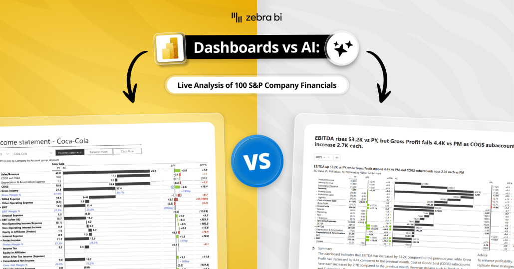
Dashboards or AI for financial reporting and FP&A? We tested both on 100 real P&Ls. A practical guide to when to use each, how to decide, and why it's both.
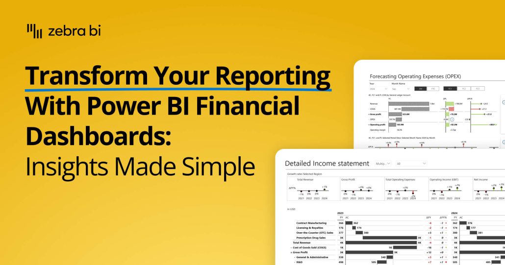
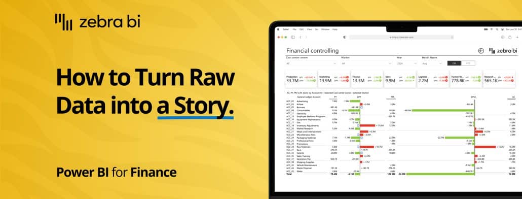
Transform your financial dashboards in Power BI. This guide shows you how to build lean, insightful reports for P&L, trend analysis, and cost management.
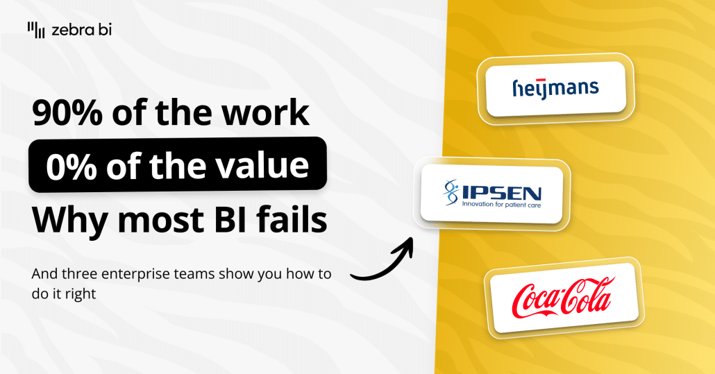
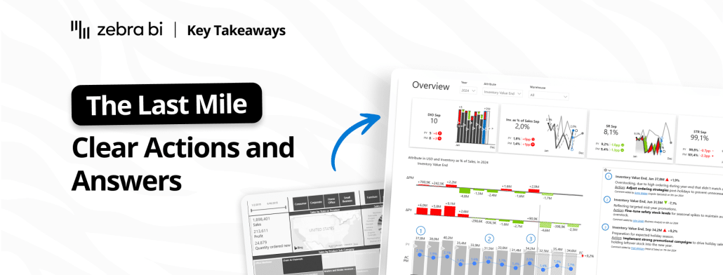
Eighty percent of BI investments fail to change a single decision. The gap between dashboard and decision has a name: the last mile of analytics. Inside: the four-question test from our Part 2 webinar, and two finance teams (Heijmans and Ipsen Pharma) who actually crossed it.
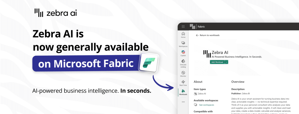
Zebra AI is designed for teams that need clarity at decision time. Now it is generally available (GA) in Microsoft Fabric where you can try it on your data.
Want to learn how to turn your sales dashboard into a true power house of insights, using Power BI? There's an easy way and our Lead BI consultants explained it in this webinar.
Your data should tell a story, and Power BI with Zebra BI can help you tell that story loud and clear. Here's what you need to know about Power BI storytelling.
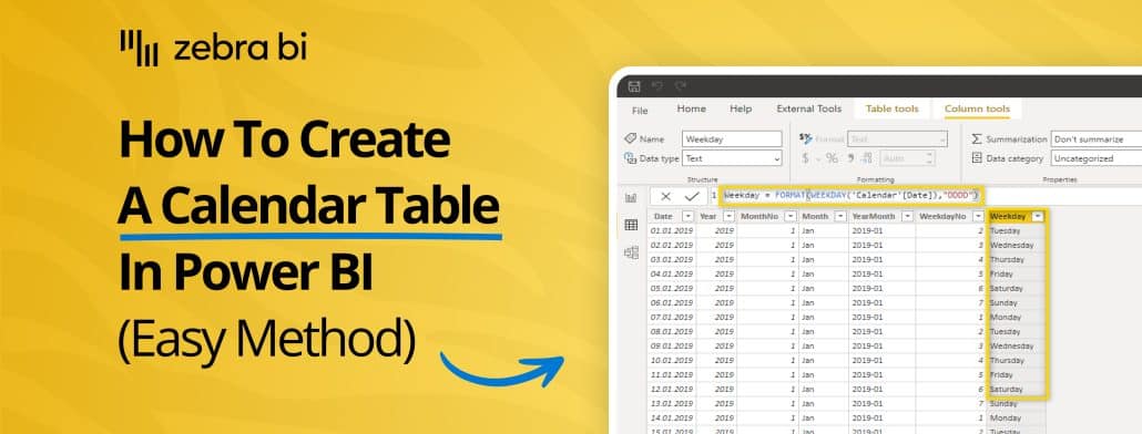
Time-based analysis is crucial for financial & business reporting, but native Power BI tools may not be enough. Here's how to create a Calendar table in Power BI (TWO easy methods)
 September 8th
 February 22nd