Get a better grip of your annual statements across multiple years and regions -- all in a clean, actionable way even business stakeholders outside of the Financial Department can decipher.
Running a project? Acquiring a tool? Whatever it is, you want to make sure your costs and benefits align. And that is exactly where this Cost Benefit Analysis Power BI Template comes into play. Download for free right now.
Running a project? Acquiring a tool? Whatever it is, you want to make sure your costs and benefits align. And that is exactly where this Cost Benefit Analysis Power BI Template comes into play. Download for free right now.
Our Cost Benefit Analysis Template helps you get all the important bits of information in one place, in an easy-to-understand way, to help you decide whether to proceed with a project or not.
Our Accounts Payable Excel Template simplifies financial management by organizing outstanding invoices and improving cash flow visibility. With advanced visualization, sorting, and automated calculations, it ensures timely payments, stronger vendor relationships, and smarter financial planning.
Download
Pagination
Join the community of 100,000 dataviz enthusiasts
It's not too late to turn your data into insights! Subscribe to be the first to get product updates, webinar invites, and news directly into your inbox.
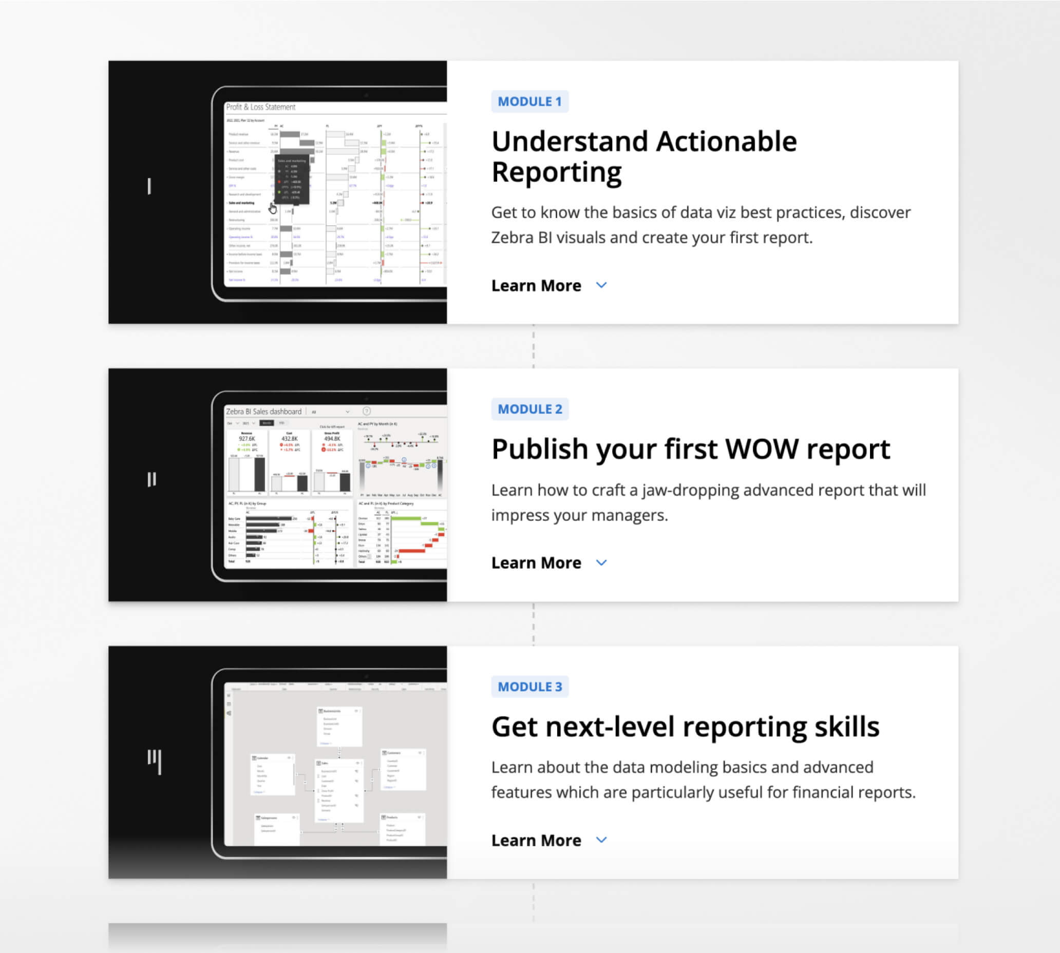
zebra bi academy
The all-in-one free learning hub to master your Power BI reports 🎯
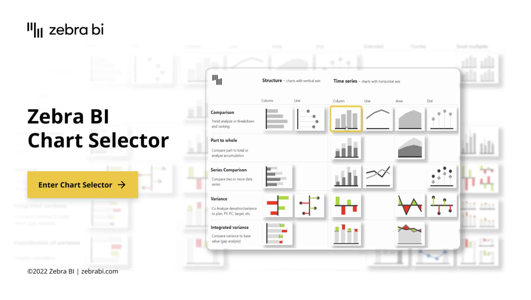
Choosing the right chart can make or break your data. We made this step super-easy for you with the interactive tool in Power BI. Use this as a cheat sheet for better reports and dashboards.
What a great audience, so much knowledge in one place.
Patrick Soehlke
Managing Director at Next Vision GmbH
Watching Zebra BI videos was a game changer for me in dashboard and report design! Thank you for always having great content! ⭐️
Meena Laird
Data Analyst
Woohoo! You guys rock the data viz world - keep up the great work!
Rachel Guthrie
Customer Success at Microsoft
Our financial landing page at KPN is completely based on the sales dashboard template. We also use a copy of the consolidated financials.
The templates of Zebra BI are providing us with a lot of inspiration, and we don't "need to invent the wheel" again 😉
WN
Wilco Nagtzaam
Senior FP&A Controller
You guys are amazing! Thanks so much for the great content! Keep up the fantastic work 👍
Kimberley Canoute
Business Intelligence Analyst
An amazing visual for finance. It has a lot of possibilities such as analytic periods, variances, or custom hierarchies for your income statement. 100% advisable.
Raúl Vinuesa Arjona
Senior Data Consultant
Awesome reports. Lots of tricks inside, thanks to the Power BI and the Zebra BI visuals.
Esteban Fabiani
MS PowerBI Consultant
Zebra BI is the best feature that has been created for Power BI. It makes designing reports easy. Thank you.
Brahim Chabane
Zebra BI User
I spent a couple of hours searching for a solution, your brief tutorial was the only one that worked for me. Thanks so much!
RC
Ryan Cheung
Zebra BI User
It looks so good to a point that makes me be like, what's the point of me learning given I'll never be that good.....😄
CW
Cheng Wang
Zebra BI User
Amazing, Mindblowing, Supereasy
WN
Wilco Nagtzaam
Senior FP&A Controller
I've recently been experimenting with Zebra BI's custom Table visual, which is like the native Power BI matrix on steroids. If your work allows for the use of custom visuals, I think it's definitely worth checking out. Planning on doing a video on it soon...
Brian Julius
Chief Content Officer at Enterprise DNA Ltd.
Hot damn @ZebraBI...speechless. Can’t share it but it looks good!
Jonathan Kapoor
Commercial Reporting and Insights Manager
Hey @ZebraBI: Your CEO is a cool dude and your visuals for #powerbi and #Excel are insane. Thanks @lapajne for presenting today. It was a ton of fun 👊
Lars Schreiber
Power BI Consultant & Trainer
I can't believe you always manage to pack so many new and great features into every update :-)
Pascal Kiefer
CEO & BI Consultant
I dare to say that Zebra BI is the most realy hight level custom visual that exist right now. Amazin job, great updates. I definitely will keep recomending this custom visual to our clients.
Harry Ferrera
Senior Business Intelligence (BI) Analyst
I had a phone interview for a #PowerBI contract, where the interviewer said of the sample dashboards in my CV:
"Great...I see you use @ZebraBI!"
How cool is that?
And they mentioned my top-secret passphrase on the call:
"Actionable Insight".
I'm in.
Jeff "Power BI Lobbyist" Weir
Modelling/Visualisation consultant and analytical storyteller
The reusable trick of switch I think is brilliant! And obviously, Zebra BI table replaces any other table now in Power bi. RIP to normal tables!
MG
Manuel Barahona Gandía
Business Intelligence Reporting Manager
This visual from Zebra BI enables you to build stunning P&L, CF, and BS statements with complex structures with ease. Very intuitive for developers and users. In my opinion the best solution for Financial Reporting structures. 11 Stars!
Daniel DeHaven
Director of Financial Systems
Already tried stacked bar. It's fantastic! Thank you for such a great feature!
Tania Tombak
Principal Consultant, Executive Dashboards and Data Analysis
As you say, Andrej Lapajne, we spent A LOT, searching and explaining how to do Comments, with Power Apps, and also with the help of Excel.
They were workarounds!!! No doubt...this is awesome and the simple way to go forward.
 September 8th
 February 22nd
 10 Jul 2025