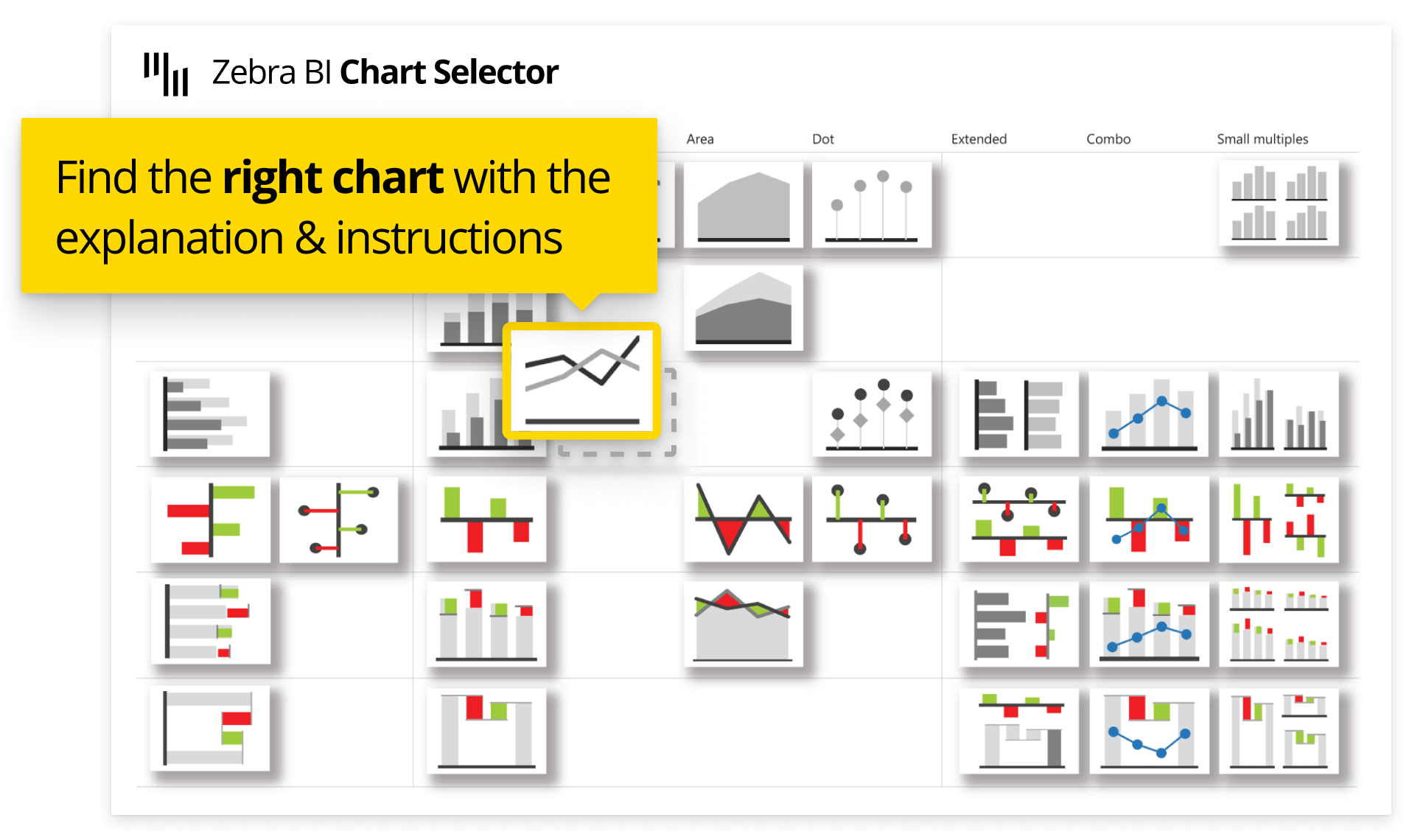
There is a ton of different charts and visualizations available. But which one should you choose for your data? Don't waste your time randomly inserting charts and hoping data will somehow magically present itself properly. Choose the right chart to
convey the right message to the audience.
The taxonomy of business charts is organized based on
three fundamental rules:
1.
Orientation: Will I display time-related data?
2.
Task: What message do I want to deliver?
3.
Shape: What type of data am I trying to visualize?
We didn’t make those rules up. In 2004
Dr. Rolf Hichert took on a challenge to standardize the way analysts and controllers present data in their reports, dashboards, and presentations.
International Business Communication Standards (
IBCS) were born and Zebra BI visuals were the first to get their certification.
Read the full guide on
how to choose the correct chart type for your Power BI report. September 8th
 February 22nd