September 8th
 February 22nd
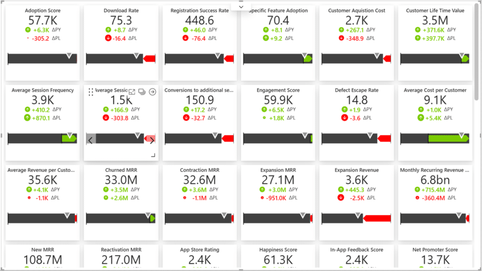
Instead of overloading your reports with separate visuals for each KPI, Zebra BI Cards enables you to add as many KPIs as you wish into one visual.
Save not just tons of time on development but also speed up the rendering and loading time of your reports tremendously. Waiting for the data to load is finally over.
Use comparisons with trendlines to really understand how well your company is performing against plans or previous periods.
For each card, you can add up to three measures for comparisons and use scaled variance icons that provide immediate insights. You can also add a trend category and integrated charts to display the behavior of a KPI during a selected time frame.
Get to the very last detail of a specific KPI in one click with the Drill-through option on every card. Dive deeper into more detailed reports on the fly and make your reviews more efficient.
What happens when you want to compare trends for multiple KPIs? Their values and variances might look quite similar, but are they really?
To get the right perspective of the data, use Scaled groups. Simply select KPIs that you want to compare and put them in the same group to properly scale charts on all selected cards.
There is nothing more annoying than seeing values without any additional contextual information. Why is a KPI performing like this? What influenced such behavior?
With Zebra BI Cards you can easily bring in dynamic comments and put your data into context. Explain the why behind the performance and shorten the time between seeing and understanding the data.


Not all KPIs are equally important. You can easily make any card with a KPI larger or smaller. Since Cards visual is completely responsive, changing the size of the card also changes the amount of information displayed on it. However, even the smallest cards remain actionable!
You can also change the order of cards with a simple drag & drop. Magic.
Some KPIs need more attention and require digging deeper into details. With one click you can put any card into Focus mode and display a specific KPI on the full screen, together with additional visualizations, comments, and options to customize card formatting.
When you have different KPIs on one report page and for some of them the rising trend is good (e.g., the revenue) while for others it is not (e.g., costs), you can invert the meaning for latter KPIs and display the proper value.
With Zebra BI Cards you can individually set the number format for each card. Change the currency, the unit, or mark something as a percentage. All with just one click inside the Focus mode.
To help report viewers better understand what's happening with each KPI, use report page tooltips. By showing additional dimensions that aren't even part of the visual you will provide even more in-depth information.
Based on your report structure, you can switch with one click between the card and row layout.
The row layout will still show all the variances with icons and IBCS rules, dynamic comment markers, and sparkline charts (you can even change the chart type).
If you prefer to keep things simple, you can remove charts from your cards and display only KPI values with scaled icons indicating the size of the variances.
One of the ways of displaying KPIs is also through the bullet charts! You can add various comparisons on a single KPI and the chart will take less space while still displaying all the relevant information.
Have a full dashboard of KPIs but not all are relevant for different use cases? No worries! Put KPIs in different groups and use filters to display only the ones relevant for a specific case.
Use bookmarks to easily switch between different views.
You can decide to show the summarized value of the displayed categories (by default) or just the last value available for the specific KPI. Zebra BI Cards will automatically detect which is the last value on each card separately. Simply click on the value and the display will change.
Axis break can help present the contribution of data elements to the total result more clearly. You can add the axis break to all cards with KPIs or add it to just the selected KPIs within the Focus mode.
By clicking on the variance elements, you can easily switch between absolute or relative variances. Or you can even have both at the same time. This action can be performed either in the design or view mode.
Use various possibilities to customize the design of your KPI reports. For icon shapes, choose between Circle, Triangle, or Circle with an arrow option. No matter the shape, icons are always scaled!
Additionally, you can change the style of cards: make them flat, elevated, or use the default style. As with all Zebra BI visuals, you can also apply your own colors, fonts, and much more.