 September 8th
 February 22nd
Changelog
Zebra BI Charts for Power BI
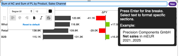
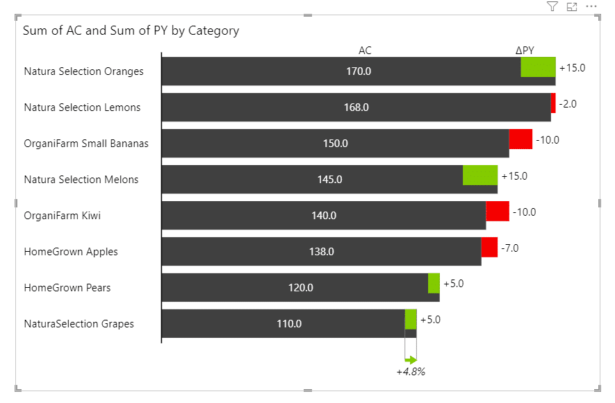
Rich title formatting
- Introducing line-breaks and multi-line support for titles for better visual hierarchy, IBCS compliance and information architecture. Now segregate distinct data categories, such as time periods and comparison scenarios, into vertical stacks avoiding cluttered, hard-to-read title strings.
The three-line structure instantly tells you who, what, and when without additional interpretation needed. You can simply click on the title and start typing. You can format the text with bolding, inserting line breaks, adjusting font sizes or colors, aligning lines, and enabling wrapping. Everything formats where you type. And it works seamlessly when you export the report into PDF or PowerPoint.

- Fixed DIN fonts not rendering and falling back to a substitute font
- Fixed blurred license lock screens affecting a small number of users
- Fixed totals not displaying in certain ragged hierarchies
Rich title formatting
- Introducing line-breaks and multi-line support for titles for better visual hierarchy, IBCS compliance and information architecture. Now segregate distinct data categories, such as time periods and comparison scenarios, into vertical stacks avoiding cluttered, hard-to-read title strings.
The three line structure instantly tells you who, what, and when without additional interpretation needed. You can simply click on the title and start typing. You can format the text with bolding, inserting line breaks, adjusting font sizes or colors, aligning lines, and enabling wrapping. Everything formats where you type. And it works seamlessly when you export the report into PDF or PowerPoint.
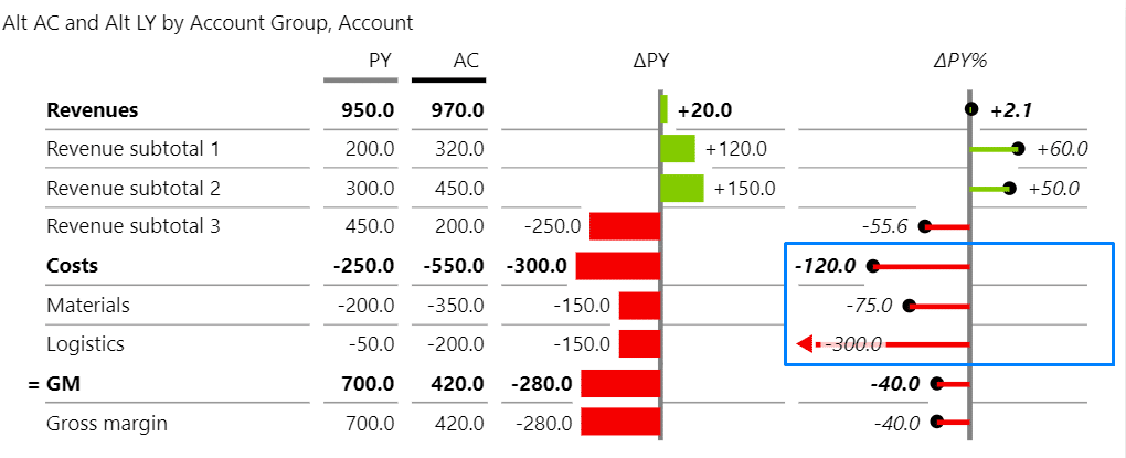
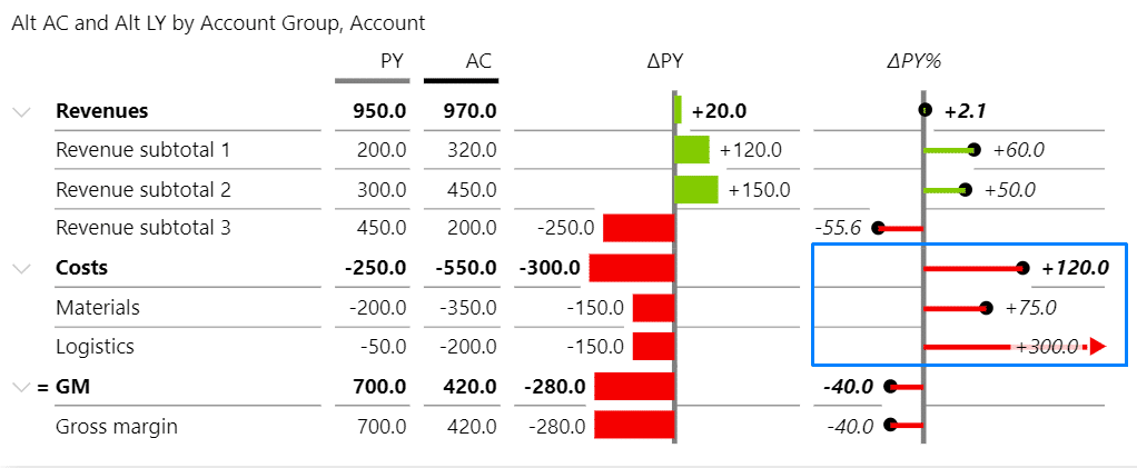
- Invert and highlight interactions now respect the Master Interaction toggle, giving report builders more control over viewer interactions
- Integrated an improved landing page for easier activation, direct access to support, and links to Zebra BI Academy and Knowledge Base.
- Fixed DIN fonts not rendering and falling back to a substitute font.
- Fixed blurred license lock screens affecting a small number of users.
- Fixed annotation icon not showing in Vertical charts.
- Fixed the Actual chart disappearing when Grand Total was enabled and AC had no value with all placeholders filled.
-
New Visual Landing Page: Integrated an improved landing page component providing an enhanced user experience on initial load, direct access to support.
- PL and FC missing from topN filter: Fixed missing PL and FC settings in the dropdown options for topN filters.
- Groups in columns with calculation groups: Resolved rendering issues when using groups in columns with calculation groups and drill-down combinations.
- Embedded Tables 7.7 blank on first render: Fixed issue where embedded Zebra BI Tables 7.7 visuals appeared blank on initial render.
- License key persistence in Power BI Desktop: Resolved issue where license keys were not persisting correctly in Tables 7.7 within Power BI Desktop in certain scenarios.
- License expiration disrupting view mode: Fixed issue where expired PBI Pro licenses were disrupting view mode in Tables 7.7.
- Link redirections stopped working: Restored link redirection functionality.
- Tables Selection Service regression: Resolved minor regression in Tables Selection Service functionality.
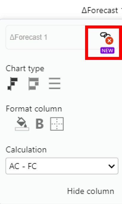
Dynamic chart legends
- Set dynamic legends on charts by directly referencing an external measure from the dropdown, slicer, or filters. They automatically reflect the chosen plan, forecast, or year, giving you accurate context at a glance and eliminating reporting ambiguity.
- Fixed an issue where category menus did not display the invert and highlight options in some cases.
- Hierarchical calculations: Added support for DAX-created hierarchies, enabling more flexible and accurate hierarchical calculations.
- Suppress nulls in hierarchies: Fixed an issue where the Suppress nulls setting did not correctly propagate to the top level of a hierarchy.
- Dynamic headers and titles: Resolved an issue where using filter buckets for dynamic column headers and titles could result in additional blank rows appearing in certain scenarios.
- Fixed an issue where clicking on ‘Expand all down one level in the hierarchy’ resulted in a blank visual.
- CAGR: Support for stacked chart calculations and ‘invert’ groups on small multiples charts.
- Fixed an issue where annotation layer comments disappear if the viewer’s language differs from the report editor’s language.
- Fixed an indentation issue to better align the data label with the value beyond the first column of a small multiples chart.
- Set dynamic column headers by referencing other measures in the column headers.
- Hierarchical calculations are now generally available, following feedback received during the preview phase. Users can now display ragged hierarchies or optimize data loading methods.
- Row-level calculations have been extended to support combinations of calculations (e.g., invert and result, skip and result).
- Integrated variance charts are now supported for hierarchical tables.
- Drill-through functionality is now enabled for tables with categories and groups by directly clicking on a category label.
- Fixed an issue where annotation layer comments disappeared if the viewer’s language differed from the report editor’s language.
- Fixed an issue that limited the selection of the top N Others category.
- Fixed an issue where positive and negative action dots were scaled separately when used with CAGR arrows.
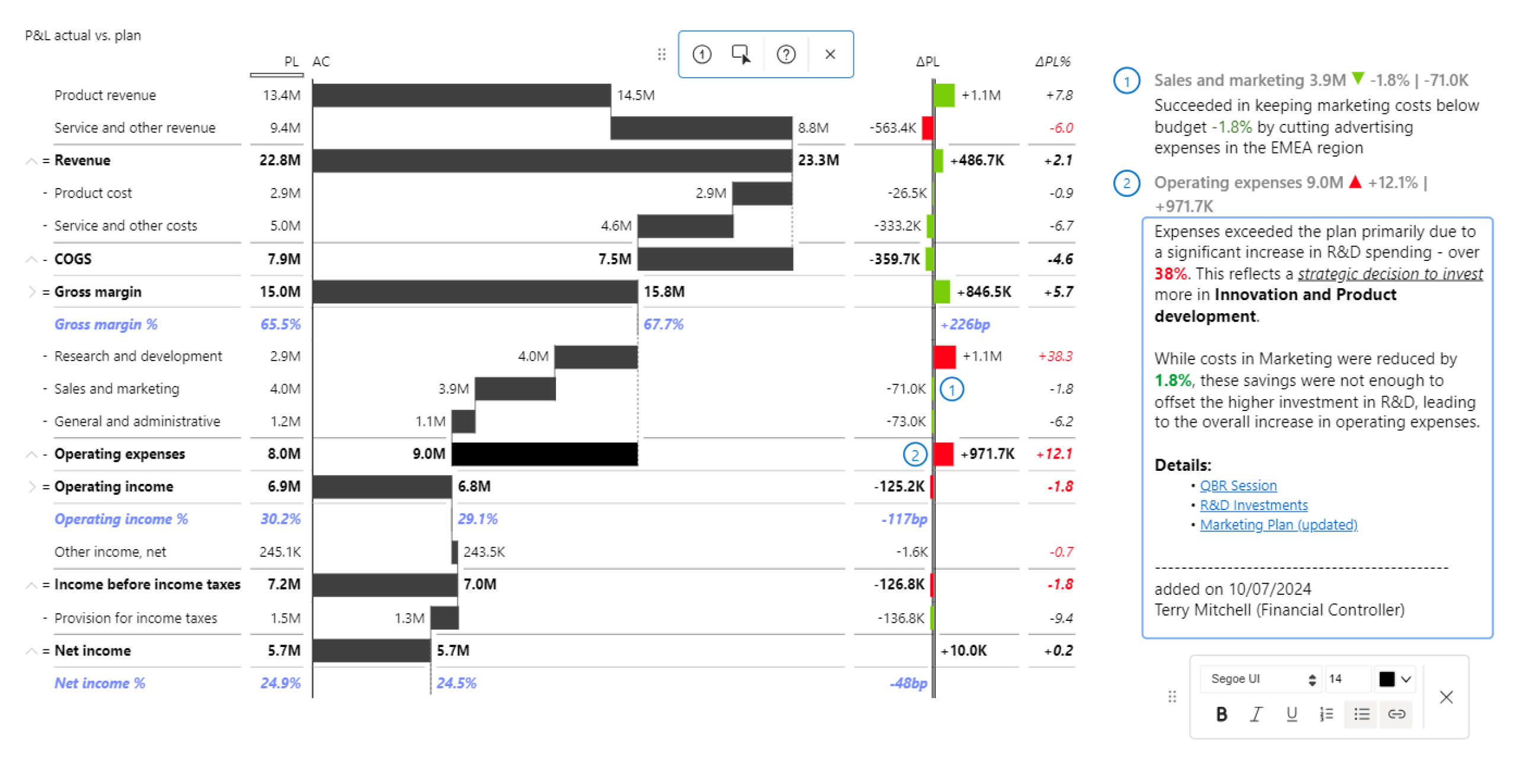
Launching Compound Annual Growth Rate (CAGR) Arrows
We are launching the CAGR arrow within the Annotation Layer for Zebra BI Charts, enabling automatic calculation and display of multi-period growth trends with a single click. Commonly used across finance and consulting, compound growth rates (annual, quarterly or monthly) enable a more accurate representation of performance over time than a simple percentage change over consecutive periods.
- Fixed an issue where the measure drill-through functionality was no longer available.
- Fixed an issue where incoherent tooltips were displayed for Waterfall charts on hover in certain cases.
- Fixed an issue where Format from model (FFM) doesn’t recognize the format and displays ‘Others’ of TopN with no format applied in a Waterfall chart.
- Fixed an issue causing data overlaps in specific cases on the integrated variance charts.
- Fixed an issue where combo charts category labels were cut off in special cases such as negative actual values and descending order.
- Fixed an issue with vertical axis chart where the difference highlight is calculated only up to the axis point for single measures with a negative total or subtotal.
- Fixed an issue where cross filtering did not work upon multi-selecting elements across more than one table.
- Fixed an issue where the tooltip of a selected category could not be dismissed and obstructed further interaction.
- Fixed an issue where Grand Total columns were not exported to Excel.
Cmd+click support for multiselection on Mac
Zebra BI Cards supports cmd+click combination on Mac in all cases where it is used.
- Fixed an issue where using auto hierarchies in a category would cause the visual to go blank.
Cmd+click support for multiselection on Mac
Zebra BI Charts supports cmd+click combination on Mac in all cases where it is used, e.g. for multiselection in visuals.
Improved recognition of 0 (zero) when using the format from model
This improvement relates to the Format from model functionality and, in addition to the null/blank and empty values, now it properly recognizes 0 (zero) when using the format from model.
- Fixed an issue where groups with empty values in AC were replaced by the comparison value in a stacked chart.
- Fixed an issue where negative data labels would overlap with the category in a waterfall chart of small multiples.
- Fixed an issue where the "&" symbol was not displayed correctly in the comment marker tooltip.
- Fixed a bug where cross-filtering no longer worked on charts.
Data export from Zebra BI Tables to Excel
In this release, you can export data from the Zebra BI Tables to Excel while preserving the data layout and calculated columns/rows without charts, icons, colors, or other formatting.
- The export icon appears in a view mode when you hover over the visual and is located in the top right corner
- The current implementation of the export uses PowerBI visuals File Download API (meaning also that downloading a file requires user consent and admin permission provided in the admin global switch), which displays this popup when the file download occurs:
The output file is not formatted, allowing you to focus on deep analysis, including Zebra BI on-visual calculations and comments.
Sample of Export from Zebra BI Tables to native Excel:
Branded image support
You can use images in the 'Category' and 'Group' fields in the Zebra BI Tables to enhance visual recognition of different brands and make reports more intuitive and engaging.
This is a preview feature, and it can be changed (updated or modified) or removed in future releases.
With this feature, you can add base64 images to categories and groups. The width and height of images will be defined automatically, but you can also adjust them in Visual settings → Categories → Text width: fixed / Row height: fixed.
It is recommended to use images of the same size for better representation in your reports.
Row-level calculations from the Power BI model
Now you can control the calculations (Invert/Skip/Result) from the Power BI Model using a Category class field in Zebra BI Tables. This would mean a much better efficiency (time saving) and simplification in developing reports as you could easily dynamically set inverts and results on the entire report in one step, instead of having to do it manually for each visual, for each report.
Row-level calculations from the Power BI Model are only applied if the new hierarchical calculations are enabled - the Hierarchical Calculations preview feature is turned on.
Add a measure with values that represent calculations from the Power BI Model in the Category class. Row-level calculation values in the Category class should have a 1:1 association with Category values.
The following notation is used for row-level calculations from the Power BI Model to be applied for calculations:
-
- Invert: “-“
- Result: “=“
- Skip: “/“
Cmd+click support for multiselection on Mac
Zebra BI Tables supports cmd+click combination on Mac in all cases where it is used, e.g. for multiselection in visuals.
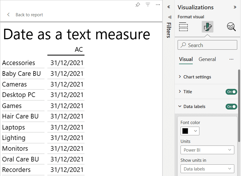
Improved date formatting in the value bucket
The date field in the Values bucket is now formatted and displayed in the visual as Date.
To make sure that it is properly formatted, go to:
- Format visual → Data labels:
- Units: Power BI
- Show units in: Data labels
Improved recognition of 0 (zero) when using the format from model
This improvement relates to the Format from model functionality and, in addition to the null/blank and empty values, now it properly recognizes 0 (zero) when using the format from model.
- Fixed an issue where it was not possible to select a formula row.
- Fixed an issue with incorrect variance color in BAN when negative values are compared to 0.
- Fixed an issue when the date format is not recognized if put dates in Groups.
- Fixed an issue with wrong sorting when a filter is removed.
- Fixed an issue when the hover-over value text is still shown if the interaction setting is disabled.
Preview Features
Preview features are now available for you to explore in this release. These early-access functionalities allow you to test new capabilities and provide us with your feedback before a full rollout. Please note that preview features may change or be removed in future releases. Preview features can be found in the Visual tab of the Visualizations pane.
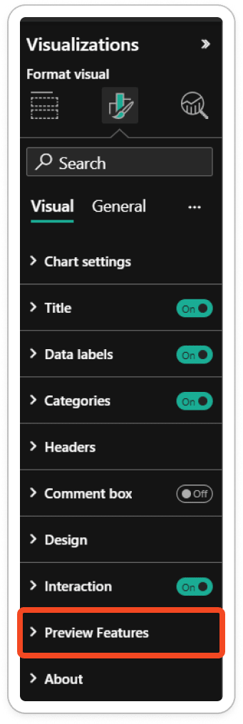
Hierarchical Calculations
The row-level hierarchical calculations are optimized and are now available as a preview feature in this release.
You can find this feature in the Visualizations sidebar → Format your visual → Preview Features.
The hierarchical calculations feature is disabled by default. Click an off/on the toggle to enable this feature. Your reports need to be migrated to the optimized row-level hierarchical calculations. Once you have enabled the hierarchical calculations and completed the migration, you can revert to the old version of calculations by disabling this feature. Please beware, if you turn off this feature in the future, all changes made to inverts up to that point will be reverted.
Row-Level Hierarchical Calculations Improvements
The row-level hierarchical calculations are optimized and now available as a preview feature: Hierarchical Calculations.
Row-level hierarchical calculations improvements in this release:
Ragged hierarchies are back - better and faster than ever
Ragged hierarchies were a key feature of Zebra BI Tables, but they were temporarily unavailable after the Tables 6.0 release. Now, they are back and fully optimized.
Improved hierarchical calculations
Applied calculations, grand totals, subtotals, and running totals are correctly propagated and display values with applied calculations in the hierarchy.
Improved and optimized hierarchical calculation operations:
- The invert/invert all children is now one single invert operation. This operation combines both inverts into a unified behavior.
- Skip is now included in the grand total calculation.
- Lower-level hierarchy can now correctly apply the Results.
NOTE: A value column formatted as a percentage is always excluded from row-level calculations.
Data Loading optimization
The data loading option has been optimized for DirectQuery, providing better loading performance than ever. Thus, you can easily manage multi-level reports and eliminate duplication issues.
Waterfall chart improvements
Improved display of waterfall chart columns, labels direction, and positioning.
Sized dots for relative variances
In addition to pin charts for visualizing relative values, you can now use sized dots, which dynamically change size based on the value. This visualization type is designed to maximize space efficiency while enabling faster, more effective insights.
Sized dots transform raw numbers into clear, visual insights, making it easy to identify outliers and key variances at a glance. They are ideal for dashboards with limited space, as they provide a quick, clear, and effective way to monitor performance.
You can access the Sized dots visual type by navigating to any relative variance column and clicking the dropdown menu in the header.
If the visual has any outlier limits, they will be shown as a white arrow up/down inside the dot.
Learn more: Sized dots for relative variances | Zebra BI Knowledge Base
With this new release, you can use dynamic legend names from Field Parameters. You can prepare different measure names via the Fields parameter and then select which variance name you want it to display.
The example below shows that the Margin card displays a variance different from the Revenue card.
Difference highlight on-visual settings
With this new version, you can directly modify the difference highlight settings on a visual. This simplifies and improves the process of the difference highlight customization, ensuring a better user experience when analyzing changes.
- Fixed an issue where the format from the model was not recognized correctly if the Actual values stopped.
- Fixed an issue where the difference highlight was getting cut off.
- Fixed an issue when a chart in Cards was not displayed when the total was blank, empty, or null.
- Fixed an issue when Cards did not update values if the filter was applied for the first time.
- Fixed an issue when the individual Card did not deselect if interacting with another visual.
- Fixed an issue when changing the variance color only changed the variance name, not the number.
- Fixed an issue when a visual was not rendered if a calculation group was used in Group.
- Fixed an issue when the format from the model was not recognized if the actual values were missing.
- Fixed an issue when suppressing large relative variance value was not working on additional measures formatted as a relative variance.
- Fixed an issue when hidden row subtotal was NaN on additional measures formatted as a percentage.
Rich text editor for comments
With this new version, you can use a rich text editor to create and update visual comments with remarkable efficiency. This feature empowers you to style and format your text, add bullet points, and insert hyperlinks, making your report a one-stop shop for the entire team by just leaving links to reports and documentation different stakeholders might have an interest in.

- Fixed an issue when filtering by dimension without a value does not clear the chart.
- Fixed an issue when stacked chart tooltip titles show wrong group value.
- Fixed an issue when change variance calculation does not work in View mode in Power BI Service.
Rich text editor for comments
With this new version, you can harness the power of a rich text editor to create and update visual comments with remarkable efficiency. This feature empowers you to style and format your text, add bullet points, and insert hyperlinks, making your report a one-stop shop for the entire team by just leaving links to reports and documentation different stakeholders might have an interest in.
Support the Unified Charts package in Cards
The unified across all Zebra BI visuals charts package is now supported in Zebra BI Cards. This provides even more stability, flexibility and scalability for data visualization in Cards.
Support the Local Storage API v2 in Cards
Local Storage API v2 is now supported in Zebra BI Cards visual since Local Storage API v1 is scheduled for deprecation by Microsoft. You can get more information on the official site of Microsoft Local Storage API in Power BI Visuals - Power BI.
- Fixed the issue when the custom tooltip did not work on the column chart in the row layout.
Scaling visual improvements when “Suppress others” (Top N “Others”) is enabled
There are cases when visual elements of Others are much longer than Top N visual elements. With this improvement, a visual is fully scalable when "Suppress Others" is selected and “Others” visual element is excluded from the visual.
Support the Local Storage API v2
Local Storage API v2 is now supported in Zebra BI Tables visual since Local Storage API v1 is scheduled for deprecation by Microsoft. You can get more information on the official site of Microsoft Local Storage API in Power BI Visuals - Power BI
- Fixed issue when a blank row was missing in combination with Top N results
- Fixed issue with incorrect display of Top N items
- Fixed issue where “Suppress absolute variances” did not work
Enable floating result columns in Waterfall charts
In this new version you can mark columns in the waterfall chart as floating result columns so that they remain “floating” and build upon the previous result.
Annotation layer: Commentary on Small Multiples and Stacked charts
Now you can add comments to the Small Multiples and the Stacked Chart directly from the visual to make your reports more actionable and insightful.
Annotation layer: Commentary on Vertical axis charts
On-visual commentary is now also supported in charts with vertical primary axis.
Support the Local Storage API v2
Local Storage API v2 is now supported in Zebra BI Charts. Local Storage API v1 is scheduled for deprecation by Microsoft. You can get more information on the official site of Microsoft Local Storage API in Power BI Visuals - Power BI.
HTML tag “ “ is now recognized in a comment tooltip for comments from a model.
HTML tags in Comments
With this new version, you can use HTML tags in comments to achieve a new level of comment formatting.
For example, you can bold the text in a comment box using the HTML tag < b > Bold Tag < /b >. Using this tag will format any text between the opening < b > tag and the closing < /b > tag as bold.
The same approach will work for other HTML tags like < i > Italic Tag < /i > or < u > Underline Tag < /u >.
You can use the < br > HTML tag for a single line break to end the current line and resume on the next.
Using HTML tags in comments makes your annotations expressive and focused on highlighting relevant business context.

Comments on Highlights
You can add comments directly to the highlights (area and ellipsis highlights) in Tables. The ability to add comments to highlights provides you with even more flexible commenting options because now you can give a comment for a group of data points or 1 data point only.
Improved behavior of newly added comments in the Annotation Layer
With this improvement, the entire comment box scrolls to the newly added comment when you add a new comment. The newly added comment is active and you can start typing immediately. The active comment box is highlighted with a blue border to narrow your attention.
Added the Global setting for turning all the dynamic column headers ON/OFF
Added the global setting “Use measure names in column headers“ to the JSON theme for turning all the dynamic column headers ON/OFF and have it override the manual toggles.
- Fixed an issue when adding a text column disregards the original sorting of groups in Tables
- Fixed an issue when you want to scroll while hovering over the categories and it was not possible because Freeze categories was turned On
- Fixed an issue when the chart view comparison value column disappeared if Group is added
Download Zebra BI July 2024 update showcase ZIP & Comments Tags Cheat Sheet
HTML tags in Comments
With this new version, you can use HTML tags in comments to achieve a new level of comment formatting.
For example, you can bold the text in a comment box using the HTML tag < b > Bold Tag < /b >. Using this tag will format any text between the opening < b > tag and the closing < /b > tag as bold.
The same approach will work for other HTML tags like < i > Italic Tag < /i > or < u > Underline Tag < /u >.
You can use the < br > HTML tag < /br > for a single line break to end the current line and resume on the next.
Using HTML tags in comments makes your annotations expressive and focused on highlighting relevant business context.
Improved behavior of newly added comments in the Annotation Layer
With this improvement, the entire comment box scrolls to the newly added comment when you add a new comment. The newly added comment is active and you can start typing immediately. The active comment box is highlighted with a blue border to narrow your attention.
Gradients bleed to transparent on the axis break so it matches the background. This bug was noticeable when a non-white background color was applied to a visual.
Resize column width in Tables
In this new version, you can change the width of individual and grouped columns in Tables.
You can go to the column header and hover over the space to the right of the heading to reveal the double arrows icon. Drag & drop to resize the column according to your business needs, or double-click to reset to default.
You can associate your measures, that are present in the “Values” bucket, with 1-6 scale groups and resize columns with the same scale group number at the same time.
Dynamic column headers
You can now create reports with dynamically changing column names.
For example, the column headers can be dynamically changed between several versions of the same comparison scenario:
You can turn ON and OFF the dynamic column header setting on any of the numeric columns (e.g. AC, additional measures, PY, PL, PL2, PL3…, FC, FC2, FC3…). When the setting is turned on, the visual will replace the default placeholder name (in the case above “FC”) with the name of the measure that is currently present in the “Values” bucket. You can rename the column manually only when the setting for that column is set off. Turning the setting off also resets to the default naming setting.
The measure in the 'Values” bucket can be dynamically changed with Field Parameters, which will make the visual automatically adjust the column header name.
Performance scrolling improvements in tables with many category entries
Long tables with individual categories that aren't narrowed down to a shorter list aren't the best way to present big datasets, but if you want to keep your data as is, you need to scroll through it. Previously, the scrolling may slow down with each scroll in tables with many category entries and multiple comparison metrics depending on your machine. This behavior has been improved in the current version of tables.
Improved behavior of a newly added comment in the Annotation Layer
When you add a new comment, the entire comment box scrolls to the newly added comment if it is not in visible view. The newly added comment is immediately active - the text box is highlighted with a blue border, and you can start typing right away.
- The variance bar is not shown when the variance is 0 if the group title is set to Fixed.
- Fixed the issue when the custom style was not applied properly on the axis break
- The difference highlight shouldn't be displayed when the variance is 0
- Filtering by dimension without a value doesn't clear the Chart
-
-
Annotation layer
-
With this new version, you can quickly and easily add comments to your ZBI Tables on the fly. There is no longer a need to manage all the comments in the data model. In one click, you can add comments directly to your visuals, highlighting what's important and providing meaningful context to tell the story of your data.
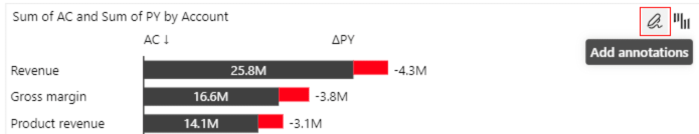
To comply with Microsoft certification requirements, all comments are saved within the visuals and are not persisted back to the data model, means no write-back to the data model.
-
-
Table Comments
-
Click the “Add annotations“ icon in the top right corner to access the annotation layer. Then you can find “Add comment“ and “Add highlight“ icons in the annotation pane. To add new comment to a table, click the commenting icon, place it on the visual, type your comment and save it.
-
-
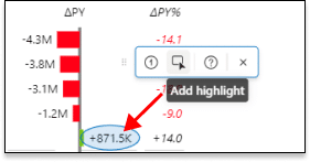
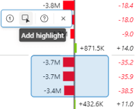
Table Highlights
-
Highlighting annotations are specifically intended to highlight different parts of the visual and draw the viewer's attention to convey the message. You can either to highlight single data points (ellipsis highlight) or groups of data points (area highlight) to direct the viewer’s attention.
You can find the “Add highlight“ icon in the annotation pane by clicking the “Add annotations“ icon in the top right corner of the visual.
-
- Ellipsis Highlight
Ellipsis highlight is used to highlight a single data point and it is drawn around the data label. Ellipsis highlights can be added by simply clicking on the data point:
-
- Area Highlight
Area highlight is used to highlight multiple data points. To add the area highlight, click and drag the mouse pointer over the data points you want to select.
-
- Filter context
You can use slicers, filters, and other visual elements to filter the contents of your Tables, and annotations (comments and highlights) will respond to your filtered state correspondingly.
First, you need to provide the Tables visual with the data that filters it. You can do this by adding the fields and measures you want your annotations to respond to in the dedicated “Filters” bucket:
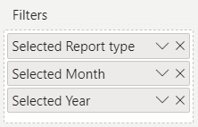
For example, you are using a slicer to select report type and time and you want your comments on the Tables visual to be associated with those values. In this case, you need to make sure that the report type and time (Month, Year) are added to the Filters bucket, and then you can display the right annotations for each slicer selection:
Format from model
With this new version, you can switch the data label units setting to the “Power BI” option, which allows you to read the format of the data labels directly from the Power BI model itself. This means that the numbers will no longer be auto-formatted as they usually are by the Zebra BI visuals, but the format will be replaced with your predefined values from the data model. This is especially useful when you’re using slicers or filters to display different kinds of numbers in one visual, like in the example below where we’re switching between the KPIs formatted in millions and a KPI formatted in percentages:
- The dashed line for the comment box resizing has been accidentally repositioned in a previous version and has been amended
- The annotation toolbar can’t be moved out of the visual anymore
- Clicking outside of the title menu now closes the menu
- Reordering of fields in the Filters bucket no longer changes the annotations
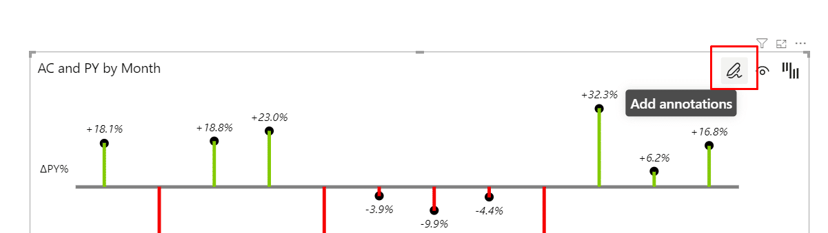
- Annotation layer
The day is here when the highly anticipated annotation layer finally lands in your lap! The annotation layer is a new set of features that enables you to add context to your charts and tell a story about your data: The first feature to land in the Charts annotation layer is the quick commenting feature, which allows you to add comments on charts on the fly, without the need to meddle with the data model. You can simply select the category on the chart and type the comment in directly, no fuss. You can then further edit and delete the comments.Keep in mind that the comments are saved within the visual and are not persisted back in the data model (in other words, no write-back to the data model). This is because we wanted to keep our visuals certified and thus we are not permitted to perform write-back.To enter the annotation layer, click on the icon in the top right corner. Then you can select the commenting icon, place it on the visual, type in your comment, and save it. Voila, you have added your first comment.
- Setting up the filter context
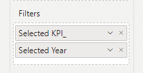
Naturally, you’re often using slicers, filters, and other visuals to filter the contents of the charts visual and you want the annotations to respond to your filtered state. Due to restrictions in Power BI, you need to provide the Charts visual with the data that is filtering it. You can do so by adding the fields and measures that you want your annotations to respond to, to the dedicated “Filters” bucket:

For example, if you are using a slicer to select KPIs and you want the comments on the charts visual to be associated with each selected KPI, you add the “Selected KPI” measure to the Filters bucket and then you can display the right annotations for each slicer selection:
Let us know how you like the feature and what improvements you would like to see in the future!
 The first feature to land in the Charts annotation layer is the quick commenting feature, which allows you to add comments on charts on the fly, without the need to meddle with the data model. You can simply select the category on the chart and type the comment in directly, no fuss. You can then further edit and delete the comments.
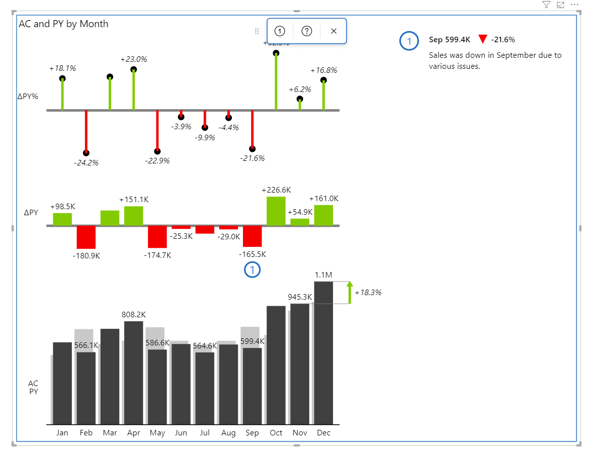 Keep in mind that the comments are saved within the visual and are not persisted back in the data model (in other words, no write-back to the data model). This is because we wanted to keep our visuals certified and thus we are not permitted to perform write-back.To enter the annotation layer, click on the icon in the top right corner. Then you can select the commenting icon, place it on the visual, type in your comment, and save it. Voila, you have added your first comment.
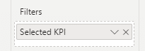
- Format from model
With this new version, you can switch the data label units setting to the “Power BI” option, which allows you to read the format of the data labels directly from the Power BI model itself. This means that the numbers will no longer be auto-formatted as they usually are by the Zebra BI visuals, but the format will be replaced with your predefined values from the data model. This is especially useful when you’re using slicers or filters to display different kinds of numbers in one visual, like in the example below where we’re switching between the KPIs formatted in millions and a KPI formated in percentages. - Quick column calculations
In many cases, the raw numbers that you have in your Power BI model are not enough to convey the true picture behind the data. To save you time from having to calculate more and more measures manually in the data model, we are introducing a new feature called “Quick column calculations”. This is a list of preset calculations that you can add to your visual:
% of grand total: calculates the % of the grand total for each row
% of…: calculates the % of the reference value for each row
Running total: calculates the running total for each row
Running total %: calculates the running total in % for each rowCurrently, the reference column is always the AC column. The newly added columns can be renamed, switched to a chart, formatted and much more:
- Dynamic visual title with references to fields and measuresWe have long since tired of static visual titles, especially since they can be too non-descriptive or sometimes even misleading if you’re using slicers and filters to dynamically change the data you’re visualizing. So naturally, you want your visual title to reflect that dynamic behavior and adjust to your slicer values. This is especially important on large dashboards with lots of visuals and slicers where viewers could easily have the data filtered, but not immediately recognize it and thus misunderstand the data. Consider this case, where the visual is filtered by slicers above it. The default static title says “AC and PY by business unit” which is not enough to understand what we’re looking at. By adjusting the title content and referencing the pre-prepared measures, the title dynamically adjusts to the selected values:
To achieve this, you need to add your fields or measures to a new filters bucket in the visualizations pane:If you add regular fields to the filters bucket, remember that the values will be aggregated. For example, if you select 2021 and 2020, only 2020 will be displayed in the title. To display both, you need to prepare a separate measure (in our case called Selected Year) that concatenates the values and always returns the correct value to be displayed in the title.
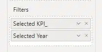 If you add regular fields to the filters bucket, remember that the values will be aggregated. For example, if you select 2021 and 2020, only 2020 will be displayed in the title. To display both, you need to prepare a separate measure (in our case called Selected Year) that concatenates the values and always returns the correct value to be displayed in the title.
- Our flagship commenting feature is now expanded to work even better with hierarchical tables!Great news for all our fans of the commenting functionality! Our existing comments from the data model have now been improved and polished to work even better in the hierarchical tables. Until now, the comments in hierarchical tables were added primarily on the lowest levels and if the hierarchy was collapsed, there was no way of knowing where the comments were “hidden” on the lower levels. This functionality has now been expanded and:
-
you can now add comments on all levels of the hierarchy
-
if you collapse a row that contains comments on the lower levels, a small blue dot will appear that indicates the presence of a hidden comment. As a cherry on top, you can click on the comment indicator, and the table will automatically expand to the level of your comment and show it in the comment box.
-
-
Filtering by a measure without a value now correctly clears the table
-
The date format is now being correctly recognized in groups and doesn’t display the long date-time format anymore
-
Clicking on a category now correctly filters the groups. Previously only the first group was being filtered, now all the groups for the relevant category are displayed
-
Using the TopN no longer prevents the data from being filtered out
- Dynamic visual title with references to fields and measures
We have long since tired of static visual titles, especially since they can be too non-descriptive or sometimes even misleading if you’re using slicers and filters to dynamically change the data you’re visualizing. So naturally, you want your visual title to reflect that dynamic behavior and adjust to your slicer values. This is especially important on large dashboards with lots of visuals and slicers where viewers could easily have the data filtered, but not immediately recognize it and thus misunderstand the data.Consider this case, where you have a visual being filtered by a slicer for KPIs on the right and another visual for years below it. The default static title simply says “AC and PY by month” which is not enough to understand what we’re looking at. By adjusting the title content and referencing the pre-prepared measures, the title dynamically adjusts to the selected values:To achieve this, you need to add your fields or measures to a new filters bucket in the visualizations pane:

If you add regular fields to the filters bucket, keep in mind that the values will be aggregated. For example, if you select both years 2021 and 2020, only 2020 will be displayed in the title. To display both, you need to prepare a separate measure (in our case called Selected Year) that concatenates the values and always returns the correct value to be displayed in the title.
- By popular request, we have added support for word wrapping of category names. If you’re using long category names, you can finally set the option to wrap the labels like this:
However, note that this approach is not IBCS-recommended. The better and more correct solution is to rotate the axis to display a vertical chart like this:
Show vertical axis = ON
Text width = Full
-
In our previous version, the category settings dropdown was visible in view mode and viewers were able to interact with it, even though the settings were not saved in view mode. We have fixed the issue.
-
Fixed the bug where some numbers in tooltips were wrong when the axis break was used on line charts
- On-visual settings for data labels
Here comes the next improvement in our goal to move all the settings to the visual itself. When hovering over the data labels, you will get an option to open a dropdown with all settings for data labels where you can change the font, decimal places, units, format of negative values, data label density, and more.
- Stacked charts
We’ve improved the sorting functionality for stacked charts. The sort options are now ascending, descending and original order. Note that for sorting to work, the Top N functionality must be turned off.
- We fixed a bug we introduced with the last version where the relative variance in grand total was incorrectly calculated.
- Expanding the comment box to the maximum size caused Power BI to stop working. We have fixed this in this version.
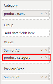
- Text columns
In this version, we have supported adding text columns to our Tables visual. The users can now add additional textual fields or measures to the Values bucket without creating a hierarchy in the Table. In the example below, we added the product_name field to the Category bucket and a product_category field to the Values bucket alongside the actual sales numbers.

This results in a new column to be displayed next to the categories. The newly added text column can also be moved left or right by dragging and its width can likewise be resized.
Finally, we also added support for hyperlinks in the text columns.
 The newly added text column can also be moved left or right by dragging and its width can likewise be resized.
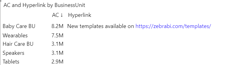
- Improving Data Accuracy and Visualization
Until now we required our users to report costs and expenses with positive numbers in the data and invert their meaning on the visual itself, which is a recommended IBCS approach. With this new version, however, we are introducing a new setting to the Tables visual called “Calculate relative variance” which can be used for reporting costs and expenses as negative numbers in your data.Before: The negative numbers for costs cause the relative variance to be negative (and share the same orientation as the absolute variance), even when the costs are semantically increasing.After: When the new setting “Calculate relative variance” is set to “Mathematical calculation”, your costs will now be treated correctly and relative variance will be calculated and displayed correctly as well.
 After: When the new setting “Calculate relative variance” is set to “Mathematical calculation”, your costs will now be treated correctly and relative variance will be calculated and displayed correctly as well.
-
We fixed a bug from the previous version, where the Power BI’s regional settings weren’t read correctly.
-
When inverting the variance colors, we fixed the bug where the zeros changed the color as well and turned to red.
-
In the tooltips, we mistakenly displayed the values for absolute variances of PY and PL twice. This is now fixed.
-
Minor bugs:
-
The user is no longer able to completely turn off the scenario patterns for measures.
-
Fixed the position of some tooltips for the formula editor.
-
We now dim the borders of scaled groups in preview.
-
- We have added a separate setting to show or hide the bar chart in the total row. In practice, this means that the bar charts are no longer scaled down due to the proportionally larger total row bar chart.
- It is now possible to change the background of a single row, similar to the existing background color setting for columns.
- Column header text trimming was improved for better legibility.
- We have added the missing interaction settings for column renaming and design, as well as for hiding and adding columns.
- Improved performance on Android devices.
- Fixed bug causing doubled values when using the result option in the ragged hierarchy.
- Data from colored columns no longer disappears when the filter in a slicer is changed.
- Integrated variance column settings no longer go missing when the chart view is switched.
- Row values are no longer misaligned when using the sorting option.
- Fixed multiple Top/Bottom N option issues that resulted in missing or incorrect data.
- Fixed tooltip display of blank values and relative variance values.
- date formatting got corrupted if the format was changed in Power BI
- chart slider was not working correctly with the drill down
- visual was going blank on drill down when a single category was selected
- visual was going blank if there was no data to show
- Highlight the last data point
With Zebra BI Cards 1.7., the charts will have the last data point highlighted in blue when the user clicks on the BAN to toggle from total to the last data point. In the example below the last data point is October:IMPORTANT: When the highlighting is applied (user toggles to the last data point entry), chart columns will turn from dark grey to light grey. This can be solved by clicking on the chart (the dark grey will reappear).
- Fixed the last data point, which was incorrectly displayed in case of a negative value.
- Fixed the reset to default for the Legends setting, as it was in some cases not working as expected.
- Corrected the wrap card title toggle to work properly.
- Fixed the rerendering of the visual, which was showing landing page instead of visual content .
- Category settings directly on the visual
This is a continuation of our process to move all Charts settings to the visual itself to improve the interactivity even further. Next up are the category settings. Head over to the categories with your mouse pointer and the blue outline will appear. By clicking anywhere on the categories area, you are able to open the category settings. There you can customize the axis font, trim or rotate the long labels, adjust the density of labels by only showing the first and the last or only every N-th, and set the gap between the columns. - Stacked chart settings directly on the visual
With 6.4 version we also made it easier to adjust the settings on stacked charts as we moved them to the visual. To adjust the settings on a stacked chart, simply hover and click over the series names and open either general settings or specific series settings. You can highlight a series, change the Top N function, and more. - Legend settings directly on the visual
You can now adjust several legend settings directly on the visual. To do that hover and click on the legend area. You can change the color coding, aliases, and margin.
- Stacked charts now properly filter by category.
- Fixed a bug where we’ve displayed a 100% relative variance where we should display 0% in the comment box.
- We’ve corrected the color and direction of the comment box variance arrows in certain cases.
- We’ve fixed the wrong numbers in the tooltip and grand total variance calculations.
- Disabled tooltips will no longer bother you in the mobile view.
- Consolidated the numbers in the stacked chart and comment box.
- Difference highlights are correctly calculated for stacked charts with negative values.
- Display of multiple BANs
Now, users can track multiple BANs, besides the actual value (AC) – like plan (PL), previous year (PY), or forecast (FC). In this way, getting instant insight into several important KPIs and comparing them is even easier. To show the BANs, go to the formatting pane under Card, and you will see an additional feature called 'Show variance'. Choose the view you wish to display and see the insights on all cards. - Sorting option for cards
Now we enable our users to sort the cards by different criteria:- Relative variance (vs PY, vs. PL, vs FC)
- Absolute variance
- Value
- Title (alphabetically)
- Custom sort (custom sort puts the cards in the order that you choose by dragging cards around and positioning them upon your wish)
- Default sort (it is the sort that is defined by PBI once making a new card set)
- For all options, the sort can be set to descending or ascending by using the toggle.
The sorting settings can be reached via the global toolbar, as well as from the formatting pane under the Grid section
IMPORTANT: The sorting is working for the rows and uniform layout. It is currently not supported in the custom layout (no icon for sorting in the global toolbar).
- Highlight specific cards
With Zebra BI Cards 1.6 users are now able to emphasize particular card(s). In this way the visual message is even stronger, pointing the report viewers to the most impactful KPIs. To access this feature, you need to go to the focus mode. There you will find a new field called “Card Highlight” which offers you several predefined colors and has also the possibility to use any other color of your choice – using the color grid, HEXA, or RGB codes. Once happy with the selected color, press on save and the card will receive a colored left border. - Basis points formatting
This new addition allows you to measure different margins in cases where they do not grow by many percent but by fractions of a percent. This will enable companies who can benefit from basis points to have an even better understanding of their data and a clearer picture of the performance. You can change basis points formatting on a global level using the formatting pane and for each card individually using focus mode.To change this globally, go to the formatting pane and under Data labels change the card number format to a percentage (%). Then toggle on the ‘Use basis points format’ setting. You can also rename the basis point's name with predefined options from the dropdown menu or choose a custom name.To change this on a single card, open it in focus mode. Under Unit choose Percentage (%) or simply click on the % Percentage button. Two new settings will appear - basis point and basis point decimals. To trigger the basis point on the chosen card, click on the Basis points button. Then you can also set the number of decimal places that will be displayed on the card.
IMPORTANT: currently basis points are not supported with Zebra BI Charts. This means that the charts within cards will still show percentage points even when using the basis points format.
- Numbers format change on a global level
It is now possible to change the format data on a global level, using the Power BI formatting pane. In this way users with multiple cards that contain the same type of data can save precious time, changing the format of all cards in one go. To perform the change of all cards at once, go to the Data labels section and choose the data format from the drop-down menu of the “Set cards number format”. You can choose between auto, none, thousands, millions, billions, and percentages. - Reset to default on an individual card
It is now possible to reset the individual card back to the default state. The reset to default on the individual can be accessed in the focus mode toolbar via the button “Reset to default “ in the top right corner. This will come in handy in particular when:- We in the past interacted with a card in many ways and we would like to come back to the default state with one click.
- We in the past interacted with a setting on an individual card, e.g. chart slider, however afterward we want to apply a certain change to all cards via the global setting pane - like changing a chart type. Without the default state of the modified card, the global setting will not affect that card. However, by hitting the reset to default button on the modified card and then applying the global setting, we achieve that the change is applied also to that card.
- Treat nulls as zeros
You now can use the “treat nulls as zero” toggle for charts within Zebra BI Cards. The toggle can be accessed via the global setting pane under the Cards section. - Hide variances for all cards
Now the user can hide variances for all cards. Go to the formatting pane under Card. Choose None in the dropdown for the Show variance setting. - Inverting & highlighting the category on Zebra BI Charts
Just like you can invert or highlight the category in the Zebra BI Charts visual, it is possible to do it now also on charts within the Zebra BI Cards 1.6.1 visual. You reach it by hoovering with your mouse on the category you wish to invert or highlight, using the right mouse click. By doing so, invert and highlight (if applicable) categories will appear. You can activate them by thicking them. - Include scaled groups' in Interaction settings
Report creators now have the option to include the Scaled groups' functionality also in the Reading view. By default, it is still disabled, but creators can enable it by going under Interactions in the formatting pane and toggling ON the ‘’Scaled groups’’.
- The KPI Definition setting field was renamed into KPI Descriptions.
- Empty KPI Descriptions buckets have now updated the tooltip saying “No description“.
- We introduced the data labels section in the Visualization pane to be consistent with Zebra BI Charts & Tables.
- Resolved the issue where the tooltip on a single card was not working.
- Fixed the KPI description field by repeating the same description multiple times.
- Charts in scaled groups no longer bleed out of their margins.
- Fixed native PBI Focus mode, so it works if you have (or filter) only one card.
- Last category BAN is now correctly displaying the value also in cases where the last data point is 0.
- Added a character limit to scenario alias rename functionality. From now on, users can type in max 20 characters. If they insert more, they will be returned to the 20 characters.
- Removed the layout name that appeared over the visual when it was exported from Power BI to PDF.
- Fixed the bug causing the tooltip measure labels do not match the inputs under the Legend settings in the formatting pane.
- Fixed the bug causing to revert the manually changed measure names back to the original ones.
- Resolved the issue with clearing the cache after using the slicer which caused the cards not to display correct data.
- Tooltip for KPI definitions
To ensure a better understanding of what each KPI visualized with Zebra BI Cards represents, you can now add the exact definition for each indicator. To do that, we added a new data field ‘KPI description’ where the report creators drag and drop the text fields from their data. Report viewers can then hover the title on each card and read the definition displayed in a tooltip.To correctly present the description, you should not include a trend in the 'Category' placeholder.
- Enabled the possibility to add custom JSON theme files to reports with Zebra BI Cards. To insert your own JSON theme to a report with Zebra BI Cards, go to View > click on the dropdown on Themes > Browse for themes > Upload your theme and confirm the change.
- The design of the global toolbar was updated.
- Uniform layout
It is now possible to switch between three different layouts when using Zebra BI Cards: custom, row, and uniform. The latter enables you to set all cards to the same dimensions effortlessly. To access this feature, go to the global toolbar at the top and choose the third layout option. The visual will adjust and all the cards will be the same size. You can then simply hold the bottom right corner of the first card and make it bigger or smaller. Once done all other cards will adjust to the same size.There is also a neat tooltip that will inform you about the dimensions of the cards.
- Rename scenario aliases in the legend
With Zebra BI Cards 1.3 users are now able to rename the scenario aliases in the chart’s legend inside the card. This gives you more flexibility and is now consistent with the same setting in the Zebra BI Charts visual.To access this, a user can open the Settings pane and see the newly added Legend section. Simply change the default aliases by entering new names that match your needs best.
- Customize background color
The highly anticipated feature for allowing users to change the background color on all the cards at once is here. To explore this functionality, open the global toolbar, click on Design, and adjust the color under ''Card color''. You can also apply a desired color under the ''Card border'' option.To ensure flexibility in use, you can of course also change only the background color on each individual card as well. To change that, open the selected card in focus mode where you will find a new setting called Background color. Simply choose the desired color and return to the report. This is perfect for applying brand colors, highlighting specific cards, and for dark-themed reports.
- We disabled the renaming through the measure rename for everything except the single card title. Variances are now pulled from the settings page ‘’Legend’’ and display actual (AC), plan (PL), or forecast (FC) as default.
- Fixed the bug where suppressing null cards did not reflect on the dimension which resulted in the wrong value being shown on other visuals when this card was used for filtering.
- Resolved the issue where the maximum number of cards in a row was not working.
- Fixed the issue where scrollbar width affected the card’s width calculations in the custom layout.
- Font settings on Zebra BI Cards
From now on, users can set their preferred font type for all elements on cards. You can customize all the elements on the cards: the KPI title, value, variances, and chart labels. Once you apply the preferred settings, this change is global and applies to all cards at once.With this new feature, users can define the font size, color, and style.
To access the feature, open the global toolbar and click on the dropdown arrow next to Fonts. Customize the font options to best fit your needs.
- Year-to-date (YTD) Performance tracking
Zebra BI Cards visual now supports the display of the YTD value for the KPIs. This year’s period total is compared with the same period’s total of last year.With the latest updates, the KPIs have three different stages: YTD total, total and last period. By clicking on the number, a user can toggle between the three options. If the YTD state is selected, the card’s title gets an appendix “YTD”, which can be changed in the settings pane.
- Interaction settings
With this release of the Zebra BI Cards visual, report designers now have more control over which interaction is allowed to the end-users (viewers) once a report is published to Power BI Service and consumed in view mode.We added the Interaction group of settings to enable report designers to toggle key interactions On/Off. Some examples: show global toolbar, chart slider, resize and/or move cards, change variance calculations, and so on. Even if the user disables interactions on the items above, the whole card is clickable for filtering.
- We added tooltips to the layout buttons in the global toolbar.
- We added support for local storage.
- Users can now navigate from the previous card to the next card directly in the focus mode with just one click on the icon.
- We implemented a toggle animation to the measure type switch to make it clearer to the users what has changed when they toggle the measure type.
- There is now a symbol for an Indian rupee in the symbol menu when in focus mode.
- Removed the line break between the measure and the remainder of the title.
- We introduced separate decimal number settings for absolute (actuals and absolute variance) and relative (relative variance) numbers.
- Improved the context menu behavior, meaning, the browser's built-in context menu no longer opens when right-clicking on the title or top of the visual. Additionally, the context menu always opens when a user right-clicks on a blank place in the visual.
- Fixed the bug where comparison measure had different values for chart and variance label.
- Corrected the display of date format.
- Resolved the issue which prevented users from pinning the Zebra BI Cards visual in a custom layout when using Power BI Service.
- Bookmarks can now save the state of quick layout (custom or row), card type, suppress chart option, axis break, and show variance setting.
- Increased the performance of the visual by optimizing rendering events.
- Cards work properly in Power BI for Microsoft Teams.
- Resolved issues where charts were not shown if the last data had 0 as a value.
- Corrected the issue from the 1.0.1 version where Focus mode was not working for a single card.
- Fixed the bug causing the card to disappear when a single data point had no data.
- Resolved the issue of NAN being shown in the variance when the value from the last point was displayed and slicer was used to filter cards.
- Fixed the bug causing the cards to merge or disappear.
- Resolved issues with the grouping of charts.
- Corrected the expiration notice displaying in view mode.
- Adjust settings directly on the visual
To ensure more interactivity of Zebra BI visuals in Power BI, some settings have been moved directly to the visual. This means users no longer have to open the formatting pane and search for the right setting. The user experience is much more seamless, and it saves additional time for the report creators.From now on, you can edit the comment settings by clicking on the ‘Settings’ icon in the comment box top-left corner. You will see the possibility to change the Title, decide on which variance to show, choose the variance icon, adjust the padding, define the gap between comments, and turn on/off the shadow. There is also an option to reset everything to default at any time. Additionally, you can adjust the font settings for the title by clicking on it directly on the visual.
- Drill-down is enabled in tables with hierarchies where the parent and the child have the same name.
- The drop-down markers are suppressed in the rows with no subordinate layers to ensure better readability of the tables with hierarchies.
- In some cases, values formatted as percentages were displayed incorrectly. They were rounded up or down which caused deviation from the correct values. This issue is fixed, and percentage values are now displayed correctly.
- Corrected the issue causing sub-total and grand-total changes when using the “drill down” option.
- Fixed the bug causing incorrect tooltip display on added formulas.
- Corrected the issue causing the chart to disappear when scrolling through a long set of data.
- Top/Bottom N + Others when using hierarchies with 3+ levels
To ensure even greater data visibility in hierarchical tables with many levels, you can now use the Top/Bottom N + Others feature also if you have tables with 3+ levels.To access it simply right-click on the category, select the level on which you wish to apply the feature, choose whether you want the Top, Bottom, or Top + Bottom N + Others, and define how many entries should be visible.
- The long category label names that are trimmed are now shown in the tooltip on hover for an unlimited time.
- Removed the hover tooltip ‘Click to sort’ from the column mouseover if the interaction setting for ‘Sorting’ is turned off. The report creator still sees it, but the viewer does not.
- Custom styles are now applied to all groups on all levels. By going into the formatting pane > Group title, users can adjust the font color, size, family, and alignment for all levels.
- Columns can be renamed without pressing enter after inputting the new value.
- Fixed the bug where clicking on a category row only filtered out the first group on the left instead of the whole row (all groups).
- Corrected the issue causing the ‘invert’ calculation to not work on the 1st level when a table had at least 2 levels.
- Fixed the bug causing the ‘skip’ calculation to not work on the 1st level when a table had at least 2 levels.
- Basis point formatting
Users can now implement the basis point formatting to measure different margins in cases where they do not grow by many percent, but by fractions of a percent. This will enable companies who can benefit from basis points to have an even better understanding of their data and a clearer picture of the performance.You will find the new feature in the formatting pane under Data labels. Just above the ‘percentage point’ setting, there is a new global toggle setting called ‘Use basis point format’ that by default is toggled off. When you turn it on, the setting for renaming the percentage point abbreviation ‘pp’ also changes into ‘bp’ (basis point). When the setting is on, all percentage point numbers are multiplied by 100 to show the basis point correctly. If you want to, you can also rename the setting based on your needs.
To enable even clearer visualizations, you will also see a new setting ‘Suppress relative variance for percentage values. By using it you can hide the percentage growth of percentage change.
There is also a new feature ‘Percentage point decimals’ under Data labels settings. It lets users define how many decimals should be included in the cells formatted as percentage points or basis points.
- Renamed the field ‘Hierarchy Identity’ in the calculations manager to ‘Data field’.
- Fixed the issue causing the small numbers in variances did not round.
- Corrected the issue where the visual went blank with a combination of an integrated chart and a grand total row.
- Performance optimization
With Zebra BI Tables 6.0 we submitted a completely new visual for Power BI. The loading time of tables with hierarchies is up to 50x times faster than with the previous versions.Zebra BI Tables is now the fastest custom Power BI visual when it comes to loading the data. Before this update, we needed to fetch all the data when a user opened a report, even for the collapsed rows. Now, the new Zebra BI Tables 6.0 visual fetches data on-demand, only for the rows you expand as it is running on one of the latest Microsoft APIs.
- New highlighting options
For better data visibility, it is important to have the ability to adjust the highlighting of the rows on mouseover. With Zebra BI Tables 6.0 users can now explore a new setting ‘’Row hover’’ where they can choose from different options:- Bolding: when you hover over a row the information gets bold
- Highlighting: when you hover over a row the information gets highlighted with a light background fill. This is now set as the default setting.
- Off: you can turn off any effect on mouseover
To access it, open the Formatting pane > Interaction. Choose Row hover and if the setting is set to ‘’Highlighting’’, you can further define the ‘’Interactive hover color’’ and ‘’Interactive hover color opacity’’. There is also a ‘’Reset to default’’ button.
- New drill options
With the new Zebra BI Tables 6.0, all different drill scenarios are now supported. You can now choose to drill up, drill down, go to the next level, or expand all down one level. In practice, this means you can now create a table where you can dynamically and quickly switch between different fields in table rows (e.g., switch between sales per buyer to sales per product in the same table). - Bookmark all settings
Zebra BI Tables 6.0 brings the ability to bookmark all the settings used when creating a report or dashboard! Now you can prepare many different views with hiding/unhiding columns by bookmarking every view and using a Bookmark navigator.Previously, whenever we added a new setting, it was impossible to make them bookmarkable without affecting the current bookmarks. As Zebra BI Tables 6.0 was submitted as a new visual, we decided to enable bookmarks for all the settings.
IMPORTANT: if you simply switch from 5.4 to 6.0, your current bookmarks will not be saved, and you will need to create them again.
- Calculations manager
Users can now see and remove calculations thanks to the new Calculations manager. This means you can now have an overview of all the Zebra BI custom calculations (invert, skip, invert all, result) separated by group. Additionally, this feature enables you to select and delete individual, grouped, or all calculations.You can access the calculation manager by right-clicking on a category name and selecting Manage calculations.
- Moving comment markers to different columns
From now on you can drag and drop a comment marker to a different column which also updates the comment value in the comment box. For example, if you move the comment marker from the Plan (PL) to the Previous year (PY), the numbers and variances in the comment title will change and reflect the transition.If the comment marker is one of the calculation columns (ΔFC, ΔFC%…), the first value in the calculation gets displayed alongside the variances. If the comment marker is on the base measures' columns (PL, AC...) the corresponding value is displayed alongside the variances. If the comment marker is on the additional measure, only the corresponding value is shown without variances.
- Suppress the values for the ‘Others’ column
The option to suppress the values in ‘Others’ on individual columns when using the Top N + Others functionality, allows you to have a better overview of your data, especially when analyzing columns with non-additive measures. This allows you to prevent displaying aggregated values in the ‘Others’ row when it does not make sense, such as in percentage (%) and average measures.To access the individual column settings simply hover over the column header in question and click on the dropdown arrow right of the column name. You will find the ‘Suppress others’ checkbox among the column settings. Marking the checkbox will hide the values on the ‘Others’ row of that column.
- You can now distinguish more clearly between different waterfall charts in the tooltip. Choose from the Waterfall chart or Calculation waterfall chart.
- We re-enabled the option to display a text for the empty cells in the Zebra BI Tables visual.
- There is a new setting called the Interactive comment box. It enables you to toggle between benefiting from the interactivity of the feature (changing placement, choosing the best variance, etc.) or turning these settings off if you prefer to do so.
- Scenario notations or patterns were improved for multiple plans (PL), so it’s easier to distinguish between different measures.
- To improve the consistency of our terminology, we renamed the existing settings: "Apply patterns" to "Apply scenario patterns" and "Scenario" to "Scenario patterns".
- Corrected the sorting by relative variance where the issue was incorrect handling of empty reference values.
- If you use freeze row grand total, the visual body is no longer empty.
- Fixed the issue where nulls in group did not get plotted.
- Formula editor is displayed on Edit formula button.
- Resolved the bug where pattern still applied on Previous year (PY) even when the “Apply patterns” setting was set to off.
- Fixed the issue where measure menu was drawn on the wrong place when comment box was on the left of the visual.
- Fixed the clipping on long category names.
- Resolved the issue where title element was showing shadow on hover.
- Fixed the issue where user could not click on the drop-down menu in Groups.
- Improved Dynamic comment box
The 5.3 update is all about making the comment box even better and more flexible! From now on users can have more control over the width of the comment box. This can be done directly on the visual by moving a dashed line that appears on hover to left or right (you’re familiar with that from the small multiples option). If there is no resize, then the behavior is automatic.Additionally, the comment box can now be displayed in different positions: right, left, or at the bottom of the chart. You can now specify the number of columns, and the comments are displayed left-to-right in columns.
You can now also set different design settings for the comment box like set inner and margin padding or apply different background fill. You can also switch the border On or Off. If switched On, then you can also choose settings for border width, border color, border radius, and/or shadowing options.
Finally, for more control over the elements that are displayed in the comment title, users can now specify the icon (choose from triangle, circle, or circle with arrow) and variance label (display relative, absolute, or both variances).
- Added option to expand Top N rows in focus mode.
- Corrected the display of Tables in MS Teams (desktop).
- Resolved the issue causing Tables to be zoomed in/scaled up when existing Formula editor after adding or deleting a formula.
- Fixed the bug causing comment title to display icon and % symbol in case only one measure was present.
- Corrected the issue where absolute variances were multiplied by 100 when percentage point was set to "%".
- Resolved the issue with row level decimal places not working on non-percent formula rows.
- Fixed the bug where column background color was not applying on some columns and on Grand total row when freeze grand total was toggled On. Also, corrected the background for column headers when selecting a scale group in additional measure’s menu.
- Resolved the issue where additional measure tooltip in header menu for number format was affected by vertical scroll.
- Fixed the closing of color picker when user exits the formula editor.
- New Bookmarkable Settings
From now on, there are several different settings in Tables visual that can be bookmarked:- Chart slider (change view)
- Expand/collapse groups
- Column headers
- Chart settings: layout and grand total
- Title: text
- Data labels: units, decimal places, and percentage decimals
- Comment box (on/off)
- Design: style
- Simply select the settings you want to bookmark and save the view. One of the benefits is greater flexibility when it comes to capturing the current state of a report page because when you change between different bookmarks the report will switch to the exact state of the visual when the bookmark was created. This will enable report viewers to view the exact state of the report that you bookmark.
- Support multiple forecasts and multiple plans
This new feature allows you to display up to 3 plans and up to 3 forecasts with or without variance columns! Simply add multiple plans to the Plan field or multiple forecasts to the Forecast field. Those measures will be displayed in columns. To make this even more efficient you can now also see automatically calculated variances, and choose how exactly to calculate them, e.g., FC2-AC, but also FC3-FC2 or FC2-FC.
The great thing about this new feature is that it gives you lots of flexibility in the changing environment as it enables you to combine multiple different scenarios in one visual.
- Optimized performance of Zebra BI Tables to be more on par with the native visuals. This means there is no more unnecessary data fetching when it is not needed (e.g., on resize or when users only change the design).
- Improved the performance of a custom marker on additional measure. These markers apply on charts (pin and bar chart) in the same way as they do with FC and PL columns. In the case of a Table chart type, the selected marker is shown in the header indicator.
- Resolved the issue with formula referencing in cases when a specific formula was deleted and re-added but the formulas referencing the original one didn’t respond to that change. Also, corrected the issue with vanishing formulas.
- In case when there are no dimension attribute fields on Zebra BI visuals, the report page tooltips are still displayed on the visual instead of changing to the default tooltip.
- Fixed the issue where collapse/expand group did not work with right-click on the left down arrow.
- Corrected the missing “-” symbol with an inverted formula row.
- Fixed the issue with absolute variances format which caused the duplication of pp unit if global settings for data label format and row format were set to percent.
- Resolved the issue where *100 was missing in the calculation of absolute variance when two measures formatted as a percent with PBI format are used as AC and PL.
- Fixed the cut off of the last row when only one measure was filtered in the visual filter
- Corrected the behavior when column calculation changes on PL or FC caused the PY column to change as well.
- Formula Manager
You can now see the list of all the formulas in the visual and quickly edit or delete them! Access the Formula Manager by clicking on the Manage formulas button when editing or adding formulas:The great thing about this new feature is that it allows you to delete one or more formulas on the visual or edit one or even more formulas at once. For example, you can select multiple formulas and set the same font color or number format to all of them in one go.
- Suppress data labels for large relative values
You can now suppress data labels in table columns for relative variance values that are bigger than XY!To implement this new feature simply go under Settings --> Data labels and change the switch next to Suppress large relative variance to ON and input the value in %. For example, if you would like to limit the % greater than 100 and not display the exact value, you can now easily do that, and the values will be displayed with the signs > or < (< -100% or >100%). - Grand totals and subtotals formatting
With this new feature you can add an outline and change the background of your grand total and all your subtotal columns in your visual! This way you can mark all the important parts of your report and draw attention to the overarching information.Turn on your subtotal and total columns by hovering over the top of your columns and click on the Add columns (+ symbol) at the top of your Categories list. Access the format settings on the total columns the same way as for any other column in Zebra BI Tables by hovering over the column name and clicking on the down arrow symbol.
- Improved the display of long column names so it doesn’t spill over to other columns and the text doesn’t overlap. This also provides a better experience when clicking on an arrow or using sort on that column.
- The display of grand total (if enabled) is now clear, and it doesn’t overlap with values in upper rows.
- Updated the display of Top N, Bottom N, Top + Bottom N in case when using 0 under the settings for item.
- Enabled option to deselect the category or Others row by double-clicking on them.
- Improved the option to still display headers even when Freeze headers is disabled in the settings.
- Provided better consistency between tooltip fields names and JSON template (or column headers). The names that are used in column headers are now also displayed in the tooltip.
- Enabled option of opening the dropdown arrow to open the column format menu even if the group name is extensively long.
- Added ‘’-’’ option to column settings, row format settings and formula settings.
- Fixed freezing categories and hidden icons when the grand total column was added.
- Fixed the issue where visuals in pinned tiles in a PBI dashboard went blank.
- Disabled the display of ‘’above subtotals’’ also on the waterfall charts as using ‘’below subtotals’’ should be the only option for this visualization.
- Fixed the issues on percentage format including percent format not getting passed over from row to formula (and formula editor), percent format on rows not showing % symbol, and percent formula causing inconsistent results on the additional measure in combination with other formats.
- Fixed the issue with center alignment for ‘Group title’ value.
- Corrected the issue with percentage format on relative variance measure type when using additional measure. Also, corrected the display of blank values in such case.
- Fixed the issue where formula row didn’t show up when there were blank (null) values.
- Fixed the issue where suppressing empty columns didn’t work when measure type relative variance was used as an additional measure in 3+ hierarchy causing the zeroes to be displayed instead of blank spaces.
- Resolved the issue with formulas in waterfall charts which caused the incorrect grand total and missing connecting lines.
- Fixed the problem with incorrect calculations caused by persisting formulas in the background even after they were visually deleted.
- Resolved the issue related with More colors not being applied to Bar and Overlapped bar integrated charts in Zebra BI Tables v5.0.0.
- Comment box
Zebra BI visuals now support displaying dynamic comments directly inside the visual. Simply put your comments data field into the Comments placeholder and turn the Comment box setting to On:
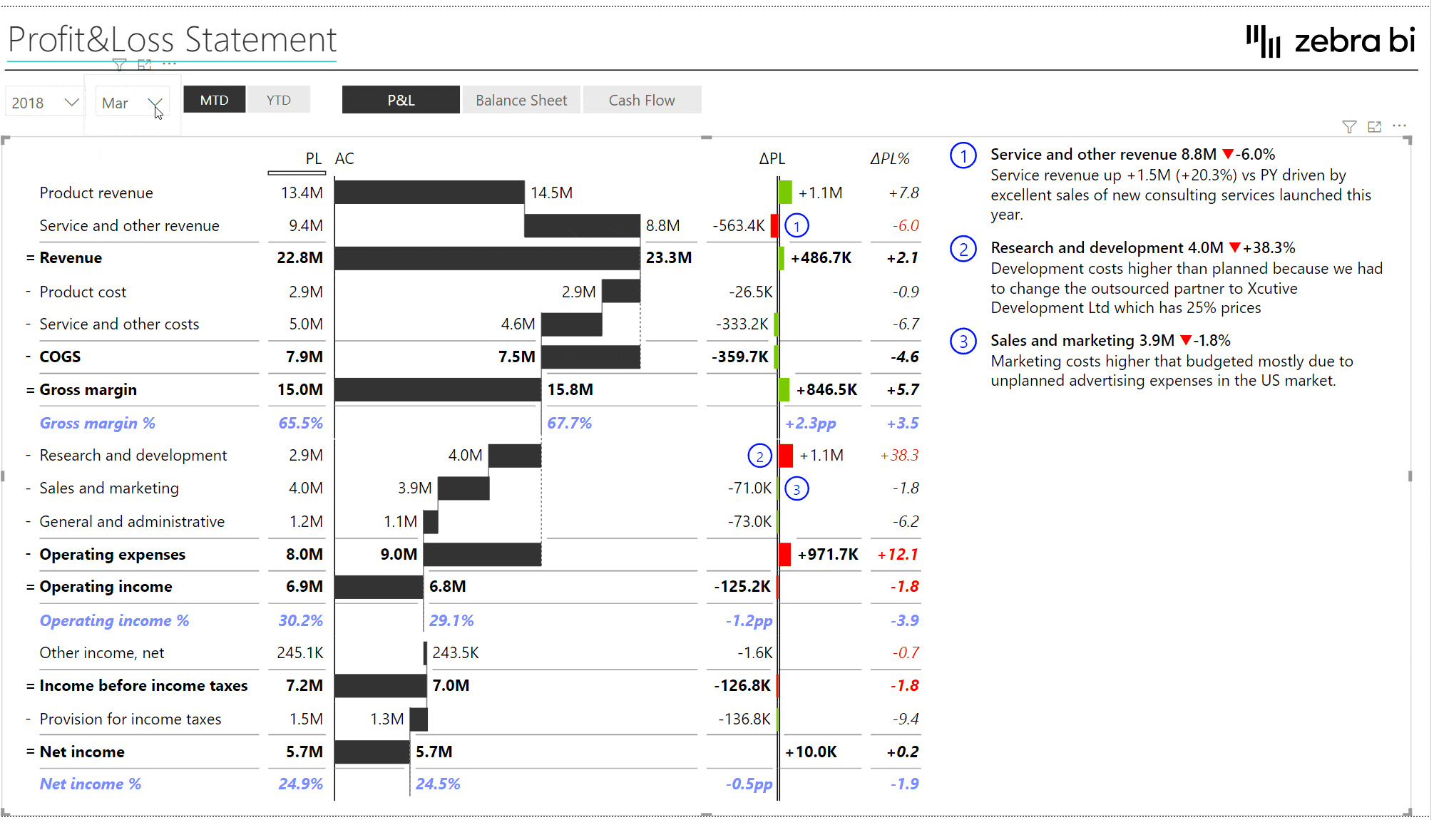
- Flexible row formatting
You can now set a custom number format on any row in a Zebra BI Table!
Simply right-click on a row header and select Format to set the format of the selected row. You can change the unit, the number of decimal places, custom font color, custom bar color, bold, italics, and a gridline.

- Redesigned the row format menu for a better user experience. It now displays the element name on the top, options are grouped and separated with a gridline, and all row format design options are displayed in a compact submenu:
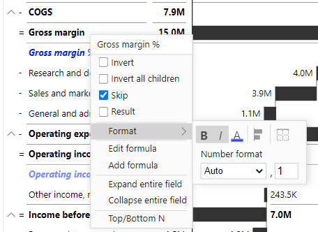
- The Suppress empty columns setting now supports Zebra BI formula calculations. You can now dynamically switch comparisons between for example PY and a plan in a Zebra BI Table even if it contains custom formulas added with Zebra BI Formula Editor
- Upgraded Microsoft Custom Visuals API to version 3.6. This fixes an issue where MS Power BI returned wrong datetime values under certain regional settings
- Added the column format drop-down menu to columns in all matrix (cross-table) layouts
- Fixed an issue in certain cases where drag&drop reordering of columns was not working correctly
- Formula Editor - Add new, automatically calculated rows!
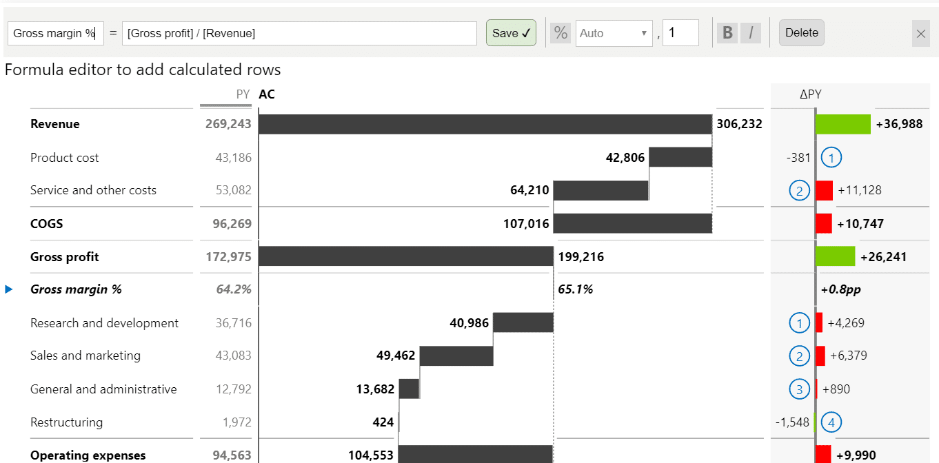
- Dynamic comment markers with text tooltips
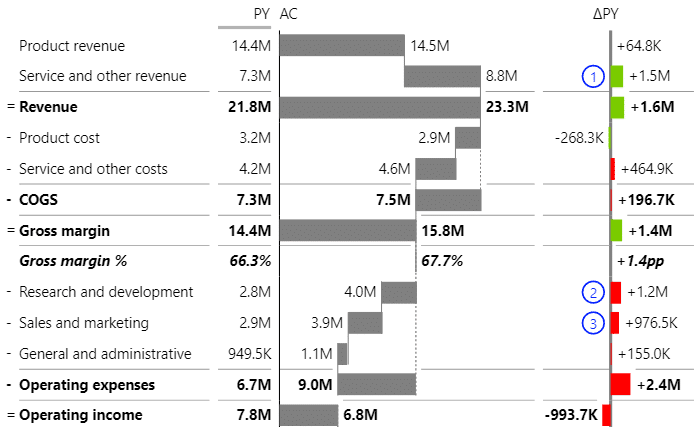
- Added option to display variances as "chevron" arrows
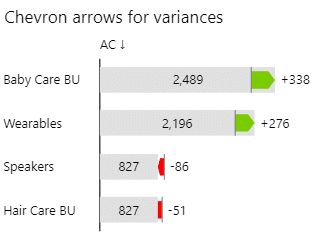
- Allow renaming individual groups
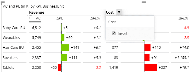
- Allow users to invert an individual group
- Added option to invert individual columns
- Allow column settings drop-down menu (arrow) in view mode
- Improved the display of date formats in tooltips
- Improved display of ragged hierarchy elements
- Fixed a bug with turning off the data labels on value charts
- Fixed an issue with calculation waterfall chart with 3 levels of hierarchies
- Fixed an issue with Top N + Others if blank elements were present
- Fixed an issue with scrolling where columns have backgrounds
- Fixed an issue where multiple variance chart overlapped
- For a long time you could only show value elements as table when you had a hierarchy. But we just added support for value charts on hierarchies as well!
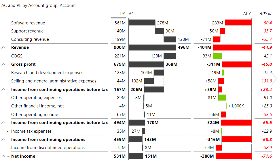
- One of the most awaited features is now here: freeze categories!
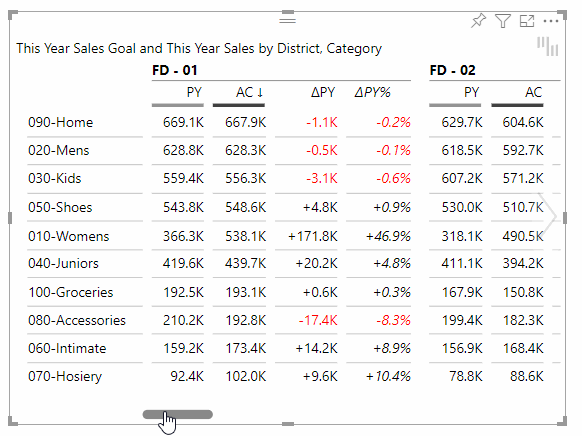
You can find this under Categories -> Freeze categories. - You can now use our Top N functionality on all the levels of your hierarchy, whereas before you were limited to using it only on the last level.This comes with a completely new user interface, which you can reach by right clicking on the Categories and choosing Top/Bottom N. You can also find it under Categories -> Open Top/Bottom N form.
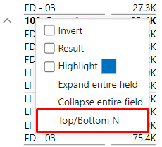
This will open a new Top N form, where you can choose the level of the hierarchy to which you wish to apply the Top N, as well as other Top N parameters.
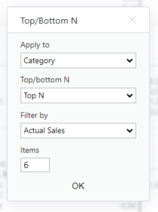
- We also made it a lot easier for you to change the number of Top N elements you wish to see! When you hover over the visual you will now see up / down arrows next to the "Other" category, which will allow you to adjust the number of shown elements.
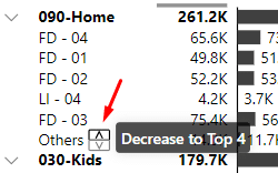
- "Others" label is now customizable. You can set it under Categories -> Others label.
- Added an option to show "%" in the labels of relative elements.You can find the option under Data labels -> Show % symbol in numbers and for the additional measures this can be set on the column settings form:
- Added support for analytics pane! You can now add average, constant, median, and percentile lines to the visual! The display of the line and the corresponding label is completely adjustable.
Just head to the analytics pane and start playing with it!
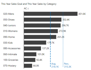
- Added tooltips field, which you can use for displaying any additional information in the tooltips.
- Several performance improvements. First tests show improvements of 15-25% in many cases.
- Added support for custom fonts. By using report themes you can now use any custom font you want!
- Grand totals for waterfall charts are now displayed as a chart instead of a table (except in some specific cases).
- You can now hide individual columns from the Grand total group. Before you could only hide them from all the groups.
- Custom scenario colors are now correctly displayed in tooltips.
- Removed the values for Other elements of relative additional measures. Since these are non-additive measures we cannot calculate them on our own from the existing elements. Until now these were still displayed as a sum of the elements, but we decided to remove them completely, since summing them is always incorrect.
- Improved how the connecting lines on waterfall charts are displayed when there is missing data.
- Fixed an issue with sorting where in some cases not all the levels of the hierarchy were correctly sorted.
- Fixed an issue with the visual not displaying correctly when collapsing certain elements.
- Fixed an issue with percent formats not correctly being applied when using Percent additional measures.
- Fixed an issue with using transparency in Edge browser. The background of the columns was displayed black if color was semi transparent.
- Relative additional measures don't display a semantic axis anymore.
- You can now display your Additional measures as Charts!
Since additional measures are often showing KPIs that are unrelated to other KPIs in the same visual you can decide how they should be scaled by adding them to different Scaling groups.
On top of that we increased the number of measures you can add to 20!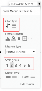
- You can now independently format your Additional measures.
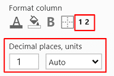
- Added tooltips for truncated categories.
- Added the option to set the "Show row subtotals" using Report themes.
- Added "Gap between columns (%)" setting, which controls the amount of gap between columns.
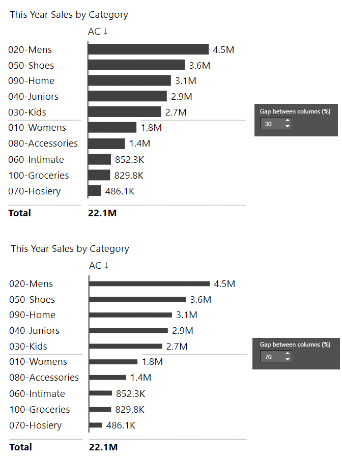
- Added support for "Suppress zeros" and "Suppress nulls" when using multiple group elements and when showing Groups in columns.
- Added transparent backgrounds to labels on Waterfall charts. The amount of transparency is controlled by going to "Data labels -> Background transparency".
- Added an option to hide the Calculation symbols ("=" and "-"). You can find the setting under "Chart settings -> Show calculation symbols".
- Improved the display of tooltips by not showing the elements that were hidden from a particular group.
- Improved the licensing window by allowing the users to scroll down when the visual has limited space.
- Improved the detection of outliers.
- Improved the display of the layout tooltip, which is now displayed in the middle of the visual. This it makes it much easier to see whether we are using the "Chart" or the "Table" layout.
- Clicking save on the Color picker now closes down the Color picker.
- Fixed an issue with part of the visual displaying empty space after collapsing one of the elements.
- Fixed an issue with formatting data labels when using the Percent format. When using a custom unit setting for data labels the display of Additional measures that used Percent format was also affected. Now this is not the case anymore.
- Fixed an issue with "Show row subtotals" sometimes missing from the settings.
- Fixed an issue with the missing gridline above the "Others" category.
- Fixed an issue with "Hide column" option being visible on the Total columns when using the Actual / Absolute layout.
- Fixed an issue with sorting Absolute and Relative difference values when the values contain zeroes. The elements with zeros should now be displayed in the correct position.
- Fixed an issue with setting custom highlight color.
- Fixed an issue with Plan and Forecast scenario being swapped when all four scenarios were present.
- Fixed an issue with not being able to set some of the Variance calculations.
- Fixed an issue with alignment of scenario indicators in Internet Explorer.
- Fixed an issue with horizontal scrollbar sometimes not being visible in Internet Explorer.
- Fixed an issue with missing axis on grand total for Plus Minus charts.
- Fixed an issue with hiding columns after copying the visual.
- Fixed an issue with disabling the pro features. After completing the free trial you could not go back to using the Free visuals. This should now be fixed.
- You can now show 4 scenarios in a single Tables visual, together with 3 comparisons between them!
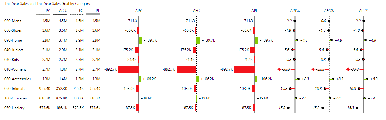
- Added support for highlighting columns. Users can now right click on axis labels and highlight any element. The default color of the highlight can be set in the Style, but users can change the color of each individual highlighted element.
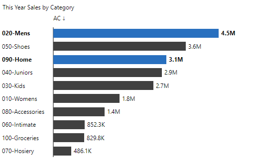
- Fixed an issue with color picker not closing after clicking the Save button.
- Improved the column grand total alignment when center option is selected.
- Improved the display of colors for Internet Explorer.
- Improved interactions on mobile devices.
- Updated the copyright information.
- Fixed an issue with missing column settings. In some cases, especially if you did not have any elements in the Group field, the column settings were limited or missing.
- Fixed an issue with overlapping labels when one of the columns is completely empty.
- Fixed an issue with the headers being hidden when column background color was applied.
- Fixed an issue with certain elements incorrectly displaying bold.
- Visual is now certified! 🎉 Read more about it here.
- Added an option to show column subtotals when we have at least two items in the Group field.
- Added an option to show column Grand totals.
- Added an option to expand / collapse columns.
- Added an interaction option to disabled column formatting.
- Improved the display of connecting lines on waterfall charts.
- Improved the display of tooltips which were sometimes getting cut of
- Fixed an issue with highlighting.
- Added support for Report themes.
- Published the visuals to the AppSource, read more about it here.
- Fixed a problem with changing the calculations on integrated charts.
- Fixed a problem with highlighting a whole row when we had a hierarchy with at least 3 levels. In some cases this caused other visuals to not display correctly.
- Improved the display of categories. In certain cases the categories extended past their bounds. In other cases the categories were truncated even though the visual still empty space available.
- Fixed an issue with highlighting when the visual is displaying a hierarchy with more than 3 levels. Clicking on the elements was adding the elements to the selection even without using Ctrl key. Now regular clicks select a single element as they should.
- Fixed an issue with showing duplicated Actual column in Responsive layout with a hierarchy. Instead of the duplicated Actual column we now show the correct comparison column.
- You can now limit the number of categories that are displayed in the visual. All the other values are shown as Other element. You can choose to show Top N, Bottom N, or Top + Bottom N elements. The setting can be found at Categories -> Top/bottom N.
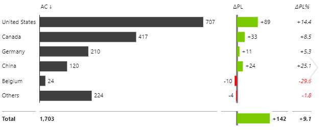
- Added an option to hide columns only from a specific group. You can reach this by clicking on the header arrow, then choosing the option from the Hide column drop down. The option is only available when the visual is showing multiple groups.
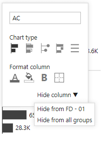
- Added a setting to manually set the outlier values. The setting can be found under Chart settings -> Custom outlier limits. You can individually set the value for the minimum and maximum outliers.
- Added support for showing the Integrated layout as a table.
- Improved hiding of the list of columns that can be added. In certain cases the list stayed visible even when we moved our mouse out of the visual. This should now be fixed.
- Improved the table layouts. The charts now expand to fill all the available space.
- Added support for different colors for scenarios. You can find the settings by going to Design -> More colors
- A new feature to switch any column from a chart to a table column (works in all layouts, both in chart view and in table views):
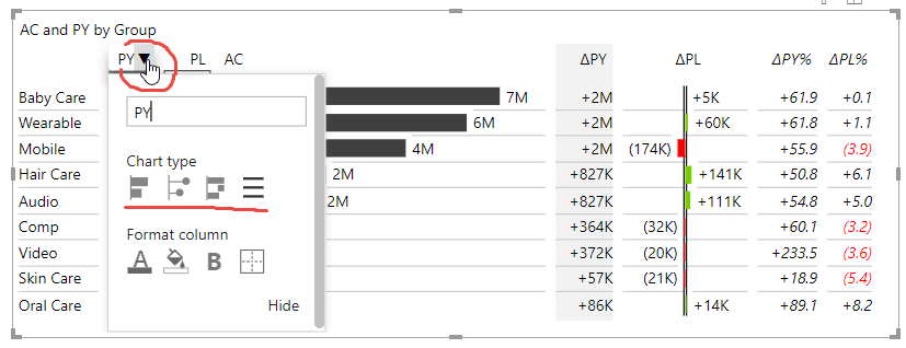
- Hide/unhide columns in a table:
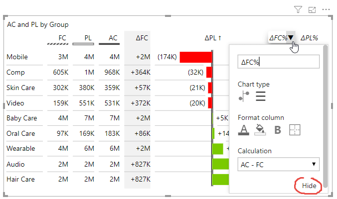
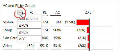
- Change the calculation of variance for each individual variance column:
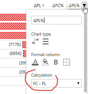
- Added support for displaying groups in columns in responsive layout so you can build tables like this one in a few clicks (simply put your grouping field such as "Period calculation" in our example below into the Group placeholder):
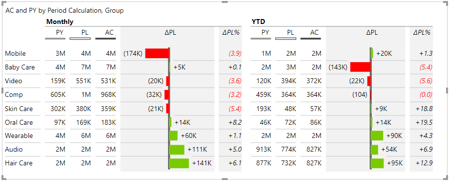
- Added option to right-align numbers when showing negative values in parenthesis (Setting Data labels > Right align numbers, shown when Negative value format is set to Parenthesis)
- Added option to change the chart type and reorder columns to all layouts, even when a hierarchy is applied to columns
- Improved and automated the display of base columns if the overlapped bar chart is selected in AC column
- Improved the design in many layouts
- Modernized the design of scrollbars
- Added descriptive tooltips for better user experience
- Improved the experience of dragging the columns when changing the order of columns
- Improved the sizing of columns when the sorting arrow is shown in column header
- Fixed a bug when applying font color to custom-calculated columns of type Percent (%)
- Fixed the calculation of grand totals when a flat dataset is used (one Category field) and Results (subtotals) are turned on
- Fixed an issue with left-aligned titles in certain layouts
- Fixed an issue when a column border was cut at the bottom of the visual
- Fixed a problem with displaying column headers for custom-calculated column names
- Fixed flickering of headers when moving the mouse next to the header from the right side
- Every column in the visual can now be individually styled! Just click on the arrow next to the column's header and you will be able to: set the text color of the column, set it's background color, display the text as bold and even show a border around it.
For additional measures you can also choose the marker you wish to display. - Allow the users to hide the values of the subtotals. The feature can be found under Chart settings -> Show subtotals -> Above, hide values.
- Added a vertical pin chart, which can be used interchangeably with the bar chart for showing absolute values. You can easily change to pin chart by clicking on the header arrow and selecting it from the list of available chart types.
- Added a minimum chart width setting, which can be found under Chart settings -> Minimum chart width. In some layouts the charts turn into tables when the visual is resized. You can now adjust at which point this happens. Setting the minimum chart width to a low number will results in the visual changing the display to tables later.
- Improved the formatting of labels when the units are shown in the title or not shown at all. After this fix the labels always display the specified number of decimal numbers, even for round numbers.
- Fixed an issue with highlighting the total values. This sometimes made other visuals in the report show a warning.
- Optimized the width of the columns in certain matrix layouts. The width of the charts is now proportional to the displayed data.
- Removed the "Show as table" setting since you can use the slider to do the exact same thing.
- Added additional layout options. You can now also use "Groups in column" option on the following layouts: Actual / Absolute, Actual / Relative, Absolute / Relative.
- Added support for showing two comparisons on Absolute and Relative layouts.
- Improved the chart widths on all the layouts where we display groups in columns as well as the width of relative charts on Responsive layout. Before all the charts had the same width, even if their values were significantly different. Now their width is proportional to their values which greatly optimizes the usage of available space.
- Improved the display of Waterfall charts. In some cases the charts did not use up all the available space.
- In version 3.3 we added an option to add up to 3 additional measures to the visual. We have increased this and you can now add up to 10 additional measures displayed as additional columns. Additional columns work in all the layouts (chart layouts, tables, cross-tables, hierarchical matrices)! Just add your custom measures to the Values bucket as an additional data field.
- Added a setting for the amount of indentation on hierarchies. When you have more than two levels in your hierarchy you can now set your own indentation under Categories -> Indentation.
- Improved the date formatting of categories which now uses your existing column format.
- Improved the display of hierarchies. We now only expand the top two levels of the hierarchy by default, but you can always manually expand other levels!
- Fixed an issue with grand total getting cut off at the bottom.
- Fixed an issue with P&L calculations where in some cases the Waterfall charts were overlapped with other charts.
- Fixed an issue with grand total being hidden when the title was disabled.
- Added a new settings that allows you to only show the gridlines on subtotals. The setting can be found under Chart Settings -> Major gridlines.
- New user interface for changing the chart's title. You can now change the title directly on the visual (click on the ▼ dropdown icon on the title and simply edit it).
- Added an option to allow the title to wrap if it is too long. The setting can be found under Title -> Word wrap.
- Improved the truncating of categories in table layouts. In some cases the categories were getting prematurely truncated. Now we only start to truncate the categories when we run out of space for the values.
- Improved the performance of the visual when displaying larger amounts of data.
- Fixed an issue with overlapping elements. This issue occurred when with a hierarchical chart and when some categories were blank.
- Added a feature to automatically enlarge/zoom the font size in Focus mode to improve the readability in focus mode. By default, the zoom factor is 150%, but you can customize the zoom factor for each visual in the settings (under Interaction > Zoom in focus mode (%)). While in focus mode, press CTRL+mouse wheel to increase/decrease the zoom while presenting.
- Improved the header positioning in many layouts.
- Improved the width of the categories in table layouts. In some cases the values in the tables were displayed on the right side, far away from the categories. In cases like these the values are now displayed close to the categories.
- Changed the calculation of relative variances which now also calculates the relative variance if one of the compared values is negative while the other one is positive.
- Added sorting indicator in the header's tooltip.
- Fixed an issue with suppressing values.
- Added support for up to 3 additional measures displayed as additional columns in the visual. This is perfect for adding:
- Common size measures such as "% of Revenue" to your Income statements
- Additional measures, e.g. Gross margin in % to your Sales vs. Budget reports
- Custom-calculated variances, e.g. FX-corrected variances (in addition to regular variances calculated by Zebra BI PowerTable)
Additional columns work in all the layouts (chart layouts, tables, cross-tables, hierarchical matrices)! Just add your custom measures to the Values bucket as an additional data field. You can add up to 3 custom measures (all together 4 data fields in the Values bucket are allowed).
- Added support for cross visual filtering (press CTRL+click on several visuals to filter by multiple criteria).
- Added an option to display negative values in parentheses (check out Data labels > Negative values format)
- New user interface that makes it much easier to sort and rename the columns. You can now rename any column directly on the visual (click on the ▼ dropdown icon in the chart header and simply edit the name). Changing the chart type for each column is also improved, click on the dropdown icon to choose the chart for the column).
- Fixed an issue with filtering. In some cases the visual would display an old value even when filter was applied.
- Fixed a problem with highlighting.
- Fixed a problem with the landing page scrolling out of view.
- Fixed a problem with missing headers when showing multiple waterfall charts.
- Fixed an issue in iOS App where the visual has been cut due to wrong sizing in Microsoft CV API.
- Add support for different table layouts. Support was added for all existing layouts, so you can now show all the same KPIs as with the charts.
- Improve the display of gridlines when grand total is shown.
- Fix a problem with background transparency setting not being correctly applied on overlapped charts.
- Fix a problem with right clicking on the expand / collapse arrows in hierarchies. The expand / collapse menu was hidden behind the Power BI's context menu.
- Fix an error that sometimes occurred when right clicking on the visual in Power BI Desktop.
- Fixed a bug where the visuals did not use up all the available space.
- Improved rendering of table headers for certain font types and sizes
- Improved display of relative variance labels in matrix charts
- Fixed a bug with sorting by column in P&L tables
- Added the option to sort tables and matrix charts by individual columns
- Added option to highlight and filter the whole row by clicking on the row header (label)
- Improved tooltips in cross-tables and matrix charts - the title now combines row & column names, separated by a forward slash
- Improved formatting of column headers in table layouts where multiple fields are put to column (hierarchy in columns)
- Improved highlighting when a cell is selected in a table (respective row and column header are emphasized)
- Fixed the rendering of grand totals in integrated variance chart
- Fixed the rendering of matrix charts if one or more groups are blank/null
- Added an option to mark a row as 'Result' (right-click on the category name) in Absolute variance and Relative variance chart layouts
- Fixed a bug in P&L cross-tables that resulted in empty cells
- Made matrix charts a default layout (the 'Chart settings > Groups in columns' is true by default for variance charts)
- Added a setting to select a custom color of major gridlines (not both major and minor gridlines can be customized)
- Added support for bookmarking a selected expanded/collapsed state of the visual (e.g. expand a particular group of rows in the table and then add a bookmark to activate this state with a button)
- Improved rendering of column header gridlines in Table layout for certain font types and sizes
- Fixed highlighting when visuals contain empty/null categories
- Added the first support for cross-tables! A new layout called Tables is added to the Layout combo under Chart settings. The fields placed into the Group placeholder will be displayed as columns in a cross-table. If you place two fields into the Group placeholder, a hierarchy of columns will be rendered!
- Added support for rendering Integrated charts as columns in a matrix. If you place a field into the Group placeholder and select the Integrated variance chart Layout, a matrix of integrated variance charts with several columns will be rendered. A new setting called Groups in columns allows you to display the groups as columns or place them in rows.
- Improved the design of the expand/collapse arrow on dark backgrounds (white fill removed)
- Changed the license information text on the landing/home page for subscriber licenses
- Fixed an issue when filtering charts with no data (empty datasets).
- Fixed a bug in waterfall calculation in hierarchical tables.
- Fixed a sorting bug in hierarchical tables.
- Fixed a problem with Forecast and Plan fields being swapped when Actual field was not used.
- Fixed a problem with inverting a subtotal row in a multilevel hierarchy when the child item is suppressed/not displayed.
- Drill-through supported!
- Added 'Show Data' context menu (right-click on a chart element)
- Added an information page when the visual is added to report for the first time
- Added support for Power BI themes. Color picker (in Design settings and in all font color settings) now works with custom PBI themes/styles
NOTE: This version uses Microsoft Custom Visuals API 2.3, which requires minimum November Update of PBI Desktop and January Update of PBI for Report Server.
- Improve P&L calculation when we have more than two levels in our hierarchy.
- Fix a problem where relative labels were cut off in certain cases on Responsive chart layout.
- Fix a problem with overlapping relative headers, when no relative values were present.
- Fix a problem with P&L calculation.
- Fix a percentage format display for the second absolute comparison.
- Added support for titles in local languages based on the current language setting in Power BI (9 local languages supported).
- Added support for report level tooltips on hierarchical subtotals
- Further improvements in designing ragged hierarchies (truncated rows do not display expand/collapse arrows)
- Fixed the display of titles when the Segoe UI bold font is selected.
- Improved rendering of scenario indicators in tables (optimized display for different font types and sizes)
- Added support for ragged (unbalanced) hierarchies with an unlimited number of levels!!!
- Added support for more calculation scenarios on hierarchies (subtotals such as COGS)
- Added support for calculations across ragged hierarchies
- Improved logic of rendering grand totals on vertical waterfall charts
- If grand totals are added then 'Freeze grand total' is On by default
- Fixed an issue with reordering columns if multiple value fields were added and columns were reordered in between
- Removed an extra zero column in hierarchical tables with only one value field (no comparison, just actuals)
- Fixed a bug where right-click expand/collapse was working in view mode, even if disabled in interaction settings
- Added the option to change the order of columns by simply dragging the column headers with the mouse. This allows the users to fully customize the way their reports are displayed.
- Improved many of the chart layouts to make them even more responsive.
- Relative tables and relative table headers are now shown in italic.
- Fixed the display of values in tooltip issues when % measures are used on the visual
- Added support for report page tooltips
- Added support for report page tooltips on small multiples
- Merge tooltip settings
- Fixed label formatting
- Upgrade CV API to 1.13.0
- Added the option to freeze (fix) column headers when scrolling
- Added the option to freeze (fix) the title when scrolling
- Added the option to freeze (fix) the grand total row at the bottom of the visual
- Added the Actual/Relative chart layout
- Added the option to set gridline density in hierarchical view (applied to the last level in the hierarchy)
- Improved the highlighting/filtering experience in hierarchical tables
- Improved the 'Auto' algorithm for truncating long category labels in hierarchical tables
- Improved the UI for setting decimals, percentage decimals and gridline density
- Fixed a bug when highlighting/filtering parent rows that have one child element with exactly the same name
- Add grand total calculation on Absolute and Relative layouts.
- Fix category width calculation on multi level hierarchies for the Full width category option.
- Improve the triangle appearance when using a second reference scenario.
- Added support for multi-level expand/collapse in hierarchical views
- Added support for native "Sort by column" settings (ellipsis menu on the top-right of the visual)
- Increased the row count to the maximum allowed limit (30.ooo rows)
- Speed optimizations for rendering high volumes of data
- Added setting to disable expand/collapse in view mode under Interaction settings
- Added Expand entire field and Collapse entire field to the right click menu on row headers
- Added extensive support to control row height (automatic, font-sized, fixed height, stretch)
- Made gridlines responsive to hierarchy level and expand/collapse state
- Made gridlines lighter
- Added a setting to set the background transparency on data labels displayed over overlapped columns
- Moved the settings for renaming column headers into a separate setting group
- New feature to control which interaction is available in view mode
- Added Interaction settings
- Consolidated chart layout settings between both visuals
- Fixed the issue with cutting the bars in integrated variance chart with relative labels
- Consolidated chart layout settings
- Added a separate setting for percentage decimals
- Improved order of settings
- Added support for report page tooltips
- Added support for report page tooltips on small multiples
- Merge tooltip settings
- Upgrade CV API to 1.13.0
- Fixed label formatting
- The highlighting option for the grand total column is enabled. Right-click on the label and choose 'Highlight. You can also apply your custom color by clicking on the color picker.
- The comment box turns on and off automatically when the comments are added or removed from the fields.
- The positioning of the comment makers on result columns is improved for better readability.
- Added the subtotal difference highlight values to the tooltips.
- Fixed the wrong date category labels that were appearing on drill down since the 6.0 version
- Corrected the positioning of the comment markers in some cases where they overlapped with the category labels
- Adjust settings directly on the visual
To ensure more interactivity of Zebra BI visuals in Power BI, some settings have been moved directly to the visual. This means users no longer have to open the formatting pane and search for the right setting. The user experience is much more seamless, and it saves additional time for the report creators.From now on, you can edit the comment settings by clicking on the ‘Settings’ icon in the comment box top-left corner. You will see the possibility to change the Title, decide on which variance to show, choose the variance icon, adjust the padding, define the gap between comments, and turn on/off the shadow. There is also an option to reset everything to default at any time. Additionally, you can adjust the font settings for the title by clicking on it directly on the visual.
- Changed the default setting of ‘Treat nulls as zeros’ to OFF.
- Improved the display of difference highlight relative and absolute labels to avoid overlapping.
- Improved the position of the highlight ellipses when using the difference highlight.
- Fixed the issue causing the tooltip to show incorrect variances on a line and area charts when hovering over a number.
- Resolved the bug causing NaN values to appear in the tooltip on the relative variance lollipop chart.
- Subtotal difference highlight
In a single-measure waterfall chart, you can now show the difference highlights between the subtotals. Each result column (except the first one) will now highlight the subtotal difference by calculating the difference between the result on its left and this result. The arrow color corresponds to the variance color settings (up = green, down = red, unless the user turns on the “Invert variance colors” setting). If you click on the difference you can toggle between the absolute or relative variances or display both.To access this feature, you need to visualize the data with a single-measure waterfall (or bridge) chart. Open the formatting pane and set the settings under Difference highlight (by default toggled to on). Besides adjusting several settings (e.g. labels, connecting line design, shapes, etc.) you will also find a new setting called ‘Show for all subtotals’ (toggled on by default)on the top where you can toggle this new feature to off (and keep just the difference highlight for the last result).
- Added comparison data label when ‘Show comparison data’ is toggled to ON and ‘Treat null as zero’ is toggled to OFF.
- Added the possibility to see a color preview when the color picker is used for highlighting.
- Updated the display of the Total column when 2 comparisons are available (PL or PY and FC).
- Excluded the option ‘Show all forecast data’ on a waterfall chart.
- Removed the Layout setting when 2D small multiples are displayed to avoid non-optimal layouts.
- Resolved the bug which prevented the correct working of the ‘Invert’ functionality in waterfall charts.
- Fixed the bug causing inconsistency between the data label and the tooltip
- Fixed the issue causing the chart to display the wrong data when a dimension without data was selected instead of showing a blank visual.
- Fixed the bug causing some charts to disappear when adding the Zebra BI Charts visual from scratch.
- Fixed the bug causing the column chart to show a console error in Power BI Online Service (edit mode in Chrome) when changing the layout.
- Corrected the issue where the arrow color was incorrect on the inverted data category.
- 2D Small Multiples
We relaunched the multidimensional small multiples! With the latest version, we upgraded the data model that is running in the background of the Zebra BI Charts visual. As a result, you can add 2 dimensions to the Group placeholder (the 'Layout' setting in the 'Small multiples' settings must be set o 'Smart rows'.This will change the view to a matrix view organized by columns and rows (e.g., Category and Segment). Of course, the charts are also perfectly scaled for easier data interpretation.
- Rename legend entry directly in the chart
To provide a better user experience in Zebra BI Charts, we enabled the users to rename legend entries directly in the chart. When you hover over a legend name, you will now see a dropdown icon. By simply clicking on it, you can add your input for renaming the field.Save the legend name by clicking the Enter key or clicking outside of the input field.
- Corrected the inconsistency on relative variance in total columns when the ‘’Treat nulls as zeros’’ setting is set to off.
- Added interaction setting for Legend settings.
- Changed the default setting of the data label density back to ‘’Highest’’.
- Fixed the issue causing the tooltip to not work on integrated variance charts’ total column.
- Scenario notation in single measure waterfall charts
The waterfall chart has received a major upgrade and has become even more flexible than before. The business analysts can now benefit from having the option to apply patterns for scenario design settings to elements on the single-measure waterfall chart.To access the new settings simply right-click on the respective x-axis element (category) and mark it as a Result. Now if you right-click again, you will also see the Scenario pattern options and you can select the appropriate one.
- Color coding of the chart legend
Color coding improves the legibility of the legend when custom colors are applied and whenever the user changes the chart background to a dark color. The legend entry is the same color as the lines or columns, depending on the chart type.First, head to the Format panel and search for the section Design. In the dropdown under Style choose Custom. Toggle on the option for More colors and apply the colors you wish to Previous year, Plan, and/or Forecast. Now go to the Legend section and toggle on the switch next to the “Use colored legend names” to apply the changes.
Additionally, we fixed some other issues related to the legend-making it more functional, clear, and concise.
- In previous versions, comments did not work well in combination with groups, so we improved this functionality and ensured that all comments get displayed even when multiple groups are used within a Zebra BI Charts visual.
- There is a new setting called the Interactive comment box. It enables you to toggle between benefiting from the interactivity of the feature (changing placement, choosing the best variance, etc.) or turning these settings off if you prefer to do so.
- To improve the consistency of our terminology, we renamed the existing setting “Apply patterns” to “Apply scenario patterns.”
- In previous versions, the visual had an Auto option for the data label density, which displayed as many labels as possible, without them overlapping. In this version we supported further data label density options: High, Medium, and Low, so you can decide what is the best fit for your chart.
- Updated the calculation of combo chart marker size to match the new marker-area-based calculation.
- Fixed the bug causing the comment marker colors for a variance to not display the proper color when the small-multiple group was inverted.
- Fixed the issue where changing the font color and family of the data labels also affected the design settings of group titles and grand total.
- Resolved the bug where the menu was high when a user wanted to use the highlight option by right-clicking.
- Corrected the alignment of axis labels for the last row and first chart & last row in small multiples.
- Fixed the issue causing other visuals not to be filtered when a user clicked on a forecast bar.
- Resolved the bug causing the title not to wrap at the start of a comment box part.
- Improved Dynamic comment box
The 5.3 update is all about making the comment box even better and more flexible! From now on users can have more control over the width of the comment box. This can be done directly on the visual by moving a dashed line that appears on hover to left or right (you’re familiar with that from the small multiples option). If there is no resize, then the behavior is automatic.Additionally, the comment box can now be displayed in different positions: right, left, or at the bottom of the chart. You can now specify the number of columns, and the comments are displayed left-to-right in columns.
You can now also set different design settings for the comment box like set inner and margin padding or apply different background fill. You can also switch the border On or Off. If switched On, then you can also choose settings for border width, border color, border radius, and/or shadowing options.
Finally, for more control over the elements that are displayed in the comment title, users can now specify the icon (choose from triangle, circle, or circle with arrow) and variance label (display relative, absolute, or both variances).
- Improved the PY and PL marker (triangle) size to make them responsive to category width by adding Marker size settings with dropdown (auto/fixed) or marker size (numeric up/down). Same was done for the combo charts markers size.
- Optimized the visibility of legend in waterfall charts on Cards visual.
- Improved the display of the last label in waterfall charts by preventing it from overlapping with the total label.
- Resolved the issue where drill down did not work past the second category if Top N was ON.
- Fixed the bug that caused data points showing on the x-axis for line and area chart type.
- Improved the drill-down functionality past the second category when Top N is on.
- Clear visibility of first and last axis labels when charts are narrow.
- Key settings are bookmarkable
With this update, we’re introducing the bookmarking option to the Zebra BI Charts visual. This new feature allows you to simply select and save the settings for the desired view and return to it whenever it’s needed. Settings that are bookmarkable from now on:- Chart slider (chart type)
- Chart settings: layout, show grand total, show vertical axis
- Data labels: units, decimal places, percentage decimals, density
- Categories: top/bottom N, items
- Legend (on/off)
- Comment box (on/off)
- Design: style
- Difference highlight (on/off): Label, From/To, Highlight ellipse
- Axis break (on/off): percent
- Stacked charts – switch between column/bar chart
Zebra BI Charts visual now supports both column and bar stacked charts! To switch between the two options simply use the ‘Show vertical axis’ toggle in the Chart settings.
- Enabled the option to click on the data labels directly on stacked charts to toggle between absolute values and % of the total.
- Added new option to Chart settings to handle last (incomplete) category variance display in column charts.
- Improved the visualization for Show all Forecast data when AC-CM covered FC-CM as FC variance was no longer seen. Also, improved the data label for FC, extended white background for labels also to the percentage values, and removed the overlap between FC variance and absolute measures.
- Optimized the Show all forecast data for total and plan variance.
- Fixed the issue that caused the click area to not be aligned with the group title if the alignment of it in the settings was set to center or right.
- Resolved the display of wrong value in the tooltip on axis break
- Corrected the behavior of “treat null as zeros” functionality in line charts.
- Showing forecast data even with AC present
You are now able to show forecast data in your visuals even if the actual data is present and not only when AC is empty. The forecast can always be shown, meaning that you can control which months are shown by making the forecast empty on closed months.As a result, this option enables a completely dynamic solution. For example, DAX formula returns empty FC for closed months.
- Highlighting selected chart in small multiples
We added the option ‘’Highlight’’ to the right-click menu also on a selected chart in small multiples! This means you can now use the same highlighting colors as in Stacked charts and seamlessly switch between both visuals.
To do that just right-click on the Group title and choose the highlight option.
- Added the up/down button to enable users to change the number of items for the Top N + Others feature directly on the visual. This is now possible on the waterfall charts as well as for the version with the vertical axis. Additionally, the tooltip is now visible when you hover over the button to either Decrease to the top [N-1] or Increase to the top [N+1].
- Provided better consistency between tooltip fields names and JSON template (or column headers). The names that are used in column headers are now also displayed in the tooltip.
- Added up and down buttons to Others in case if there is a drill down with 2x category.
- Fixed the issue which caused lower opacity of all comments in the comment box if the category was highlighted.
- Corrected the issue where the descriptions disappeared when the Drill Mode was used for drilling down to a single category member.
- Resolved the problem where users were unable to change the highlighting color on stacked charts more than once.
- Fixed the issue where visuals in pinned tiles in a PBI dashboard went blank.
- Corrected the display of the legend on stacked charts when values are negative. Also, the Total label number and position are now working properly.
- Fixed the issue where any input that was not a letter broke the visual in Charts 5.0.1.
- Corrected the Tooltip field values if the Top N categories were used on waterfall charts.
- Fixed the issue in Vertical view for Zebra BI Charts where the Data Label on the very bottom of the visual was always cut off.
- Comment box
Display dynamic comments directly inside a Zebra BI visual! Simply turn the Comment box setting to On:
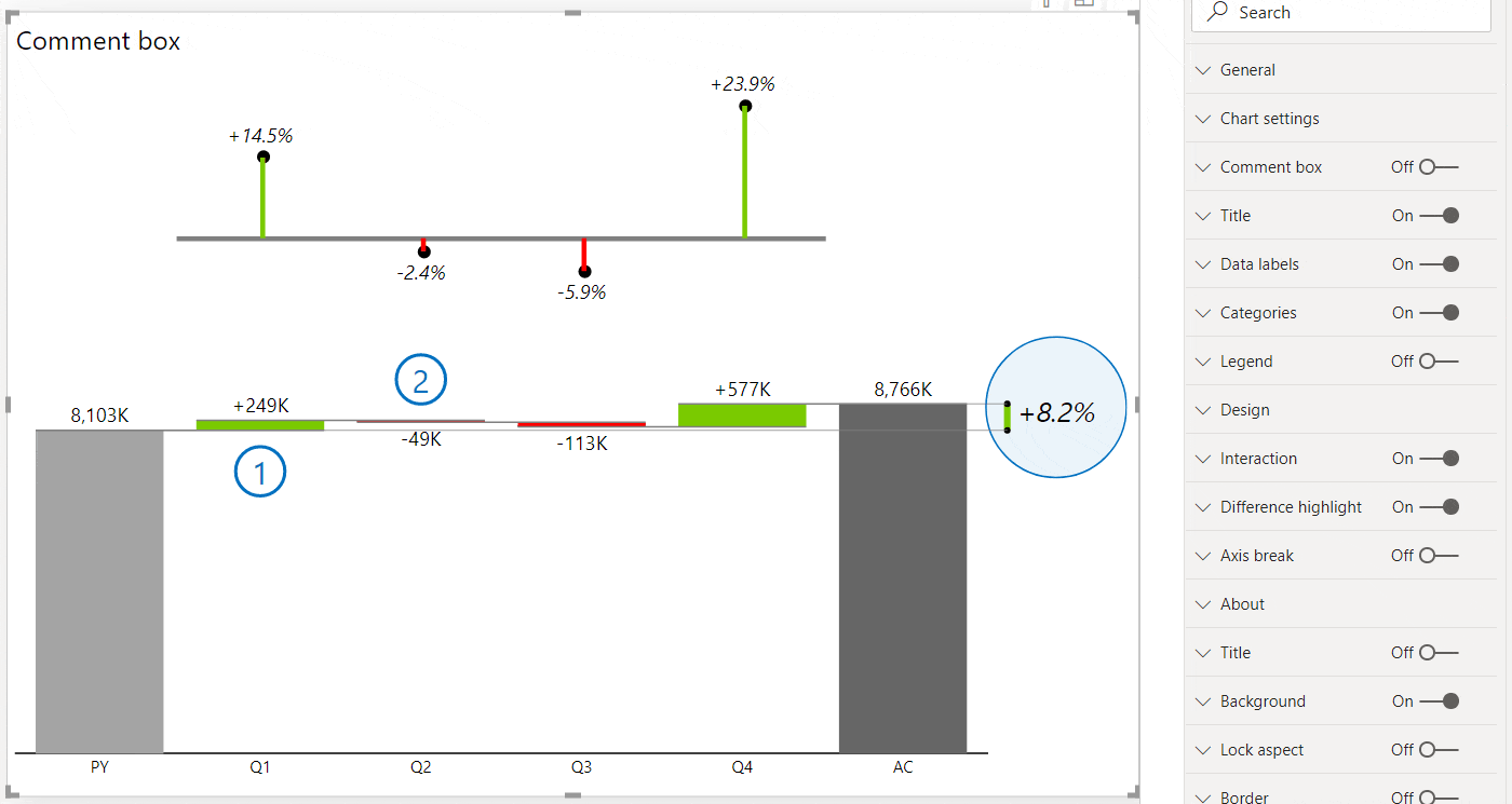
The new comment box automatically generates titles based on the category name and even calculates variance for you in case you have a comparison. The red or green triangle marking the difference will help users understand the message even quicker.
The comment box is responsive and adapts to the size of your table.
It's completely dynamic so you can simply switch the time period to see only the relevant comments. - Advanced Stacked Charts
Zebra BI Charts visual now supports advanced stacked charts. It renders stacked column charts and stacked area charts and they are packed with useful features.
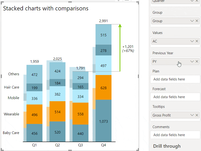
Zebra BI stacked charts can show comparisons of multiple measures within a stacked chart! Simply take the measure, put it in the right placeholder and your stacked chart will present the comparison.
Stacked charts also support the "Top N + Others" feature. In case you have a lot of data series, Zebra BI will automatically filter them and calculate the "Others" data category, so that the totals are preserved. Users can increase or decrease the number of data series displayed by simply clicking on the up/down arrows directly on the legend:
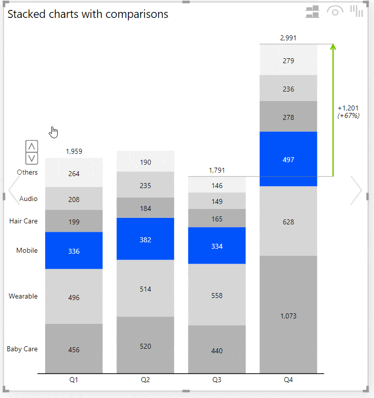
You can highlight any data series with an individually selected color by right-clicking on a legend entry:
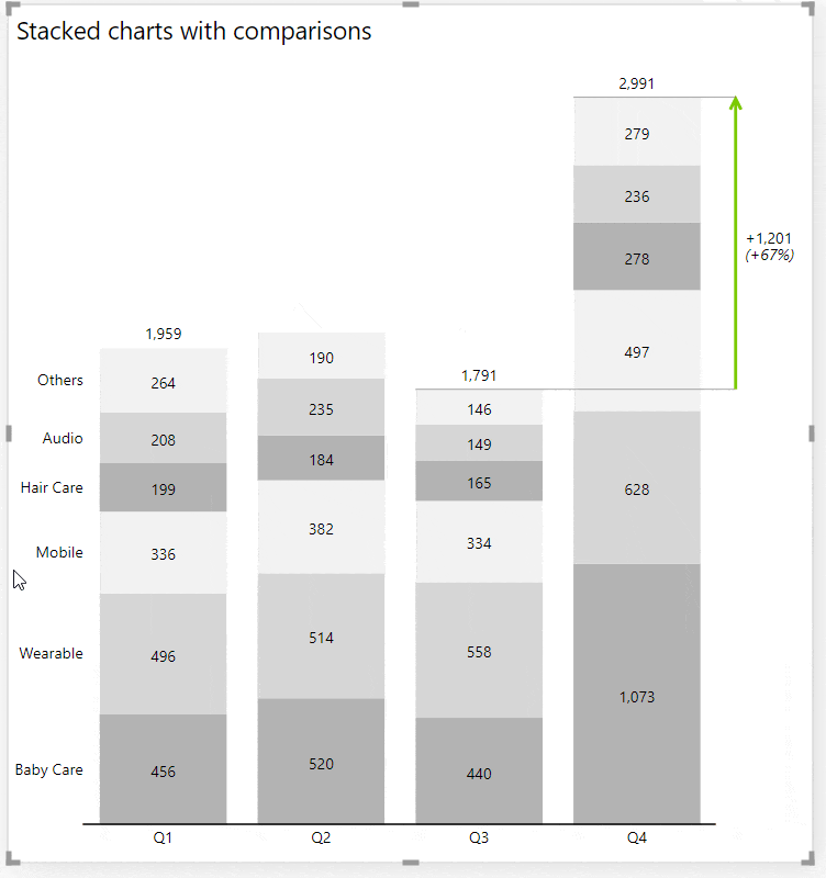
Users can even dynamically switch between a stacked chart and small multiples with 1 click;
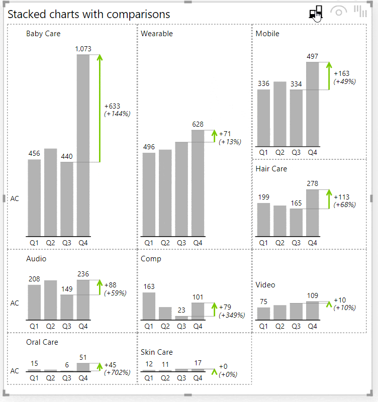
- Support for switching dynamically between comparisons
Zebra BI now provides out-of-the-box support for switching between scenario comparisons with a native Power BI slicer. No bookmarks are necessary for this! Add a slicer, make sure that your comparison measures return empty values if they are not selected, and turn the new Suppress empty charts setting to On:
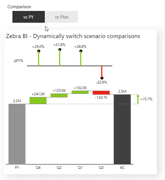
- Support for dark mode
The Zebra BI Charts visual now fully supports dark mode. In case you're using dark backgrounds you can design all the elements on a Zebra BI Charts visual in a legible way. In version 5.0 we added a setting called Zoomed chart background to the Small multiples group of settings that sets the background of the zoomed/pop-out chart in small multiples to a custom background fill: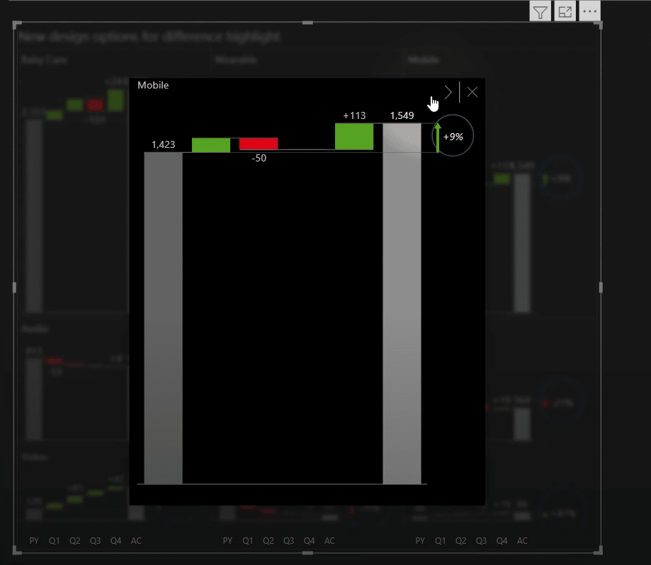
- Allow the designer to hide selected chart types from the chart slider for viewers (when published)
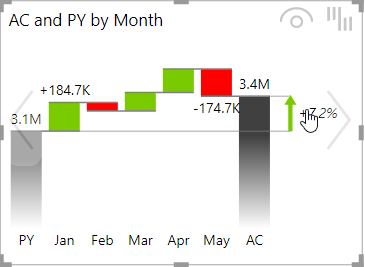
- Support for customizing scenario headers (labels AC, PY, PL, FC) in report themes/styles (JSON files)
You can now specify your own default labels for business scenarios instead of AC, PL, PY, and PY. Furthermore, you can customize your default labels for all variances, absolute and relative, between all possible scenarios. Your custom labels will appear on charts and tables by default, but the end-users can still rename them afterward directly on a visual if needed. - Added support for drill-through by measure
- Vastly extended design options for combo charts
We have added many settings to customize the design of combo charts. Marker density, marker size, droplines, line styles, colors, etc. Check the new options under Combo chart group of settings. We have also redesigned the behavior of the secondary axis in combo charts so that both data series are always rendered on the same 0 X-axis, even if one of them has negative numbers.
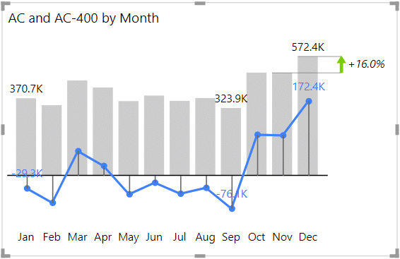
- Zoomed chart in small multiples now supports a quick display of next/previous data element. The zoomed chart also shows tooltips (also page tooltips) and even supports drill-through!

- Add settings to customize and emphasize the difference highlight
Check under the Difference highlight settings, where you will find new options like Connecting line color, Connecting line style, Custom difference font, Highlight ellipse, and more.
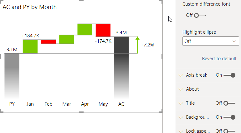
- Allow data labels on the second data series (PY or PL or FC)
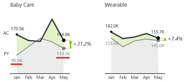
- Option to display comparisons as markers (triangles) instead of overlapped columns
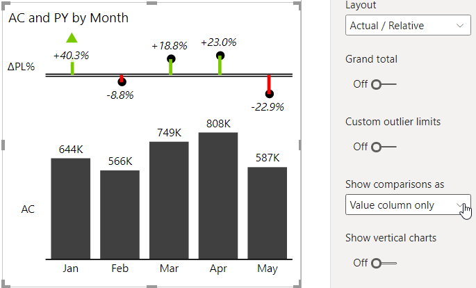
- Upgraded both visuals to MS Power BI Custom Visuals API 3.5 (fixes cross-visual filtering issue in PBI Desktop)
- Improved left and right offsets so that labels don't get cut
- Improved display of left-right buttons for 'Others' in multiples
- Improved display of relative labels if one of the values is empty or zero
- Improved display of comparison columns in segmented integrated variance charts
- Fixed a bug where tooltip not shown over negative variance in the integrated chart with vertical axis
- Dynamic comment markers with text tooltips
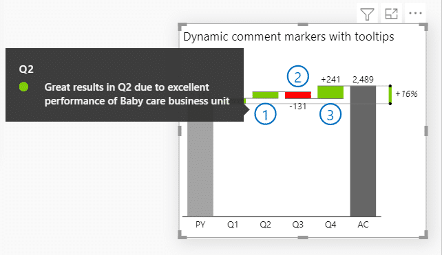
- Added option to display variances as "chevron" arrows
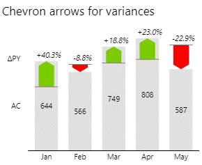
- Spread out legend entries if they overlap
- Improved the display of date formats in tooltips
- Corrected the display of tooltips so they don't cover the Others arrows
- Better display of Auto multiples with Top 1 + Others
- Fixed an issue with data labels on 2d small multiples
- Fixed a bug where plan pattern did not work if More colors were used
- Greatly improved Auto layout when displaying small multiples.
Before one big chart could only span over two smaller charts. Now it can span over multiple charts, as many as can fit!
This spanning of bigger charts can now happen in multiple columns, while before it could only happen once.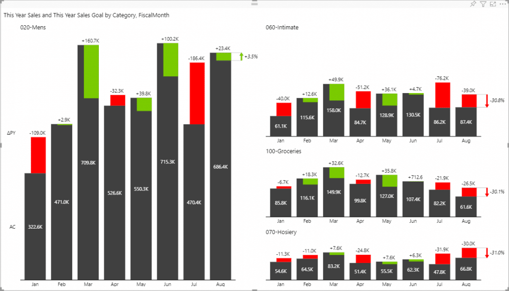
- Improved the licensing window by allowing the users to scroll down when the visual has limited space.
- Improved the detection of outliers.
- Improved the grand total tooltip when we have two segments or all four scenarios.
- Fixed an issue with overlapping labels on Integrated charts when variances were zero.
- Fixed an issue with overlapping labels on vertical, single measure Waterfall charts.
- Fixed an issue with negative grand total on segmented charts.
- Fixed an issue with setting custom highlight colors.
- Fixed an issue with disabling the pro features. After completing the free trial you could not go back to using the Free visuals. This should now be fixed.
- Added support for highlighting columns. Users can now right click on axis labels and highlight any element. The default color of the highlight can be set in the Style, but users can change the color of each individual highlighted element.
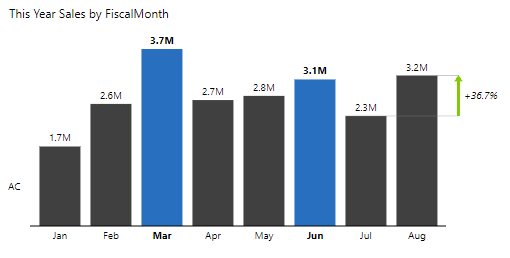
- Added axis density options which allow the users to control the amount of displayed axis labels. This is especially helpful when the visual contains many elements, since the labels can start to overlap.
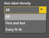
- Added a setting to control the gap width in all column charts.
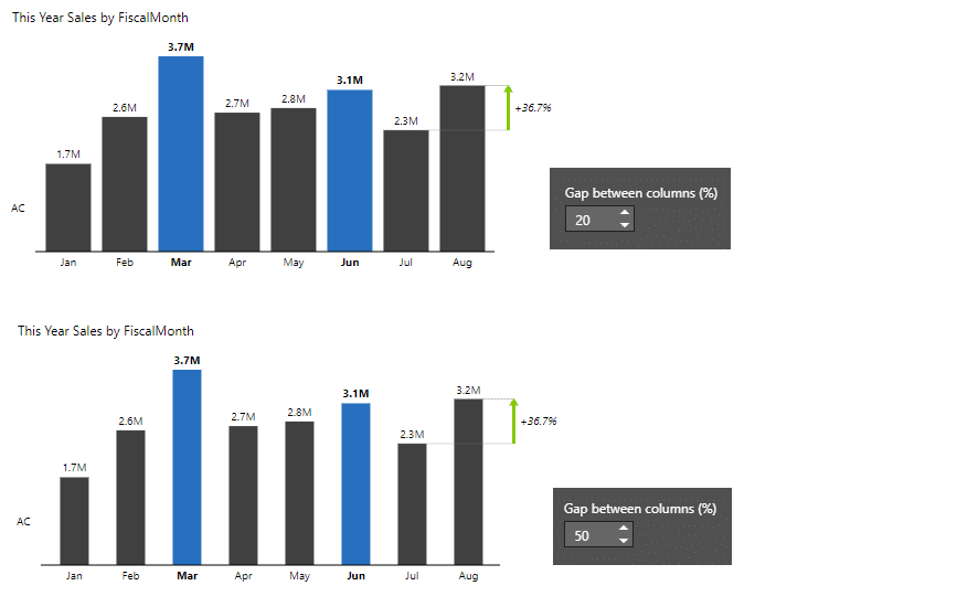
- Added several difference highlight arrow options as well as a setting for customizing the difference highlight line width.
- Added an option to change the opacity of variance areas.
- Improved the application of scenario colors to lines and markers in line and area charts.
- Fixed an issue with "Others" element being incorrectly calculated for negative values.
- Fixed an issue with Grand total chart when all the reference values were missing.
- Fixed an issue where clicking on the chart title applied filtering.
You can see a lot of these changes in action in our Impact of COVID-19 on the global stock markets report.
- You can now switch between vertical and horizontal orientation of your charts! This works for integrated, waterfall, column, and pin charts!
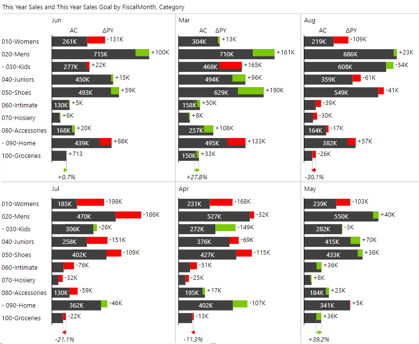
- Added min / max options to difference highlights.
- Improved group title horizontal alignment.
- Improved interactions on mobile devices.
- Fixed an issue with using drill down. When chart slider interaction was disabled the drill down did not work.
- Fixed an issue with labels being cut when the visuals is narrow.
- Fixed an issue with filtering on single measure waterfall charts.
- Updated the copyright information.
- Published the visuals to the AppSource, read more about it here.
- Visual is now certified! 🎉 Read more about it here.
- Added support for Report themes.
- Fixed and issue with axis break not working when we have missing data.
- Improved the label positions on negative numbers in the absolute / relative layouts. The labels sometimes overlapped with the category labels.
- Fixed axis break on charts that have null values.
- Fixed an issue with category text on segmented charts. The category on the ending column was sometimes displaying the incorrect scenario.
- Added a setting to manually set the outlier values. The setting can be found under Chart settings -> Custom outlier limits. You can individually set the value for the minimum and maximum outliers.
- Fixed renaming the Total element in the single measure Waterfall chart.
- Added support for different colors for scenarios. You can find the settings by going to Design -> More colors
- Fixed combo chart when showing Grand total.
- Added the lollipop chart to Zebra BI PowerCharts (last chart in the chart slider if you have 1 measure in the visual):
- Improved rendering of connecting linesin the new waterfall chart (created from a single measure)
- Fixed a bug in rendering difference highlight Last AC to Last FC if FC values are missing
- Improved the calculation of absolute variances in cases when some of the values are missing. We now treat missing values as zeros, but you can always switch back to treating them as missing under Chart settings -> Use null values as zeroes.
- Improved the rotation of the labels on the axis. The labels are now rotated less when there's enough space.
- Improved the formatting of labels when the units are shown in the title or not shown at all. After this fix the labels always display the specified number of decimal numbers, even for round numbers.
- Improved the date formatting of categories which now uses your existing column format.
- New user interface for changing the chart's title. You can now change the title directly on the visual (click on the ▼ dropdown icon on the title and simply edit it).
- Added an option to allow the title to wrap if it is too long. The setting can be found under Title -> Word wrap.
- Added the axis break options to the waterfall chart with subtotals. It works just like on the regular waterfall charts!
- The PowerChart visual now supports new waterfall charts with extremely flexible subtotals. When you are using just one measure and a category field with the Waterfall chart you can now right click on any category and mark it as a result.
- Improved the legibility of labels on integrated chart.
- Changed the calculation of relative variances which now also calculates the relative variance if one of the compared values is negative while the other one is positive.
- Added support for cross visual filtering (press CTRL+click on several visuals to filter by multiple criteria).
- Added a feature to automatically enlarge/zoom the font size in Focus mode to improve the readability in focus mode. By default, the zoom factor is 150%, but you can customize the zoom factor for each visual in the settings (under Interaction > Zoom in focus mode (%)). While in focus mode, press CTRL+mouse wheel to increase/decrease the zoom while presenting.
- Added an option to display negative values in parentheses (check out Data labels > Negative values format)
- Added an option to show the difference highlight between the Last Actual value and the Last Forecast value (available in settings: Difference highlight > From/To)
- You can now specify the maximum height of the combo chart (secondary axis scaling in %). In certain cases this helps with overlapping labels. A new setting is added to Combo chart > Max height percent (%)
- Increased the size of the zoomed charts in small multiples (click on a chart title in small multiples)
- Fixed an issue with segmented charts: the dot chart was sometimes displayed over other charts.
- Added a feature to "Invert" categories in waterfall charts (right-click on the category axis label and click Invert from the context menu). Useful for bridge charts where you need to invert a specific element inside the bridge (e.g. costs/expenses).
- Added additional category (axis) labels settings
- Added Combo charts
- Increased limit of the number of categories to the maximum allowed (30.000 data categories)
- Improved rendering and bug fixes in area charts where certain values are missing/null
- Fixed the missing fade out effect in area charts with axis break
- Improved readability of negative values in waterfall charts if they are close to the axis (they won't overlap with the axis labels)
- Improved readability of data labels in integrated column charts (small values are suppressed)
- Added new area charts. The Layout setting in Chart settings now contains two options:
- Integrated variance layout displays the "Hills&Valleys" charts with red/green coloring of variances)
- Actual layout displays the area chart for the actual measure, overlayed by a line chart for comparison series (PY, PL or FC).
- Added a new feature to focus/zoom-in on a selected chart in small multiples. You can now zoom into individual charts in small multiples! In small multiples, click on a title of each individual chart to display an enlarged version of this chart in zoom mode (a popup window appears). A very helpful feature for exploring values in smaller charts.
- Added a feature to resize all charts in small multiples by simply dragging the gridline of the first row up or down. This will resize all the charts in small multiples to make them bigger or smaller as needed, while still preserving pixel-perfect scaling!
- Improved label positioning in grand totals in column charts.
- Improved calculation of the width of difference highlights to further optimize the rendering of charts and small multiples.
- Improved rendering and design of grids in small multiples. Turn the Show grid setting under Small multiples to On and explore further settings to set the gridline color, line style or turn the outside border on/off.
- Improved layout in small multiples when the Auto layout is used.
- Changed the license information text on the landing/home page for subscriber licenses
- Added support for inverting a selected chart in small multiples. Very useful in cases where a KPI dimension is used in small multiples to show different measures, for example, Sales, Costs, and Profit. In this case, the whole chart for costs needs to be 'inverted' to properly show the variances (toggle the red/green color). You can do this by right-clicking on the title of a chart in multiples and then selecting Invert from the context menu.
- Added a setting to display a grid in small multiples. The setting is available under Small multiples > Grid. Allows setting a custom grid color, line style (solid, dotted, dashed) and showing or hiding the outside border.
- Fixed a bug in filtering if the top/bottom N categories filter is used
- Drill-through supported!
- Added 'Show Data' context menu (right-click on a chart element)
- Added an information page when the visual is added to report for the first time
- Support for Power BI themes. Color picker (in Design settings and in all font color settings) now works with custom PBI themes/styles
NOTE: This version uses Microsoft Custom Visuals API 2.3, which requires minimum November Update of PBI Desktop and January Update of PBI for Report Server.
WARNING: Due to a missing feature in Microsoft CV API 2.3, two-dimensional small multiples (two fields in the Group bucket) cannot display correct chart legends. We're working on a workaround together with Microsoft. Until this is resolved, please use version 2.2 if you are using two-dimensional small multiples in your reports.
- Added support for localized titles based on the current language (available for 9 different languages)
- Added the difference highlight to the overlapped chart with a single category
- Improved positioning of legend entries if first categories are missing (null)
- Fixed a bug in the Top-N feature when more than two comparisons are displayed
- Fixed a bug in the grand total calculation in case of missing (null) values
- Added Automatic data labeling! All charts now have a new option called 'Auto' in the Data labels > Density dropdown. It's the default option for all the charts and will automatically display data labels in such a way that they do not overlap. This works responsively, so if the chart is resized or is view in focus mode, more labels will be displayed in a bigger chart.
- Fixed a bug in rendering waterfall chart with axis break if cumulative value crosses the axis
- Added the automatic "Top/Bottom N + Others" functionality to Waterfall chart (available under Categories chart setting).
- Category delimiter heights are now adjusted based on the number of category levels.
- Improved scaling in Plus minus charts.
- Added user interface for 1-click managing of axis breaks in line and area charts
- Improved display of rotated category labels on the X-axis
- Fixed number formats for percentage data values when units are set to "None"
- Added the axis break setting to line charts and area charts. Works in individual charts as well as in small multiples!
- Improved the highlighting experience on Line and Area charts with persisted droplines when filtering
- Small multiples with extended charts! Works for the following column chart layouts: Actual/Absolute, Actual/Relative, Absolute/Relative
- Support for Top N + Others in small multiples with extended charts
- Support for bookmarking (visual remembers the bookmarked state)
- Improved filtering experience (persisted filtering)
- Fixed display of tooltip values in the case of multiple comparisons
- Synchronized the display of overlapped columns in grand totals across all layouts
- Added support for Top N + Others in small multiples. Supports displaying top N items or by percentage. Automatically generates charts for Others.
- Improved controls when adding fields to the Group placeholder
- Improved the UI for setting decimals, percentage decimals and gridline density
- Fixed a bug in tooltip where the value of the second reference scenario was missing
- Fixed a bug when data label background turns to white after mouse over
- Improve the triangle appearance when using a second reference scenario.
- Fixed an issue with displaying the visual on the dashboards.
- Improved the tooltip text (variance labels are taken from Legend entries)
- Improved the calculation of variance when the reference scenario contains empty values
- Added a setting to set the background transparency on data labels displayed over overlapped columns
- Added option to either trim or rotate long category names
- Added a new chart layout (Actual / Relative)
- Added a new setting 'Lighten when overlapped' under Design to improve readability of overlapped column charts
- Changed the behavior of Absolute/Relative and Actual/Absolute chart layouts to non-responsive
- Adjusted label background design for better readability of overlapped column charts
- Improved label density behavior with "First, last, min, max" setting
- Improved rendering of group titles in small multiples
- Improved display of axis labels for default Power BI date fields
- Fixed a bug where lollipop chart was not aligned with the base waterfall chart
- Added support for multiple comparisons in all charts (e.g. Actual vs PY vs Plan or Actual&Forecast vs PY vs Plan)
- Added legends to all charts
- Added a setting group to toggle legends on/of and rename them if needed
- New feature to control which interaction is available in view mode
- Added Interaction settings
- Added Actual / Absolute chart layout
- Added Absolute / Relative chart layout
- Consolidated chart layout settings between both visuals
- Improved labeling in responsive variance chart layouts
- Fixed calculation of relative variance on the grand total column
- Fixed tooltip values for grand totals
- Fixed percentage point (pp) data labels in the integrated variance chart
- Improved user experience when visuals expire
- Licensing improvements
- Fixed rendering errors when the visual is pinned to a dashboard
- Fixed Segoe Bold font rendering issues for row and column headers in 2d multiples
- Added a separate setting for percentage decimal places
- Improved order of settings
- Improved Auto layout algorithm in small multiples
- Improved rendering of scenario delimiters in segmented area charts