Share this
 September 8th
 February 22nd
Sometimes you want to add completely new elements to your tables but they're not in your data set. Until now you could simply calculate new items with a formula within a visual.
What about calculations based on existing formulas? With Zebra BI Tables 4.6 you can do that too!
The new version contains the improved formula editor that you can use to create nested calculations and format your formulas within the table.


💡 The auto-complete feature will search for all elements that you already have in your data set, as well as custom calculations that you already used.
Goodbye complex data set changes, hello custom calculations within Zebra BI!
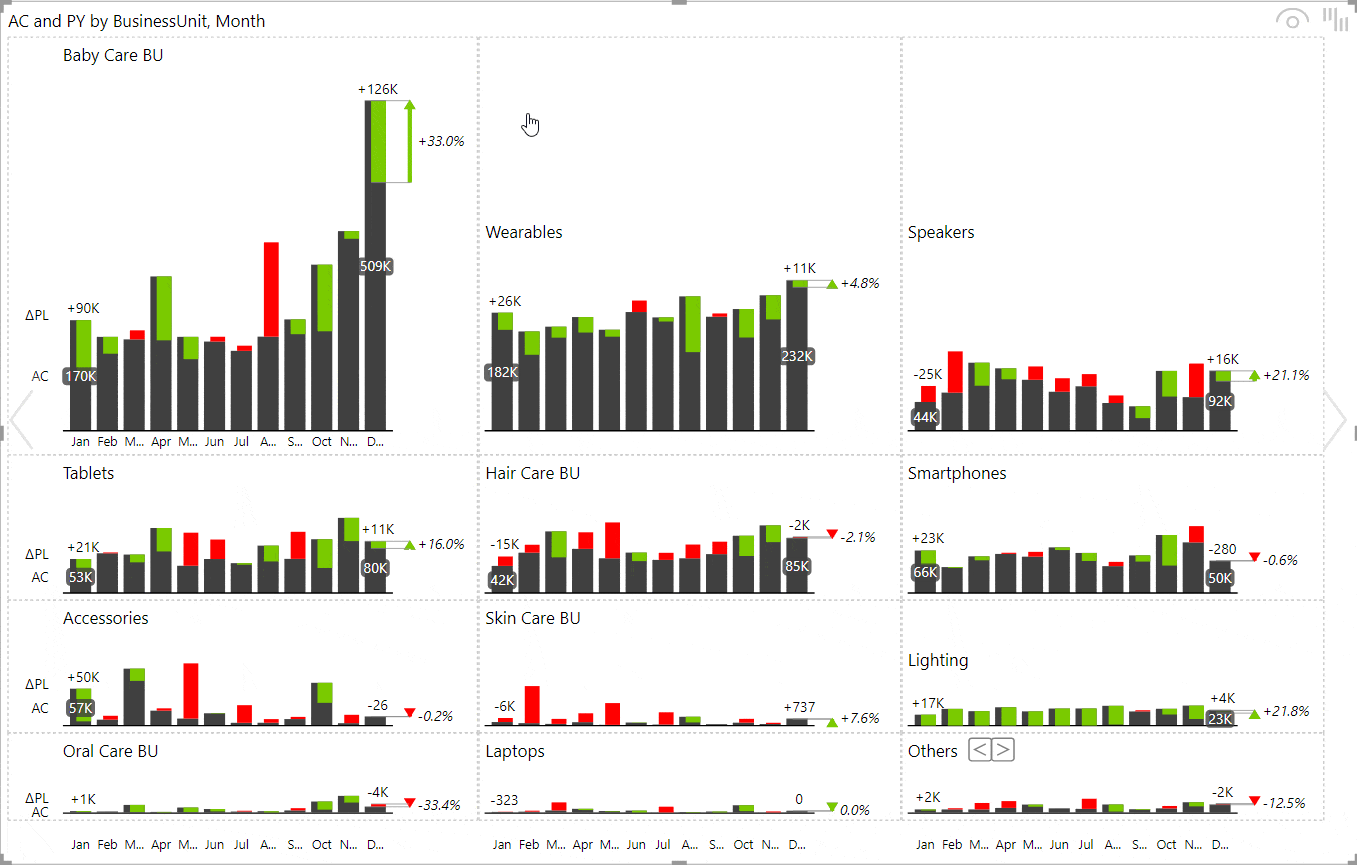
Small multiples have become extremely popular due to their ability to present a very high-level overview of your business.
With a click on the title, you could explore the details by zooming a single chart. In Zebra BI Charts 4.6 this "zoomed" chart supports page tooltips as well.
From now on, your users can:
Dynamic PL = SWITCH('Comparison scenario'[Selected comparison], 1, BLANK(), 2, [PL])
If you want to dynamically switch the display of actual performance compared to the Plan vs. compared to the Previous Year without dealing with the complex setup in Power BI, then this is for you.
With the 4.6 version of Zebra BI Tables you don't need to mess with bookmarks and doubled and hidden visuals anymore! Simply add the 3 scenarios to your table and get an option to switch between two comparisons out-of-the-box.
This was one of the most requested features — we hope you love it. 💛
Consistency in business reporting is especially important in large rollouts across organizations with hundreds or thousands of users.
With this release, you can now define your own labels all variances, absolute and relative, between all possible scenarios and standardize them across the whole organization.
Your new custom labels will appear on charts and tables by default, but the end-users can still rename them afterward directly on a visual if needed.
Specify labels in your JSON theme
Zebra BI will automatically replace all existing labels with new ones from the theme
Watch our step-by-step webinar tutorial and learn how to use small multiples in your Power BI reports and dashboards. A practical PBIX example is included!
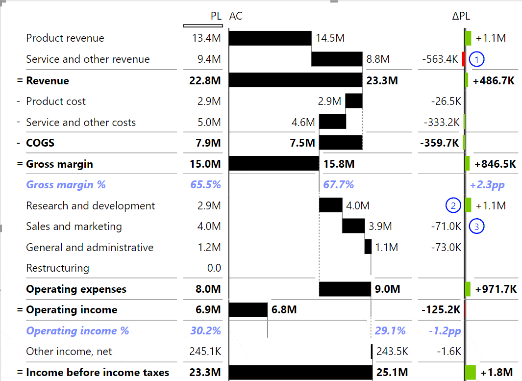
In a situation where you have a lot of cost elements in your P&L, it makes sense to invert the meaning of these items so that they get subtracted from the Revenue.
For example, if you’re showing Revenue and Costs within the same table, it has a completely different meaning whether the Revenue is growing versus if Costs are growing. Growing costs have a negative contribution to the end result.
How To Invert Items
Click on the top line item (e.g. "Operating expenses") and select "Invert all children".
That command will invert all items in that particular group. Zebra BI will automatically change the colors to properly signal a positive versus negative contribution.
We all know that not all charts are appropriate for all data sets. In some cases, it can be even wrong to use a certain chart type (e.g. using a waterfall chart to show non-additive measures such as profitability %).
Many of you have been advocating for the ability to select the type of charts that you want your end-users to choose from and hide the rest.
This is now finally possible!
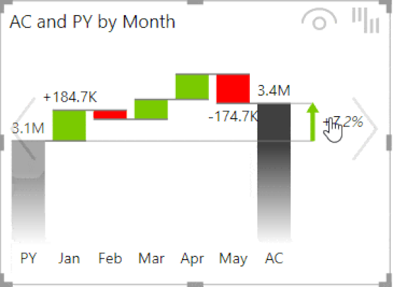
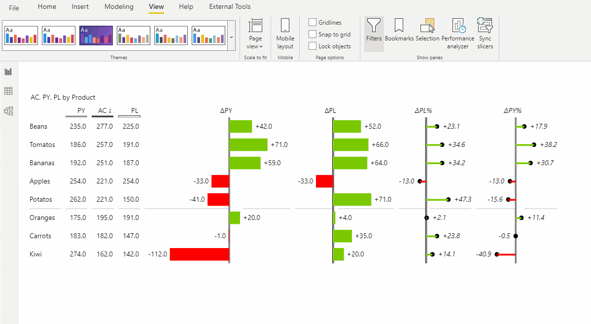
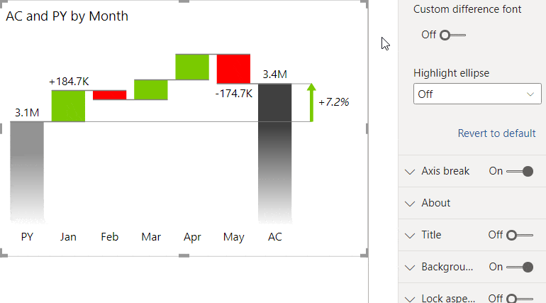
Variances are extremely important when it comes to the interpretation of data. If you want to emphasize a certain variance, you can now use a highlight ellipse or change the font to make it larger or in a different color.
💡 Difference highlights are completely dynamic. You can change the chart type and they will still stay visible.
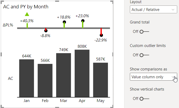
Since comparisons are one of the key elements in any business report, Zebra BI now offers you new options for displaying them.
You can choose whether you want to display just your base or also your Previous Year or Plan in the overlapped column.
You can also decide to display them as a column with a marker on top of that.
Enjoy many settings to customize the design of combo charts: marker density, marker size, droplines, line styles, colors, etc.
Check the new options under the Combo chart group of settings.
We have also redesigned the behavior of the secondary axis in combo charts so that both data series are always rendered on the same 0 X-axis, even if one of them has negative numbers.
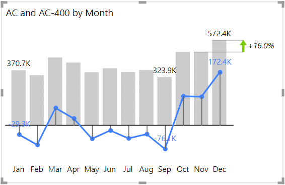
This is very useful if you want to show data labels also on your comparison scenarios.
Improvements
Bug fixes
Improvements
Bug fixes
If you're already using the AppSource version of Zebra BI (version 4.0.0 or higher), then your Zebra BI has already been updated via the Microsoft's AppSource marketplace automatically. You're good to go!
If you're using an older version of Zebra BI (e.g. 3.x.x or older), then this might be a perfect opportunity to update your Zebra BI! When ready, just shoot us an email at support@zebra.bi and we'll help you migrate to the latest version.
Haven't tried Zebra BI before? Opt in for our 30-day free trial here: