 September 8th
 February 22nd
Zebra BI in 2016 - A Year in Review
2016 was the year of the product releases. Well, heck, so were the rest of them 😉 And so will be the next one. We can't help it, we're the product people.
But before we dive into product releases, let us share a few stories that we'll remember best from 2016.
Thank you for your trust!
First of all, our customer base grew 94%, so we thank every one of you for laying your trust in us. We're especially proud that not only commercial businesses like pharmaceuticals, manufacturing, financial, media, etc., but also non-profit organizations use our tool. Organizations like Amnesty International or the Salvation Army and even government bodies like SFGOV (San Francisco City and County). A full list is available here.
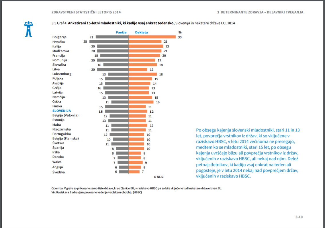
And not just for financial management. For example, the National Institute of Public Health in Slovenia uses Zebra BI to produce their key annual publication on the state of public health. A document that has 572 pages and, thanks to Zebra, now also twice as many charts that help ordinary citizens understand public data on an important aspect of their life.
Does it work under Chinese settings and should we display charts right-to-left?
By the end of 2016, our users came from 45 different countries from all 5 continents. Which brings a few specific challenges. We have to make sure that it works with any regional settings possible and in any language possible.
Since Excel uses localized function names and has different and sometimes peculiar ways of supporting regional number formats, this is not an entirely trivial task...
So we might find ourselves installing Chinese language versions and regional settings to our test computers or even personal laptops, only to find out that we have no idea how to switch back to English ;). Or find ourselves discussing whether it's correct to show the charts under Hebrew or Arabic left-to-right or right-to-left (and again have no idea how to switch the Windows back to English) ;).
Can I use 637 charts on the same worksheet?
For us, Zebra BI is not just a product. It's the whole offering, together with the support and also education.
Most of the time we're able to handle the support requests quite fast, but once in a while, we hit a real challenge.
The case that will stick with us from 2016 is a report that had 637 charts on one single worksheet. And these charts were scaled. It actually works and this customer has it in production, refreshing it and distributing it to numerous end-users. But can we make it faster? We tried and at least partially we succeeded, especially in version 1.9.2, where small multiples perform 3 to 6x faster than before.
However, we'll continue to optimize for speed in the next year, so even extreme reports like this one can run amazingly fast.
CIOReview Award
Our efforts didn't go unnoticed by the media. In January we were recognized as one of 20 Most Promising Data Visualization Solution Providers for 2016 by CIOReview. This was additional proof for us that we're on the right track and that we should continue to try our best to enable our users to become data visualization and reporting superstars. 🙂
How? We started hosting regular webinars:
What's your favorite webinar?
We did 8 of them this year. The top 3 most popular were:
- Practical Rules for Visualizing Budgets, Plans and Forecasts in Excel
- Automating Excel reports with PivotTables and slicers
- The Definitive Guide to Waterfall Charts
In case you've missed any of them, here's the link.
Which one is your favorite?
Top 5 Zebra BI features in 2016?
OK, as promised, back to the product features! We started the year with version 1.5.4 and ended with version 1.9.2. That's a lot of new features, improvements, and bug fixes!
Here's a list of our top 5 features from 2016 in random order:
#1 Highlighting

All charts with horizontal axis now support difference highlighting. Line charts, column charts, all variance charts and even the waterfall chart.
All it takes is 1 click and Zebra BI will add the highlight and calculate the difference automatically. If you're sensitive to the details, you'll notice that we're to make it smart, so that the user experience is better: in line or column charts, the difference is calculated between the last and the previous column by default, while in waterfall charts, the difference is calculated between the last two fixed ("results") columns. In 2017 we plan to add this feature in all vertical charts as well.
Furthermore, it is now easier than ever to highlight single values (we call this the "single highlight" or the "category highlight". This one works in all Zebra charts. The animation above says it all.
#2 SharePoint

In May we released Zebra BI for SharePoint. Now you can create your Zebra BI dashboards in Excel, publish them to SharePoint with 1 click and then share them with all users in your company via a standard web browser.
What's even more exciting is that you can create mobile dashboards so you can show them off wherever you are.
To see videos and animations of everything you can do with Zebra BI for SharePoint, click here.
#3 Axis break

In version 1.9.2 we added a slightly controversial, but highly useful feature. Why controversial? Because it breaks the rules of IBCS standards. Rolf Hichert is a strong opponent of breaking the axis, ever.
Why useful? Because with this feature, a lot of your waterfall charts will become much more meaningful. Now you won't have problems anymore in situations when the changes are too small compared to the totals. You can use waterfall charts on any data - no matter how small the changes are.
In the animation above you can see that all it takes are 2 clicks to insert the axis break in a waterfall chart.
#4 Stability + speed!
This is the one that everyday users of Zebra BI and Excel will appreciate the most. In version 1.9.2 we significantly improved the speed of some crucial Zebra BI functions. You will especially notice this when working with a lot of scaled charts (like small multiples, etc.) when switching between sheets, copying sheets, ...
We also continue to work on the stability of Zebra BI. In 2016 we fixed a lot of bugs, most notably the one that caused Excel 2016 64-bit to crash. This one took months to fix (we had to rewrite a large portion of the code) because of some undocumented changes in the last version of Excel.
#5 Styling
Changing Styles is now easier than ever. You can easily undo the changes you made so those accidental or unwanted changes are a thing of the past. Another much-requested feature was the ability to reset the prepackaged Zebra Styles back to their original settings.
We also added a new "Apply" button in Reporting Standards section of Zebra BI ribbon. With this button, you can apply the selected style to all charts on the current worksheet or the entire workbook. See how easy it is:

Over to you
What was your favorite new feature of Zebra BI in 2016? What is the number one feature that you think is missing in Zebra BI and would like to see introduced in 2017? Let us know in the comments!