(1:18) Example of a dashboard in Power BI
(3:28) Including forecast data in reports
(4:55) Presenting more data in detail: Multiple charts
(7:04) Hierarchical display of data
(8:27) Income statement example
(11:27) Recap of how to use Zebra BI visuals in Powe BI
(14:32) Use of variance charts
(15:52) Showing the comparison in the chart
(17:19) Sorting
(17:39) Displaying the grand total
(19:07) Adding the region
(19:45) Group vs. category field: Chart type
(20:34) The positioning of the grand total
(21:48) Switching between different type of charts
(24:44) Editing style
(26:20) building the hierarchy
(28:02) YTD – Year to date
(28:51) Adding a period calculation
(30:05) Managing Slicers
(31:24) Presenting YTD
(32:12) Editing the opacity
(32:39) Adding Forecasts
(35:40) Switching visibility of charts: Bookmarks
(37:46) Inverting colors - basic
(38:44) Creatin Income statement
(38:58) Preparing the data
(39:43) Creating the hierarchical chart
(40:42) Turning off the sorting
(41:08) Inverting the colors and specifying the results in Income statement
(43:15) Managing comparisons
(44:26) Zebra BI resources
(45:31) Q & A
Share this
Ready to start uncovering actionable insights from your data?
Explore Zebra BI for Office and Power BI, or start a trial instantly and test our tools on your data. You can also contact us to help you build your first test report and create a custom package for your business.
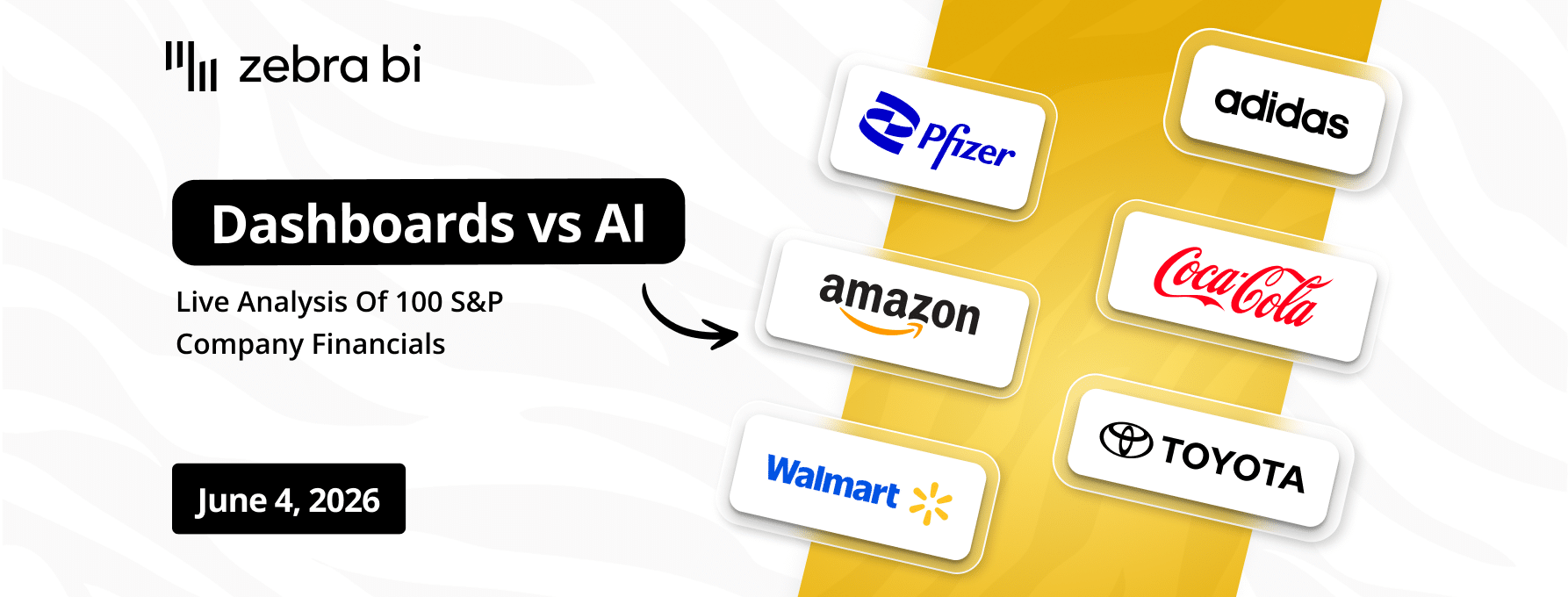
Finance teams are debating dashboards vs AI. We're not going to debate. We're going to show. On June 4, we walk through 100 real company P&Ls (Nike, Tesla, Pfizer, Walmart, Amazon) across 6 industries and 6 years of public financial data, live, in a single report. See what great financial reporting looks like at scale.
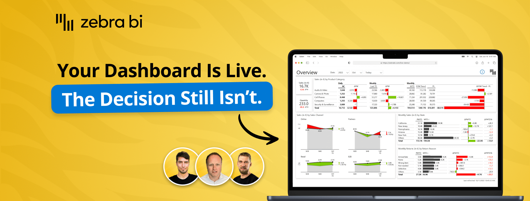
Your reports are ready. Decisions aren't. Learn how to close the Last Mile - live Power BI build, real client case, actionable framework. Free, 60 min.
Your reports are ready. Decisions aren't. Learn how to close the Last Mile - live Power BI build, real client case, actionable framework. Free, 60 min.
Join our live webinar to learn how to use Zebra AI to turn raw finance and business data into executive-ready dashboards that help Controlling & FP&A teams explain performance.
 September 8th
 February 22nd