 September 8th
 February 22nd
Changelog
Zebra BI Charts for Power BI
- Drag and drop of fields in the data buckets not works reliably on Apple Mac
- We fixed a bug where parsing of a pivot table didn’t work in certain cases when subtotals were turned off
- We fixed some URLs in the add-ins
We have made the parsing of data in ranges more robust!
Until recently, inserting a column or a row before the source data range caused the add-in to display the wrong data because the data range didn’t get automatically updated and needed to be updated manually. After this latest improvement, we detect the changes in the data range and adjust them automatically, so your visualization remains intact.
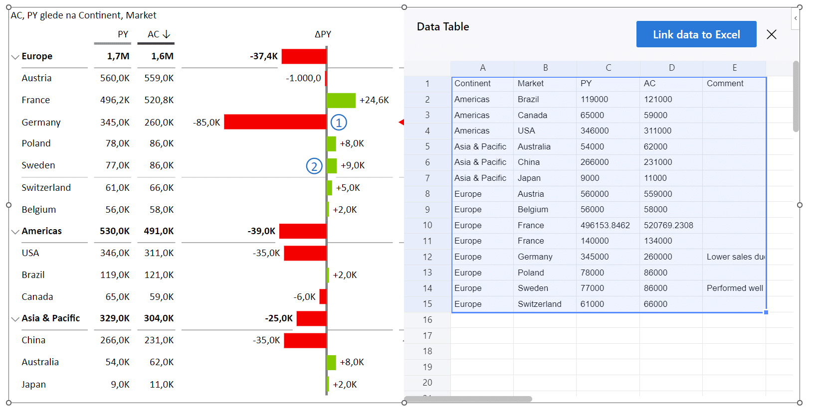
Data Linking from PowerPoint to Excel files on OneDrive
Until now, the so-called “data linking” between add-ins in PowerPoint and data residing in Excel worked only for Excel files on Sharepoint. We have boosted this feature by enabling you to link to the Excel files residing on OneDrive.
To link a PowerPoint add-in to the data in Excel on OneDrive:
- insert the add-in in PowerPoint
- select a chart in Chart Chooser that matches your desired end goal
- click on the “Link data to Excel” in the data grid
- find your One Drive file and select the desired table or range
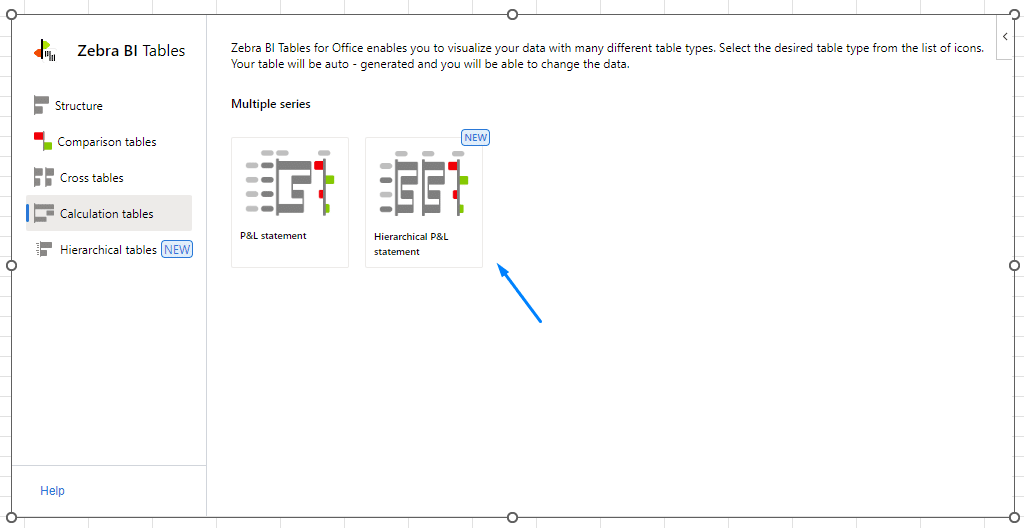
- The hierarchical P&L statement was added to the Hierarchical tables category in the Tables Chooser:
- We have polished the display of the logo in the global toolbar on the desktop version so it’s no longer cut off
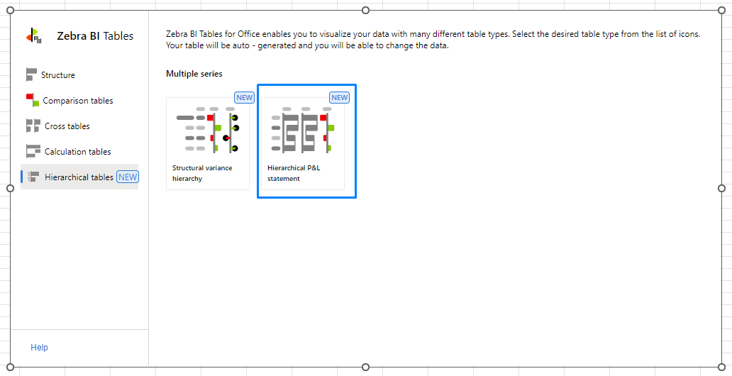
- Hierarchical Tables in the Tables Chooser
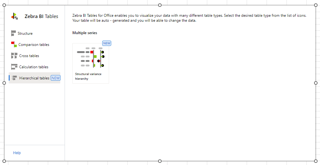
The Tables Chooser can be launched if you insert the Zebra BI for Office Tables add-in on an empty Excel spreadsheet. In the Chooser you will see a new section called “Hierarchical tables” where you can find a newly added “Structural variance hierarchy” sample table: Selecting it creates a new hierarchical table where you can see how the data is supposed to be structured for those types of tables if inserting them from a range or an Excel table:

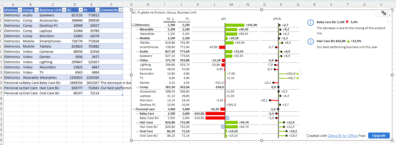
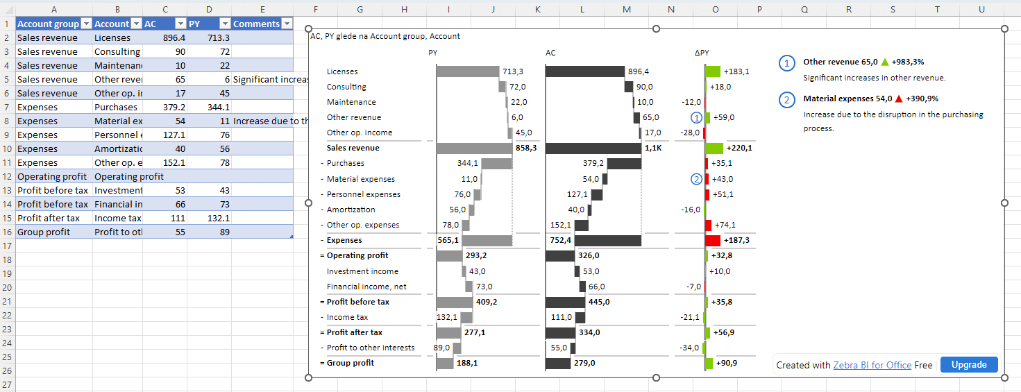
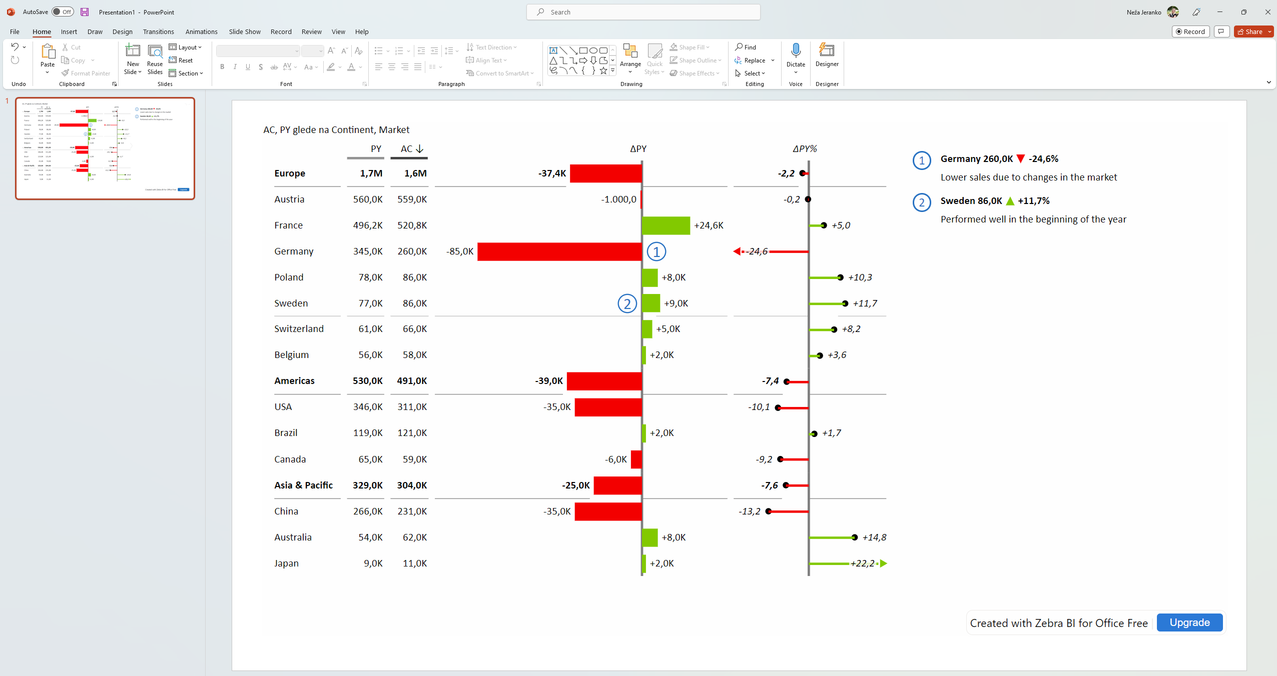
In the “Calculation tables” section we have also added the “Hierarchical P&L statement” sample table:
Which creates a nicely structured P&L table with comments:
 Selecting it creates a new hierarchical table where you can see how the data is supposed to be structured for those types of tables if inserting them from a range or an Excel table:
-
We’ve fixed the bug where the last row wasn’t parsed if you created a hierarchical table from a range or Excel Table
-
Upon reopening the Excel file with add-ins present, the Zebra BI toolbar is no longer visible in the top right corner until you click on the add-in and select it
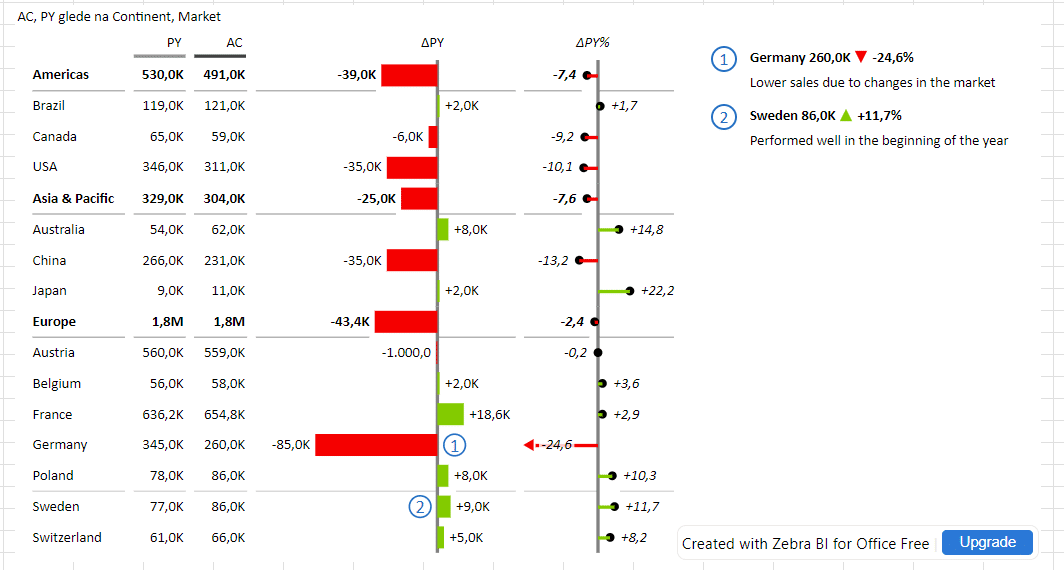
- Hierarchical table with comments
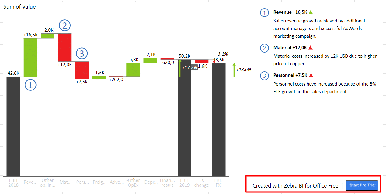
From this version onwards you are finally able to create a hierarchical table with comments both in Excel and in PowerPoint and take your reports to the next level.
To achieve it, we have added support for inserting a hierarchical table from both ranges and Excel tables, which unlocks several new features.
Up until now, the users were able to insert a hierarchical table in Excel only from a pivot table, however, since adding textual columns to a pivot table isn’t easy, those tables were usually without comments. At the same time, since PowerPoint doesn’t have pivot tables, hierarchical tables were not possible to create in PowerPoint at all.
Inserting a hierarchical table from a range or Excel Table:
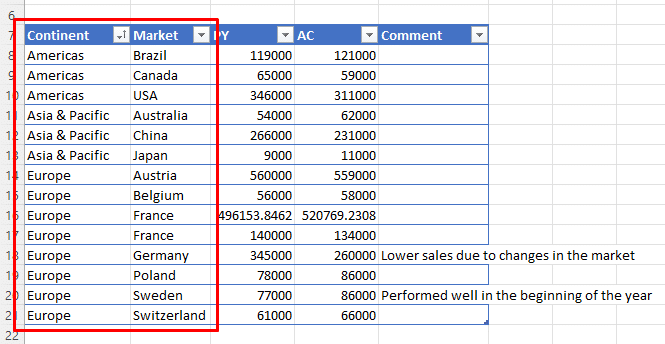
Step 1: Prepare the data
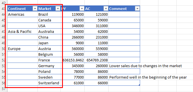
You can prepare the data in two ways. You can repeat the category names for the parent level like in this example:Alternatively, you can also skip the repeated parent-level names like this:
Don’t forget to add the comments to your hierarchical table, just make sure that the comments are positioned after your numeric columns.
Step 2: Insert the Zebra BI Tables add-in
The add-in will automatically detect that this is a hierarchical table:Creating a hierarchical table with comments in PowerPoint:
In PowerPoint, you can insert the data in the same format to the data grid:Alternatively, you can also link the data from Excel that is residing either in a range or in an Excel table.
Voila, a hierarchical table with comments in PowerPoint:

- For the Free license users we have slightly updated the watermark in the bottom right corner that it still allows interactions with the underlying elements
- Start a free 14-day Pro trial
We have added support for a free 14-day Pro trial. If you have a free license currently, you can click on any of the “Start Pro Trial” buttons in the add-in. You will be directed to a different URL where you can start your pro trial on your own.
- "Show units in" setting
The “Show units in” setting was added to the side pane in Tables and Charts add-ins. You can choose to display the units in the title, data labels or nowhere.
- Global toolbar
We’ve improved the user experience in our global toolbar by making it more intuitive. The gear icon for settings was split into two icons, one for data fields and the other one for general add-in settings.
- We’ve supported reordering of the data fields for multiple plans and forecasts feature that was missing from our last implementation.
- We’ve fixed the issue where the grand total in pivot tables broke the visual.
- Support for multiple styles in corporate branding feature
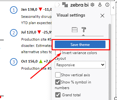
Our existing corporate branding feature supported one global style that was loaded every time an add-in was inserted to Excel or PowerPoint. We have improved this feature now by supporting multiple styles.Personal styles: users can now add their personal styles that will load just for them and won’t be visible to other users.
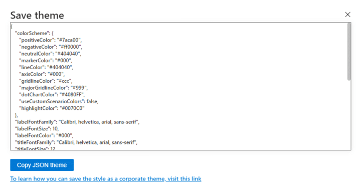
Global styles: each company can now have more than one global style that is visible to all users from the same company. One of those global styles remains the default one.To save the currently selected style, click on the Save theme button in the settings.
After that, copy the JSON code here:
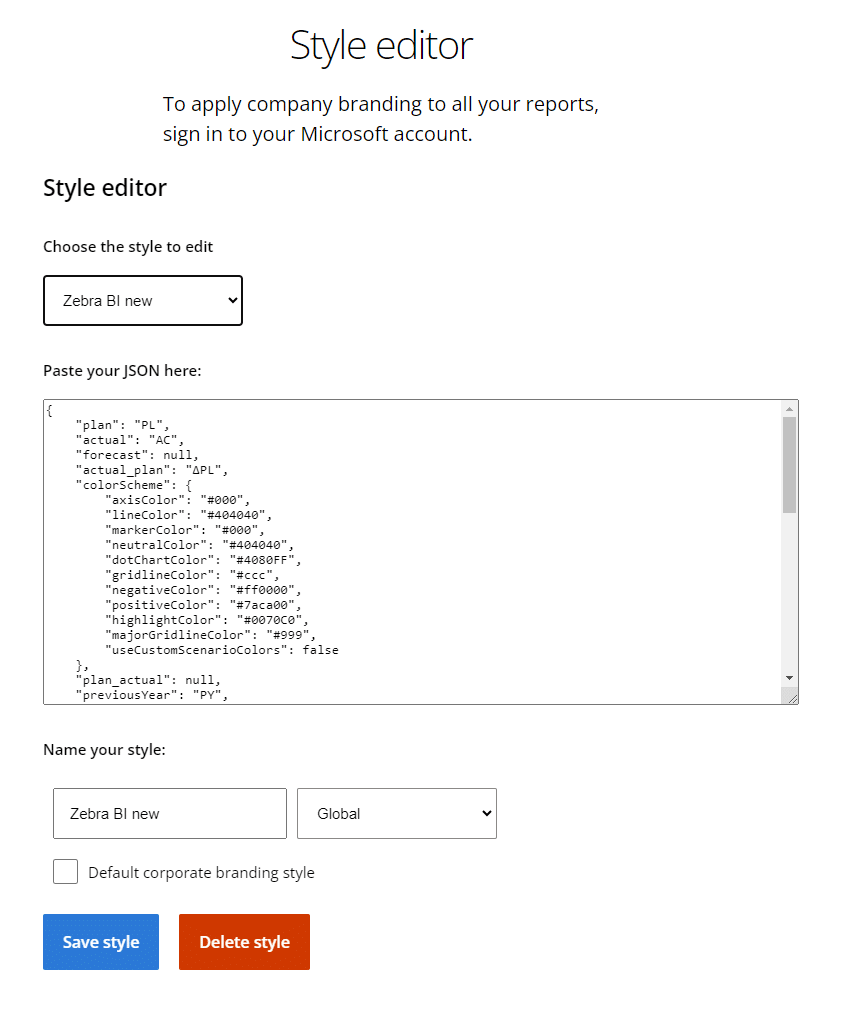
And paste the JSON code to the style editor on our website: https://zebrabi.com/style-editor/
You can choose the name of the style, set it as Global or Personal or set it as default. Here you can also edit or delete existing styles.
Finally, the style you have created can be accessed in the add-in’s settings in the Style dropdown.
Happy styling!
- Data parsing improvement
We have improved the parsing of dates from pivot tables so that they are now displayed in the correct format:
-
We fixed the bug where the comment marker positions reset to default after the source data table was updated
-
If the user selected a cell on the edge of the data range, the range wasn’t detected correctly. This is now resolved and the user can now select any cell in the data range when inserting the add-in.
-
Moving comment markers to a different position and closing and reopening the file caused the comment markers to change their position. This is now fixed.
- Adding additional measures
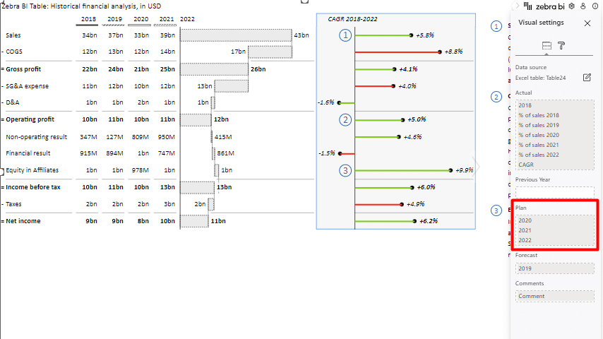
When using Zebra BI Tables in Excel you can now add up to 20 custom calculated measures to the Actual placeholder. It is a very popular feature on our Zebra BI Tables visual for Power BI as it gives you option to add all the data you need. To access this new feature, first add the additional measure to the data source. The newly added column will then appear in one of the buckets and you can drag and drop it to the “Actual” placeholder at which point it will start to behave as an additional measure. - Adding multiple plans & forecasts
Similar to the additional measures feature, we’ve added support for multiple plans and forecasts. You can now add up to 3 columns to the Plan and Forecast buckets and compare them for easier forecasting and planning processes.
To add the multiple plans and forecasts, add new columns with the data in the Excel spreadsheet. The columns will be added to one of the placeholders and you can drag and drop them to the correct buckets.
- We’ve fixed the bug where using the grand total setting caused the Zebra BI Tables add-in to go blank in some instances.
- Fixed some issue with non-signed in users.
- We’ve removed the limitation of only 4 levels in the hierarchical table created from pivot tables.
-
Fixed the issue where the toolbar wasn’t opening all the way and messed up the UX.
-
Some corporate branding bugs were discovered and fixed.
- Visual cross-filtering for interactive dashboards
With Office 2.0, Zebra BI became the first add-in on the market that enables visual cross-filtering on Excel dashboards. This brings the Power BI-like experience to all Excel users, removes too many slicers and filters on the page, and thus increases the dashboard's visibility.The feature works when pivot tables are your data source. After you have your data in one or many pivot tables, create slicers connected to each. Then, insert the Zebra BI add-in (either Zebra BI Charts or Tables) into the pivot table data. The visuals will detect slicers and connections to pivot tables automatically, so no additional settings are needed. Select any data point in the visual element to trigger filtering. Follow the step-by-step instructions.
- Company branding in all your reports
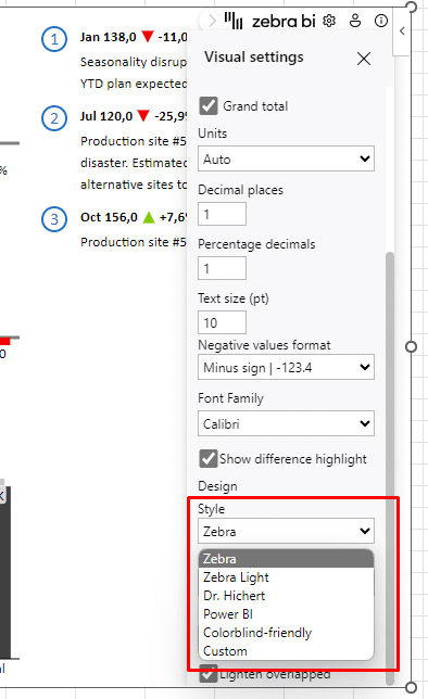
Zebra BI for Office offers several style options: the default (IBCS compliant), the one for people with color deficiencies, the custom one, etc. From now on it is possible to apply the company theme to all your reports & presentations.To achieve that, only one creator from the company needs to set the desired colors by going to Settings > Style > Custom. Once you align all the colors, you will see a blue button on top of the settings: Save theme. Click on it and it will generate a JSON format of the theme for you. Copy the code and paste it into the style editor. Save the changes. Now everybody in your company who creates reports using Zebra BI in Excel or PowerPoint will automatically match your company branding. See step-by-step instructions.
-
Support filtering across Excel add-ins
-
Rendering of Calibri font on macOS
-
Fixed the disappearing chart type setting in the Tables
-
Bold format and result on row get applied to all the columns
-
Hide column setting was added
-
We are now able to parse pivot tables in additional languages (German and Spanish)
-
When the add-in was updated PL was reassigned to PY (this is now fixed)
-
Fixed some bugs with auto assigning of the fields
- We’ve fixed the UI glitch where the last row in Zebra BI Tables was cut off if the filter was set to a single group
- we’ve improved the license-checking process so that if you have any of the paid licenses, the add-in will check for your license immediately after sign-in and won’t display the erroneous “Continue with a Free license” prompt.
- Automatic data field recognition
With the first version of the automatic data recognition, the add-in will recognize your actuals, previous year, plans, and forecasts correctly from the column title. Now the add-in distinguishes between column titles and assigns them to the correct placeholders. For the automatic recognition to work, you should name the measures with the following titles- AC: “Actual”, “ACT”, “AC”, “Ist”
- PY: “Previous year”, “PY”, “Last year”, “LY”
- PL: “Plan”, “Budget”, “PL”, “BU”, “BUD”, “Target, “TGT”
- FC: “Forecast”, “FC”
- Comments: “Comment“ “Comments“ or any text column
- Any text column can now be assigned to the Comments placeholder. It no longer needs to be named with Comments or Comment.
- Fixed the bug where adding a comparison to the pivot table after the add-in was already inserted, didn’t result in the calculation of the variances as it should.
- Edit data source functionality for Excel tables and pivot tables
In this release, we’re upgrading the feature for editing data sources to enable you to switch between all three different data sources (cell ranges, Excel tables, and pivot tables) effortlessly!
Open the settings panel, go to the fields pane, and click on the edit data source icon. In a resulting pop-up, you are now able to switch between all the data sources in your spreadsheet with a simple click.
- After inserting add-ins from the Table Chooser, your data will now be converted automatically from a range to an Excel table. This is a much better way because any change to the dummy data (new column, row, or new data) will be visualized automatically.
- We’ve removed the restriction of a maximum of 2 comparisons in the Zebra BI Tables add-in. Now you can add the third one and enjoy the full spectrum of AC, PY, PL, and FC comparisons.
- We’ve removed minor glitches in the behavior of the title settings dropdown where the font size, color, and family were not as responsive as they should be.
- When the comments in the PL and FC columns are edited, the table doesn’t lose formatting anymore.
- Edit data source functionality
From now users can edit the data source range directly on the visual without having to insert it again for each change. This works when the data is added in cell ranges. To access this setting, simply open the settings pane, go to visual settings, and click on the edit icon next to the data range. This will open a pop-up window where you can enter a new desired range.
This will allow you to expand your data range, for example, to add a column for a new measure or add more rows to your table.