September 8th
 February 22nd
To make your report successful, it is crucial to first understand the needs of the end users. This lets report creators know which questions should the report answer and which problems should be addressed.
Since this is often easier said than done, this customer story focuses on the importance of report prototypes & wireframes. The iteration process and continuous feedback collection are crucial components leading to efficient reports and effective meetings.
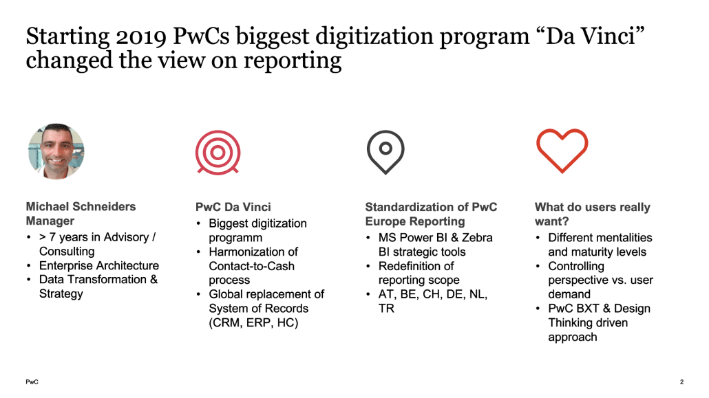
Hear it from Michael Schneiders, Enterprise Architecture, Data Transformation & Strategy at PwC, who shared how his team used the design thinking process to understand what their users wanted, built wireframes, and went through multiple iterations to successfully prepare guidelines for report developers.
Michael has been with PwC for over 4 years and leads the data transformation & strategy team. They were heavily involved in the DaVinci program which was the biggest digitization program PwC ever did. It had two major goals. The first one was Europe-based and related to the harmonization of the contact-to-cash process. The second was to replace the given system of records (CRM, ERP, and HC) on a global level.
The first goal was related to the standardization of PwC Europe reporting. After some research, the team decided on Microsoft Power BI together with Zebra BI custom visuals as strategic tools. To truly accomplish their goal, they provided all employees at PwC with a license for Zebra BI, so that it can be used globally on any report.
By changing the processes and technology, the team wanted to redefine the reporting scope and harmonize reporting on the most important reporting dimensions like client, business unit, engagement, and further dimensions on the European level (Austria, Belgium, Germany, the Netherlands, Switzerland, and Turkey).
During the period of changing processes, technology, and reporting scope, the team was looking for the best approach to tackle this. One of the biggest challenges was figuring out the real users' needs.
In a large organization like PwC, different territories have different requirements. For example, larger territories like Germany and the Netherlands already had a mature reporting organization and had different mentalities in place as opposed to smaller territories like Austria or Belgium where reporting demands are different. To illustrate, in the Netherlands, the need for diversity reporting is much more pronounced than in Switzerland.
Additionally, during feedback collection on the old reporting, the end-users would say that those reports tend to contain a lot of data, but in the end, they were looking around for data that they actually needed. So another important input for Michael and his team was to ensure that with the updated reporting system, users' perspective is put in front.
To determine how future reports should be designed, they used the PwC Best Experience Technology approach. It is a framework based on the Design-thinking approach. This refers to an iterative process teams use to better understand end-users. This often results in challenging predefined assumptions, redefining problems, and creating innovative solutions based on numerous prototypes and wireframes.
To accomplish optimal outcomes, this framework is set into two spaces:
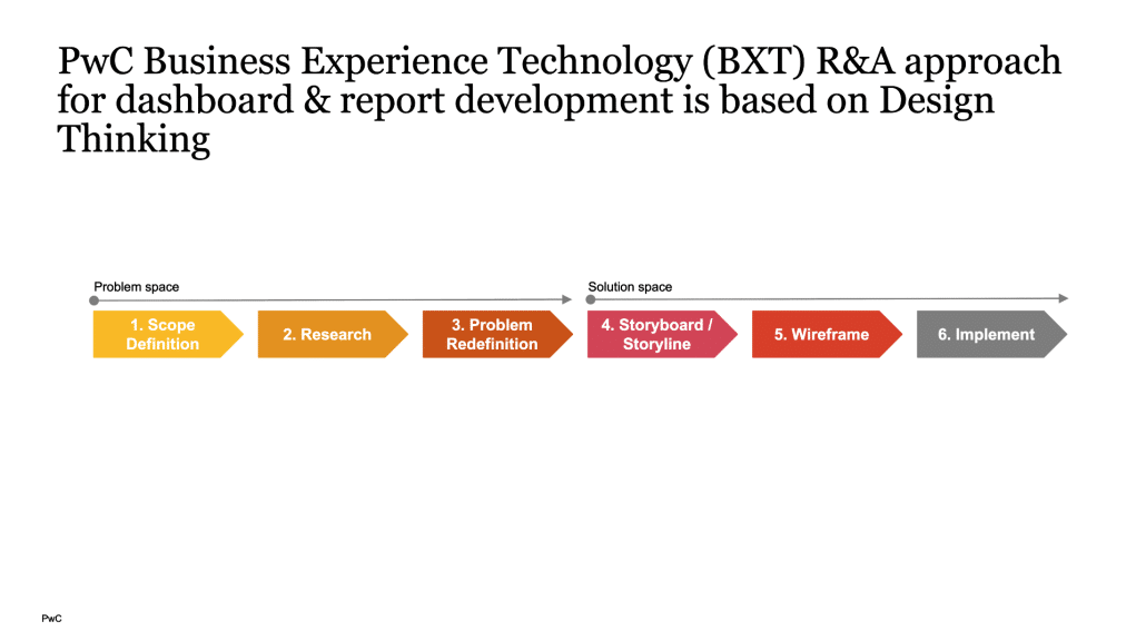
At the beginning of such a project, it's very important to define the scope of it. It will allow you to really understand the analysis's focus.
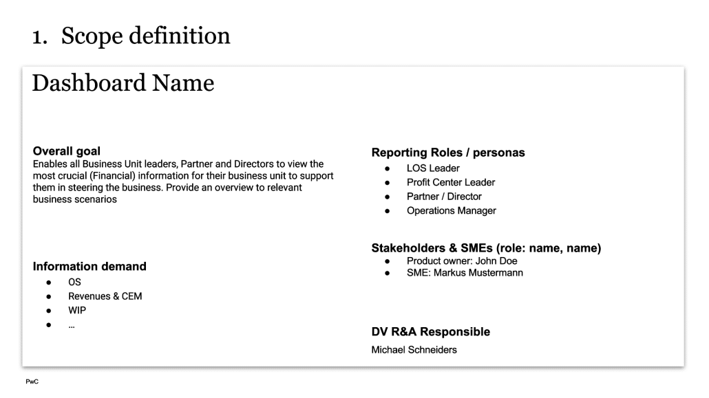
Michael's team began with basic information that could fit on one page, referencing high-level inputs. This included: the dashboard's goal, the main users, the product owner, the list of subject matter experts (SMEs), the main responsible person, and those behind the development wheel.
2. Research time
During the research phase, they conducted several interviews with SMEs coming from different departments, such as IT, business, and controlling, and various territories across PwC Europe. This way they made sure that different points of view were considered and different demands were included.
After giving them initial information and presenting the goal to ensure common understanding, it was very important to let the interviewees present themselves. They shared information about their job role, responsibilities, and how they typically use the existing dashboards.
Michael's team learned that instead of directly asking 'What data do you need?' or 'What is the information you want to see?', you have to use a different approach. It's better to ask questions like:
Such questions leave you with a much better understanding of the actual usage of the dashboard and the needs the viewers have. Only after understanding these, you can proceed with asking more specific questions such as which data is being used, what is the frequency and what kind of functionality are they expecting.
On average they did pair report interviews with 25 SMEs, and they had a huge list of business questions. This allowed them to really understand which demand came from which perspective.
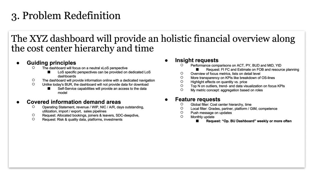
3. Problem redefinition
After thorough research, the team had enough information to redefine the dashboards' purpose:
Having all of this listed allowed the team to understand the real users' needs. Since the feedback was collected based on extensive interviews with people from different departments, it led to a really clear problem redefinition.
They aligned it again with all SMEs and got the final buy-in from everyone: the management, IT, business users, and controllers.
Only when you really understand the problem, you can start with the solution.
4. Create a storyboard and storyline
The PwC team met in Frankfurt to come up with a storyboard and storyline. The main purpose of the workshop was to understand the reporting objectives and which business questions would derive from them based on different perspectives (sales, operational, client, etc.).
This was a good approach because it allowed all teams to work together and align in person on which functionality to use in which area. For most of the questions, it was more a confirmation of the interviews they did in the previous phase. However, it was also beneficial as they could ensure the right demands were met and the dashboard contained the elements the users asked for. In the end, the team fully understood which parts were needed during dashboard development.
5. Preparing data landscape & wireframes
This led them to the creation of the first page which covered the most crucial information for everyone. It contained all the data users wanted to see when opening the dashboard. To continue from there, viewers had 2 options. The first one was to continue the predefined path created based on the value chain of how engagement management reporting should look. However, there were also shortcuts on the first page enabling report users to go directly to the detailed pages they were most interested in.
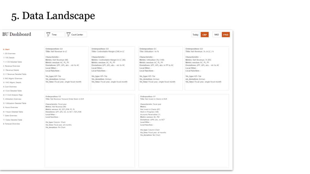
They defined page by page and tile by tile which data should be displayed where. They offered a broader story but also filters so people could immediately understand how they could filter the data. This allowed them to also include some new functionalities like job-to-date and engagement-to-date. Besides the usual year-to-date or fiscal year-to-date, this was something completely new. For the first time, it was possible to analyze the performance of an engagement from the beginning of it until a certain period. This is especially useful for longer engagements like audits that sometimes last even longer than a year. This really helps users to understand the performance in the long run.
From my own experience – when you show this to the users it’s very hard for them to understand actually how all of this will look like in the end and it’s hard to get buy-in.
Because of so much information, this was the point when wireframes became crucial. Michael’s team at PwC used Power BI with Zebra BI visuals and Adobe Experience Designer. The page from the previous image is now displayed here as an engagement one-pager with crucial information. The benefit of a wireframe like this is that before full implementation, they could discuss with stakeholders if this matched their needs. They needed multiple iterations to achieve the final structure.
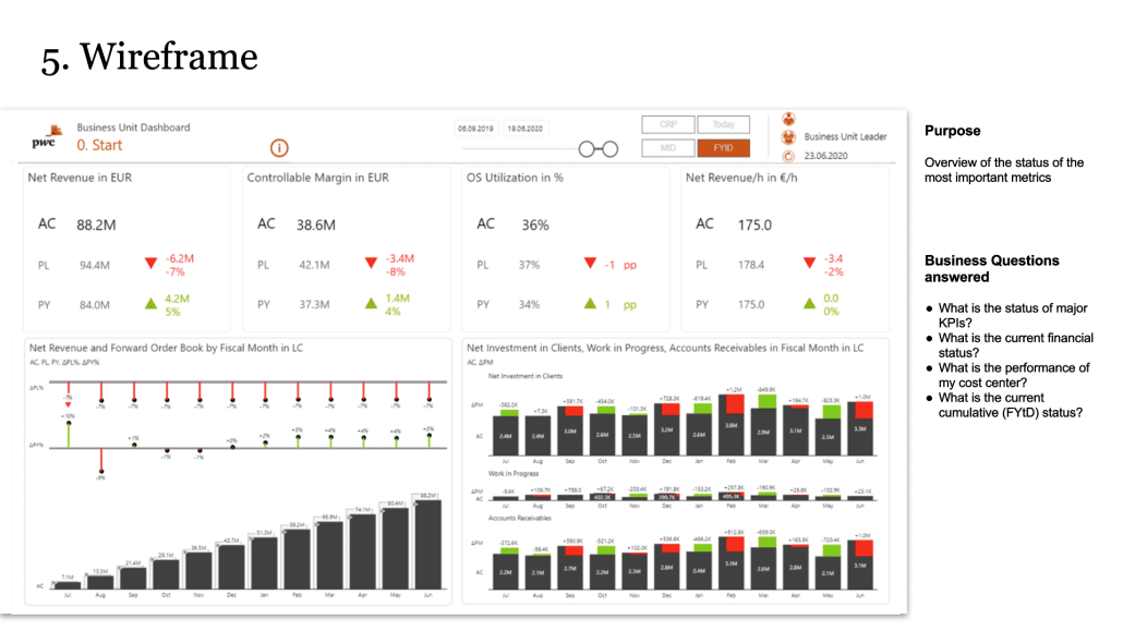
During the process, they learned that the preferred way of ordering data depends on the person looking at the report. They went through several iterations of wireframes and corrections. For example, in the first update, they redesigned the data used. The second proposal focused too much on the past so they also added some forecast information to the third version. After aligning several iterations, they reached the middle ground for everyone.
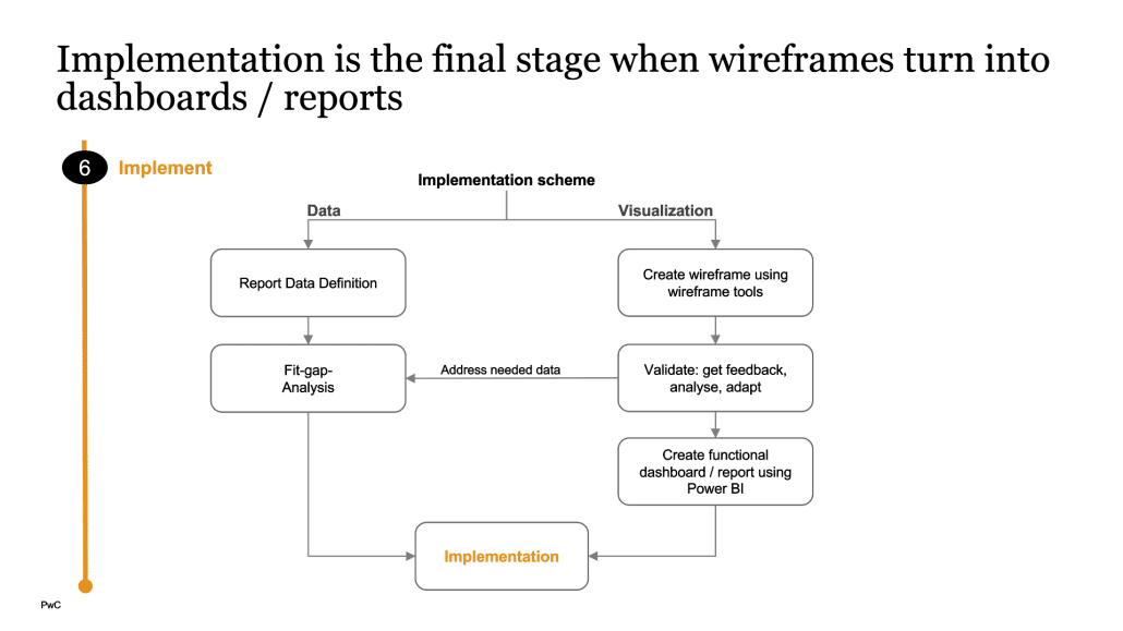
6. Implementation
With the final wireframe being confirmed, the dashboard went into live implementation. Because it considered all user needs for different departments, the team has gained huge user acceptance and this has become the reporting norm across all areas of the firm and all territories.
Since this is a long process with many steps and many people involved, Michael prepared a short list of recommendations to follow to reach the best outcome:
Ready to start building reports that people actually use?