Share this
 September 8th
 February 22nd
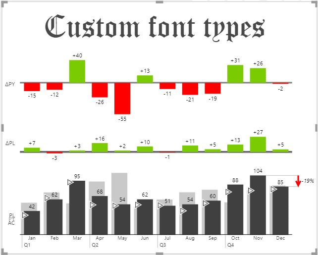
Before we dive into specific updates, there's a special announcement we'd like to make: all Zebra BI visuals for Power BI now support custom fonts!
Gone are the days when you wanted to use your very own fonts but they weren't supported by native Power BI. Whether it is to align with your company branding or simply because you like to use extravagant Gothic fonts like the one below, this news is for you. 💛
All fonts can be imported by a custom JSON theme.
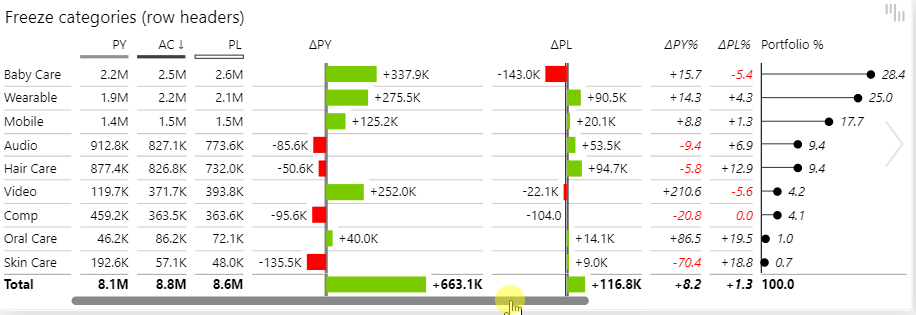
If you freeze a first column or row headers, it locks them into place. This is very practical for use with data-heavy spreadsheets, where you can freeze header row to make it easier to read your data.
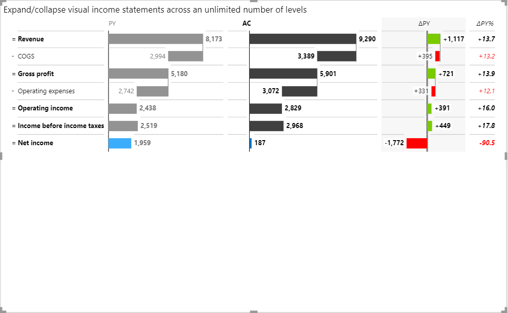
This feature is our favorite from this update and it's easy to see why. Hierarchical charts are quite a challenge in data visualization because of the scaling issue with higher levels on the hierarchy being much larger than all other levels below that.
But not anymore. We found a more natural way for you to display the contribution of each level lower on your hierarchy.💡
Here is an example with a vertical waterfall chart. As you can see, it makes it very clear to understand how each business unit contributes to the total bottom line of each division:
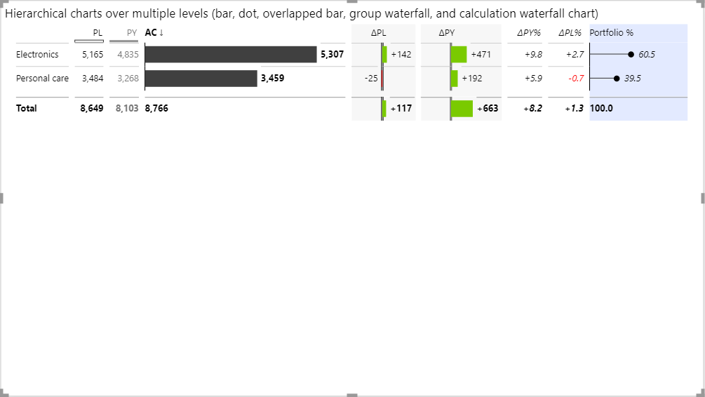
This solution works especially well in P&Ls (or so-called income statements). In a hierarchical P&L, you can simply expand certain rows, for example, revenue, and understand that revenue comes from product and service revenue:
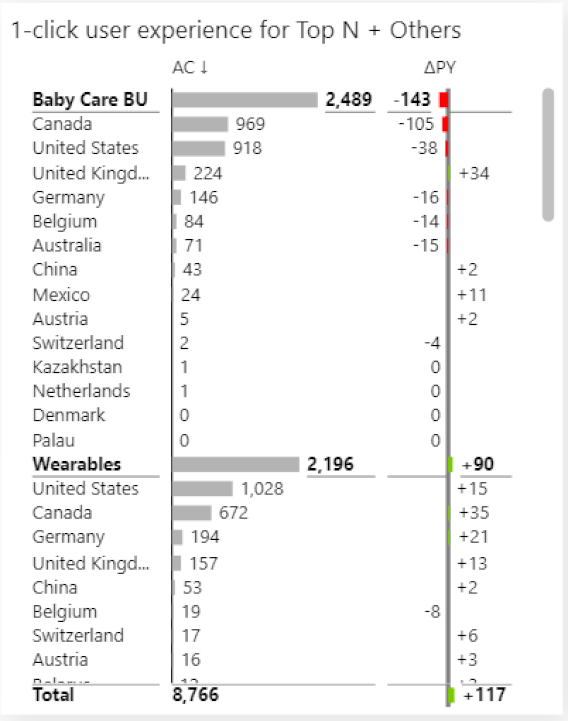
Filtering tables with the Top N feature is now even better. We made it a lot easier for you to change the number of Top N elements you wish to see!
This feature is rolled out across all hierarchies. In the example below, you can see how to display the top 5 countries within each business unit and get a much more actionable report:
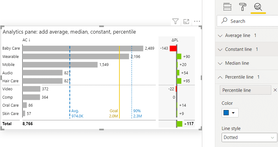
Analytics pane is one of those Power BI features that too often gets overlooked but is actually hiding some useful powers. It enables you to simply add certain calculated elements, i.e. average, median, constant, and percentile to your tables. You can for example set the benchmark and it will be displayed on the table (see the yellow line below):
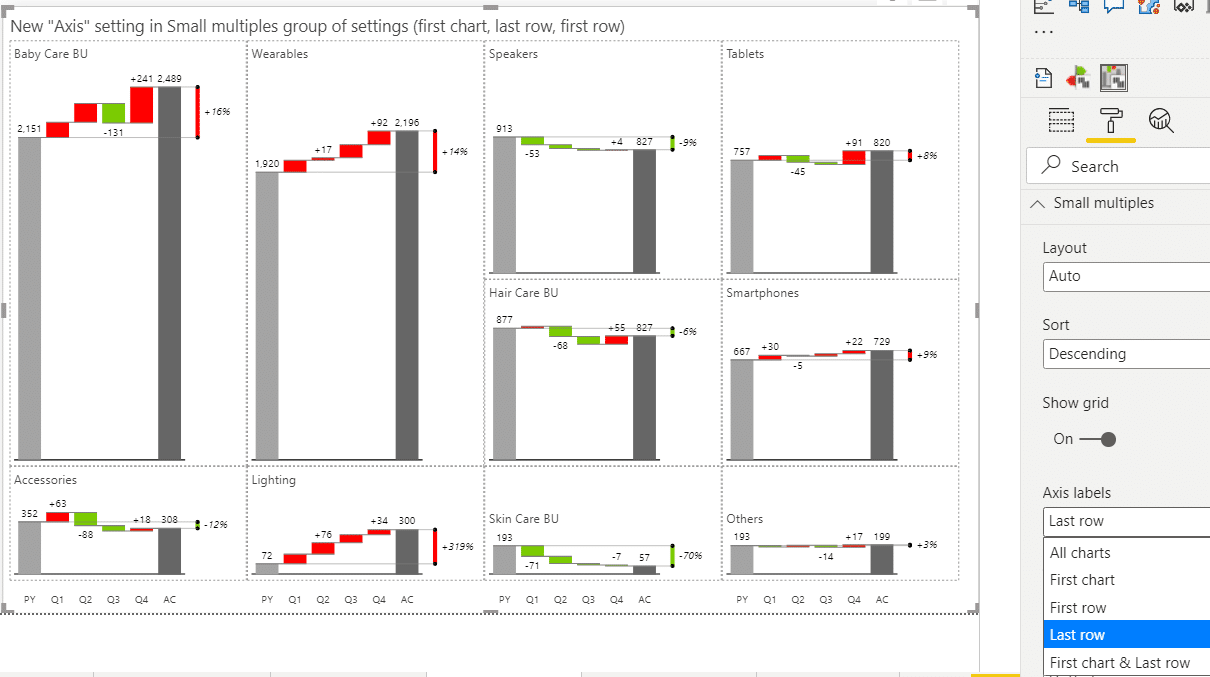
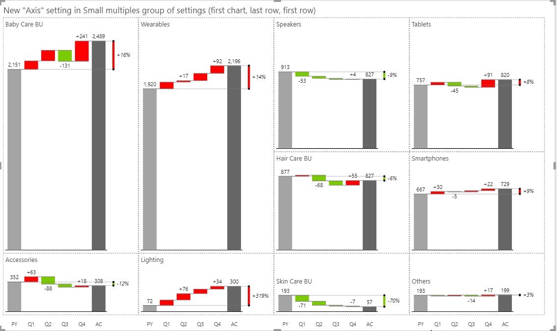
Our small multiples are already quite advanced and follow a minimalistic concept, however, with this version we’re further improving their legibility.
You can now control the density and the number of axis labels.
This is important because in a typical small multiple there can be a lot of redundancy in data labels. Now we’re giving you more options, i.e. to display only labels in the first chart, only on the first row, or on the last row only. See the example below:
From now on you can change the number of charts displayed with one simple click. Even your viewers can increase or decrease the number of charts.
P.S. When you change the number of charts, everything else is still automatically calculated in the Other chart.
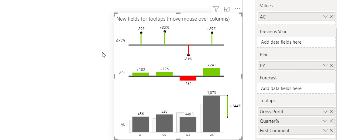
Tooltips make reports more understandable for people who read them. Period.
From now on there are additional data fields in your data tooltips. Use them wisely and when your users hover over certain values, they are going to see additional information for each data point, even text comments!
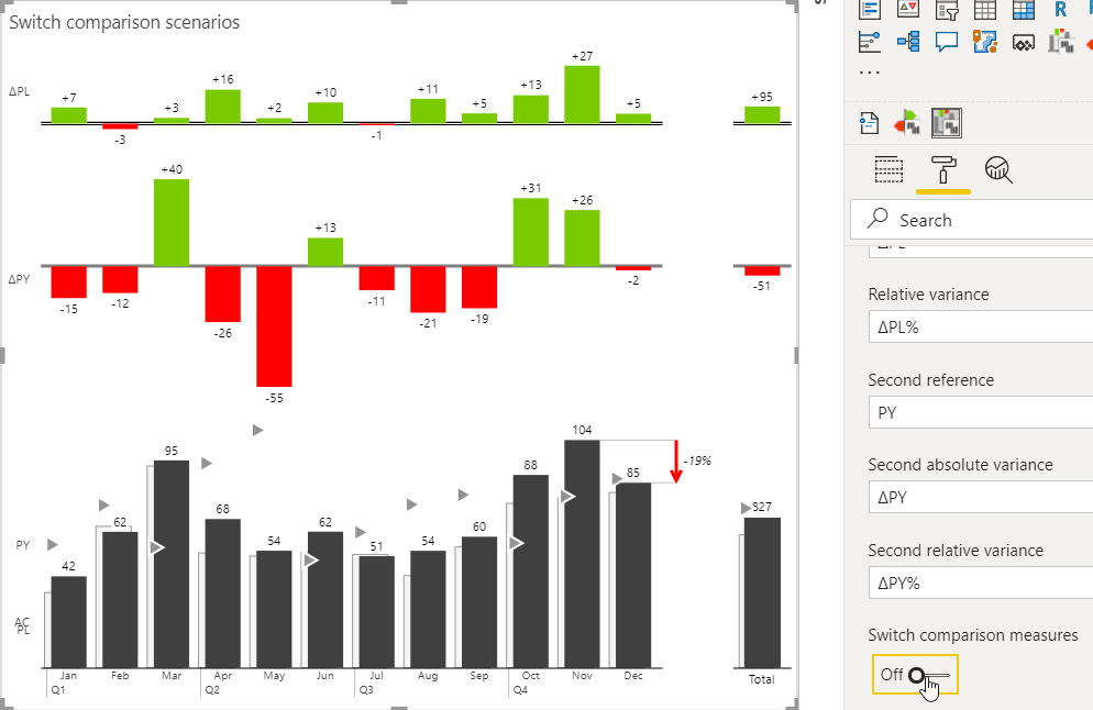
If you have multiple comparisons in your visual, you can now choose the order in which they are displayed.
If you're already using the AppSource version of Zebra BI (version 4.0.0 or higher), then your Zebra BI has already been updated via the Microsoft's AppSource marketplace automatically. You're good to go!
If you're using an older version of Zebra BI (e.g. 3.x.x or older), then this might be a perfect opportunity to update your Zebra BI! When ready, just shoot us an email at support@zebra.bi and we'll help you migrate to the latest version.
Haven't tried Zebra BI before? Opt in for our 30-day free trial here: