Share this
 September 8th
 February 22nd
Goodbye complex data set changes, hello custom calculations within Zebra BI!
With Zebra BI Tables 4.5, whenever you want to add a new element to your table and it's not in your data set, you can now simply calculate it with a formula within a visual.

1. Right-click on Gross profit and select “Add Formula".
2. The new formula editor will appear at the top of your table.
3. To add a new row, simply type the name of your new measure (Gross margin %) and type your custom formula:
Gross margin % = Gross profit / Revenue
💡 The auto-complete feature will search for all elements that you already have in your data set.
4. To format your new measure, simply click on the % symbol, use bold or italic formatting, and confirm by clicking the “Add” button.
5. The new row will appear below the Gross profit and will calculate the percentage in all table columns. That means it will work for all your measures such as PY, AC, as well as for custom calculated variances.
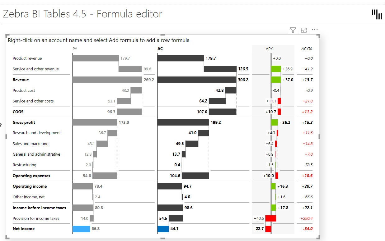
That’s how you can add completely new elements to your tables, without doing any work on your data set. Simply add an element you need with the new custom formula editor!
Commenting can make or break your Power BI reports. It's crucial for conveying your key business message in a clear and comprehensive way.
From now on, you can finally display your dynamic comments in Power BI reports and dashboards!
Simply hover over the comment marker for the comment to appear in the tooltip.
💡 This works across all chart types in both visuals (Tables and Charts). So even if you slide across charts, you will still see the comment markers on specific data points!
To add new comment markers, all you need to do is drag & drop your text field for comments into the new Comments placeholder and Zebra BI will do everything for you automatically.
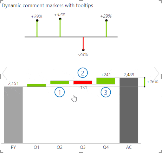
In this example, the dynamic comments are displayed with comment markers and tooltips, as well as within a new visual on the right side. This is a native Power BI matrix visual displays the same comments, linked with comment numbers. That way users can read through the comments without hovering over single comment markers across your report.
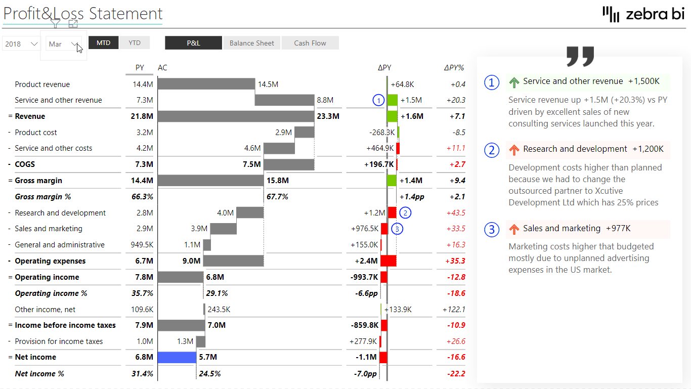
💡 Comments are completely dynamic. You can link comments to time periods or report types (e.g. P&L, Balance Sheet, Cash Flow). What does this mean? If we switch, for example, to another month, we will see comments that are related to that month.
Watch our step-by-step webinar tutorial and learn how to use small multiples in your Power BI reports and dashboards. A practical PBIX example is included!
In a situation when you have different types of KPIs in your table, you can now invert certain elements where that makes sense.
For example, if you’re showing Revenue and Costs within the same table, it has a completely different meaning whether the Revenue is growing versus if Costs are growing. Growing costs have a negative contribution to the end result.
How To Invert Groups
Click on the down-arrow on the right side of the “Cost” measure and select “Invert”. That command will invert only the part of the table that relates to your costs. Zebra BI will automatically change the colors to properly signal a positive versus negative contribution.
How To Rename any of your KPI/Group directly within the visual
Click on the name of your KPI and type in the new name. For example, you can change the name “Cost” to “Expenses”. Press Enter to confirm.
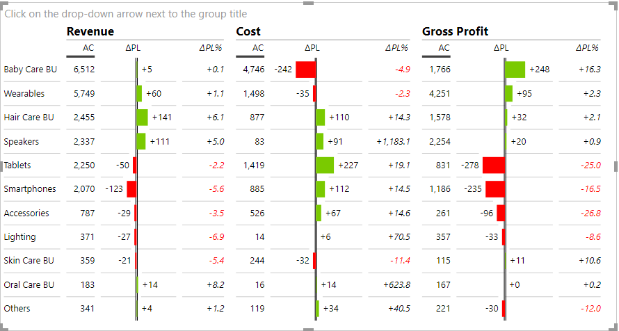
This is how you can now create tables where you have a lot of different KPIs with a mixed meaning (“good vs bad”) and you can do it all in just one simple Zebra BI Tables visual.
The latest version of Zebra BI for Power BI 4.5 brings many design improvements.
Display variances with arrows pointing up/down or left/right to better distinguish between positive and negative variances.
How To:
💡 This feature is very useful for people with color vision deficiencies because variances are not distinguished only by color but also by their shape.
You can also change the color of your chevron arrows by simply selecting the color of your choice for “Positive color” and “Negative color” in your Design settings.
If you're already using the AppSource version of Zebra BI (version 4.0.0 or higher), then your Zebra BI has already been updated via the Microsoft's AppSource marketplace automatically. You're good to go!
If you're using an older version of Zebra BI (e.g. 3.x.x or older), then this might be a perfect opportunity to update your Zebra BI! When ready, just shoot us an email at support@zebra.bi and we'll help you migrate to the latest version.
Haven't tried Zebra BI before? Opt in for our 30-day free trial here: