Watch Recording for "The 5-Second Sales Performance Dashboard"
Watch Tine and Mark, Lead BI Consultants, demonstrate how to create a quick and effective Sales Dashboard in Power BI.
 September 8th
 February 22nd
 05 Mar 2026
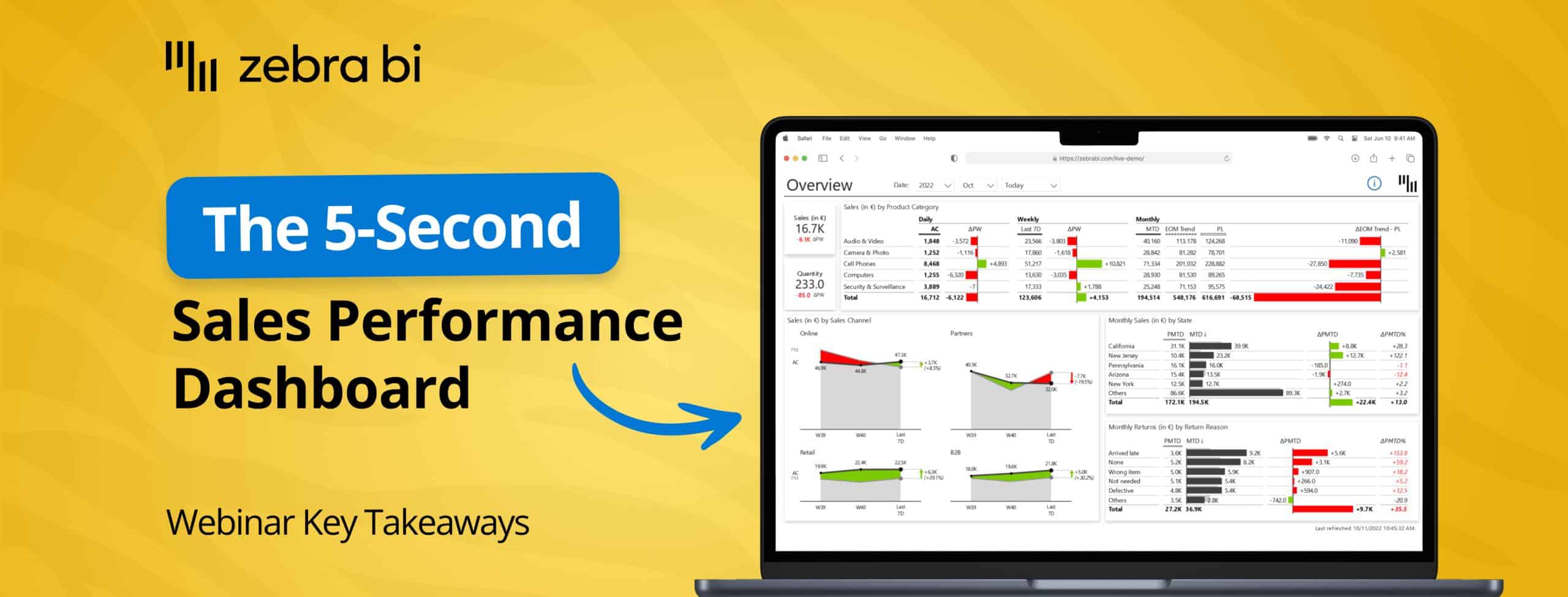
Building sales performance dashboards that actually work shouldn't feel like the work of Sisyphus.
In our latest webinar, Mark and Tine, Senior Power BI Consultants, covered everything you need to know about building Power BI dashboards that deliver insights, not headaches.
Mark covered the core dashboard structure and building techniques, while Tine shared best practices for mobile reporting. Together, they demonstrated how to handle actuals versus plan, end of month forecasts, security implementation, and mobile-friendly views that work for managers, reps, and executives alike.
Here’s a quick overview of what was discussed during the webinar, and what you can do to turn your Power BI into a sales performance power house.
Most times, sales reports fail to present numbers with clear context, which makes users spend too much time understanding the data rather than acting on it.
The most common issue is the lack of a clear story with meaningful insights, targets, trends, or benchmarks that show how the organization is actually performing. Reports often present comparisons and variances between reps, periods, products, and regions without clear explanations, and they lack consistent standards for colors, formats, and scaling.
When data is obscured through plain numbers or tables without proper visualization, sales leaders and operations specialists are forced to dig, export, and interpret instead of taking action. This leaves sales reps guessing about quotas, payments, and permissions, which creates frustration, especially when these reports need to be consumed on mobile devices while teams are in the field.
Mark outlined five foundational principles that transform raw data into actionable insights.
Mark demonstrated how Zebra BI provides three specialized visual types that make building performance dashboards straightforward and consistent.
Mark showcased how building is simple through drag-and-drop functionality where you add measures and comparison targets easily. The visuals use hash patterns to represent forecasts visually using standardized notation, and they support dynamic titles that automatically reference selected periods and measures.
He also demonstrated custom tooltips that enable detailed breakdowns without leaving the page, and the annotation feature that lets you add commentary directly to data points that respect filter context.
When Mark invited Tine to share his perspective on end of month trends, Tine emphasized that this calculation is "super important" for sales reporting.
When you're only five days into a month, comparing that partial data to a full month plan isn't meaningful. End of month trends predict what the final performance will be at month's end, providing a valid comparison point that becomes more reliable with each passing day as more actual data replaces predictions.
Tine outlined several approaches to calculating end of month trends:
As Tine explained, "The good thing is that with each date, your data is becoming more and more reliable because more data is the actual data, and then those prediction trend data is becoming less and less with each day."
Mark demonstrated how implementing proper security ensures that users see only the data relevant to them while maintaining sensitivity of commission and revenue information.
The best practice is to use User Principal Name, which means whatever Microsoft login credentials and specific roles users have will be applied to the report automatically. Mark advised against creating individual roles for each user, and instead recommended leveraging existing Azure or Entra ID groups. He showed how to use the "View As" feature to test roles and ensure security works correctly before deploying.
This approach means users see only their relevant data, which reduces report clutter and maintains data sensitivity while enabling personalization once the report is published. Mark demonstrated how a sales rep viewing their own data will see only their information and commentary, while a manager with unlimited access can view everything across their team.
Tine took over to explain that mobile reporting requires a different approach than desktop reporting because of the unique way users interact with smaller screens.
Tine emphasized that "in its core, mobile reporting is not that much different from standard reporting—it's still based on all those key core principles of actionable reporting and information design." However, the device through which users interact with reports is quite different and specific, requiring attention to technical rules and best practices.
The recommended technical approach is to create dedicated mobile reports separate from desktop versions while using the same semantic model for both, maintaining a single source of truth. As Tine explained, Power BI doesn't provide great support for controlling what appears in desktop versus mobile views, so separate reports allow you to optimize each experience properly.
Tine demonstrated several advanced features that enhance the mobile experience. The Top/Bottom N feature with outliers narrows large datasets down to manageable size by focusing on best and worst performers while grouping others into a single category—potentially reducing 45-50 countries down to just 10 key outliers.
Zebra BI's dual-layout capability lets you show actual performance in one view and variance in another without requiring additional space. Tine also showed how creating app-like navigation with buttons instead of default menus provides seamless page-to-page transitions, and he advised avoiding additional scroll bars within visuals themselves to prevent a frustrating user experience.
Mark concluded the main presentation by recapping the core principles that every successful sales performance dashboard should follow.
As Mark and Tine wrapped up, they reminded participants that Zebra BI visuals are available through Power BI AppSource and are Power BI certified, meaning they provide the same secure experience as native Power BI visuals. Organizations can deploy them as organizational visuals for enterprise-wide use, and a free trial is available so you can test the visuals on your own data. Zebra BI also offers over 50 hours of webinars on specific topics, an online learning academy that teaches actionable reporting principles, and monthly live demos with Q&A sessions to help you implement these practices in your own environment.
As always, you can watch the webinar recording for free, if you want to go in-depth on the discussions Mark and Tine had about Sales Dashboards in Power BI.