Power BI Sales Dashboards: How to Build, Design, and Optimize Your Reports
PRO Trial
Most Power BI sales dashboards take a lot of time to build because sales managers, FP&A analysts, and BI developers can't agree on which metrics to include.
So, most sales dashboards end up looking the same: packed with charts nobody needs, missing the one number sales should track, and, somehow, a month behind.
A well-designed Power BI sales dashboard shows the right numbers, updated in real time, so the entire team works with the same view instead of 5 different spreadsheets.
So, how can you design a decision-ready Power BI sales dashboard?
In this guide, we’ll share the KPIs you should include in a sales dashboard, how to build one, Power BI sales dashboard examples to work from, and free Zebra BI templates you can download and adapt to your own data.
What Is a Power BI Sales Dashboard?
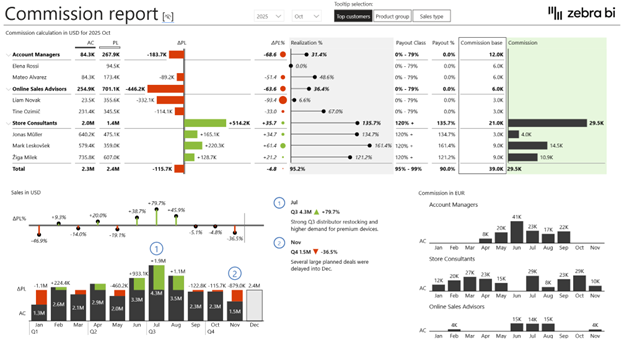
A Power BI sales dashboard is a live, interactive report that consolidates revenue, pipeline, team performance, and forecasting data, updated automatically from your CRM and ERP.
Unlike a static report, it refreshes in real time, letting you analyze any number and check what's driving it. Additionally, a sales dashboard can display different views depending on who is viewing it.
FP&A uses it for revenue forecasting, while CROs and VPs of Sales use it to check pipeline health without asking anyone for an update.
Key KPIs to Track in Your Power BI Sales Dashboard
There's a strong temptation to track everything on your sales performance dashboard.
These KPIs are the ones worth the space, split into two categories: how your team is performing, and what's coming next.
Sales Performance KPIs
- Revenue (actual vs. target): the core number everything else supports.
- Win rate: deals won divided by total deals closed, the clearest read on conversion effectiveness.
- Average deal size: flags whether you're closing bigger or smaller deals over time.
- Sales rep performance: individual results benchmarked against the team average.
- Quota attainment %: how close each rep or team is to hitting their target.
- Customer acquisition cost (CAC): what it costs to land a new customer.
- Churn rate / net revenue retention: whether you're keeping the revenue you've already won.
Sales Pipeline KPIs
- Pipeline value: total value of open deals, broken down by stage.
- Weighted pipeline: deal value multiplied by close probability, a more realistic forecast than raw totals.
- Deal velocity: how many days deals sit in the pipeline before closing.
- Conversion rate by stage: where deals are dropping off.
- Average sales cycle length: how long it typically takes a deal to close, start to finish.
Power BI Sales Dashboard Examples (With Free Templates)
The fastest way to build a sales dashboard that works is to start from one that already works.
Here are 4 Power BI sales dashboard templates built on IBCS standards, each one designed for a specific use case and available as a free PBIX download. Choose the one that fits your team, connect your data, and you’re ready for your next meeting.
Sales Funnel Power BI Template
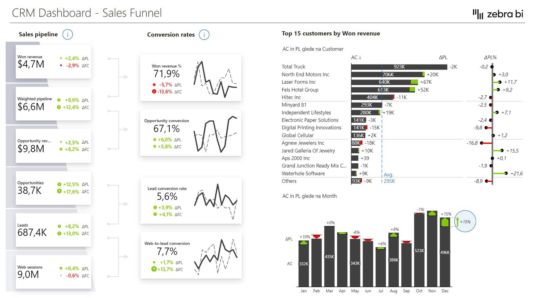
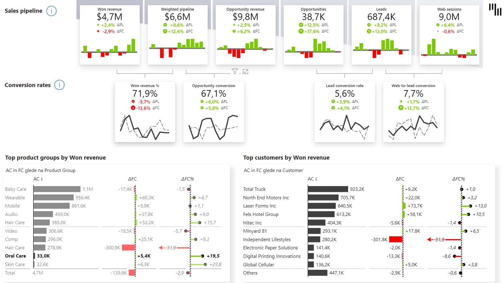
The Sales Funnel dashboard gives you a stage-by-stage breakdown of your entire sales process, from lead generation to closed deals, so you can see exactly where revenue is getting stuck.
Instead of guessing which stage isn’t performing, you can see conversion rates, deal value by stage, and actuals versus plan in one view.
Waterfall charts show how revenue moves through the funnel, variance indicators flag where you're falling behind, and segment breakdowns tell you which customer or product groups are driving performance and which ones are dragging it down.
The sales funnel Power BI template is one of the best dashboards for sales managers to track pipeline health, RevOps teams optimizing lead-to-revenue journeys, and executives who need a clear view of what's coming in and what's at risk.
Download the PBIX file, connect your data, and start your next pipeline review with numbers you can actually trust.
Sales Dashboard in Power BI Template
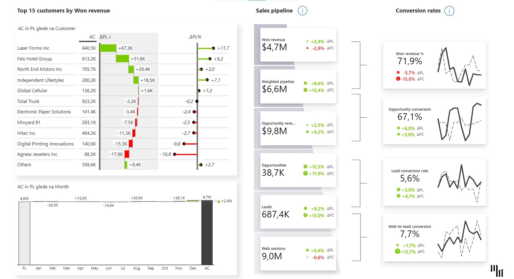
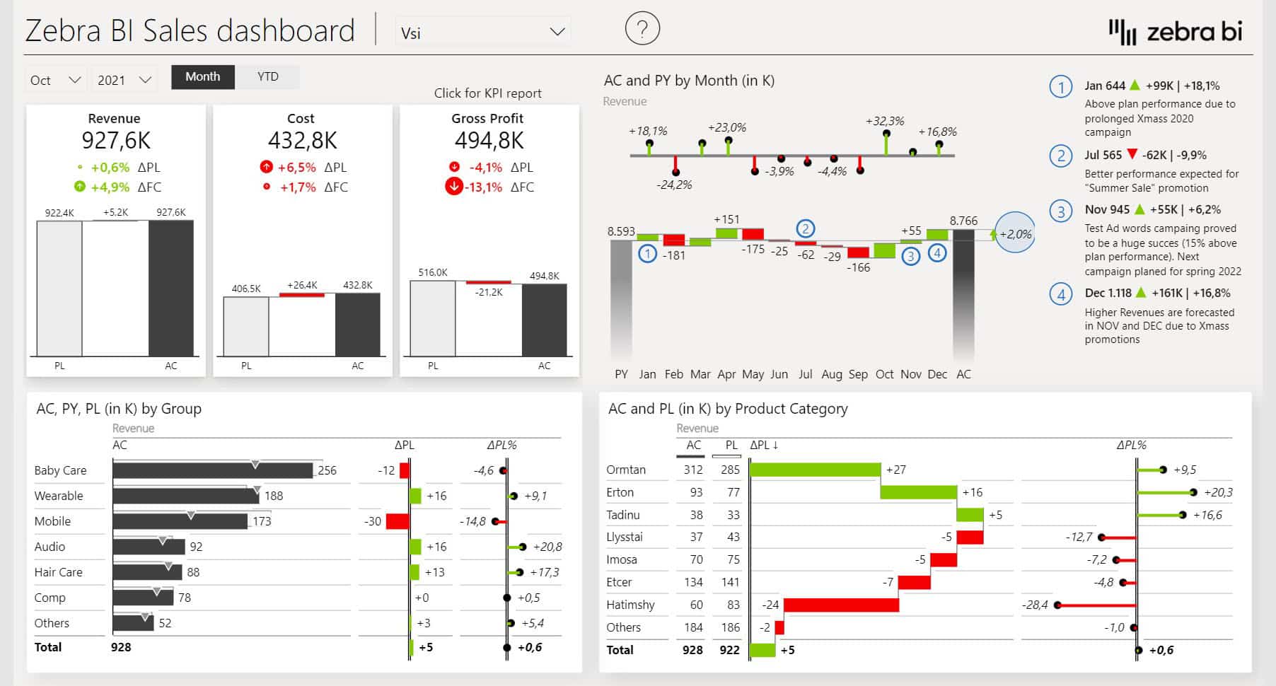
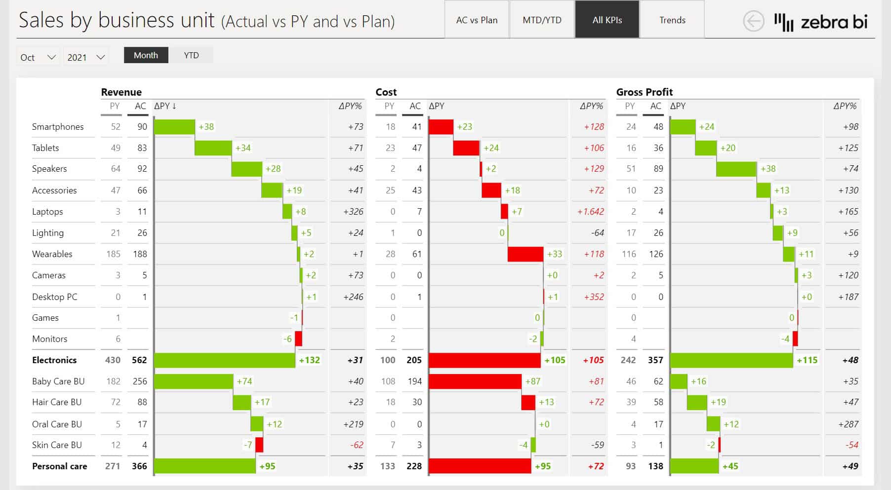
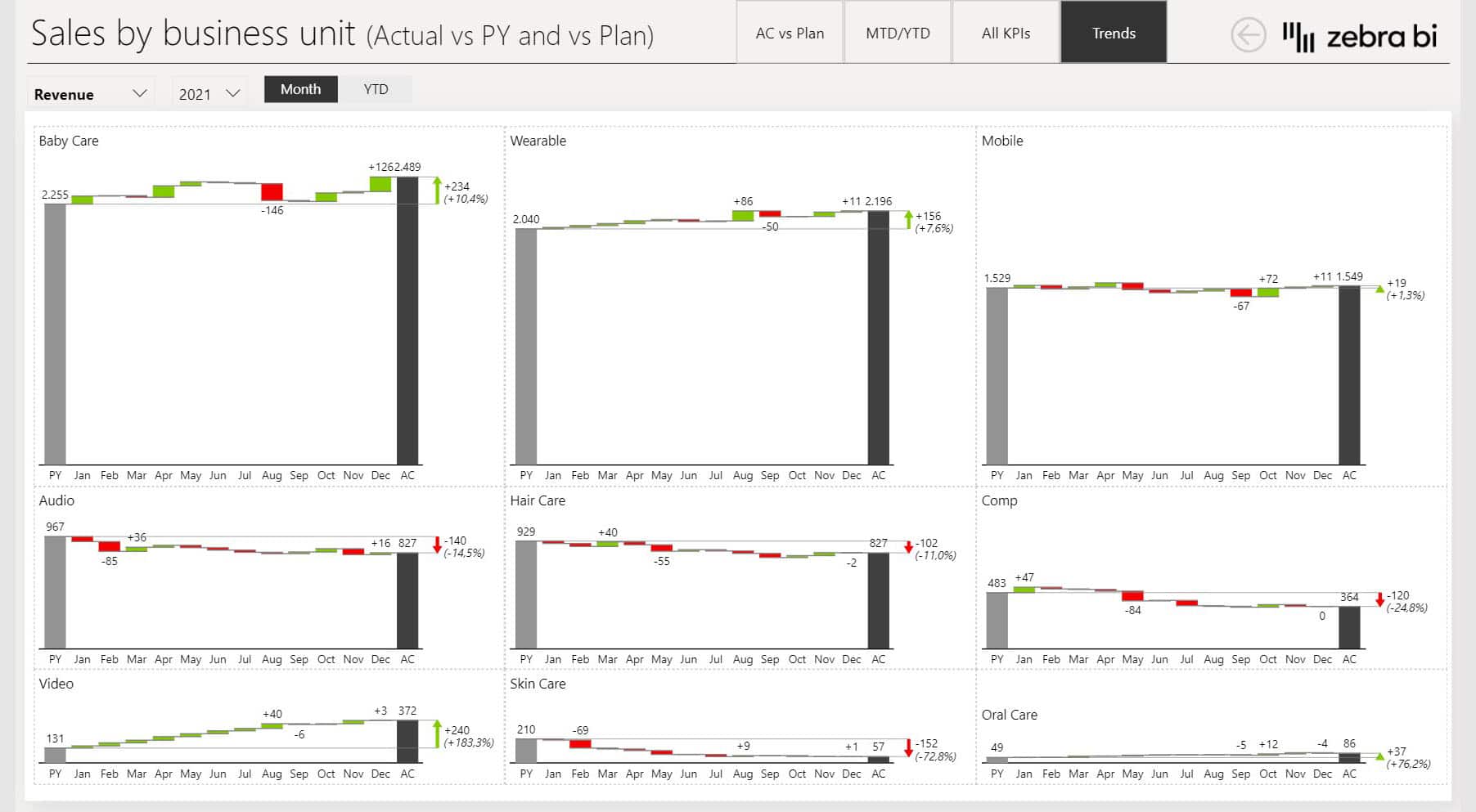
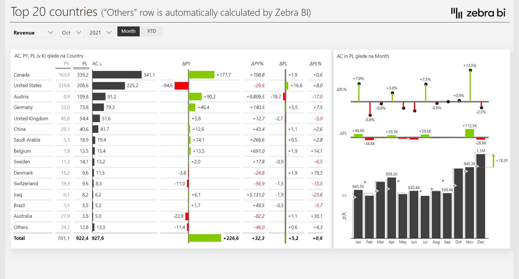
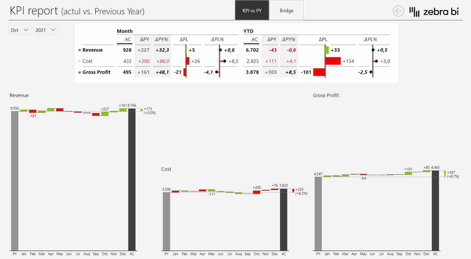
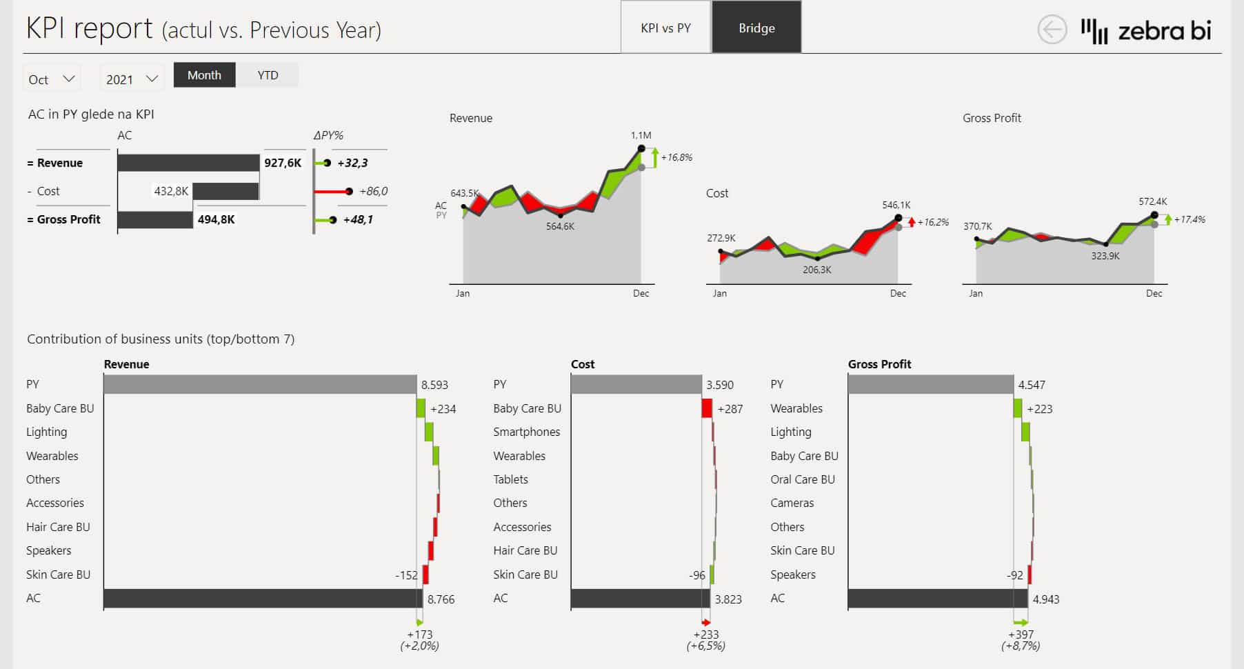
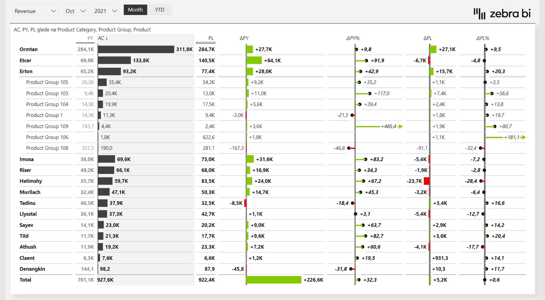
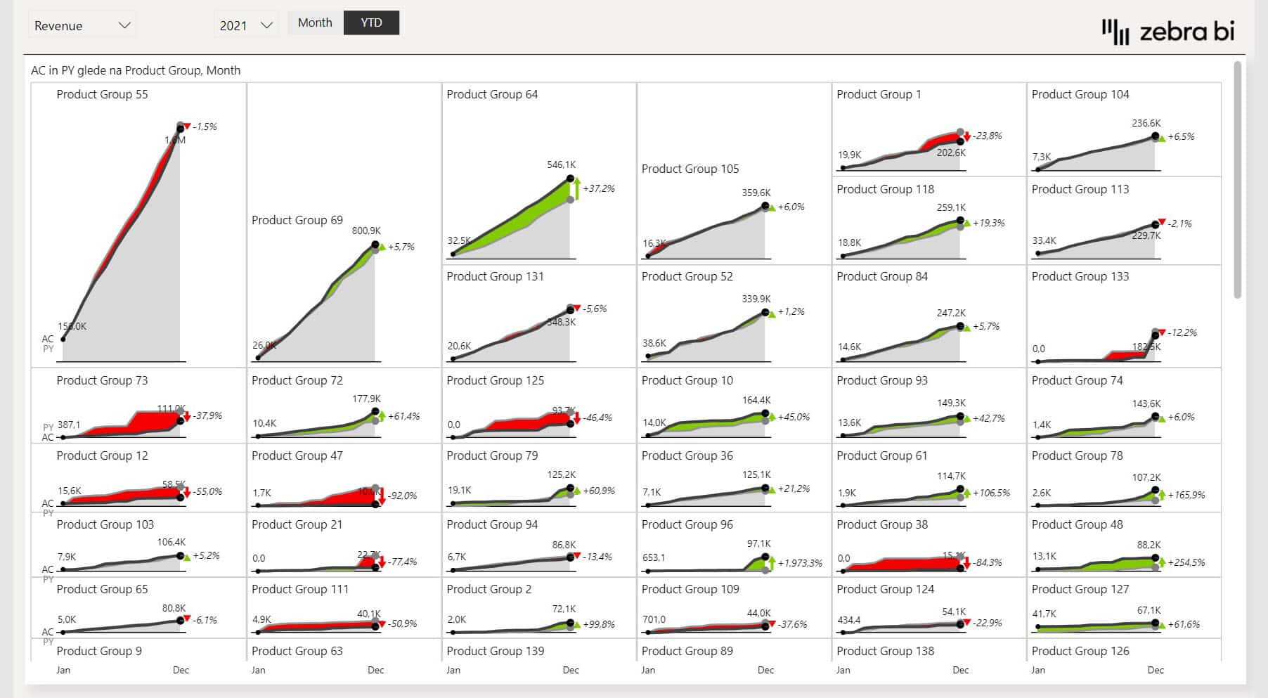
The Sales Dashboard gives sales managers, BI analysts, and finance teams a single view of revenue, targets, and variances without writing complex DAX or stitching together multiple reports.
Variance waterfall charts show exactly what's driving performance against plan, Top N logic surfaces your best and worst performers automatically, and dynamic comments let you add context directly to the charts without switching tools.
The dashboard works for a sales rep checking their numbers, a regional manager comparing territories, and an executive reviewing conversion rates. Everyone sees the same data in the same format, so there's no version confusion or conflicting numbers at the same meeting.
Zebra BI’s sales dashboard is trusted by sales teams at Bayer, Raiffeisen Bank, and Coca-Cola for critical sales performance reporting.
Daily flash sales dashboard
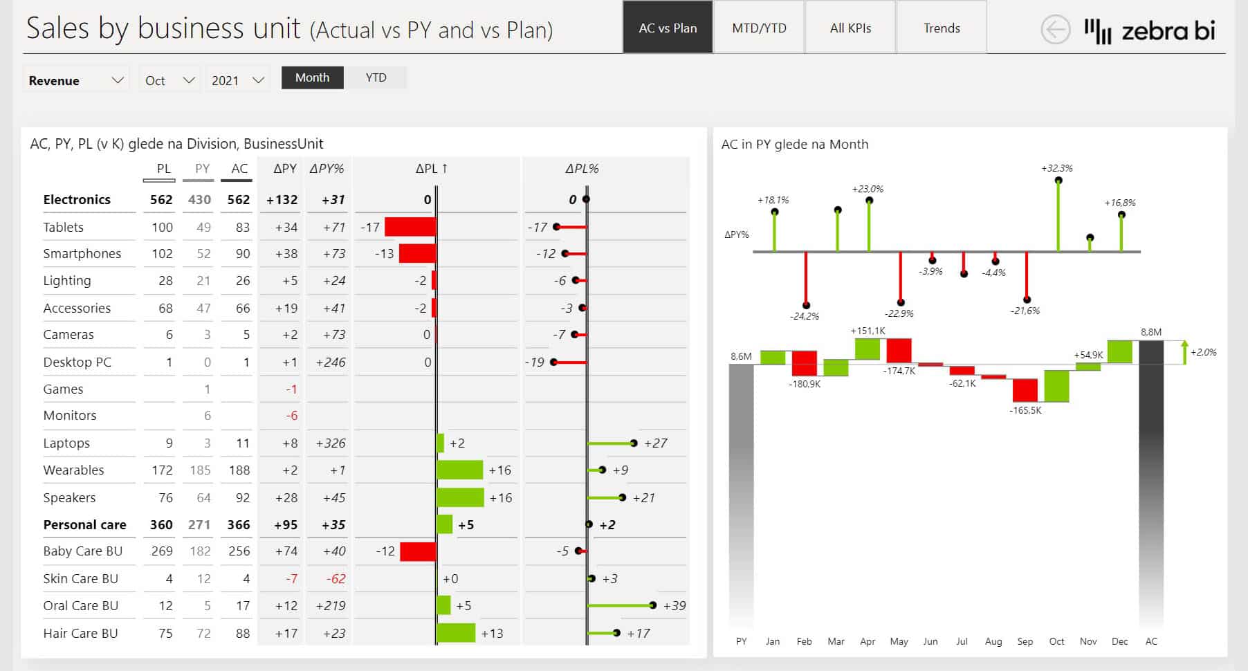
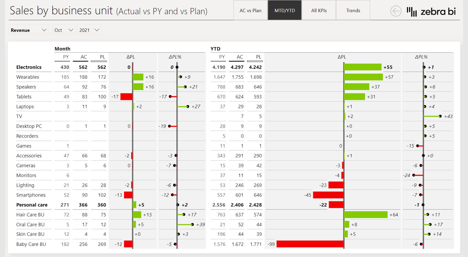
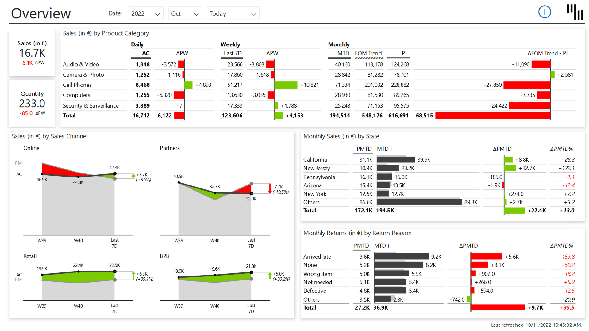
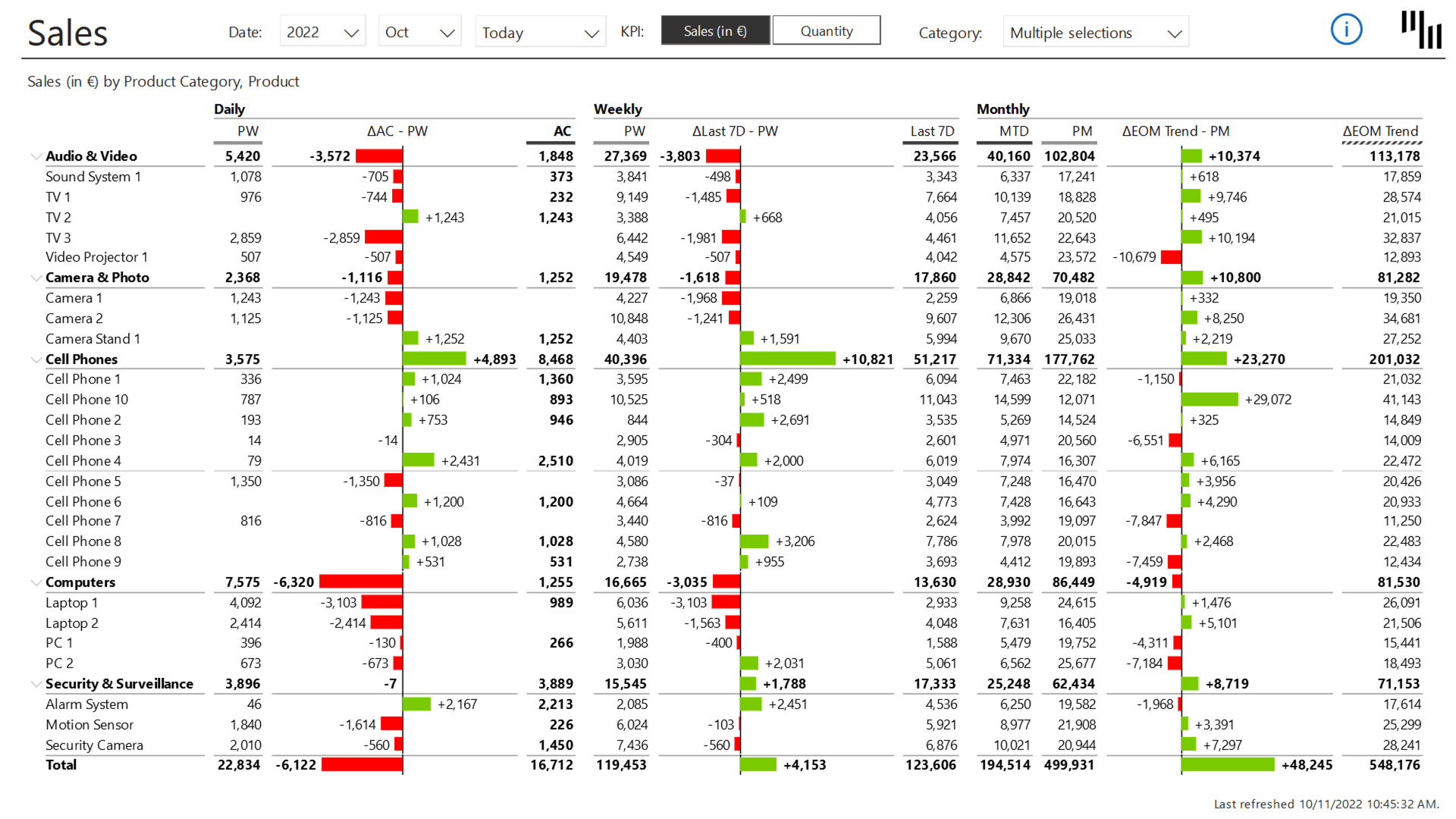
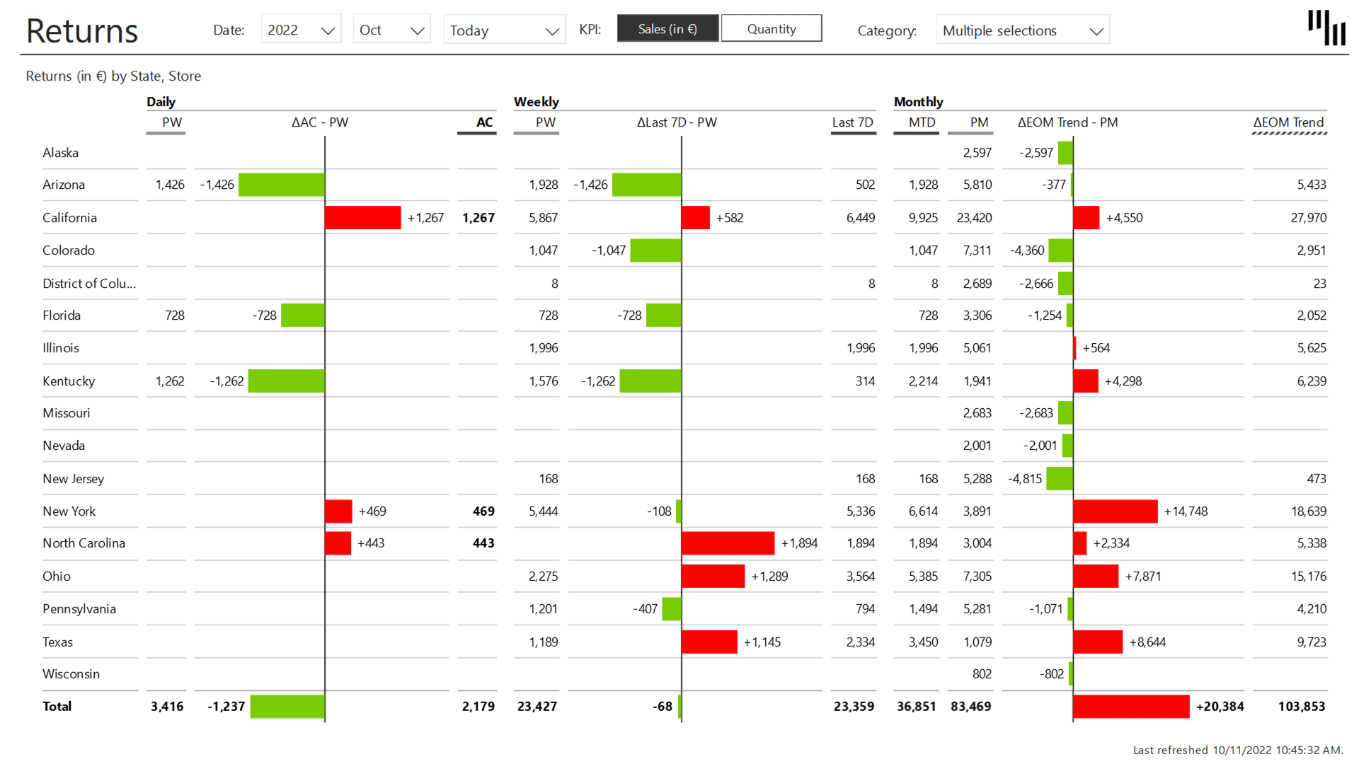
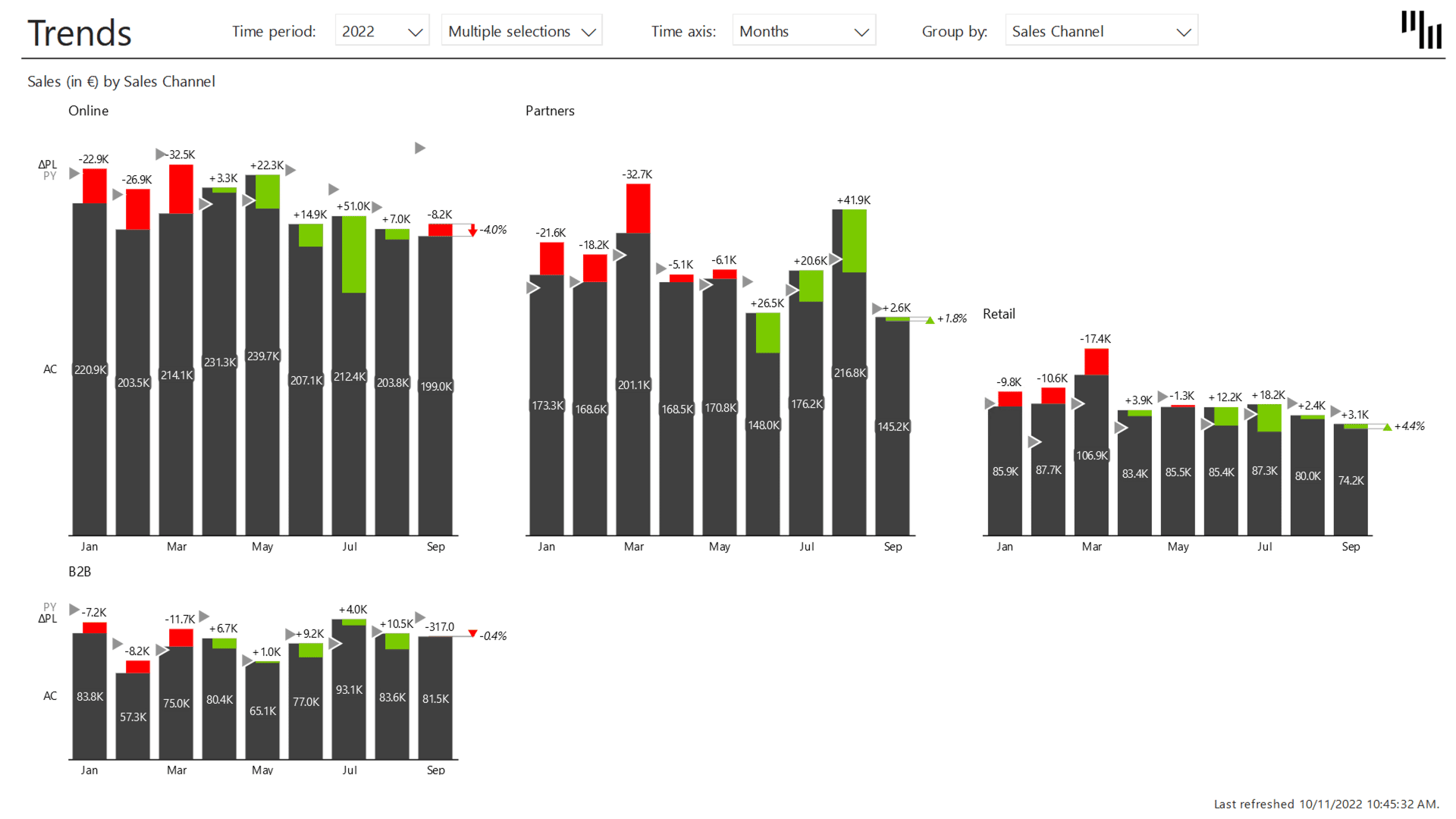
Instead of opening 3 different reports and a spreadsheet before your morning stand-up, the Daily Sales Flash dashboard puts everything on one screen.
Daily, weekly, and monthly performance in a single view, an end-of-month forecast that updates automatically, and the option to switch between Sales and Quantity with a single click.
Every time you open it, the data is up to date, and the story is already there, so you don’t have to manually update it or wait for someone to refresh the file.
Each data point in the Last 7 Days view accounts for exactly 7 days, making the charts more actionable and easier to compare across periods. IBCS standards are built in, so the formatting is consistent, and the numbers are always presented the same way.
It works for a CRO who needs a 30-second read on where the business stands, and for a sales manager who wants to dig into returns or spot a trend before it becomes a problem.
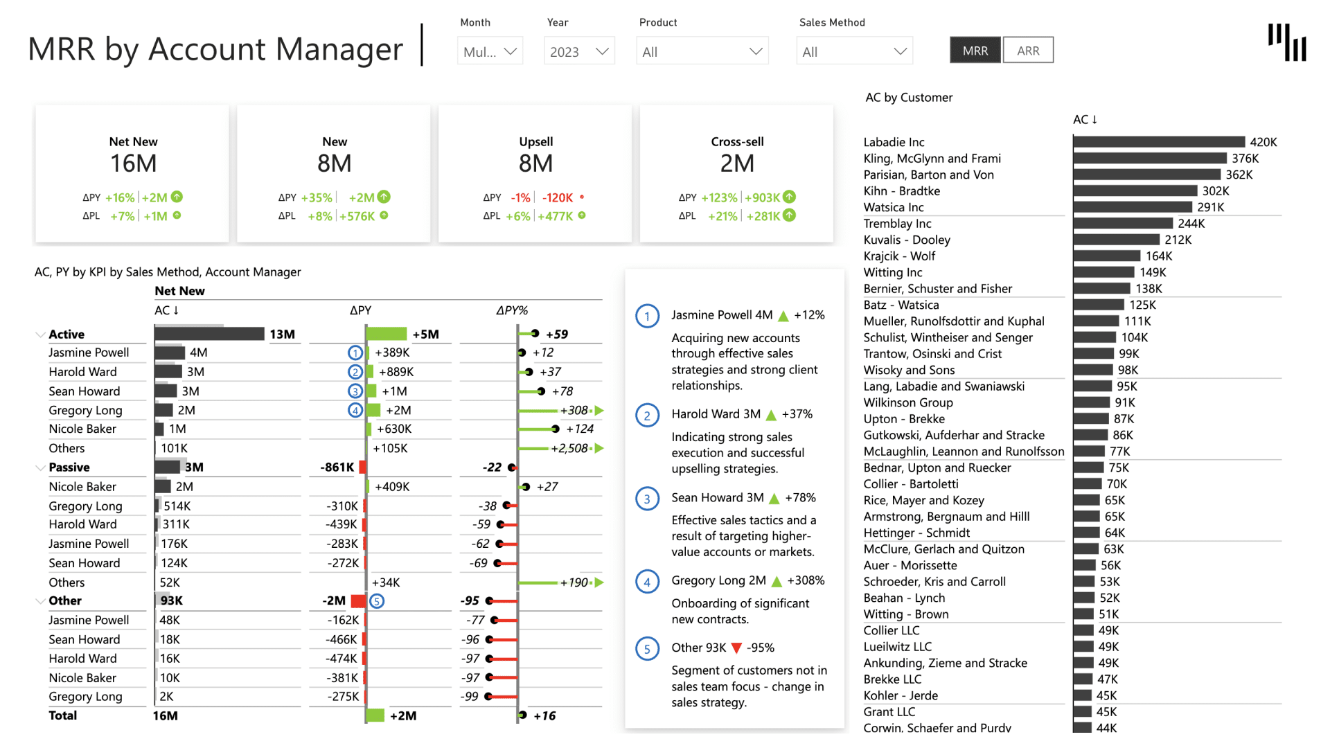
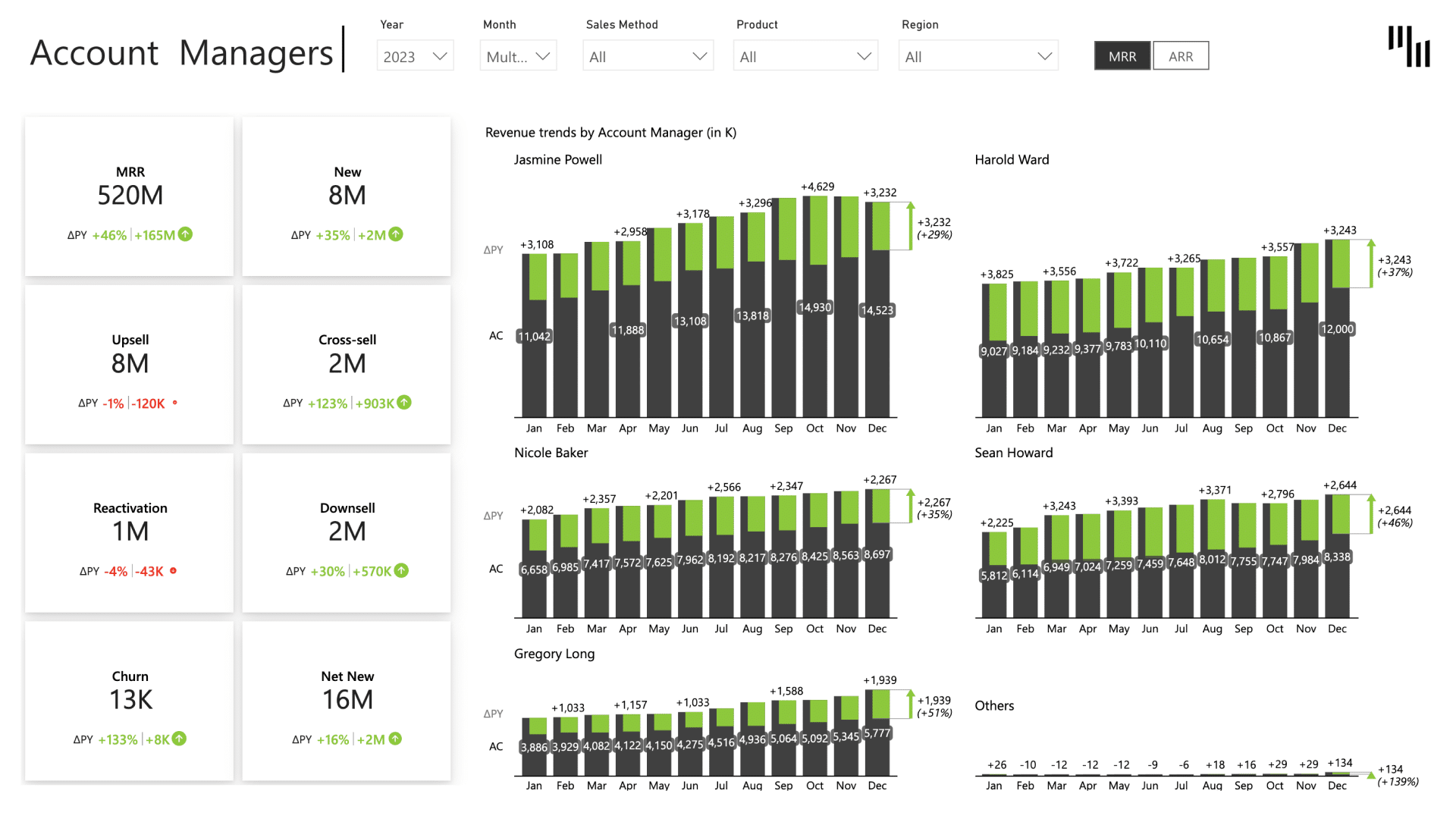
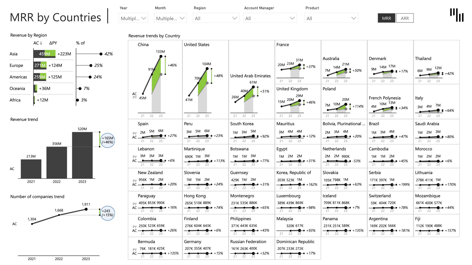
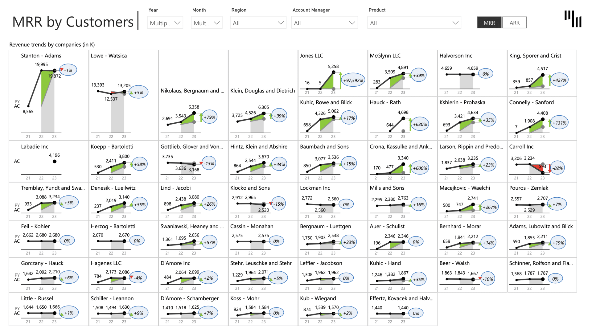
SaaS Sales Dashboard
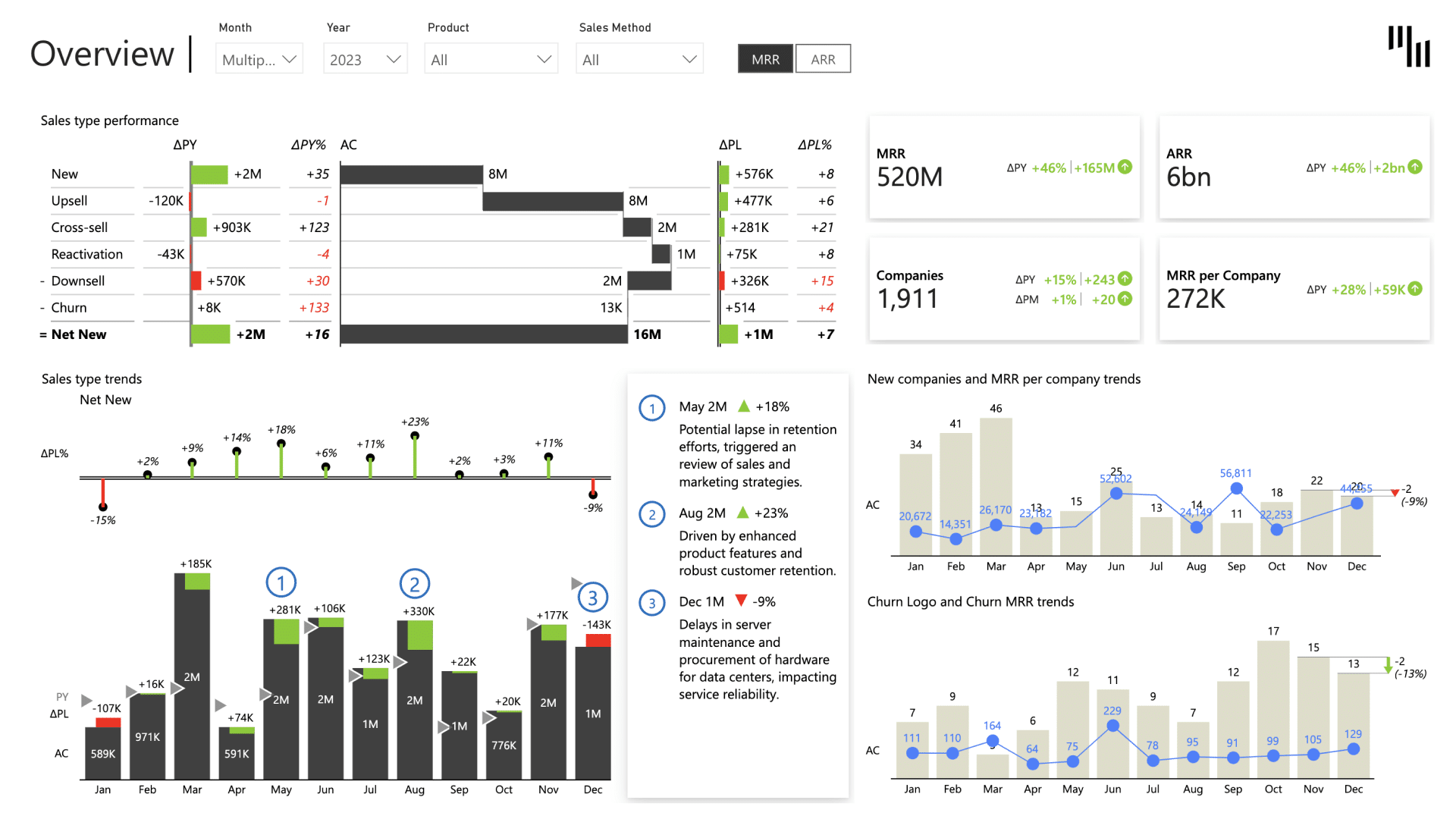
Did your MRR drop because of churn increase, contraction, or a slower acquisition month?
The SaaS sales dashboard gives you the answer before the meeting starts. This Zebra BI template tracks the metrics that matter most to recurring revenue businesses, including MRR, ARR, churn rate, expansion revenue, and customer acquisition.
Track every shift in your recurring revenue with waterfall charts that show subscription growth and contraction, cohort analysis that surfaces at-risk segments before they escalate, and Top N logic that identifies your key revenue drivers in seconds.
Once you connect your data, you have a complete SaaS performance report without spending hours on formatting or writing a single line of DAX.
How to Create a Power BI Sales Dashboard (Step by Step)
When building a sales dashboard in Power BI, you have to go through the same steps every time. Get the data right first, then the model, then the measures, then the visuals. Each step depends on the one before it, and skipping any of them is where most dashboard designs go wrong.
Step 1: Connect your sales data
Power BI connects natively to most major CRMs without needing an ETL tool. You can get the data for your sales dashboard from Salesforce, HubSpot, Microsoft Dynamics 365, SAP, and Pipedrive.
Once connected, the tables you need for a sales dashboard are: Opportunities, Contacts, Products, and Close dates. These four give you everything required to track revenue, pipeline, win rates, and rep performance.
Step 2: Build your data model
Use a star schema: a central Sales Fact table connected to a Date table, a Product table, and a Rep table. This structure enables cross-filtering, so when you click on a rep, a product, or a time period, every visual on the page updates accordingly.
Take the time and make sure you set it right. A poorly structured model means measures that don't filter correctly and dashboards that give wrong numbers for certain selections.
Step 3: Write your main measures
There are 4 measures that cover most of your data on a sales dashboard:
- Total Revenue: SUM(Sales[Amount])
- Revenue vs Target: DIVIDE([Revenue], [Target])
- Win Rate: DIVIDE([Won Deals], [Total Deals])
- YTD Revenue: CALCULATE([Revenue], DATESYTD(Date[Date]))
Everything else, commissions, pipeline coverage, forecast accuracy, builds on top of these measures.
Step 4: Choose your visuals
Match the visual to the question it needs to answer:
- Line chart for revenue trend over time
- Bar chart for performance by rep or product
- Card or KPI visual for quota attainment percentage and win rate
- Funnel for pipeline by stage
- Matrix for actuals versus target by rep and month
The matrix is where native Power BI starts to show its limits. If you want to format it to show variances with consistent scaling and readable tables, it requires significant manual effort. Zebra BI handles this automatically, with built-in variance columns, IBCS formatting, and small multiples that scale correctly across all reps and periods.
Step 5: Add interactivity
For Power BI sales dashboards, there are 3 slicers that cover most use cases:
- A date slicer with MTD, QTD, and YTD options
- A rep slicer for switching between individual and team views
- A drill-through to deal-level detail for when a manager needs to understand what's behind a number.
If both managers and reps will use the sales dashboard, set up row-level security so each rep sees only their own data while managers see the full team view.
When designing a sales dashboard with Power BI native tools, expect it to take 4 to 8 hours from connecting your data to have it ready to present it. Of course, the time it takes depends on how much custom DAX your measures require and your experience with manually building dashboards.
Wonder if you can do it faster? With Zebra BI it takes you as little as 30 minutes.
How to Build a Power BI Sales Dashboard with Zebra BI (30 Minutes)
Step 1: Connect the same data model
Zebra BI reads directly from your existing Power BI semantic model, so you keep your measures, your relationships, and your data sources exactly as they are. Just add the visual to the canvas and you're ready to start.
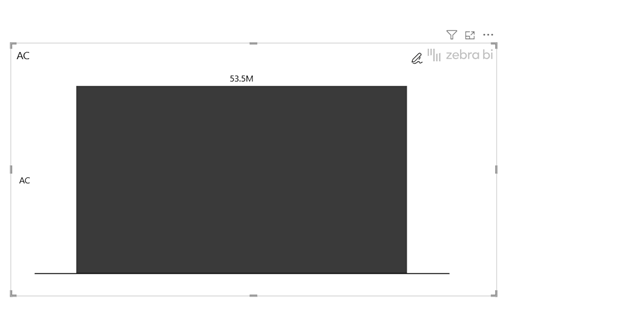
Step 2: Drop Zebra BI Charts and Tables onto the canvas
Add a Zebra BI Charts visualization to the report canvas by selecting it from the visualization pane, no manual setup or formatting needed. Assign your core sales measure, such as actual sales, then add a time dimension to break results down by month and create a clear trend over time.
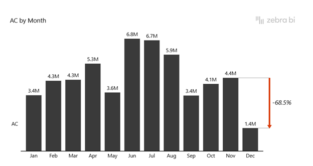
From there, drag an additional measure into the comparison placeholder, such as plan, target, or prior-year values. Zebra BI automatically applies the right performance visualization, variance calculations included, without you having to choose or configure chart types manually.
The design adjusts to the available space and stays focused on variance, trends, and benchmarks, so you can spend time on the analysis instead of the formatting.
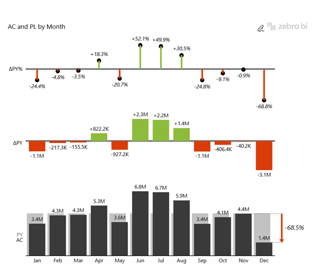
Step 3: Add context with dynamic annotations
Click any data point and add a written narrative directly to the chart. The annotation layer saves with the current filter context, so a comment left on a specific rep, period, or product stays attached to that data point as users navigate the report.

Sales managers stop guessing why a number changed because the explanation is already there.
If you'd rather see it in action than read through the steps, watch the full walkthrough below:
Power BI Sales Dashboard Best Practices
A well-designed Power BI sales dashboard should tell your team what's happening and what to do about it. Here's what to keep in mind when designing a dashboard that helps your team make accurate decisions instead of guessing:
Design for the audience, not the data
The same dashboard rarely works for everyone who uses it.
A CRO needs to see revenue against target, pipeline coverage, and win rate at a glance. A sales manager needs team performance, quota attainment, and deal velocity. A rep needs their own numbers, their ranking, and what's due to close this week.
If you add everything on the dashboard, everyone will spend more time filtering than deciding. To make it readable, use role-based slicers or dedicated pages so each user lands on the view that's relevant to them, without having to filter through everyone else's data first.
Refresh on a schedule that matches the sales cycle
If the data is two weeks old, nobody will trust the dashboard enough to use it.
When the numbers on screen don't match what the team is seeing in their CRM, they stop opening the dashboard and start asking each other instead. Match your refresh schedule to your reporting cadence: daily for the sales flash, weekly for pipeline reviews, and monthly for revenue reports.
To keep everyone on the same page, display the last refresh date on the dashboard so users always know when it was last updated.
Make it mobile-ready
Most sales managers check the dashboard between calls, before meetings, or on the way to the office.
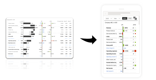
If your dashboard only works on a big screen, you’re designing it for the wrong device. Use Power BI’s mobile layout editor to build a dedicated mobile view that includes 3 to 5 KPIs, vertical stacking, and touch-friendly elements.
Use gamification for team accountability
When reps can see where they rank against their peers, quota attainment becomes visible and competitive in a way that a private spreadsheet never can.
Color-coded attainment bars, visible benchmarks, and team rankings drive engagement without a single management conversation. The reps who are ahead want to stay there. Those behind want to catch up. Build it into your Power BI sales dashboard and let the data do the motivating.
Power BI Sales Dashboard Examples (With Free Templates)
Not sure how to build the Power BI dashboard you need for your next meeting? Download Zebra BI’s free dashboard templates, connect your data, and publish it.
All templates follow the IBCS standard, so they’re clear, consistent, and ready-to-use from day one. There are 20,000+ financial teams worldwide already using Zebra BI templates.
Frequently Asked Questions
What is a Power BI sales dashboard?
A Power BI sales dashboard is a live, interactive report that pulls revenue, pipeline, and team performance data straight from your CRM or ERP, updating automatically instead of waiting for someone to rebuild a spreadsheet.
What KPIs should I track in a Power BI sales dashboard?
It depends on what you're showing. Line charts work for revenue trends, bar charts for rep or product comparisons, card visuals for top-level KPIs, and funnel charts for pipeline by stage.
What is the best Power BI visual for a sales dashboard?
It depends on what you're showing. Line charts work for revenue trends, bar charts for rep or product comparisons, card visuals for top-level KPIs, and funnel charts for pipeline by stage.
Is there a free Power BI sales dashboard template?
Yes, several. Zebra BI offers free PBIX templates for a general sales dashboard, sales pipeline, SaaS sales metrics, and a daily sales flash view. Download any of them and connect your own data
Can I connect my CRM data directly to a Power BI sales dashboard?
Yes. Power BI connects to most major CRMs (Salesforce, HubSpot, Microsoft Dynamics, etc.) as well as SQL databases and Excel files. Once connected, you can apply Zebra BI visuals to transform the raw CRM data into clear, interactive dashboards.
How do I make my Power BI sales dashboard mobile-friendly?
Build a dedicated mobile report instead of relying on Power BI's auto-generated mobile layout. Keep it to the KPIs that matter most, stack content vertically, and use larger fonts and spacing so it's easy to read and tap on a phone.
What is the difference between a sales dashboard and a sales report in Power BI?
A sales report is usually static, a snapshot of numbers as of a specific date. A sales dashboard is live and interactive and updates as new data comes in instead of needing to be rebuilt or re-sent.
