5 Essential Steps to Mastering Your PowerPoint Consulting Presentation
In the world of business consulting, presentations are the lifeblood of communication. They are tools that distill complex information into digestible insights, driving critical decision-making processes. The ability to craft an exceptional consulting presentation is a skill that separates top-tier consultants from the rest. This guide will provide you with an in-depth look into the art of creating compelling, impactful PowerPoint slides that resonate with your audience, just like the ones used by leading consulting firms such as McKinsey, Bain, BCG, and the Big 4 (KPMG, Deloitte, PWC, and EY).
We will dive into slide structure, design, and formatting. These elements, when executed effectively, can deliver clear insights in a standardized and consistent manner. More than that, we’ll also share some tricks of the trade to help you achieve that elusive professional look. From mastering title creation to selecting the right chart, implementing focused coloring to crafting concise text, each step will bring you closer to delivering an unforgettable consulting presentation.
Buckle up as we embark on this journey to perfecting your PowerPoint skills and transforming your business data presentation. By the end of this guide, you will be equipped with the knowledge to prepare slides like a professional consultant and be ready to impress any audience with your powerful consulting presentations.
Don't Just Present, Impress!
Amplify your impact and set a new standard in presentations with Zebra BI for Office. Drive your message home with powerful data visuals.
Master the Art of Title Creation
A compelling title can make or break your consulting presentation. It’s the first thing your audience will read and it sets the tone for the rest of your slide. In the world of consulting, the title isn't just an introduction to your slide; it's a powerful summary that carries the main point you want to deliver.
When crafting a title, it’s essential to be clear and concise. Instead of using a single word or phrase that merely introduces the topic, consider writing a complete sentence that encapsulates the key message of the slide. This strategy is regularly used by leading consulting firms, helping them to communicate their points effectively and efficiently.
For example, instead of titling your slide "Sales Performance," consider using a more descriptive title like "Q1 Sales Performance Exceeded Targets Due to Increased Market Share." This gives your audience an immediate insight into what the slide is about and what the key takeaway is. It sets the stage for the rest of the slide and enables the audience to understand the supporting details better when presented.
By mastering the art of title creation, you can transform your PowerPoint slides from simple visual aids into powerful communication tools that drive home the main point of your consulting presentation. The rest of the slide – be it charts, graphics, or bullet points – should then provide the supporting details that reinforce this main point, ensuring a cohesive and impactful presentation.
Select the Right Chart
After you have crafted a compelling title, the next crucial step in creating a high-impact consulting presentation is choosing the right chart to represent your data. The correct chart type can visually emphasize your main point, making it easier for your audience to understand the key message you're trying to convey.
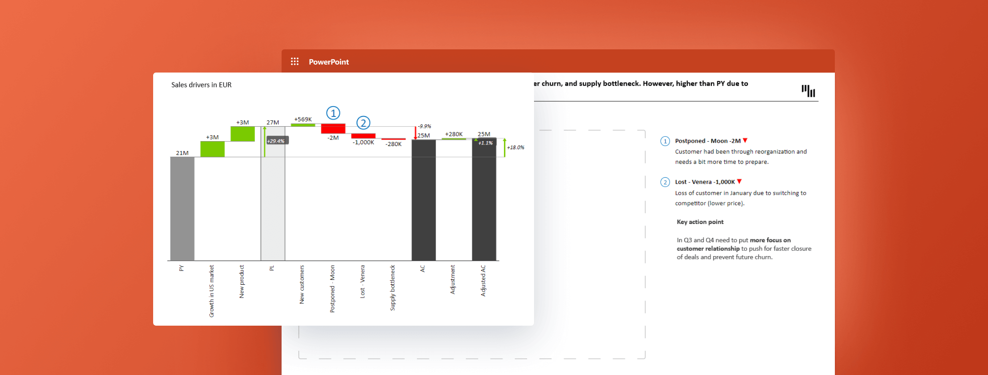
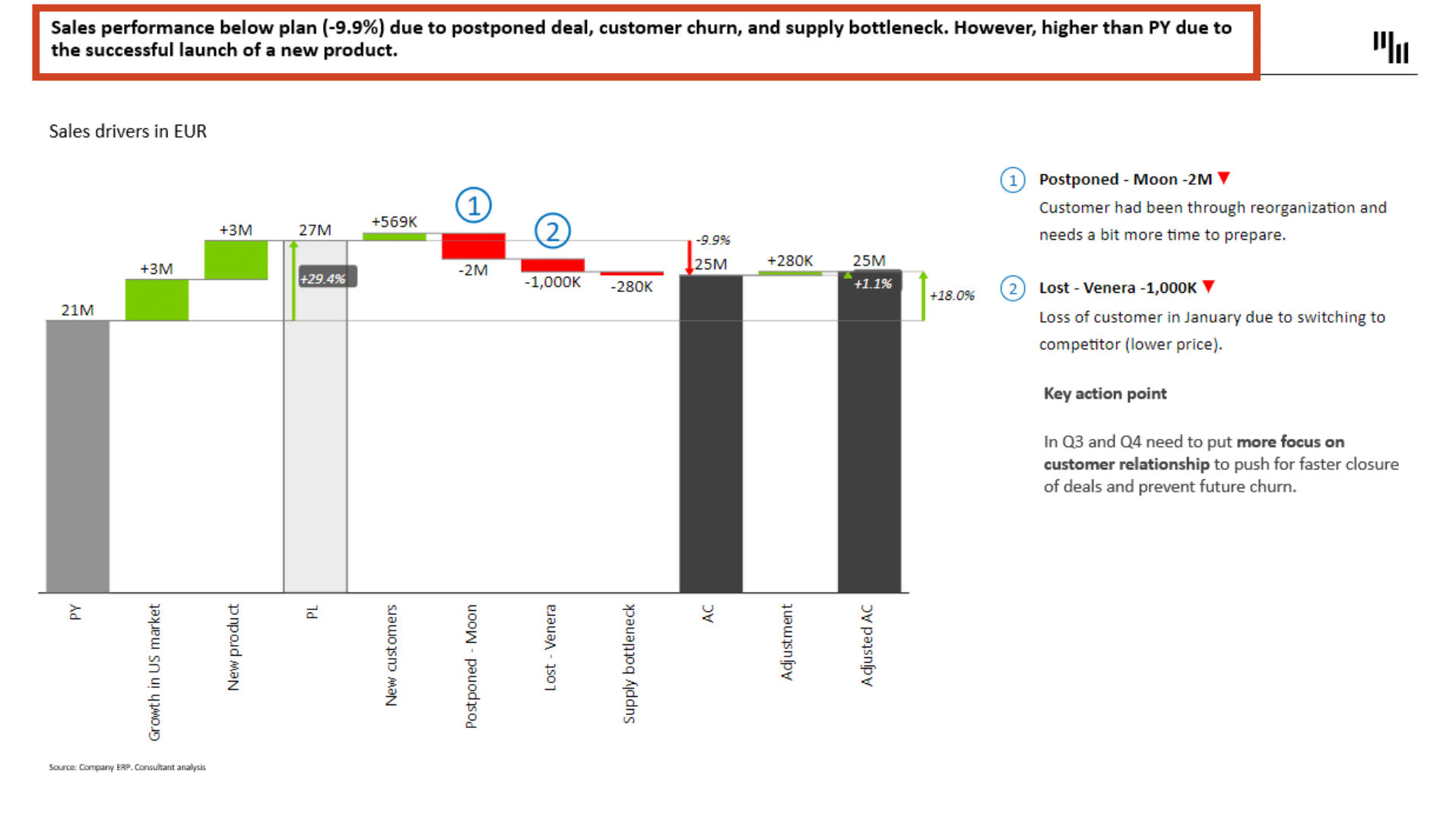
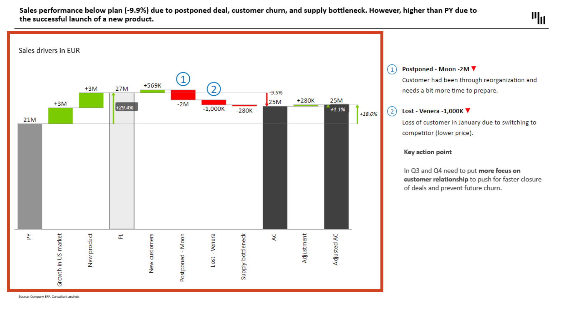
In consulting presentations, charts are not merely decorative elements. They serve as visual narrators of your data story. To demonstrate this, let's consider a scenario where you're explaining sales performance. Instead of using a simple bar chart, you might choose a waterfall chart, a powerful visual tool that clearly shows what drives sales performance compared to the previous year (PY) and plan (PL).
For instance, a waterfall chart can effectively illustrate factors such as underperformance due to a postponed deal, customer churn, or supply bottleneck. The main takeaway, in this case, is not the total amount of sales but rather the explanation of variance against the plan. This approach puts sales drivers into the spotlight and allows your audience to quickly understand the reasons behind the numbers.
Thankfully, choosing the right chart type is made easier with tools like the Zebra BI Chart Selector. This tool can guide you to select the most appropriate chart type for your data, ensuring your main point is clearly communicated. By selecting the right chart, you're not just enhancing the visual appeal of your consulting presentation; you're also making it more insightful and impactful.
Implement Focused and Consistent Coloring
The use of color in your consulting presentation plays a crucial role in conveying your message effectively. Strategic use of color can make finding insights quicker and easier, saving your audience time and mental effort. The key here is to remain focused and consistent.
Imagine a slide showing sales performance data. Clever use of color can highlight the positive and negative impacts on sales. For instance, green could indicate positive growth or favorable conditions, while red could signal a decline or areas needing attention. This simple color-coding system removes unnecessary confusion, enabling the audience to instantly understand the state of affairs.
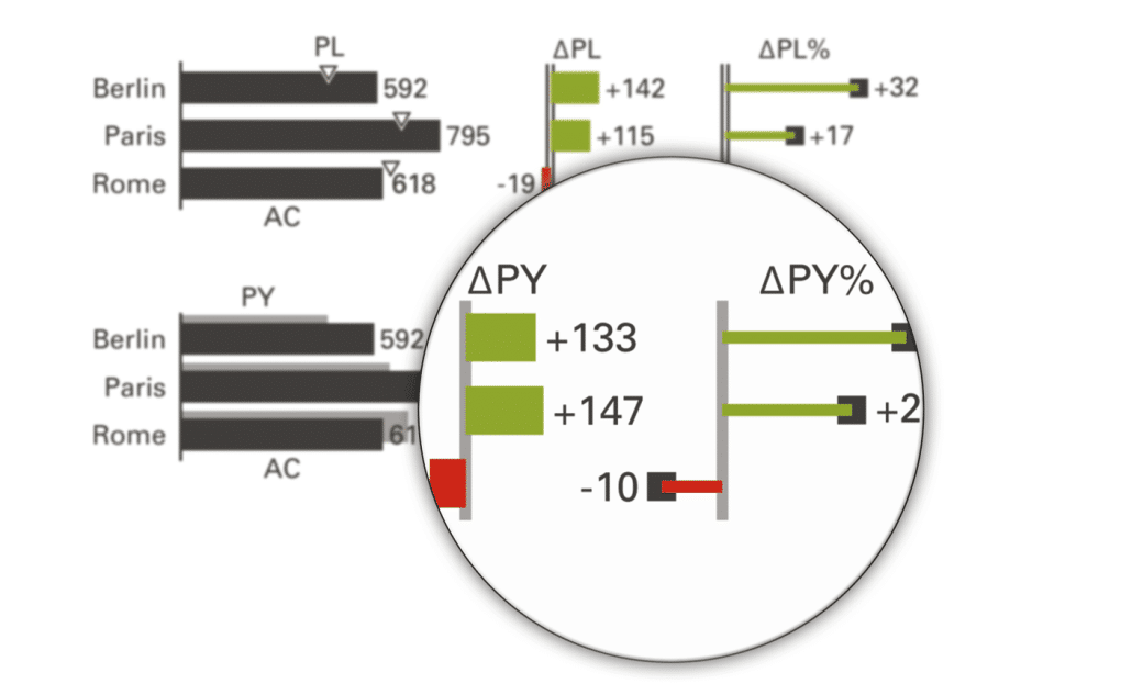
In addition, using different shades or hues for the previous year (PY), plan (PL), and actual (AC) can further enhance your presentation. For instance, you could use light grey for PY, white for PL, and dark grey for AC. Such a color scheme helps differentiate these three categories, making it easier for the audience to follow the data.
However, while employing colors can be beneficial, be mindful not to overuse them. Increasing the number of colors on your slide can overwhelm the audience, diluting the effectiveness of your presentation. Stick to a consistent palette that aligns with your message and brand identity.
By implementing focused and consistent coloring, you're not only making your slides visually appealing, but you're also enhancing their communicative power, making your consulting presentation more impactful and memorable.
Craft Concise and Effective Text
While visuals and colors play a pivotal role in your consulting presentation, the text is equally important. It provides context to your visuals, clarifies your points, and further supports the key message of your slide. However, the effectiveness of your text depends largely on how it's crafted.
In a professional consulting presentation, the text needs to be concise and to the point. Long, verbose explanations can overwhelm your audience and dilute the impact of your key message. Instead, strive for brevity and clarity. Use bullet points to break down complex ideas, making them easier to digest. Remember, your slide is not a document; it's a visual aid. The text should support the visuals, not overshadow them.
Another technique to consider is the strategic use of bolding. By bolding key portions of your text, you can draw your audience's attention to important points. This can be particularly useful when presenting complex data or insights. However, exercise caution when using bolding. If overused, it can lose its impact and make your slide look cluttered.
By mastering the art of crafting concise and effective text, you can complement your visuals, enhance your key message, and make your consulting presentation more engaging and impactful. The result? A presentation that not only looks professional but also communicates effectively and persuasively.
Professional Tricks for Efficient Slide Preparation
After learning the basics of title creation, chart selection, color use, and text crafting, it's time to look at some professional tricks that can take your consulting presentation to the next level. These are techniques that top consulting firms use to achieve a polished, professional look efficiently.
One such trick is the use of the Align function in PowerPoint.
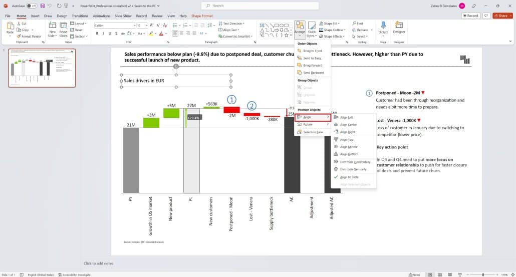
Aligning slide objects to each other ensures a clean, organized layout. To achieve perfect alignment, select all objects on the slide (Control + Click), then choose the Align function in the Home Tab of your PowerPoint. Here, you can align objects to the left, right, top, middle, or bottom. If you have elements listed vertically and are struggling to distribute them evenly, the distribute vertically and distribute horizontally functions can be your solution.
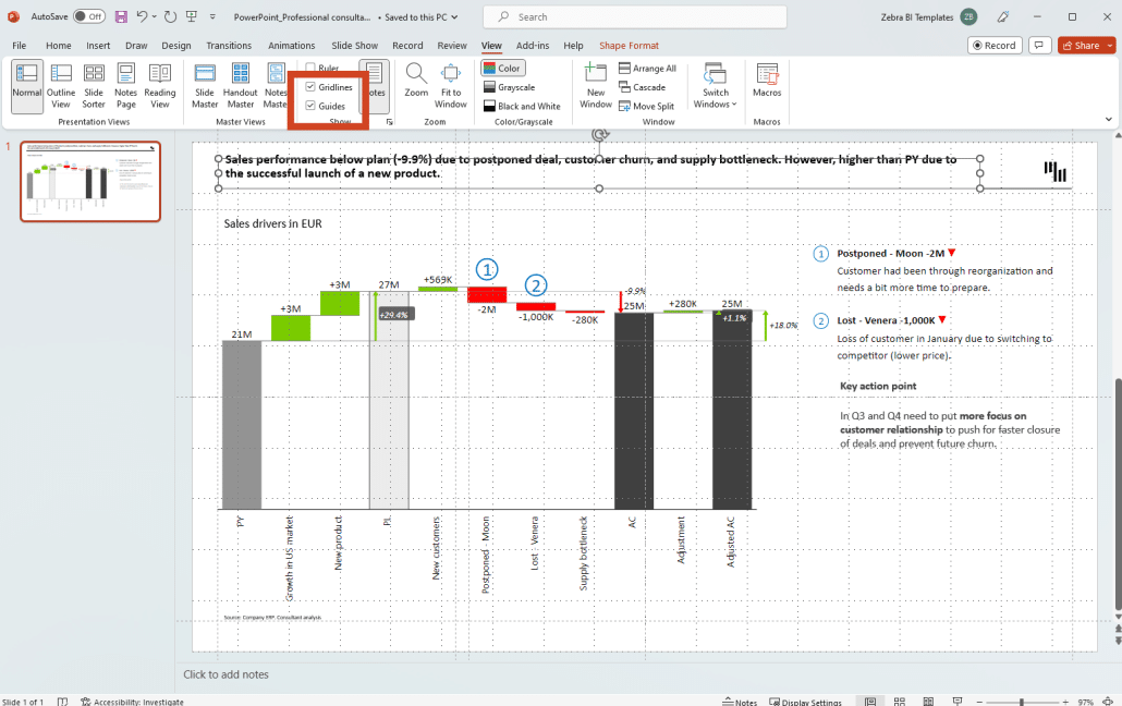
Another professional trick is the use of gridlines and guides. These features help you align objects on your slide, ensuring that they are properly positioned and evenly spaced. You can access gridlines and guides in the View Tab of PowerPoint. By right-clicking in the slide area, you also get the option to add additional vertical or horizontal guides.
These tricks might seem minor, but they have a substantial impact on the overall appearance of your consulting presentation. They ensure a professional look and feel, enhancing your audience's viewing experience and making your key points more compelling. Remember, the devil is in the details, and paying attention to these details can make a significant difference in your consulting presentations.
Preparing Slides with Zebra BI
Having learned the art and science of crafting a compelling consulting presentation, it's time to bring it all together using a practical tool. Zebra BI is a leading tool for visualizing data in PowerPoint, and it can significantly streamline the process of creating professional slides.
Suggested reading: Preparing slides with Zebra BI
Zebra BI excels in transforming complex data into easy-to-understand visuals. It offers an array of chart options, allowing you to choose the most effective way to present your data. For instance, you might need to create a waterfall chart to illustrate sales performance variance against the plan. Zebra BI can help you create a waterfall chart that doesn't just look good but also communicates your point effectively.
The tool also provides features that support the principles we discussed earlier. It allows for consistent coloring, aligning with your branding or the message you want to convey. It also supports concise text placement, ensuring your key points stand out.
In short, Zebra BI combines the elements of effective slide creation into a single, user-friendly interface. It's a powerful tool that can elevate your consulting presentation, turning your insights into compelling stories that resonate with your audience. By mastering Zebra BI, you're not just enhancing your PowerPoint skills; you're also positioning yourself as a highly proficient consultant, capable of delivering impactful presentations that drive decisions.
Conclusion
The ability to create a compelling consulting presentation is a critical skill in today's data-driven business environment. By leveraging the power of PowerPoint and integrating the best practices of leading consulting firms, you can deliver presentations that are not just visually appealing, but also rich in insights and effective in driving decisions.
Mastering the art of title creation, selecting the appropriate chart type, using color strategically, crafting concise and effective text, and applying professional design tricks are all important steps to creating an impactful consulting presentation. Using a powerful tool like Zebra BI can further streamline this process, allowing you to transform complex data into easy-to-understand visuals.
Remember, the goal of a consulting presentation is not just to inform, but also to persuade.
By enhancing your PowerPoint skills and adopting a consultant's approach to presentation design, you can deliver powerful messages that resonate with your audience and drive meaningful action. With these skills at your disposal, you are well-equipped to take your consulting presentations to new heights.
Dive Into The Future of PowerPoint Presentations
Ready to take your PowerPoint presentations to the next level? Zebra BI for Office is here to transform your data into powerful, impactful visuals.