Share this
 September 8th
 February 22nd
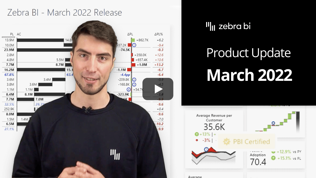

The cherry on top of the Zebra BI Cards visual that we released in December is for sure the Microsoft certification. It means that the visual is compliant with the highest security standards as it passed the rigorous testing done by Microsoft! 🎉
Besides that, the certified visuals also give some other benefits to the users, like exporting your reports to PDF or PPT, subscribing end-users to receive frequent updates and unlimited use of all functionalities.
Learn more about the certification here.
What is better than having the option of using dynamic comments to explain the further context behind your data? Having the possibility to adjust and control the width is one way to improve it. 😎
In Zebra BI Charts and Tables visuals version 5.3, you can now do both. To adjust the width of the comment box, simply hover over the line separating it from the visuals and simply drag and drop to make it bigger or smaller.
The dynamic comments have just become even more flexible and insightful than before! 🥳
Having more control over this functionality is great but being able to customize all elements in a comment box is an additional bonus. And we’re all for it.
In the settings, you can adjust the information displayed in the title, either turn it off, display just the title or add also the values and variances where you can switch between relative, absolute, or both types. For further customization, you can also control the variance icons where you can choose from a triangle, circle, or circle with arrows.
How to top that? You can set all these settings also directly on the visual by clicking on the elements. This way you have complete control to tailor the comment box based on your needs. 💪
Have you ever thought how awesome it would be if you could switch the placement of the comment box? Now, this can be your reality with the Zebra BI Charts and Tables visual!
Under the Settings, you can define the placement of the comment box, so it fits your needs best. Additionally, you can set the padding, listing, and gap between comments. Furthermore, you can also apply a background color, a shadow, or define the border width, color, or radius and set a custom title and text fonts.
This adds the one missing piece to align the commenting functionality with your company branding. Pretty awesome 😎
It’s not the best user experience when you want to change the size of the visual but the markers on the chart don’t adapt to the change. We solved that with the Zebra BI Charts 5.3 release.
The marker sizing is now consistent regardless of the changes of the size on the visual. If you prefer to keep the marker size the same no matter the size of the visual, you can do that in the Design settings under the Reference marker size. Switch to the Fixed-size and define the size that suits you best.
We all love the Top N functionality as it makes our reports much more clear, concise, and actionable. That’s why we also added it to the focus mode now!
You can access the Top N functionality in a table by clicking on the category name. When you turn it on, you will see 2 different options, one for the Edit mode and one for the Focus mode. Since you want to get more detailed information when you put certain information in focus, you can choose more categories than in the edit mode where you want to keep your reports as understandable for the end-user as possible.
If you're using the AppSource version of Zebra BI (version 4.0.0 or higher), then your Zebra BI will be updated via Microsoft's AppSource marketplace automatically once processed. Expected release dates according to the Microsoft Power BI team:
If you're using an older (private) version of Zebra BI (e.g. 3.x.x or older), then this is a perfect opportunity to update your Zebra BI! When ready, just shoot us an email at support@zebra.bi and we'll help you migrate to the latest version.
Haven't tried Zebra BI before? Opt-in for our 30-day free Pro trial here: