 September 8th
 February 22nd
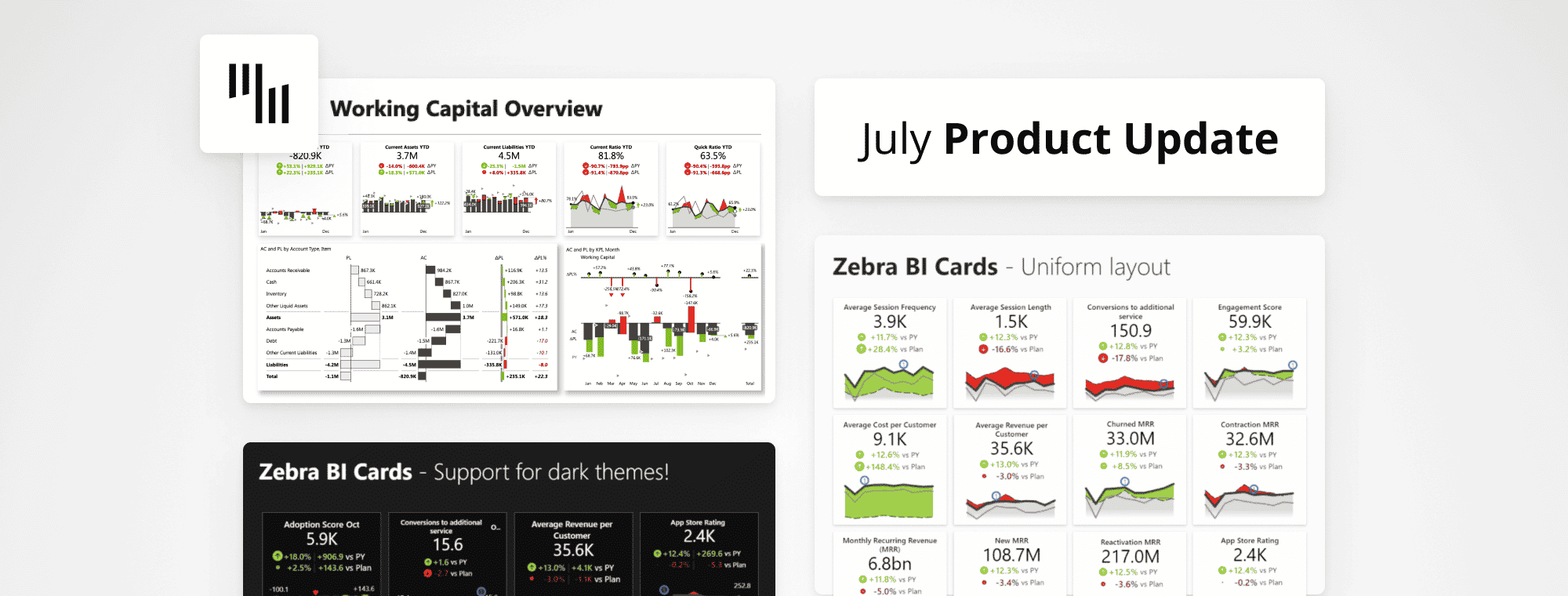
Zebra BI July Product Update
Summer is in full swing, making it a great time to wind down for a moment. But that certainly doesn't stop you from improving your reports and dashboards to make them even more actionable.
In any case, you shouldn't fear missing out on dataviz news this time of year, especially now that you've landed on this month's Zebra BI product update. Here's a wrap-up of everything you've missed in the past month and what's coming soon: recent insights, new features, and content pieces.
Explore new exciting features of Zebra BI Cards & Charts visuals. Did you know that with the new release, you can be even more flexible in report creation and benefit from the 2-dimensional small multiples? Additionally, there's the new Zebra BI template for Power BI: the working capital overview is essential for getting a crystal clear understanding of your short-term financial obligations....and more!
Well, let's dive right into it - watch the July Product Update below 👇
Zebra BI Cards 1.3 release: uniform layouts and background color
This release, it's all about different report design options. As you may know, the Zebra BI Cards visual enables you to resize any of the cards as you wish to make them as user-friendly and flexible as possible. However, in some cases the free layout might not be the best option, so you can now explore the uniform layout as well. It enables you to prepare reports where all the cards are the same size and you can simply make them larger or smaller!
Different color options in the Zebra BI Cards visual are another neat feature that you can explore from the 1.3 release onwards and it has been particularly highly anticipated by our users. You can now define a global and individual card background color and also set global border colors! The reports and dashboards with Zebra BI Cards visuals can now exactly match your company design and branding, and you can also create reports with the visual in dark-themed reports.
Flexibility in report design is crucial for adopting the visual as it helps you meet your company's needs and create a great tool for efficient storytelling through your reports and dashboards.
Friendly tip: in order to still make the most out of your reports, make sure that the same colors should always mean the same thing. Less is more. 🤓
*The Zebra BI Cards 1.3 release will be available on AppSource in the upcoming weeks, so stay tuned through our social media channels or subscribe to our newsletter to be the first to know.
Zebra BI Charts 6.0: improved legend UX and 2-dimensional small multiples
Hold your breath. You see it correctly, the Zebra BI Charts is jumping straight to version release 6.0* to match the exciting new features in this release and the ones that are coming up in the next months.
From the Zebra BI Charts 5.4 release onwards, you already had a chance to enjoy some improved features related to the legend UX. However, this update is bringing even more improvements to this area. You can now rename the legend entry directly on the visual which makes it much easier for you to manage your charts.
Stay tuned as we're already working on further new features to make your reports even better.
What's better than small multiples?
The only thing better than small multiples is 2-dimensional small multiples. And they are making a comeback! This is one of the most distinguishing Zebra BI features that enables you to compare multiple categories of data. Using small multiples allows you to immediately see which categories are the most important and also analyze the trends.
The best part? They are fully scaled which gives you the correct insights into your data.
Create even more user-friendly reports with Zebra BI Charts visual and take advantage of comparing multiple categories to see which one is the most important and where you should focus your attention.
*The Zebra BI Charts 6.0 release will be available on AppSource in the upcoming weeks, so stay tuned through our social media channels or subscribe to our newsletter to be the first to know.
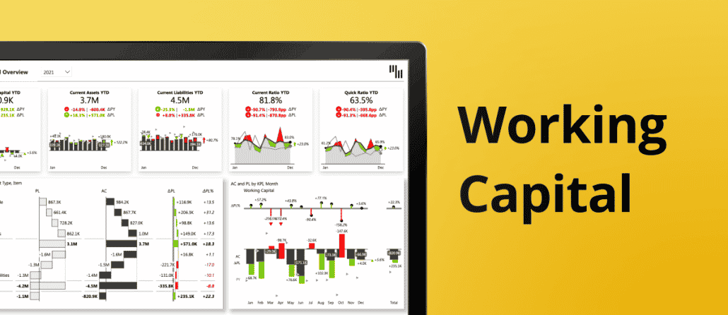
New Zebra BI template for Power BI: Working Capital
Thanks to your great feedback on the previous dashboard examples that we share, the Zebra BI template library is expanding fast.
This time we're introducing the Working Capital template for Power BI. If you decide to give it a go, you will find a familiar report structure with an overview on the landing page and more details available through the drill-through functionality. On the first page, you can immediately see the performance of the most important KPIs, such as liabilities, ratios, assets, etc. Then you can explore more details about payments, trends, or geographical breakdowns.
In-depth understanding and ongoing focus on working capital management are crucial for companies to stay
afloat during economic uncertainties. In the past few years, the world has faced some big challenges and it is more than ever crucial to stay on top of your business game.
You can also find some additional explanations and other related resources in the article Top 7 Power BI Dashboard Examples. Let us know your feedback in the comments below. 👇
Receive important updates directly into your inbox
Join other dataviz enthusiasts like yourself and we'll make sure you won’t miss out on any important news in the Zebra BI space - like this monthly product newsletter.
Enjoy the summer!