7 Best Practice Tips for Presenting Financials to the Business
If you have ever worked in finance and presented the financials to a business, I am confident you can relate to one of the following statements:
- Can I get a copy of the P&L in a simple format that allows me to understand and explain the results to my business?
- That is just accounting “mumbo-jumbo”, all I care about is how much my team has sold.
- Why does the revenue not match what we sold for the month?
- Do you mean to tell me all that money we spent last month does not show up on the P&L due to timing?
Business leaders often feel like finance speaks a foreign language when presenting financials. This is especially true when we deliver the financials (P&L) using finance terms and from our perspective vs the business's perspective. If we want to deepen our relationship with the business, we need to rethink how we present the financials.
Below are seven best practice tips to improve how the office of the CFO and finance teams present financials (P&L) to the business.
- Structure the financials based on how the business wants to see them
- Use visuals to enhance the presentation and aid the story
- Increase engagement with an interactive presentation
- Include comparisons to prior periods/plan and variances for greater clarity
- Incorporate financial ratios
- Incorporate operational metrics
- Be consistent in how you format and present the financials
The rest of the article will focus on using these tips to improve the delivery of financials to the business.
Structure financials from the business viewpoint
Before presenting financials, ask your business partners how they want to see the P&L vs. assuming the view that finance & accounting uses is what your business partners want to see.
Often, the labels used for the chart of accounts should be changed to reflect the business more accurately for business leaders. See below an example of two P&Ls with the same numbers and basic information; one is from a finance viewpoint, and the other is from a business viewpoint.
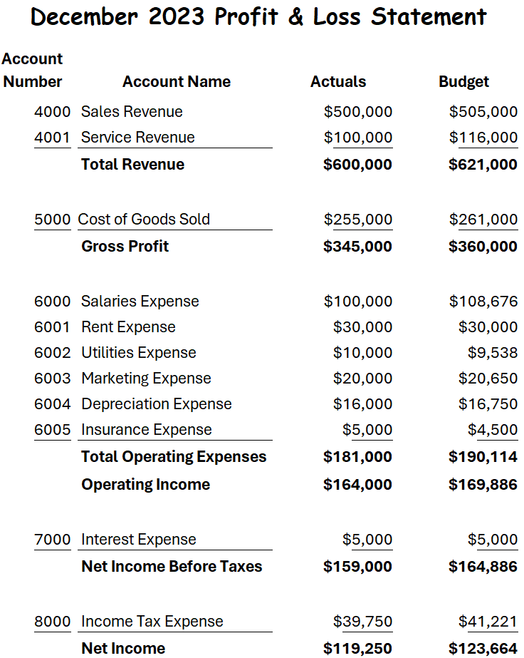
A review of the two example P&Ls quickly reveals how the first P&L is focused on a finance point of view as it includes the account number and the actual account names as displayed in the financial system for each line.
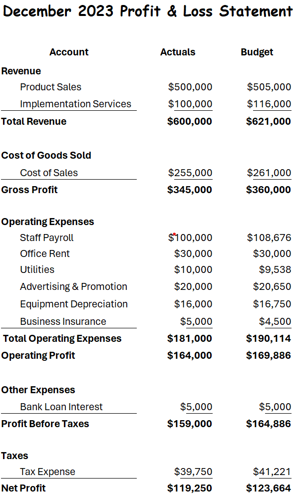
In the 2nd P&L, we have removed the account numbers as they are not something the business is familiar with, and then we have renamed each line to represent better how the business thinks of the account.
Last, we modified the format to be more business-friendly. Presenting a business-friendly P&L will go a long way toward enhancing finance's conversations with the business.
Use visuals to enhance the presentation
“By visualizing information, we turn it into a landscape that you can explore with your eyes….” - David McCandless
Presenting financials can be significantly enhanced when visuals are used to aid in the telling of the story. Using visuals makes it easier for people to process and interpret the information being presented.
Below is a simple example of how visually presenting the data can make it much easier to understand.
Using visuals allows you to tell the story and focus the reader's attention on what is important. Studies have shown that we as humans process visual images much faster than text and remember what we see at a much higher rate. As a finance professional, you only have a few seconds to grab the reader's attention, so ensure your audience can immediately tell what is important.
Below are two data sets, one using a table to present the data and the second incorporating a chart to enhance the presentation. When reviewing Figure 3, ask yourself how easy it is to interpret the data and understand what is happening within the business, then ask yourself the same question in Figure 4.
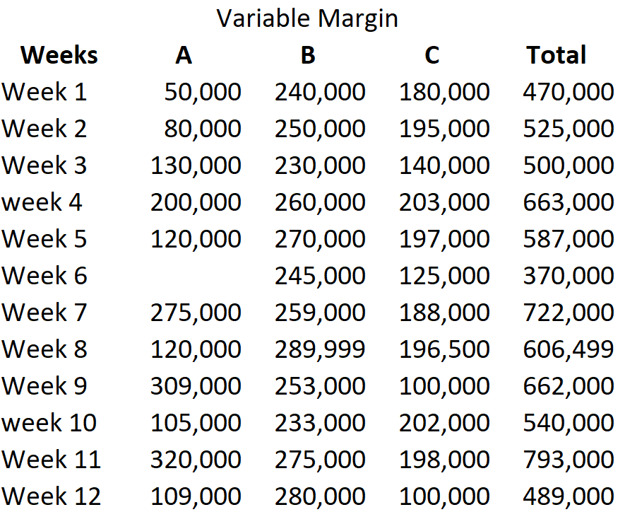
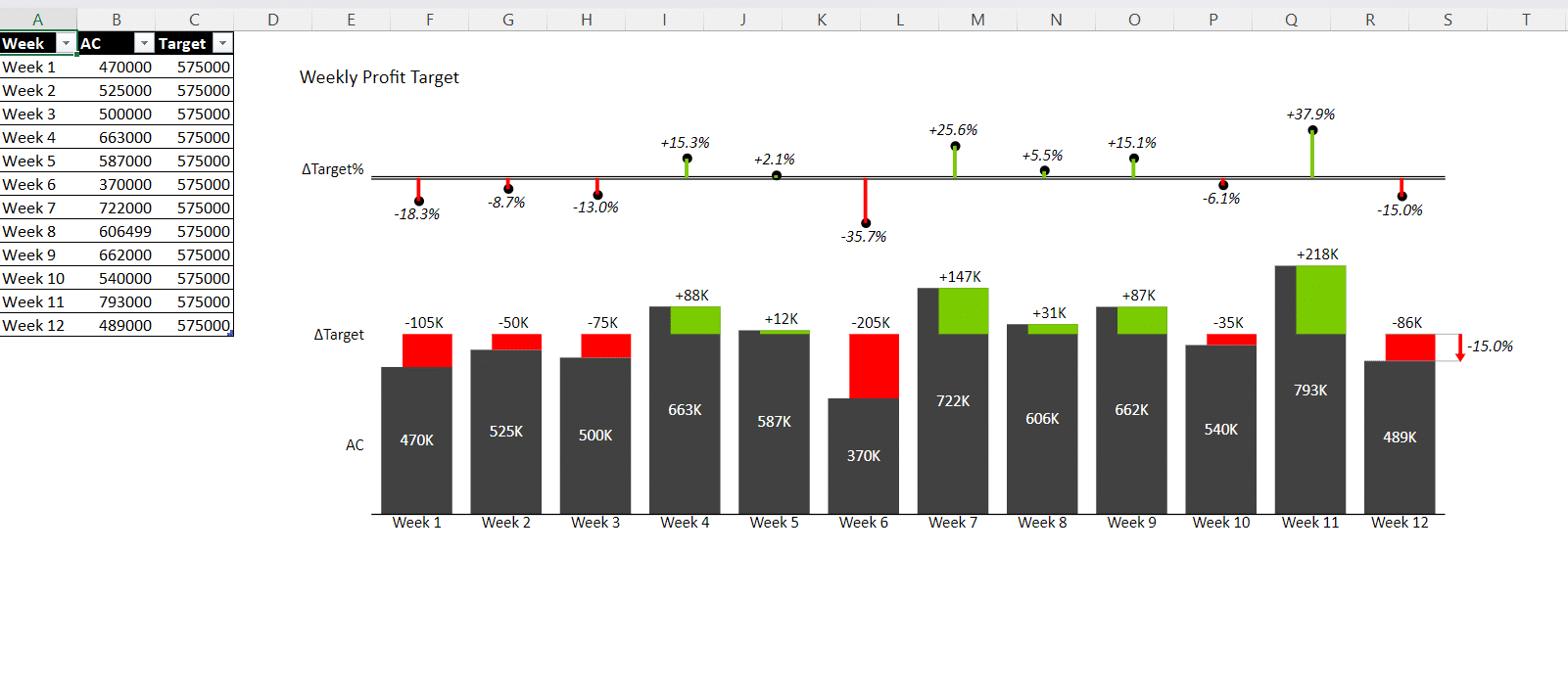
Notice how easy it is in Figure 4 to see which weeks have a problem because the data has been presented in an easy-to-read graph with a target and colors to display when we are above and below the desired target. Figure 4 allows the business to quickly understand the problem and focus on taking action.
Increase engagement with an interactive presentation
In today’s world of self-service reporting, it is important to provide readers with the ability to interact with and drill into the data whenever possible. Static reporting is often insufficient and is starting to become obsolete.
Presenting financials that allow the user to interact with the data is more effective and efficient than static reporting. This could include making it easier for the end user to sort the data, change the chart types, and drill into the data independently.
Include comparisons to prior periods/plans and variances for greater clarity
Finance professionals should always remember that the purpose of presenting financials is to help the business understand performance and make decisions to improve the overall business performance moving forward.
Adding context to your actual data (AC) in the form of comparison against other periods, such as the previous year (PY) and plan (PL), will make it easier for the business to understand how we are performing. Comparing against and prior year provides context so the business can easily determine if the performance is good or bad relative to the comparison period(s).
Providing commentary and context around the results is also important when presenting financials. A common framework to use to give context and make the reporting and commentary actionable is as follows:
- What - Explain what happened in business terms, and focus on only explaining material variances.
- So What - Help the reader understand why the variance is important and why what they are reading matters.
- Now What - Provide a recommendation on what should happen next.
In addition to providing commentary, it is helpful also to provide variances to comparison periods as this provides context to overall performance. When preparing the variances, it is important to ensure the scale and color coding are consistent and easy for the reader to follow.
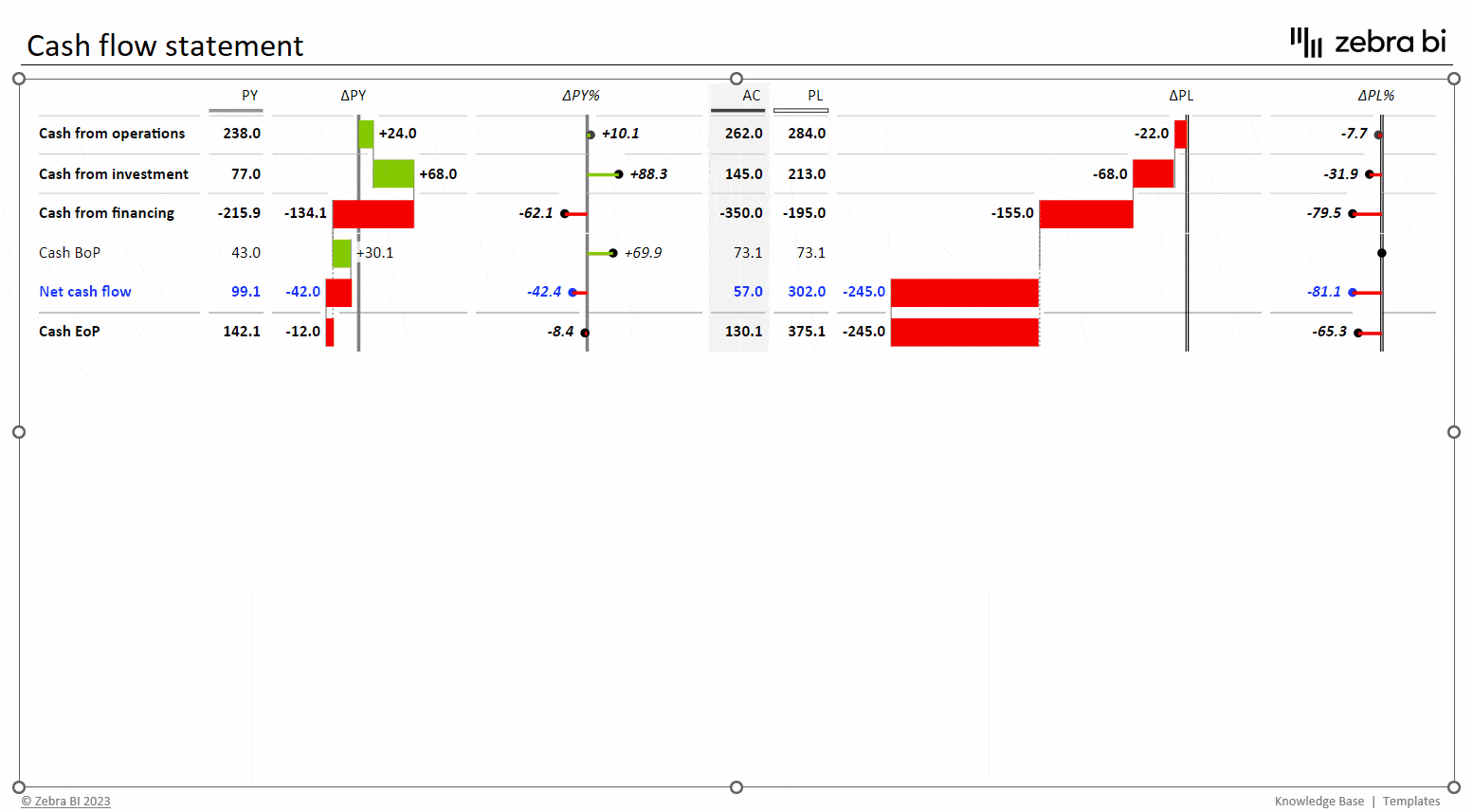
Figure 5 is an example of a less effective presentation of sales data that only includes a basic table with absolute variances and poor commentary. Unfortunately, this type of presentation is all too common and fails to provide the business with the information it needs to enhance decision-making.
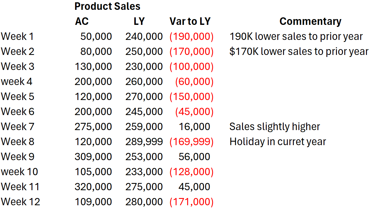
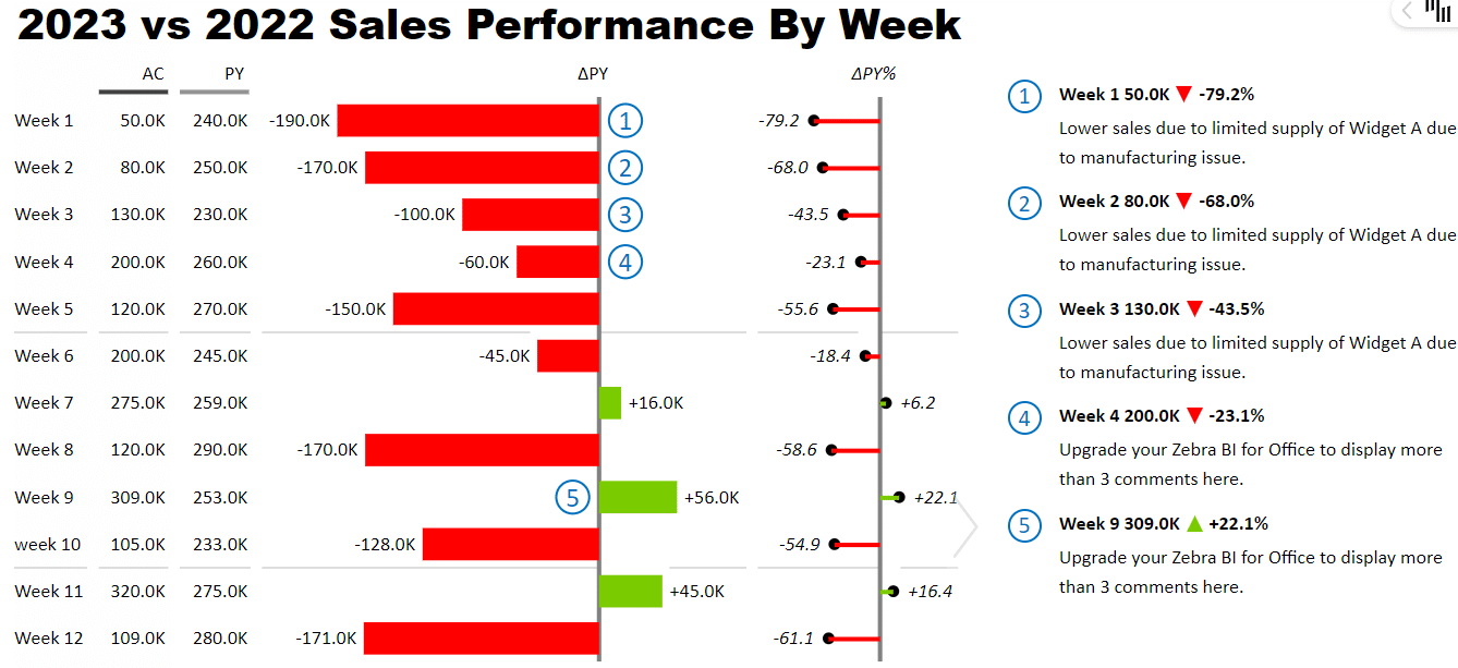
Figure 6 represents what an effective example would look like. The table below with integrated charts shows the actual and prior year data, the dollar variance, and the percentage variance in an easy-to-follow chart, followed by commentary explaining the variances.
This report was created using Zebra BI for Office and shows the level of detail we should include in our reporting and how incorporating some simple graphs can enhance the overall data story. When creating reports, remember that comparisons to applicable periods, variances, and meaningful commentary provide the context the business needs to make intelligent decisions from the data provided. Another benefit of this approach is you can immediately connect the dots between comments and the data points. Many financial reports often fail to make this connection.
It is also important to properly format and scale your visuals. Often, formatting is an afterthought, and when this is the case, it can make it difficult for the reader to follow and understand what is being presented. Focusing on the above items helps shorten the path from data to insights to actions.
Include financial ratios when applicable
Using financial ratios and metrics can enhance the overall presentation of the P&L and increase comprehension. When using ratios, focus on incorporating ratios that enhance the overall data story. In most cases, you will have some standard ratios that your business leaders will want to see; start by incorporating those into every financial statement. Below are examples of common financial ratios often incorporated within the P&L:
- Gross Profit Margin
- Operating Profit Margin
- EBITDA Margin
- Operating Margin
In addition to the above ratios, you may have other ratios that will be needed occasionally to help aid in storytelling; incorporate these as required.
Include operational metrics
A challenge that the business often faces is linking financial statements to operational metrics, and the more you can do this, the better it is for the business.
Financial reporting, by nature, is backward-looking and a lagging indicator. Take revenue, for example. If your revenue is down, this is a lagging indicator as something happened before the revenue declined that, if spotted, would have alerted you to this concern. Let us assume you have a product that people use for building infographics. A key operational metric could be the number of infographics the average user creates in a month. Including this number in your financial reporting would serve as a warning that revenue would be declining in the future due to cancellations.
Having this data would help the business leaders focus on determining why usage is declining and coming up with solutions before a significant drop in revenue occurs.
When deciding what operational metrics to include, focus on the key 3 to 5 metrics that drive the business and that the business can influence. What these metrics will look like will vary by industry and should be agreed upon in conjunction with the business as they will often understand what operational metrics are the key drivers of the business.
Use a consistent format
Creating standards for your reports is important for easy interpretation and understanding of the data. When creating your reports, it is always good to follow best practices. Some best practices to keep in mind include:
- Format reports in a consistent manner.
- Use color sparingly to enhance the story; examples include red for negative variances and green for positive variances.
- Use a consistent format for variance commentary, such as unfavorable and favorable terminology, to explain good and bad variances.
The key is to keep it consistent so that no matter which department is looking at it, they know what to expect and how to interpret data.
Once you have settled on a format, wait to change it until you first talk to the business. Review any proposed changes with the business to ensure that the changes provide value to the reports and make it easier for the business to understand the story.
Unfortunately, I have seen situations where the P&L is changed every month. I have seen this done for various reasons. Sometimes, the frequent changes were due to personnel changes, sometimes, it was due to a desire to always improve the reporting package. Whatever the reason, it will be easier for the business to interpret and act on the monthly financials when they are delivered using a consistent standard.
Conclusion
Often, many of the issues the business has with how finance presents the P&L are due to finance not focusing the reporting on the needs of the business. The good news is that if you incorporate the tips in this article, you will be on the path to ensuring the business understands the financials presented to them each month.
The seven tips that will enhance your financial reports are as follows:
- Structure the financials based on how the business wants to see them
- Use visuals to enhance the presentation and aid the story
- Increase engagement with an interactive presentation
- Include comparisons to prior periods and variances for greater clarity
- Incorporate ratios and when applicable
- Incorporate operational drivers
- Be consistent in how you format and present the financials
In addition to the tips mentioned above, a lot of great tools can be used to help ensure your entire team lays out the P&L and visuals with a similar presentation each time. One such tool is Zebra BI for Office, which follows the International Business Communication Standards (IBCS) with all its visuals.
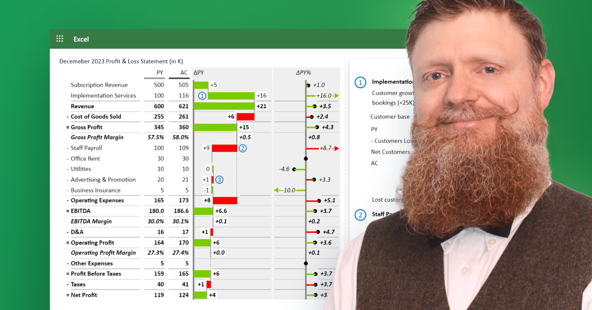
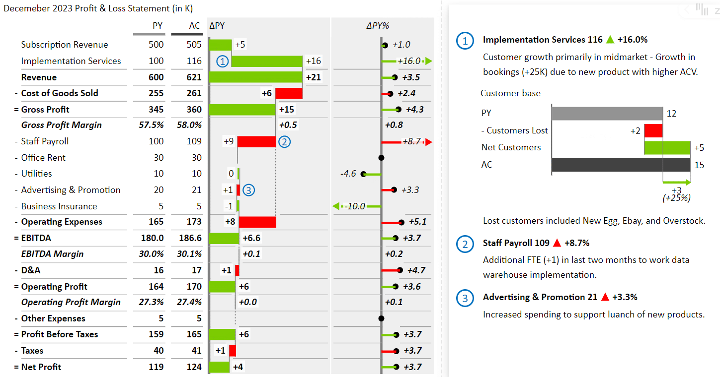
Below, I created Figure 7, a P&L incorporating the tips discussed in this article using the free Zebra BI add-in for Excel. Once you orient yourself to the program, you can create well-designed P&Ls with:
- built-in charts like a waterfall for efficient comparison to actuals,
- custom formulas to calculate financial ratios on the fly,
- and commentary on the visual for presenting to the business with minimal effort.
See below an example of a December P&L compared to the prior year, with detailed variance commentary incorporating many of the tips in this article.
If you want to learn more about Zebra BI for Office or try the product for free click here.