Webinar recording
11 Ways of Tracking Monthly Variances in FP&A

In this webinar, you'll learn about all the different visualizations of variances - from the basic to the most advanced.

We will also discuss all the latest time-tested Excel templates to start designing standardized best-practice variance reports for your company.


What's included

Full video recording
Excel examples used in the webinar
Enjoy & thank you for watching! Don't hesitate to reach out if you have any questions — write to us at support@zebrabi.com!

Presenter

Andrej Lapajne

Founder & CEO at Zebra BI

Watch the Video

Get Excel Example
You can download the Excel examples that we used at the webinar to check how it's done!
Access the materials
(0:47) Bad examples of reporting
(4:26) Example: Zebra BI monthly reporting – comparison, forecasting
(6:30) The importance of comments
(7:22) Z-chart
(9:53) Visual explanations: Additional insights
(11:04) Different types of charts
(12:30) 1: Displaying integrated variance – bar chart
(14:20) 2: Displaying separated variance – Plus-minus chart and lollipop chart
(19:57) 3: Displaying segmented variance: Forecasts
(23:01) 4: Displaying extended chart – YTD
(24:55) Using the waterfall chart for absolute variances
(27:15) 5: Displaying extended chart – adding the 13th element
(29:22) 6: Displaying the bridge chart
(32:32) Breaking the axis
(34:13) 7: Layout arrangements
(36:14) 8: Combination of charts – bridge chart, previous year, forecasts, absolute and relative variances
(39:52) 9: Displaying multiple charts/units at once
(42:11) Using line charts/area charts
(42:55) Editing chart format
(45:16) Using waterfall charts – emphasizing contributions
(47:44) Editing fonts
(49:37) 10: Displaying month over month/year over year – Difference highlight
(53:27) Displaying integrated variance – area chart
(56:08) 11: Displaying line charts – YTD values
(59:20) Combining charts
(1:01:32) Creating Z-chart
(1:03:23) Zebra BI resources and social media presence
(1:05:00) Q & A
Share this

Your Questions

Here are some of the questions that came up during our live session. Thank you for being such a proactive audience. Have more questions? Drop us a note at support@zebrabi.com!
When is it better to use the bar chart vs column chart?

Whenever you have time series (e.g., month, quarter, etc.) use charts with horizontal axes as time round from left to right. If you have any other variance (e.g., customers, cost centres, regions, business units, etc.), you would use charts with vertical axes.
Ready to start uncovering actionable insights from your data?

Explore Zebra BI for Office and Power BI, or start a trial instantly and test our tools on your data. You can also contact us to help you build your first test report and create a custom package for your business.

More Trending Webinars

June 4, 2026
Dashboards vs AI: Live Analysis of 100 S&P Company Financials
Finance teams are debating dashboards vs AI. We're not going to debate. We're going to show. On June 4, we walk through 100 real company P&Ls (Nike, Tesla, Pfizer, Walmart, Amazon) across 6 industries and 6 years of public financial data, live, in a single report. See what great financial reporting looks like at scale.
Watch now
March 26, 2026
How teams cross the Last Mile
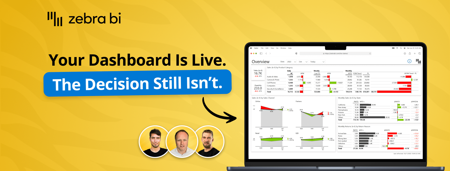
Your reports are ready. Decisions aren't. Learn how to close the Last Mile - live Power BI build, real client case, actionable framework. Free, 60 min.
Watch now
April 23, 2026
Power BI reporting that actually works: 3 real teams, real results
Your reports are ready. Decisions aren't. Learn how to close the Last Mile - live Power BI build, real client case, actionable framework. Free, 60 min.
Watch now
March 5, 2026
Why BI fails in the Last Mile - How top teams turn reports into decisions
Your dashboards look great. Decisions still lag. Find out why - and what top teams do differently to close the gap between insight and action.
Watch now
December 16, 2025
AI in FP&A: From Raw Data to Reporting Automation
Join our live webinar to learn how to use Zebra AI to turn raw finance and business data into executive-ready dashboards that help Controlling & FP&A teams explain performance.
Watch now
Browse All Resources