Power BI Made Easy – 5 Steps to Actionable Reports [Webinar Overview]
Share this
Power BI is, without doubt, one of the most advanced and useful business intelligence tools ever built. But when starting with Power BI, many people feel equal parts excited and overwhelmed: excited because it opens the doors to so many opportunities, overwhelmed because Power BI can be, well, a lot (at first).
In Webinar 47 (pfew, it's been a while!), Tilen and Mark untangled the seemingly mysterious ways of Power BI to build actionable reports. Here's a quick rundown of what they discussed (you can also watch the recording using the button below, as always).
Building reports in Power BI may seem straightforward at first—you import your data and start creating visualizations. However, this approach often leads to complications, especially if you’re working with flat tables or multiple disconnected tables. To truly harness the power of Power BI and simplify reporting for everyone in your organization, it’s essential to follow a structured process.
Here are two crucial steps to set you on the right track, no matter what you decide to do with your data next:
Preparing and Cleaning Your Data
The first step is data preparation. This means cleaning and transforming your data so it’s ready for analysis. Skipping this step can lead to confusion and inefficiency later on. Although data prep might initially seem complex, it’s actually quite manageable and necessary to ensure a smooth start.
Building a Proper Data Model
Creating a proper data model, often by using the star schema, is critical. This approach works for about 99% of semantic models and simplifies subsequent processes like writing DAX formulae. A good data model provides a solid foundation for your reports, making both building and interpreting them much easier.
Once these steps are complete, the focus can shift to visualizing the data. By using actionable elements such as variance analysis, KPIs, and target tracking, you can create reports that present insights clearly. The goal is to design reports that users can understand without needing an expert to interpret for them.
How to Organize & Build a Star Schema Data Model
Organizing your data into a star schema ensures optimal performance and scalability. In the webinar, Mark suggested you follow these steps:
Stage 1: Start from a Consolidated Table
If you're starting with a single consolidated table that contains all necessary data, follow these steps:
Step 1: Import the Data
Importing the data in Power BI is a very easy, two-click process:
Use Power BI’s Get Data function to connect to your Excel file.
Preview the data to ensure the correct table or dataset is selected.
Choose to either load the data directly or transform it for further preparation. Mark's recommendation is to transform the data first.
Step 2: Clean and Transform the Data
Although you can, theoretically, not transform your data and use it as you have it, it is recommended you do clean and transform it first, so you can start working with a proper dataset from the get-go.
Here's how Mark did this during the webinar:
Remove unnecessary columns or rows to streamline your dataset.
Address null or incorrect values to improve data quality.
Step 3: Establish Time Intelligence (Part I)
During the webinar, Mark went on and started implementing a Star Schema data model. This is necessary because it ensures a good performance of your Power BI reports, even as you scale your solutions.
The first step towards that is by referencing the clean data table and working on it by establishing the time intelligence (this is the first part of doing this, we will come back to it further down the process to finalize it).
To do this, you have to start by identifying or creating date columns. In the webinar, Mark demonstrates this by creating a date column from Columns built for Year and Month indicators, by using the merge function and building a column from examples functions.
Step 4: Separate Dimensions from Fact Table
To avoid repeating columns in text format, you then have to separate the dimensions from the table (as a general rule, the text format is not as efficient as the integer/ number format, particularly when it comes to data model performance).
To do this, follow these steps:
Reference the source table and remove other columns than the dimension we are creating
Remove duplicates.
Add index column to establish the relationship to fact table and allow sorting by custom order.
Repeat the process for other dimensions
Step 5: Bring Dimensions Back to the Fact Table
To bring the dimensions back to the fact table (without the text columns), merge back the dimension table to the fact table.
Remember to also remove dimensional text columns (you can do this by using the "Remove other columns” function).
Step 6: Establish One-to-Many Relationships
This is one of the last steps of the process, as the result of doing this will be your Star Schema model. Before moving on, however, you will have to...
Step 7: Finalize Establishing the Time Intelligence (Part II)
To do this, Mark suggests creating a Power BI calendar table using DAX code (we have a full article on how to create a calendar table using DAX, here). This will allow you to leverage the Power BI time intelligence to calculate periods like PY, YTD, MTD, and so on.
Stage 2: Building Advanced Visualizations from the Star Schema
Once you have your Star Schema in order, you can proceed to build advanced visualizations on your Power BI dashboard. Below are some key bits of information you need to know about this, as presented in the webinar.
How to Implement Data Visualization Best Practices
There are, of course, a lot of data visualization best practices to keep in mind. However, for the purpose of building this actionable report, we suggest you to:
Use simple (one line of code) DAX measures, to calculate actuals and previous year values. You don't need to solve data modeling issue with DAX if your data model is built on solid foundations.
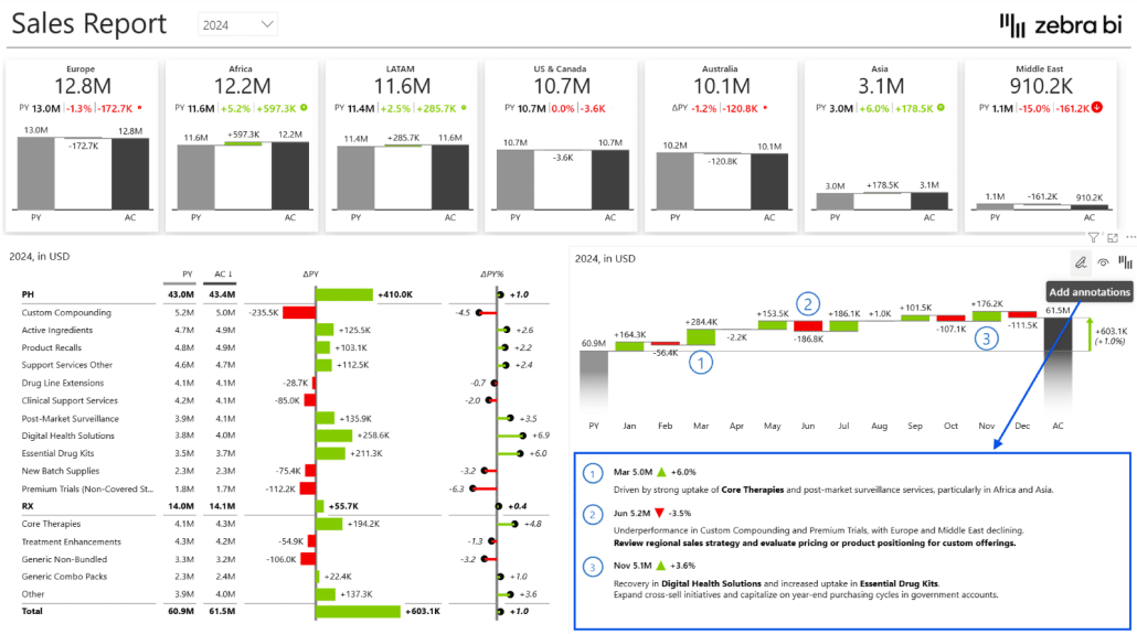
Employ Zebra BI Cards for top-level KPIs: simple DAX measure and insights are generated without extra effort. You can also add dimension into groups to breakdown the KPIs with perfectly scaled multi-card visualizations. Also, you can use these Zebra BI cards to cross-filter other visuals in the report.
As a bonus point, the Zebra BI cards erase the need for additional slicers as these can act as slicers as well.
Use Zebra BI tables for structural breakdown with visuals. These will help you get automatic variances analysis for immediate context. Also, they will enable you to add hierarchies for a more granular view on data.
Use Zebra BI charts for trends with the same functionalities (chart types, design elements, interactivity, responsive layout, etc.) all out of the box and easy to use.
With Zebra BI visuals, you don't need to worry about how to design and how to ensure proper formatting of each element. Visuals can take care of it and save you time.
Add storytelling features as a next step. For instance, you can add comments to explain why and collaborate on reports.
To change or accommodate the context of "negative" KPIs such as costs, where increase is generally perceived as a bad thing, apply invert variance colors.
Show detailed trends with small multiples.
Start small, with a simple table, as explained, and build on to get to more advanced reports with disconnected tables (for KPI selection, MTD/YTD switch, tooltips, bookmarks, etc.
How to Create Advanced Visualizations for Financial Statements
When presenting financial data, the table format is recommended for a number of reasons:
It is more intuitive in presentations (it shows data from left to right, oldest to newest, and from revenue down to profit)
It is closer to the widely accepted structure of financial statements
Here are a few things you can implement in a table format to elevate your financial data reports:
Turn ERP Exports to Power BI Reports
You can turn ERP exports or similar datasets to Power BI reports as part of your POC.
To do this, you should follow the Clean and Transformed Steps mentioned earlier, during Stage 1. Additionally, you can also do what Tilen showed webinar attendants, specifically for financial use cases:
Create account structure with index column for income P&L layout structure, i.e. custom sorting.
Establish the time intelligence, but keep in mind this would be a different approach to the calendar table one (you should create it in PowerQuery). This will help you lower the amount of DAX you need and add additional points for a solid data model that enables you to scale your solution (and keep report performance high).
Unpivot the columns to get values from multiple columns into one column. This allows you to keep your fact table as narrow as possible.
Use simple, one line DAX statements.
Visualize P&L
To better visualize Profit & Loss statements, follow these best practices suggested in the webinar:
Add Zebra BI Tables for automatic variance analysis and visualization.
Apply custom sorting by column to give proper structure to your P&L.
Employ waterfall chart type inside of your P&L table to explain the positive and negative contributors to your profit and significance of each.
Apply invert and result calculations to build the waterfall chart. Alternatively, you can add category class definition to your account structure and apply it with a single drag & drop (here's our product update describing this new feature).
Add custom calculations on the fly with Formula Manager, without a need to go into data model.
Add comments to make financials understandable to everyone, connect business events with financial outcomes.
Implement a MTD/YTD switch for a one-click navigation between MTD and YTD figures, or for a MTD and YTD view within one page.
Conclusion
Essentially, turning your Power BI reports into actionable dashboards boils down to five steps:
Clean & Transform Your Data
Start by cleaning and transforming your data. In the webinar, Mark and Tilen have shown you how to follow some basic steps in Power Query that are appliable to most common use cases.
It might look overwhelming, but it isn’t as complex as many think.
The key here lies in implementing a proper star schema data model. Setting up a proper data model is important for enabling future scaling of reports from POCs projects to business reporting solutions used across your organization.
Adopt Data Visualization Best Practices
Adopting business communication best practices (such as the IBCS) will help you make sure your reports are understandable and standardized. This also means consistency and clarity for report end users.
Having the right set of tools or software to implement any kind of business is an enabler for ROI on such projects or transformations.
This way, the report developer doesn't have to care about the IBCS rules. You just need to prepare the data and the software makes sure the visuals created from the data are already aligned with IBCS standards. This is a win-win scenario for report developers and end users.
Remember Key Elements of Actionable Reporting
In the Power BI tutorial we have shown, a lot of emphasis was on variances. The reason behind this is because they give context to your figures: is your performance good or bad? And how good or bad? Being able to answer this kind of questions from a report can be a gold mine of insights for your business.
Use Advanced Visualizations
Using advanced visualizations in Power BI helps you bring actionable reporting elements to life. Examples include:
Cards for top level KPIs
Tables for structural analysis & financials
Charts for time series (including small multiples)
Annotations can make all of them even more insightful as they give you the opportunity to explain the “why” behind the numbers, which will make your reports very actionable.
Support Adoption & Scalability
As your report (your POCs) is now build on very strong foundations, you can start scaling your solution. You can:
Use a bigger dataset
Implement wider range of use cases
Service a larger number of departments & users
Implement advanced Power BI techniques
...And more
Organization-wide adoption will create a data-driven culture—and that is precisely what you want.
Take these with you, put them into practice, and deliver reports that stimulate actions and create value for your business. If there’s no action, then all reports, all data warehouses, are just costs.
Data becomes valuable only when a decision is made and an action is taken, and the steps described in this webinar will help you do that in a clearer, more straight-forward, and accurate way.
Power BI Made Easy – 5 Steps to Actionable Reports [Free Webinar Recording]
Looking for an easy, bulletproof way to building Power BI dashboards that are 100% actionable for everyone in your organization?
Watch Tilen and Mark, our Lead Power BI Consultants uncover the secrets of turning simple databases into mean, lean, insights-generation machines.
 September 8th
 February 22nd