Power BI Performance Optimization: The Complete Guide to Building Lightning-Fast Reports
PRO Trial
Proper Power BI performance optimization saves time, prevents frustration, and protects your credibility.
Picture this: you’re in a board meeting, ready to present quarterly results. You click your Power BI dashboard—and it stalls. Thirty seconds of loading later, attention (and trust) is gone.
This happens in organizations every day. Despite big investments in licenses and hours building reports, many teams still face dashboards that don’t perform when it matters most.
The reality is simple: when reports are slow, people stop using them—and when adoption drops, data-driven decision-making collapses.
This guide will show you how to turn sluggish dashboards into lightning-fast, reliable reports that business users actually want to use.
Why Optimize Power BI Performance?
Fast, responsive dashboards don’t just feel smoother—they transform how your organization uses data. A report that loads in 2 seconds instead of 15 fundamentally changes how people interact with insights, make decisions, and collaborate.
Think about your own experience with websites and apps: when they’re quick, you stay, explore, and trust the results. The same is true for business users in Power BI. Optimizing performance ensures they engage with dashboards regularly and confidently.
The Benefits of Fast Power BI Reports
When Power BI reports load quickly (under 2–3 seconds), something powerful happens:
- Users check dashboards more often, staying connected to business metrics.
- Teams make faster decisions because insights are instantly available.
- Data exploration increases as users feel encouraged to click, filter, and drill down.
- Presentation confidence improves with visuals that load smoothly in meetings.
- Overall satisfaction with BI grows, increasing adoption and ROI.
In short: Power BI performance optimization is about more than speed—it builds trust, drives engagement, and maximizes the value of your BI investment.
Optimizing performance in Power BI isn’t just theory—it’s about applying practical steps that make your dashboards faster and more reliable. In this short video, you’ll see real examples of diagnosing bottlenecks, tuning DAX, and improving report design so your reports load in seconds, not minutes.
Want the full picture? This clip is taken from our webinar on Best Practices for Power BI Report Optimization, where our experts dive deeper into model design, query tuning, and report layouts.
Data modeling: The foundation of performance
Here's something most people don't realize: the speed of your Power BI reports has very little to do with your computer, internet connection, or Power BI's servers. The primary factor determining performance is something most users never see – the data model structure underneath your reports.
Think of your data model like the foundation of a house. You can paint beautiful rooms and install gorgeous fixtures, but if the foundation is weak, the entire structure will have problems. Similarly, you can create stunning visuals and write clever formulas, but if your data model is poorly designed, your reports will always be slow.
What is a data model?
A data model is simply how your data is organized and connected within Power BI. Most people focus on the visible parts – the charts, tables, and dashboards – but the invisible data relationships underneath determine whether those visuals load in 1 second or 30 seconds.
Understanding data model types
Just like there are different ways to organize files on your computer, there are different ways to organize data in Power BI. Some approaches work much better than others:
1. Flat tables
This is like keeping everything in one giant Excel spreadsheet. All your sales data, customer information, product details, and dates are mixed together in enormous tables.
While this seems simple, it creates major performance problems as your data grows. Imagine trying to find specific information in a single spreadsheet with millions of rows and hundreds of columns – your computer would struggle, and so does Power BI.
2. Snowflake schema
This approach breaks data into many small, connected tables. While more organized than flat tables, it creates a web of complex relationships that Power BI struggles to navigate quickly.
Think of it like a filing system where each folder points to other folders, which point to more folders – finding information requires following a long chain of connections.
3. Star schema
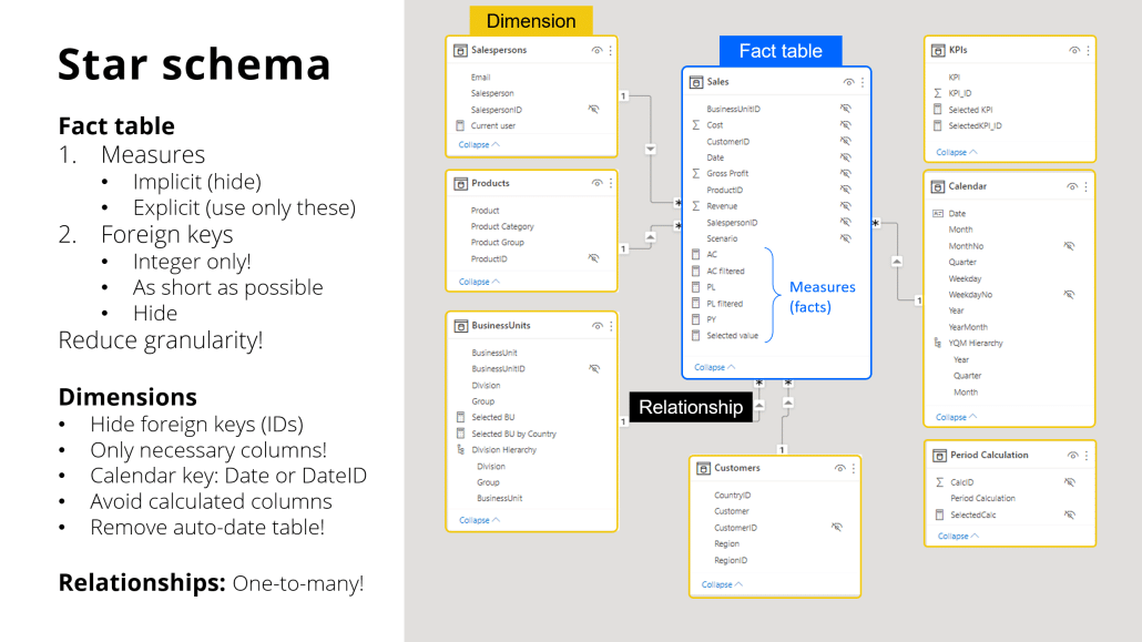
This is the "sweet spot" for Power BI performance. Data is organized into a central "fact" table (containing numbers like sales amounts) surrounded by "dimension" tables (containing descriptions like customer names, product categories, and dates).
This structure mirrors how people naturally think about business data and aligns perfectly with how Power BI's engine works most efficiently.
Why star schema wins in Power BI
Real-world case studies consistently show that converting complex data models to star schema design can improve report performance by 5-10 times. One recent analysis showed a complex model with 32 interconnected tables being simplified to 8 well-structured tables, resulting in dramatically faster performance across all reports.
Star schema delivers superior performance because it matches how Power BI's internal engine processes queries. Instead of jumping between dozens of tables to answer simple questions like "What were sales by region last month?", Power BI can find the answer quickly by looking at just a few, well-organized tables.
Key star schema optimization techniques

If you want faster reports built on the star schema data model, the following tips will help you achieve that:
Reduce cardinality
Use simple numeric codes instead of long text descriptions for connecting tables. Instead of joining tables on customer names like "ABC Corporation International Ltd.", use customer ID numbers like "12345". Numbers process much faster than text.
Remove unused columns
Every column in your model consumes memory and processing power, even if it's never displayed in reports. Including "every possible column because somebody might need it someday" is one of the most common performance mistakes in Power BI.
Use integer keys
When connecting tables, always use whole numbers (integers) rather than text or decimal numbers. This simple change can dramatically improve how quickly Power BI processes relationships between tables.
Hide technical columns
Keep the numeric keys that make your model fast, but hide them from report builders so they only see meaningful business descriptions.
Data loading & transformations
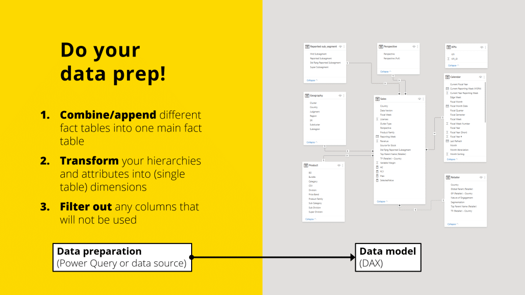
One of the biggest performance mistakes people make is doing complex calculations in the wrong place. Understanding where different types of work should happen can mean the difference between reports that load in seconds versus reports that struggle for minutes.

Power Query vs. DAX: Choose wisely
Power BI has two main "engines" for working with data, and understanding when to use each one is crucial for good performance:
- Power Query: This acts like a factory assembly line, processing data once during report refreshes. It's ideal for heavy tasks such as cleaning data, merging sources, and creating calculated columns. This work happens during scheduled refreshes (often overnight), preventing slowdowns for users during the day.
- DAX: This functions like a real-time calculator, running every time a user interacts with a report. It's perfect for measures, KPIs, and calculations that need to respond to user filters. However, since DAX executes in real-time, overly complex DAX formulas can significantly slow down visuals.
The key principle: Do the heavy computational work in Power Query during data refresh, not in DAX during user interactions.
Essential performance settings for Power BI performance optimization
Optimizing your Power BI reports requires careful attention to performance settings that can significantly enhance user experience.
Disable Auto Date/Time Tables
By default, Power BI automatically creates hidden calendar tables for every date column in your data. While convenient, these hidden tables consume significant memory and slow down queries. Most organizations should disable this feature and create one shared calendar table instead.
Implement incremental refresh
For large datasets that grow over time (like transaction logs), configure Power BI to only update recent data rather than reprocessing everything during each refresh. This can reduce refresh times from hours to minutes.
Optimize date handling
Use simple date formats rather than detailed timestamps. Most business reports need to show data by day, month, or year – not by the exact second a transaction occurred. Simplified dates process much faster.
Avoid real-time calculated columns
If you need special calculations, do them during the data refresh process rather than asking Power BI to calculate them every time someone opens a report.
Connection mode strategy

Power BI offers several ways to connect to your data, and choosing the right approach dramatically affects performance. Most users don't realize they have options, but understanding these choices is crucial for building fast reports.
- Import Mode brings data into Power BI's optimized storage engineb rings data into Power BI's optimized storage engine, delivering the fastest possible query performance. Reports load almost instantly because data is stored locally in a highly compressed, optimized format. This mode works best for most business reporting scenarios and provides the full range of Power BI features.
- DirectQuery maintains live connections to your source database, ensuring reports always show the most current data. However, performance depends entirely on your source database's speed and design. Every user interaction sends queries back to the source system, which can create bottlenecks and slow performance.
- Live Connection connects to specialized analytical databases like Azure Analysis Services. This can deliver excellent performance if your organization has invested in proper data warehouse infrastructure, but it limits some Power BI features.
- Composite Models combine multiple approaches, allowing you to import some data for fast performance while maintaining live connections for data that must be real-time. This represents the best of both worlds for many organizations.
For most business users, Import Mode delivers the best experience. Unless you have specific requirements for real-time data, choosing Import Mode will give you the fastest, most responsive reports.
Report & visualization best practices
Even with a perfectly designed data model, poor visual design choices can make reports frustratingly slow. The good news is that these issues are usually easy to spot and fix once you know what to look for.
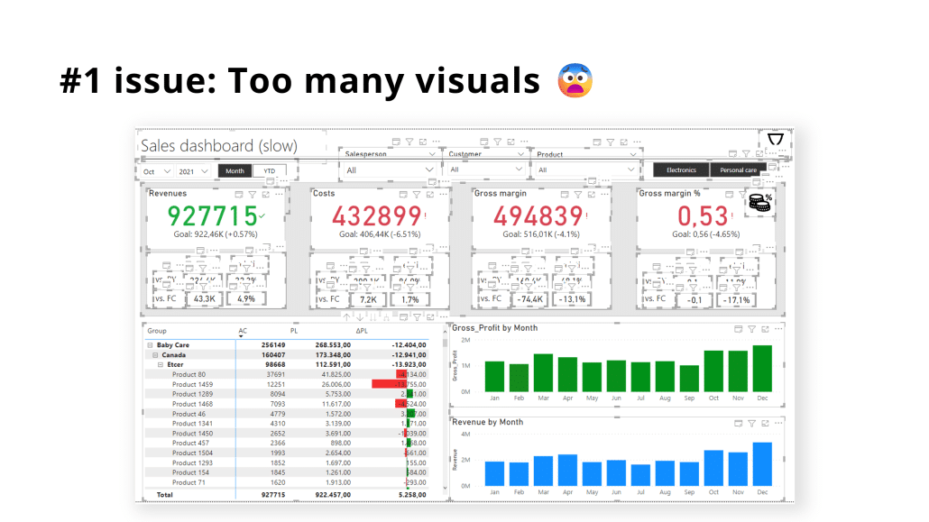
The visual overload problem

One of the most common performance killers is simply putting too many elements on a single report page. Every chart, table, card, and slicer creates additional work for Power BI's engine. A report page with 15-20 visual elements might look comprehensive, but it will load slowly and frustrate users.
Real-world testing shows that reducing visual count from 20 elements to 8 elements can improve load times from 5 seconds to under 1 second – a dramatic improvement achieved simply by consolidating information.
Limit visuals per page

Keep visual count under 8-10 per report page. This isn't just an arbitrary limit – it reflects how Power BI's engine processes queries. Each visual generates its own query against your data model, and too many simultaneous queries create bottlenecks.
Instead of creating separate visuals for each piece of information, look for opportunities to consolidate:
• Replace multiple individual cards with multi-value card visuals
• Use single tables to show relationships instead of separate table visuals
• Combine related metrics into comprehensive chart visuals
Reduce slicers and filters
While slicers (dropdown menus and filter controls) make reports interactive, each additional slicer forces Power BI to maintain more complex filter relationships. Reports with 10+ slicers often suffer from slow performance as the engine struggles to coordinate all the interdependencies.
Focus on the filters that users actually need and remove or consolidate the rest. Sometimes a single, well-designed slicer can replace 3-4 separate filter controls.
Embrace small multiples
Instead of creating dozens of separate charts for different categories, use Power BI's "small multiples" feature to show the same information more efficiently. Testing shows that even reports with 144 individual charts can load in under half a second when properly designed with small multiples – a technique that would be impossible with traditional separate visuals.
Optimize visual interactions
By default, when users click on one visual, it filters all other visuals on the page. While this creates an interactive experience, it also generates additional queries and calculations. Disable unnecessary cross-filtering between visuals that don't need to interact with each other.
Design landing pages for speed

Structure your reports with a fast-loading landing page that gives users an overview and lets them navigate to more detailed pages. Users are willing to wait slightly longer for detailed analysis, but the entry point must load immediately to maintain engagement.
General best practices
Follow these guidelines to ensure your reports are optimized for performance, usability, and clarity.
Use Performance Analyzer regularly
Power BI includes a built-in Performance Analyzer tool that shows exactly how long each element takes to load. This tool removes the guesswork from performance optimization by showing you precise timing data for every visual on your page.
Most users never discover this tool, but it's essential for understanding why reports are slow. Access it through the View ribbon, then click Performance Analyzer. Start recording, refresh your visuals, and review the results to identify the slowest elements on your page.
Handle row-level security carefully
Row-level security allows you to show different data to different users, but it can significantly impact performance. When users with different security roles view the same report, Power BI must generate different queries for each user, multiplying the processing workload.
If you must use row-level security, keep the rules simple and apply them only to dimension tables, not complex calculations. In some cases, creating separate reports for different audiences performs better than using row-level security within a single report.
Test with real-world data volumes
Always test reports with production-sized datasets before deploying them to users. A report that performs well with sample data might crawl with full data loads. Build performance testing into your development process from the beginning rather than trying to fix problems after users start complaining.
Document performance standards
When it comes to document performance standard, establish clear benchmarks for your organization. For example:
- Landing pages must load in under 2 seconds.
- Detail pages should load in under 5 seconds.
- No single visual should take more than 8 seconds to render.
Having clear standards helps you catch performance problems early and gives users appropriate expectations about report behavior.
Conclusion
Power BI performance problems are frustrating—but also preventable. Most slow reports stem from the same causes: poorly designed data models, inefficient data loading, and cluttered visuals.
The good news? These issues have proven fixes. By cleaning up your model, optimizing data loading, and simplifying design, many organizations see 5–10x faster reports, along with higher adoption, quicker decision-making, and better ROI from their BI investment.
Performance optimization isn’t just about speed—it’s about making data accessible and actionable. When reports load in under 2 seconds, executives get instant answers, analysts explore freely, and teams make decisions with confidence.
Start with the fundamentals. Once mastered, you can layer advanced techniques for even more gains.
TL;DR:
Most slow Power BI reports share the same problems—but with the right fundamentals (better models, cleaner loading, simpler visuals), you can achieve 5–10x faster dashboards, boost adoption, and turn performance into a true business advantage.
Take Your Power BI Performance to the Next Level
Optimizing Power BI performance isn’t just about cleaner models and faster queries—it’s also about designing reports that stay lean and decision-ready at scale. With Zebra BI for Power BI, you can consolidate KPIs into fewer visuals, reduce query load, and deliver dashboards that load in seconds.
Start your free trial of Zebra BI for Power BI today and see how optimized visuals transform performance.
And if you’re ready to go even deeper, check out our in-depth guide on Advanced Power BI Performance Tuning for expert techniques to squeeze maximum speed and efficiency from your reports.

 September 8th
 February 22nd