
 September 8th
 February 22nd
What Is a Line Chart? When It Shows a Trend, and When It Invents One
Is your line chart showing a real trend, or drawing one that has no connection to your data? A line chart (or line graph) is a visual that shows how a measure changes over time, so your report readers can see the direction and speed of that change.
The line chart plots values at points along a time axis and connects them with a line. Connecting your data points is easy to get wrong because the slope depends on the order you put the data points in. Draw the line across regions instead of months, sort them differently, and the same data now shows the opposite trend.
So, how can you draw a line chart that accurately shows your business trends?
In this guide, we'll explain how a line chart works, when to use one in your report, how many lines are too many, and the mistakes to avoid when working on a line graph.
What is a line chart?
A line chart is a visualization tool that turns a series of measurements into a single shape, so your readers can see the direction of change without having to compare every value. The line's slope tells you how fast a number is moving, and the shape tells you if the change is steady, seasonal, or a one-off jump.
Keep in mind that the connecting line in your line chart is also a claim. It tells your readers that these points belong to one continuous sequence and that the space between them means something.
Line charts are also known as line graphs or curve charts, but they all describe the same chart.
PRO Trial AVAILABLE FOR FREE!
Set the chart type to Line and the plan and previous year lines arrive already formatted, from the field wells rather than by hand.
Line chart cheat sheet
Line chart details
Doing its job
Time to switch
Broken most often
When you should use a line chart
The line chart's job is continuity. Every case below is a version of the same thing: the reader needs to see how a number moved, not what it was at one moment.
You're tracking one measure across many time points
That is the classic case. 12 months of revenue, 3 years of headcount, 90 days of ticket volume. The more points you have, the better a line performs, because the eye reads one shape instead of counting 12 separate heights.
You need to compare how fast 2 series are moving
Columns show you which value is bigger. Lines show you which one is climbing faster, which is a different question and usually the more useful one in a monthly review.
Your series cross each other
An overtake is almost invisible in columns and obvious in a line chart. If the story is "the challenger passed the incumbent in Q3", the crossing point does the work for you.
Your time points are unevenly spaced
Measurements taken at irregular intervals still sit in the right place along a time axis, so the gaps stay honest. One condition: the axis has to be scaled to real time. If your tool treats each reading as an evenly spaced category, a 6-month gap and a 1-day gap look identical and the chart is lying.
You want to see small movements
When a series is nearly flat, columns hide the wobble because you're comparing full heights. A line makes a 2% drift visible.
That split between time and structure isn't a matter of taste.
If you're reporting on time, always do that on the horizontal axis, so these will be line charts or column charts. Reporting on structure, so these could be cities, clients, employees, departments, will always be done on the vertical axis, and therefore that will be a bar chart.
Marnix Jansen, BI Developer and Consultant, speaking in the Zebra BI webinar How Teams Cross the Last Mile, 26 March 2026
The IBCS reporting standards say the same thing: time runs along the horizontal axis, structure down the vertical one.
When you shouldn't use a line chart
Each of these has a better chart waiting, and picking it takes about 5 seconds once you know the rule.
You only have 4 or 5 values
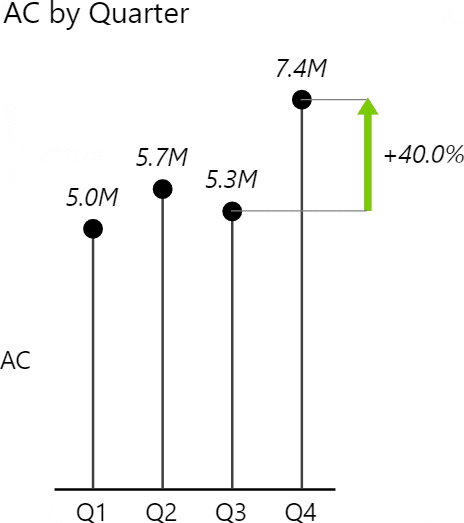
With a short series the shape of the curve tells you nothing, and the reader ends up comparing individual values anyway. Use columns, which show each value at full height. Or use a dot chart, which marks each value with a point and no connecting line, so nothing implies a trend between readings.
Your categories have no order
This is the one worth slowing down for. Drawing a line across Germany, France, and Spain produces a slope, and a slope reads as a trend. There is no trend, because there is no sequence: reorder the countries alphabetically and the "trend" reverses. Use a bar chart, which ranks categories down the page without implying anything about what comes between them.
You're measuring variance to plan
A line shows you the actual number. It doesn't show you the gap. If the question is "are we ahead or behind", you want a variance chart or a waterfall. Both of those draw the gap itself in green and red, instead of leaving the reader to measure the distance between 2 lines by eye.
You need part to whole
A line has no area, so it can't show composition. An area chart fills the space under the line and stacks the bands. Reach for it when the reader needs to see the parts adding up to the total.
There's one more limit that isn't about chart choice at all. A line chart shows movement. It doesn't explain it. Revenue going up and to the right looks like good news until you add the plan line and find out you're 8% behind it.
Line chart vs bar chart: which one for a trend?
This comparison usually has 3 charts in it rather than 2, because most people say "bar chart" for both orientations. In IBCS terms, columns run vertically and carry time, bars run horizontally and carry structure.
| Line chart | Column chart | Bar chart | |
|---|---|---|---|
| Best for | a trend across many time points | a handful of time points | ranking or comparing categories |
| Category axis | horizontal, time | horizontal, time | vertical, structure |
| Comfortable number of points | 8 and up | 4 to 12 | as many as the page fits |
| What the eye reads | slope and shape | the height of each value | length, sorted |
| Zero baseline | recommended, with one exception | required | required |
| More than 4 series | split into small multiples | overlapping gets unreadable | fine, they stack down the page |
The verdict: if the horizontal axis is time and you have more than 8 points, use a line. If it's time and you have a handful of points, use columns. If it isn't time at all, use bars and stop thinking about lines.
Not sure whether your data wants a line or a bar? The Chart Selector is a Power BI Desktop file that walks you from the question you are answering to the chart that answers it, with the line layouts rendered on real numbers. It draws through Zebra BI, so you need the visuals installed to open it. Download the Chart Selector
How many lines is too many?
More lines is not more insight. Every series overlaps every other one, the legend needs a magnifying glass, and the one store that's tanking sits hidden somewhere in the tangle.
The IBCS standards put the limit at 3 or 4 intersecting lines in one chart, and call anything past that a spaghetti chart. The recommendation is small multiples: one small chart per series, all on the same scale, arranged in a grid.
10 lines on one chart isn't a trend analysis. You can see there's movement, you just can't see whose. Break it into small multiples and the laggards jump out. You can scan all of them in the time it took to trace one line.

The standard does allow an exception. Keep everything in a single chart when the reader has to compare exact heights across series at one point in time. Splitting into panels makes the eye jump between grids to do that.
Types of line charts
Most guides name 3 types, and the names are useful because they map onto 3 different questions.
- Simple line chart. One series, one question: how did this number move?
- Multiple line chart. 2 to 4 series on shared axes, for comparing slopes and spotting crossovers.
- Compound line chart. The bands are stacked so they sum to the total. This is a stacked area chart under another name, and the area chart guide covers when the fill helps.
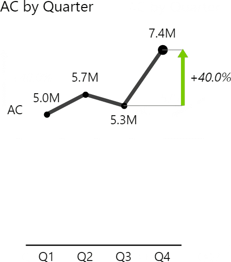
Two variants sit on top of those. A line with markers puts a visible point on each reading. That helps when the reader needs to see where the measurements actually fall, not just where the line passes. And adding a second measure to Values makes a combination chart. It puts a second series over the columns, so you do not need a separate visual beside them.
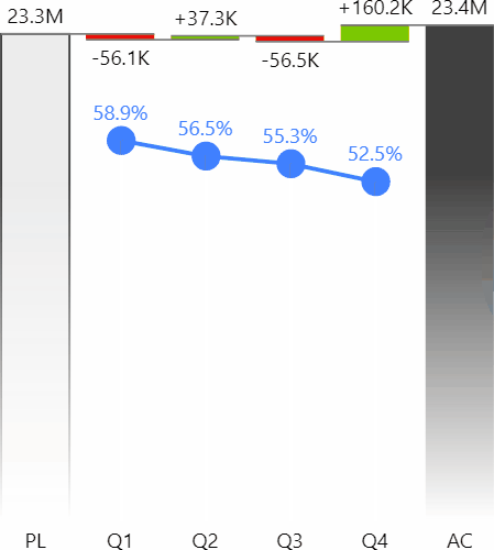
Line chart layouts in Zebra BI
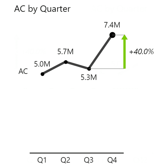
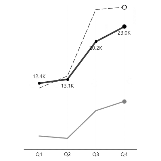

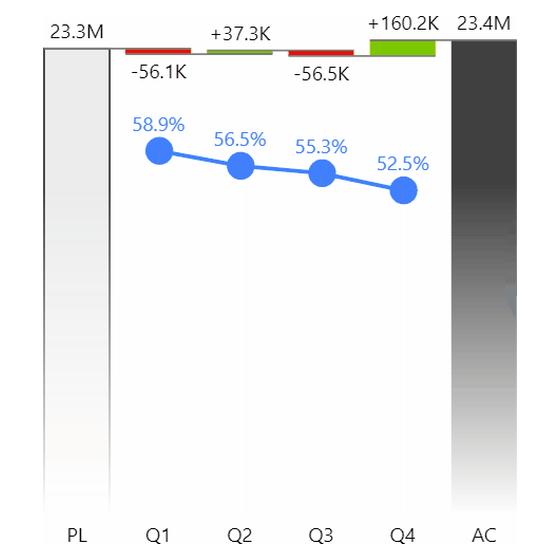


Two things the tiles can't say. Scenario lines come from the Previous Year, Plan and Forecast field wells rather than from adding more measures. The visual formats them for you instead of leaving it to hand. And the dot chart in the last tile is its own thing rather than a line chart with the line switched off. It carries its own color and its own marker and dropline settings, which is why the line width control follows it around.
ONE SERIES, SIX TREATMENTS
Trace one line. Or split them into panels and read all 6 at once.
Every chart on this page is a real Zebra BI render, not a mockup. Put your own series through the same treatment.
How to build a line chart in Power BI
Power BI ships a line chart, and for a single series it's fine. Here's the native path.
- Select Line chart from the Visualizations pane.
- Drag your date field to the X-axis.
- Drag your measure to the Y-axis.
- Open the Format pane and turn off the title if the chart sits under a heading that already says the same thing.
- Set the Y-axis to start at zero.
- Add data labels to the first and last points only.
Step 6 is where the native visual gets tedious, because you're labeling points by hand every time the data changes.
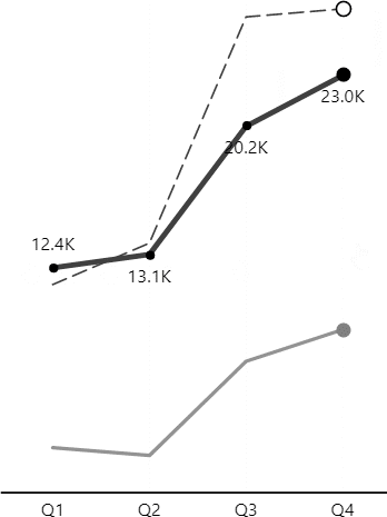
With Zebra BI Charts you get the reporting conventions without the formatting work. Pick Line as the chart type, then drop your comparison measures into the Previous Year, Plan, and Forecast wells. The actual line renders solid, the plan renders as a dashed outline, and the previous year renders in a lighter tone, which is the notation finance readers already recognize. Variance arrows and small multiples come from the same visual, so switching from one line to 6 panels is a layout change rather than a rebuild.
Line charts for Office
Zebra BI Charts ships as an Office add-in as well, so the same line chart is available on two more surfaces.
Line charts in Excel
Excel calls it a Line chart too, and the path is short. Select your data with the dates in the left column, go to Insert, then Charts, then Line. Pick the plain Line option rather than the 3-D or stacked variants.
Then fix 3 defaults. Set the vertical axis to start at zero, because Excel often picks a non-zero minimum on its own. Delete the gridlines. Replace the legend with a label at the end of each line, which saves the reader a lookup.
Line is one of the types Zebra BI Charts for Office renders in Excel, with the same scenario notation you get in Power BI. A chart built for a monthly pack keeps its conventions.
Line charts in PowerPoint
The knowledge base documents line charts for PowerPoint too, so Zebra BI Charts for Office will draw one on a slide. The difference from a pasted Excel chart is that it does not go stale. Use Link data to Excel to point the visual at a workbook on SharePoint or OneDrive and it refreshes when the deck opens. In PowerPoint desktop only the slides you actually view refresh, so click through before you present. In PowerPoint Online every visual updates when the file opens.
Line chart design best practices
Most of these come from the IBCS reporting standards, which are the notation convention Zebra BI is built on. The rest are the accessibility rules that apply to any chart on a screen.
- Start the value axis at zero. A line encodes change through slope, so cutting the axis exaggerates every movement on it. The field does not fully agree here, and the argument is below.
- Skip logarithmic scales. They break the visual comparison the line chart exists to give you. Comparing growth rates in percent is the rare tolerated case.
- Use the same scale on charts that share a unit. 2 revenue charts side by side with different scales will be read as if they're comparable. If the values differ by orders of magnitude, keep the scale identical and change the physical size of each chart instead.
- Put markers where they earn their place. Every point marked is clutter on a 36-month series. First, last, minimum and maximum is usually the right set. Zebra BI Charts can pick those for you through a marker density setting instead of leaving you to place each one.
- Label the line ends, not a legend. A legend makes the reader look away from the chart and match colors. A label at the right end of each line doesn't.
- Keep earlier periods at full strength. In a continuous series, January is not a "previous year" scenario, so don't gray it back. Keep lighter tones for a real earlier comparison period.
- Give the strokes enough contrast. Line strokes need at least a 3:1 contrast ratio against the background and against neighboring lines. That is WCAG criterion 1.4.11, Non-text Contrast, at level AA. Multi-series lines separated only by hue are the common failure. For readers with red-green color deficiency, a bluish green separates from red far better than a true green does.
- Format month labels short. "Jan 2026" reads at a glance. A long date form doesn't, and it forces the axis to rotate.
- Cut filler words from labels. "Sum of Revenue" is "Revenue". "Revenue trend analysis" is "Revenue".
- Be careful with a second axis. A line over columns on its own scale is useful when the units really are different. It misleads when someone picks the 2 scales to make the series track each other, because moving either scale changes how related they look.
The zero baseline argument
This is the one rule the field does not agree on, so here is where the disagreement sits before you pick a side.
Atlassian's chart guide says plainly that you do not need a zero baseline on a line chart, and gives the reason. A bar chart has to start at zero because of geometry, since the length of the bar is the value, while a line chart uses slope and position instead. They still say to avoid a cut axis in general, with one exception: when a zero line is not meaningful.
The IBCS standards are stricter. They need consistent scaling, and they do not allow a cut axis where the reader has to compare sizes. That covers most business reporting.
We'd side with the standard, for a practical reason. A cut axis makes a 1% movement look like a collapse. Then someone forwards that chart into a board pack, and the axis note does not travel with it. If you do truncate, say so on the chart itself.
Identify trends with a line chart
Before your next report goes out, run each line chart through four checks. Is the horizontal axis time? Do you have 8 points or more? Does the value axis start at zero? Are there four lines or fewer?
Then, ask what your line graph leaves out. A rising line looks like good news until someone adds the plan line, and the gap shows up.
If you need a faster way to build accurate line charts, give Zebra BI a try to keep the same notation across every visual in your report, so your team stops asking what each line means. You can test it through Zebra BI’s 14-day free trial.
Frequently asked questions
When should you use a line chart?
Use a line chart when the horizontal axis is time and the curve has enough points to mean something. That is usually 8 or more. Reach for it to track one measure over months or quarters. It also shows which of 2 series is moving faster, and where one overtakes the other.
Is it called a line chart or a line graph?
Both, and they mean the same thing. "Line chart" is more common in business reporting and BI tools, "line graph" is more common in education and statistics. Curve chart turns up occasionally as a 3rd name for the same thing.
How many lines is too many on one chart?
The IBCS reporting standards put the limit at 3 or 4 intersecting lines. Past that, use small multiples: one small chart per series, all sharing a scale. The exception is a reader who has to compare exact heights across series at one point in time. That gets harder once the series sit in separate panels.
Does a line chart have to start at zero?
The IBCS standards say yes, and they do not carve out an exception for lines. Several well-known chart guides disagree and allow a cut axis, on the grounds that a line shows change rather than size. The risk is that a 1% movement then looks like a collapse. If you do cut the axis, label it clearly.
When should you use a bar chart instead of a line chart?
Use a bar chart when your categories have no natural order, such as products, regions, or departments. A line drawn across unordered categories creates a slope that reads as a trend, and reordering the categories would change it. Bars rank the categories down the page and imply nothing about what sits between them.
What is the difference between a line chart and an area chart?
An area chart is a line chart with the space beneath the line filled in. The fill helps when the reader needs to see accumulated volume or how parts stack into a total. It gets in the way once you have several series, because the fills hide each other. That is why a line chart handles several series and an area chart does not.

Join over 1.5 million Zebra BI users
Do you need a line chart that survives the meeting? Zebra BI draws the plan and prior period lines from the field wells, so the notation stays the same month after month, in Power BI, Excel and PowerPoint.

