Try Zebra BI for FREE - includes waterfall templates
We don't just give you a tool - we give you everything you need to build waterfall charts that actually impress.
No credit card required • Takes 2 minutes • Used by 1,500,000+ professionals
 September 8th
 February 22nd
 04 Jun 2026
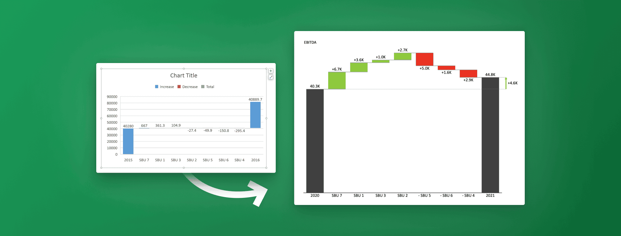
An Excel waterfall chart is a specialized column chart that visually breaks down how a starting value increases and decreases to arrive at a final total. Instead of presenting changes as isolated numbers, it clearly shows the cumulative impact of each positive and negative contribution along the way. This makes it particularly effective for explaining variance, profit and loss drivers, budget changes, or step-by-step performance shifts.
The chart solves a common reporting problem: stakeholders often struggle to understand how individual movements combine to produce a net result. By mapping each change sequentially, a waterfall chart turns complex calculations into an intuitive visual story. It is widely used by finance teams, business analysts, and managers who need to communicate results with their P&L statements, product earning reports or inventory.
In this guide, you will learn how to create, format, and customize an eye-catching waterfall chart in Excel to present your data clearly and professionally.
Don't want to do this manually?
Get Zebra BI free - includes ready-made waterfall chart templates so you skip the hard parts.
An Excel waterfall chart (sometimes called a cascade chart) visualizes how a number changes step by step to reach a final result. Rather than displaying values independently, it connects each positive and negative change in sequence so you can clearly see how the total evolves over time.
Every waterfall chart follows a simple logic and includes the following:
Each additional value “floats” from the previous one to visually reinforce how every component contributes to the overall result.
You may also hear the term bridge chart. A bridge chart is simply a variation of a waterfall chart that includes subtotals at key points to highlight intermediate stages. While all bridge charts are waterfalls, not every waterfall includes these extra subtotal markers. Both formats serve the same purpose: explaining how you move from point A to point B.
Compared to a standard column chart, a waterfall chart is far more effective for explaining change. A regular column chart shows separate bars with no relationship between them, forcing viewers to calculate differences themselves. A waterfall chart does that work visually, making the story behind the numbers immediately clear and easier to understand at a glance.
Waterfall charts are widely used in corporate, finance, and operations reporting because they clearly explain how individual values contribute to changes in a key number. Instead of simply showing totals, they reveal the positive and negative drivers behind those totals, making it clear what increased the figure, what reduced it, and how everything adds up.
Here are some common scenarios when it makes sense to use a waterfall chart:

Because each bar builds on the previous one, stakeholders can quickly see not just what changed, but why it changed.
Tip: You can also add subtotals as checkpoints within the sequence. These act as visual milestones in your data. For example, you could use Net revenue and Gross Income as checkpoints between Gross Revenue and Net incomestarting and ending values.
In short, choose a waterfall diagram when you want to explain how you got from one number to another.
A good example of a waterfall chart in Excel is a simple YoY comparison, such as “Revenue grew 8% YoY” lacks the context necessary for making informed business decisions. What’s actually needed is a way to clearly understand individual contributing factors, such as better pricing, higher demand, or customer growth. You need to understand these drivers because they have very different implications for your strategy and sustainability.
Revenue bridge analysis is a powerful tool for taking revenue values in two periods and pinpointing the causes driving financial performance, such as volume, price and customers.
The structure typically follows a clear business sequence:
Each step in a revenue waterfall chart in Excel quantifies how much that factor contributed to growth or decline, creating a transparent bridge between the two periods.

Structuring your waterfall around these drivers supports sharper decision-making. Leadership can quickly determine whether growth came from pricing power, higher demand, or customer expansion and adjust strategy accordingly. For example, customer-driven growth may justify more marketing investment, while price-driven gains may require monitoring competitiveness.
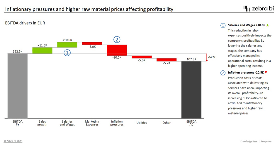
A profit bridge is a focused type of Excel waterfall chart used to explain how your organization moves from one profit figure to another. Rather than presenting profit as a single outcome, it breaks the number into the key business drivers that increased or decreased performance along the way.
This approach is especially useful in financial reviews because profit is rarely driven by just one factor. Revenue, costs, and expenses all shift at the same time, and a bridge chart shows how those movements combine to produce the final result.
A simple, practical structure includes the following steps:
A simple profit number does not reveal whether performance improved because of stronger sales or tighter cost control. This inability to clearly understand the reasons behind profit drivers prevents the management from focusing their efforts correctly.
A profit waterfall chart helps organizations identify margin improvement opportunities or control or reallocate spending. In short, the profit bridge connects financial outcomes to operational causes, turning profit analysis into clear, actionable insight rather than a headline number.
One of the most practical examples of an Excel waterfall chart is explaining budget versus actual variance. It helps organizations identify the areas in which they missed the budget and the reasons behind the variance. The variance analysis may look at revenues, expenses, volume, sales mix and prices.
Depending on which variance users are looking at, the factors may include differences in sales, cost fluctuations, timing differences, inaccuracies in forecasting or budgeting, and external factors. For example, an unplanned increase in expenses may be the result of a large increase in wages or minor increases over five categories. These scenarios require completely different responses and a clear analysis may help the organization decide on the best course of action.
In a budget vs. actual waterfall chart, the structure typically looks like this:

Using a waterfall for variance analysis improves the quality of financial reviews and planning discussions because it:
Creating an Excel waterfall chart is primarily a matter of structuring your data correctly and then telling Excel which columns represent totals. The chart engine does most of the work automatically, but mislabeling totals or cluttering the layout can quickly make the result confusing.
Below is a clear, step-by-step Excel waterfall chart tutorial for both basic and more advanced use cases.
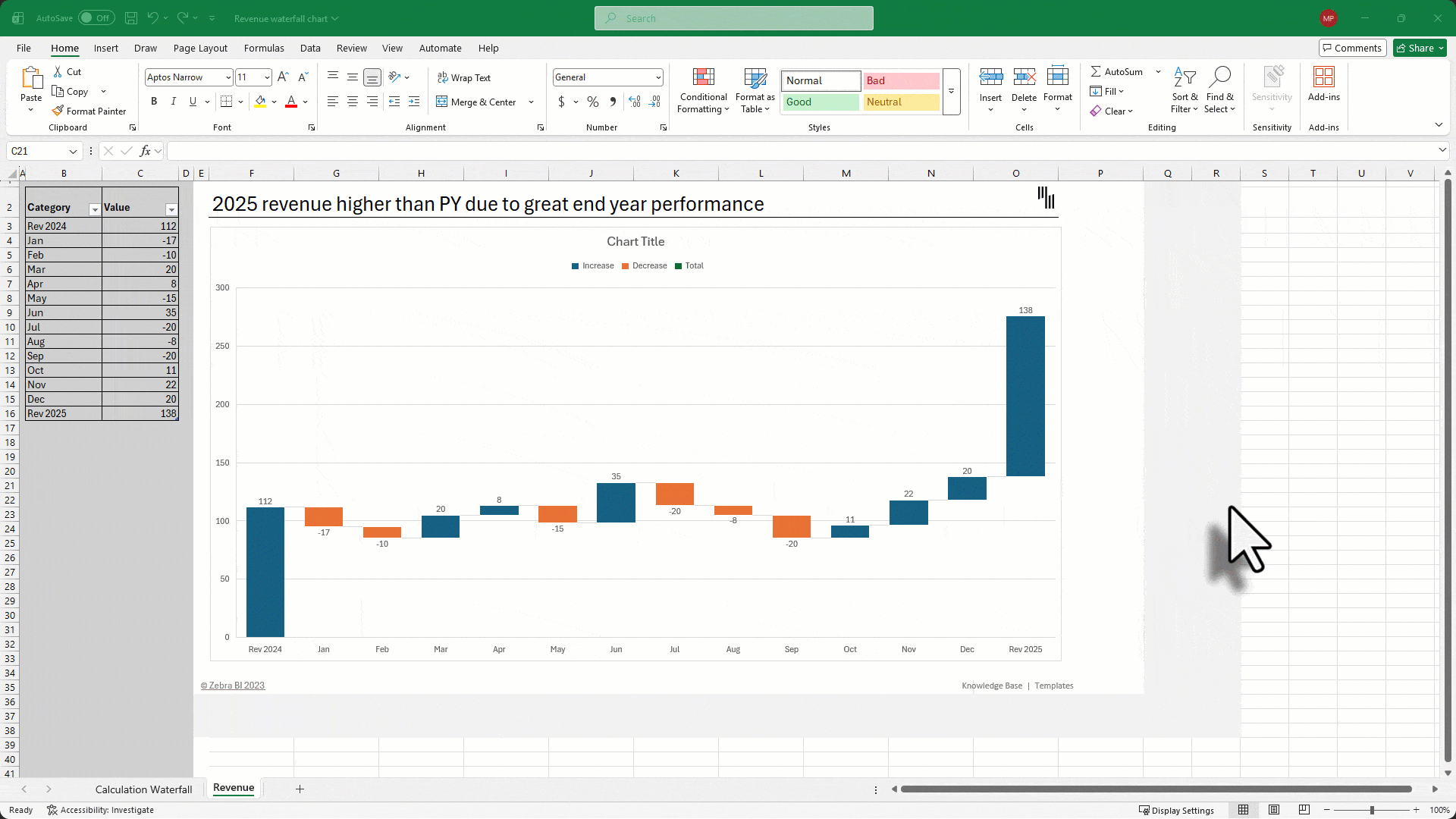
This is the most common format and works well for scenarios like revenue change, budget vs. actual, or year-over-year comparisons where you have one starting value and one ending value.
Set up two columns:
Structure the data in logical order:
Keep the sequence aligned with the story you want to tell. Waterfall charts are chronological or logical, not alphabetical.

Select the full data range
Go to the Insert tab
Choose Waterfall or Stock Chart → Waterfall
Excel will automatically color increases, decreases, and totals differently.
Step 3: Set your totals correctly
This step is critical.
Excel treats every bar as a change unless you explicitly mark totals.
If you skip this step, the chart will calculate incorrectly and “float” from the wrong baseline.
Want to skip the 10-step process?
Zebra BI builds waterfall charts in 3 steps with automatic variances, scaling, and templates included - all free to try.
By default, Excel adds visual elements that often distract from the message.
Cleaner charts are easier for stakeholders to interpret quickly.
Step 5: Improve visibility of small contributions (optional)
If some bars are too small to see:
This improves readability, but use carefully, since the chart will no longer visually start at zero.
For an advanced waterfall chart follow the tutorial for creating a basic waterfall chart in Excel above. The only difference is that you introduce multiple subtotal checkpoints instead of just one starting and ending total.
This format is useful when you want to show how a number evolves through several logical stages. For example, you might want to use Net revenue and Gross Income as checkpoints between Gross Revenue and Net income starting and ending values.
Each subtotal acts as a “pause point” that shows the cumulative result before moving to the next set of drivers.
How it differs from a basic waterfall
The chart creation steps are exactly the same. The only additional action is:
Mark every subtotal column as Set as Total, not just the first and last bars
Without this step, Excel will treat subtotals as regular changes and the math will be incorrect.

While Excel is the industry standard for spreadsheet work, its native waterfall chart functionality is not perfect. As datasets grow and reporting becomes more complex, several practical limitations start to appear. Here are some of the most common:
Heavy Manual Data Prep: Waterfall charts rely on clean and structured input data. You must manually organize categories, calculate positive and negative changes, and ensure totals are placed in the correct positions as Excel does not understand business logic such as subtotals or intermediate checkpoints.
Hard to maintain and update: Because these charts are sensitive to data structure, something as simple as adding a new revenue category or changing a subtotal can break your Excel waterfall chart. Reformatting and relabeling totals and categories adds unnecessary friction to regular reporting.
Easy to misinterpret: Some common issues include too many bars, unclear categories or wrong scale can cause readers to fail to immediately grasp the relative impact of a change.
Static visuals: Excel waterfall charts are largely static and lack dynamic filtering, drill-downs, automatic updates from live data and interactive exploration.This limits their usefulness in dashboards or environments where users need to explore different scenarios quickly.
For teams that have outgrown manual data entry, the focus shifts from building the chart to analyzing the insights. This is the logic behind Zebra BI. Instead of fighting with Excel’s formatting quirks, Zebra BI automates the heavy lifting. It allows you to create dynamic, IBCS-compliant waterfall charts that handle subtotals automatically, offer drill-down capabilities, and ensure your "last mile" of analytics is spent telling the story, not fixing the formatting.

Waterfall charts are powerful when used correctly, but they are also easy to misuse. Most problems stem from either overcomplicating the chart or structuring the data poorly. The result is a visualization that confuses rather than clarifies.
Below are the most frequent mistakes to avoid.
Trying to show every minor driver of your KPIs creates clutter and reduces readability. When a chart has 15–20 small steps, the arc of your story gets lost in details.
Fix: Focus only on the biggest contributors that explain most of the change or group smaller items into a single category.
If starting, ending, or subtotal columns are not marked as Set as Total, Excel treats them as incremental changes. This produces incorrect floating bars and misleading results.
Fix: Always explicitly set totals and double-check that they anchor to the baseline.
Random color choices make it harder to interpret gains and losses. Worse, inconsistent use (e.g., red for positive in one chart and negative in another) creates confusion.
Fix: Use consistent conventions, such as positive values in green, negative values in red, and totals in a neutral color, which is a common approach in financial reporting.
Waterfall charts are designed to explain step-by-step change and highlight contributions. They are not ideal for trends or simple comparisons.
Fix: To show trends over time use a line chart. Category comparisons are best displayed with a column/bar chart and single differences are most effectively displayed with a variance chart. Only use a waterfall when you need to explain drivers between two values.
Including small or low-impact categories distracts from the main message and weakens the analysis.
Fix: Focus on significant drivers that should be addressed by your decisions. Minor contributors are often just noise that can drown out your story.
Sorting categories alphabetically or by size breaks the logical flow of the story.
Fix: Order steps according to business logic (chronological or causal sequence).
Gridlines, legends, heavy borders, and extra labels add visual noise without improving understanding.
Fix: Remove anything that does not directly support interpretation.
When deciding when to use waterfall charts you should know how they compare to other types, such as variance and bridge charts. While they look similar, each serves a slightly different purpose.
A waterfall chart in Excel explains how multiple drivers move a number from a starting value to an ending value. It shows the cumulative impact of several positive and negative contributions in sequence. It is best for:
Essentially, variance reports show the difference between the planned or past financial outcomes and the actual financial outcomes (e.g., Budget vs. Actual, Plan vs. Forecast). It shows the size of the difference but does not explain what caused it. No organization can expect to make informed decisions without having this insight and variance reports are all about providing it.
Use a variance chart when you only need to show the magnitude of change at a high level and use a waterfall chart when you need to explain the drivers behind that change. If you want to answer the question of Why, you need a waterfall chart.
A bridge chart is essentially a structured subtype of a waterfall chart that includes explicit subtotals or milestones between the starting and ending values. Instead of showing one continuous start-to-finish flow, it breaks the journey into logical stages and highlights the cumulative result at each checkpoint.
This format is useful when you want to show how a number evolves through several business steps rather than just a single overall change. For example, you might move from Gross Revenue → Net Revenue → Gross Income → Net Income, with each subtotal acting as a clear performance milestone.
Bridge charts are best for:
A standard waterfall chart focuses on explaining one overall change between a start and an end. A bridge chart adds structure by emphasizing the checkpoints in between.
Use a waterfall chart for simpler stories with one start and one end. Use a bridge chart when you need to show meaningful intermediate stages and how each stage contributes to the final outcome.
Waterfall charts are not just about showing numbers. Creating them is only half the job. The next step is to interpret data and turn them into clear and actionable conclusions. Use waterfall charts in your analysis as a diagnostic tool for your data to see what drove change and pinpoint where you need to focus your efforts.
Start with a quick review of the chart and look for bars that stand out - either in positive or negative direction. These are the drivers that contributed the most to any changes you see in your data and here is where you need to focus your attention.
A useful question to ask yourself is “Which 2 or 3 steps explain most of the movement in my data?”. Once you have the answer, you are on your way to focusing your attention productively.
Each bar in a waterfall chart communicates two things:
Waterfall charts clearly show that not all changes are created equal. Some have a major impact on your results while others might be just a blip on an otherwise positive trajectory.
A waterfall chart is a powerful tool for explaining contribution and causality. You can see which factors drove results and how you got from point A to point B. Individual bars allow you to see the net impact of individual drivers and compare their relative importance.
On the other hand, you cannot see the reasons behind the changes. While the chart may show a $50k negative impact of churn, it does not explain why those customers left. It also cannot show whether a change like that is one-time or recurring.
Essentially, It explains what changed, not why it changed at a deeper operational level or what will happen next. It serves as a tool to focus your attention on individual areas and start looking for root causes and ways to address them.
When presenting a waterfall chart, avoid narrating every step and getting bogged down in details. After all, it is a great tool to focus your attention. Tell a story following this simple structure:
For example: “Revenue increased by $2M, mainly driven by higher pricing and new customers, partially offset by higher operating costs, resulting in a $500K net profit increase.” At its core, a waterfall chart is doing its job, when the user can see what changed and what should be acted upon.
Select your data, go to Insert > Insert Waterfall Chart, then right-click on your starting and ending columns to Set as Total. Customize by removing gridlines and legend using the Chart Elements (+) button for a cleaner look.
Waterfall charts are built into Excel 2016 and later, including Excel 2019, 2021, 2024, and Microsoft 365. Earlier versions (Excel 2013 and below) require manual creation using stacked column charts or third-party add-ins.
No, Excel doesn’t natively support combining waterfall charts with other chart types. You’ll need workarounds like overlaying separate charts manually or using third-party add-ins like Zebra BI for advanced combo chart features.
Common alternatives include stacked column charts (for cumulative values), clustered column charts (for comparisons), or Gantt charts (for timelines). For advanced waterfall features, consider Power BI, Tableau, or Excel add-ins like Zebra BI.
An Excel waterfall chart is primarily used for variance analysis. It visualizes how an initial value (like last year's revenue) is affected by a series of intermediate positive and negative factors to arrive at a final value (like this year's revenue). It helps explain the drivers behind changes in metrics like revenue, profit, budget, or cash flow instead of just showing totals.
Use a waterfall chart when you need to show contribution. It works best for variance analysis, financial reporting, and contribution breakdowns where multiple positive and negative factors impact a final outcome. If your story is about "how we got here," use a waterfall chart.
A bridge chart is a variation of a waterfall chart that includes subtotals or checkpoints between the start and end values. It is exceptionally effective for P&L explanations, walking stakeholders through how changes in COGS (Cost of Goods Sold), operating expenses, and tax impacts eventually result in your Net Income.
Yes. In fact, "Budget vs. Actual" variance analysis is one of the most common use cases. It allows you to show the planned budget as the starting pillar and then use individual bars to show exactly how you arrived at that result.
Yes. Waterfall charts are widely used in finance because they clearly show revenue drivers, cost changes, expense impacts, and profit bridges. They make complex reconciliations easier for both analysts and non-financial stakeholders to understand.
This usually happens because the starting or ending values haven't been "grounded." In Excel, you must right-click the specific data point (the pillar) and select "Set as Total." This tells Excel to start that bar at zero on the horizontal axis rather than having it float from the previous value.
A good rule of thumb is to limit your chart to 7–10 drivers. If you have 20 different factors, the bars become too thin to read, and your story gets lost in the noise.
Tired of rescaling charts manually every month
Zebra BI does it automatically - plus you get ready-made waterfall chart templates included in your free tri
AMAZING I found what I have searched for. GREAT
Financial Controller Europe
Thanks Özkan, we're glad you liked it. 🙂
Hi, using ZebraBi Excel, can I save in a cell the introduced axe break value? so I could change it (by typing in a new value, instead of using the standard way with clicking on the wheel, etc...
many thanks
Hi Oliver and thanks for your question. At the moment we don't have this option you're asking about, but we'd certainly like to add it in the future. Stay tuned!
thanks alot of information