 September 8th
 February 22nd
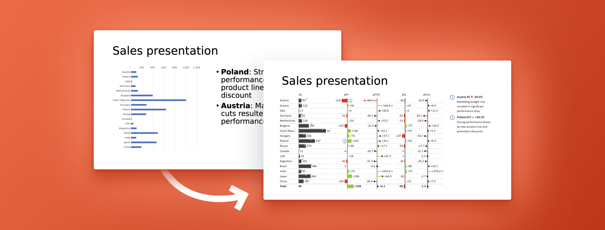
How to use PowerPoint to create compelling sales presentations
While PowerPoint is a powerful tool for creating sales presentations, its charting capabilities are limited and this is where Zebra BI for PowerPoint comes in to deliver impressive visualization options.
As a business user, creating a sales presentation can be a daunting task. It requires a clear understanding of the data, as well as an ability to present it in an engaging and visually appealing way. And with so many tools available, it can be overwhelming to choose the right one to help you achieve your goal.
Whether you are a sales executive, a business analyst, or a marketing professional, you will probably have some familiarity with PowerPoint for creating presentations. In this blog post, we will explore some of its top benefits, look at how you can use Zebra BI for PowerPoint to make your visuals pop and provide some tips for designing and giving your presentation.
So, let's dive right in!
The benefits of PowerPoint
PowerPoint is one of the most widely used tools for creating presentations and for good reason. It is an effective tool for communication for sales presentations because it helps convey a sense of professionalism, visually illustrates key points, is flexible to customize, organizes information in a structured framework, and saves time.
Here's why these benefits matter:
Professionalism: A well-designed PowerPoint presentation can help you convey a sense of expertise, credibility, and knowledge to your clients and other audiences. To successfully position yourself as a trustworthy party, pay close attention to the design and content of your presentation.
When it comes to design, use a consistent color scheme and font style throughout your slides, and avoid cluttering your slides with too much information or visual elements. When it comes to content, focus on using figures, charts, and tables to illustrate and emphasize your points.
Tip: To achieve consistency, you could adopt a standard, such as IBCS, for your reporting. Zebra BI visuals are fully compliant with this standard to help you achieve amazing results.
Remember, it's all about building up your credibility with your audience!
Visual Appeal: This is an essential aspect of creating effective PowerPoint sales presentations. A visually engaging and appealing presentation can capture your audience's attention and help them better understand and remember your message. You can include images, graphs, charts, tables, and other visual aids to help illustrate your points and make your presentation more engaging and memorable.
Flexibility: This is an area in which PowerPoint shines. It provides you with the customization and design options you need to create uniquely engaging and attractive presentations that reflect your brand and message. You can also use it to create different types of materials. You could either design a background presentation to accompany your talk or create a stand-alone handout that contains all relevant information and can be reviewed after your meeting.
Another important part of its flexibility is the fact that it can be expanded with add-ins from the Office Store, which is where you can find Zebra BI for PowerPoint which delivers advanced charting and visualization options.
Time Efficiency: Sales presentations can be created in PowerPoint easily and changed quickly to fit your needs.
Try Zebra BI for Office for free!
See how easy is to create visually stunning presentations. Try out the 30+ charting options and discover what they can do for you.
Choosing the right tool for sales presentations with Zebra BI for PowerPoint
There is no doubt that PowerPoint is an immensely popular tool. However, when it comes to creating visuals, this number one tool for presentations lacks many significant charting features. PowerPoint's visualization functionalities are very limited, which is why most presentations end up filled with screenshots of charts from other software.
This is a particularly frustrating problem in our data-driven world, where you need your data to tell a convincing story. And you simply cannot do that without a powerful visualization tool that your entire team can use to collaborate and create compelling visuals.
The good news is that you can use an add-in, such as Zebra BI for PowerPoint to craft sales presentations in PowerPoint that leave an impact. You can use our free add-in to take your numbers and transform them into engaging visualizations.
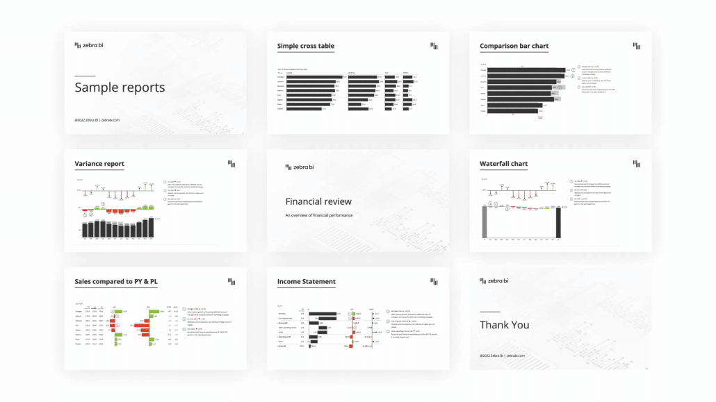
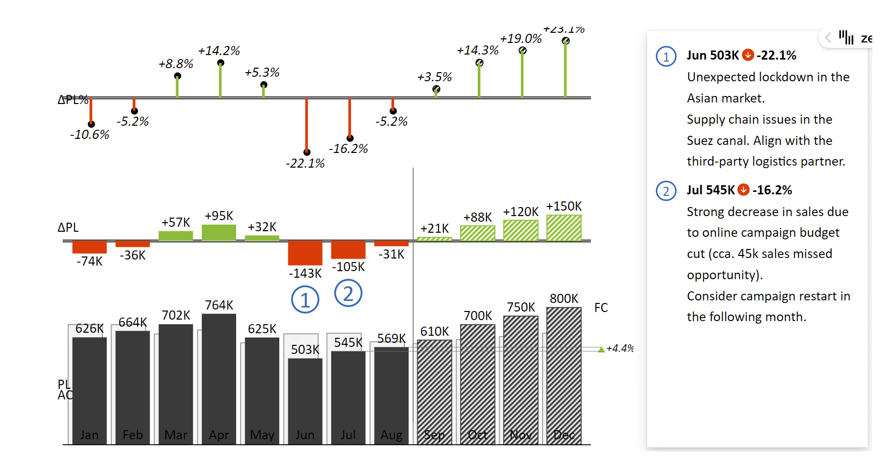
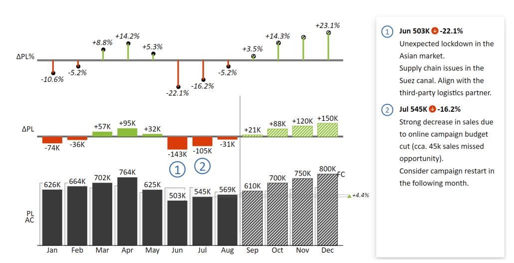
This is an example of sales data with absolute and relative variances and comparisons to plan and forecasts.
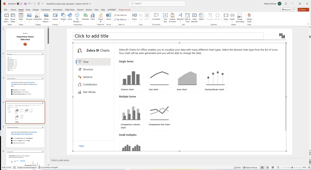
We also made it really easy to use. You just need to insert our visual, select the chart type and enter your data.
(GIF visual)
The add-ins offer a couple of really nice features that make it easy to craft compelling visual stories with your data. Here are some of them.
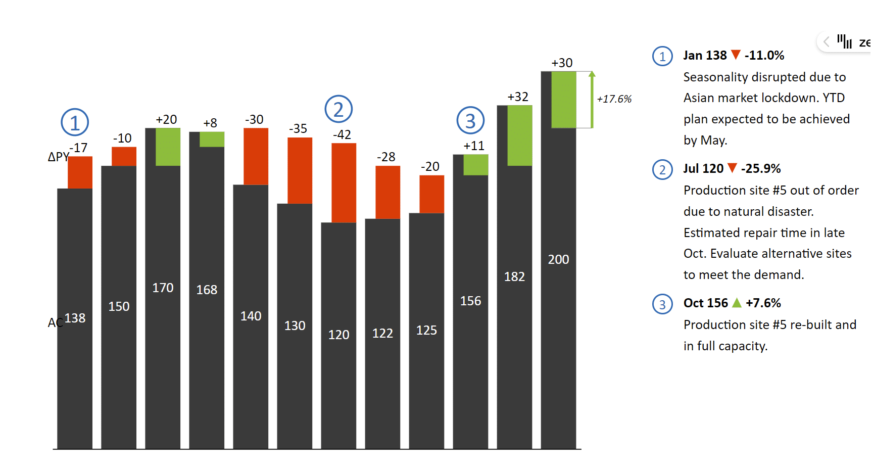
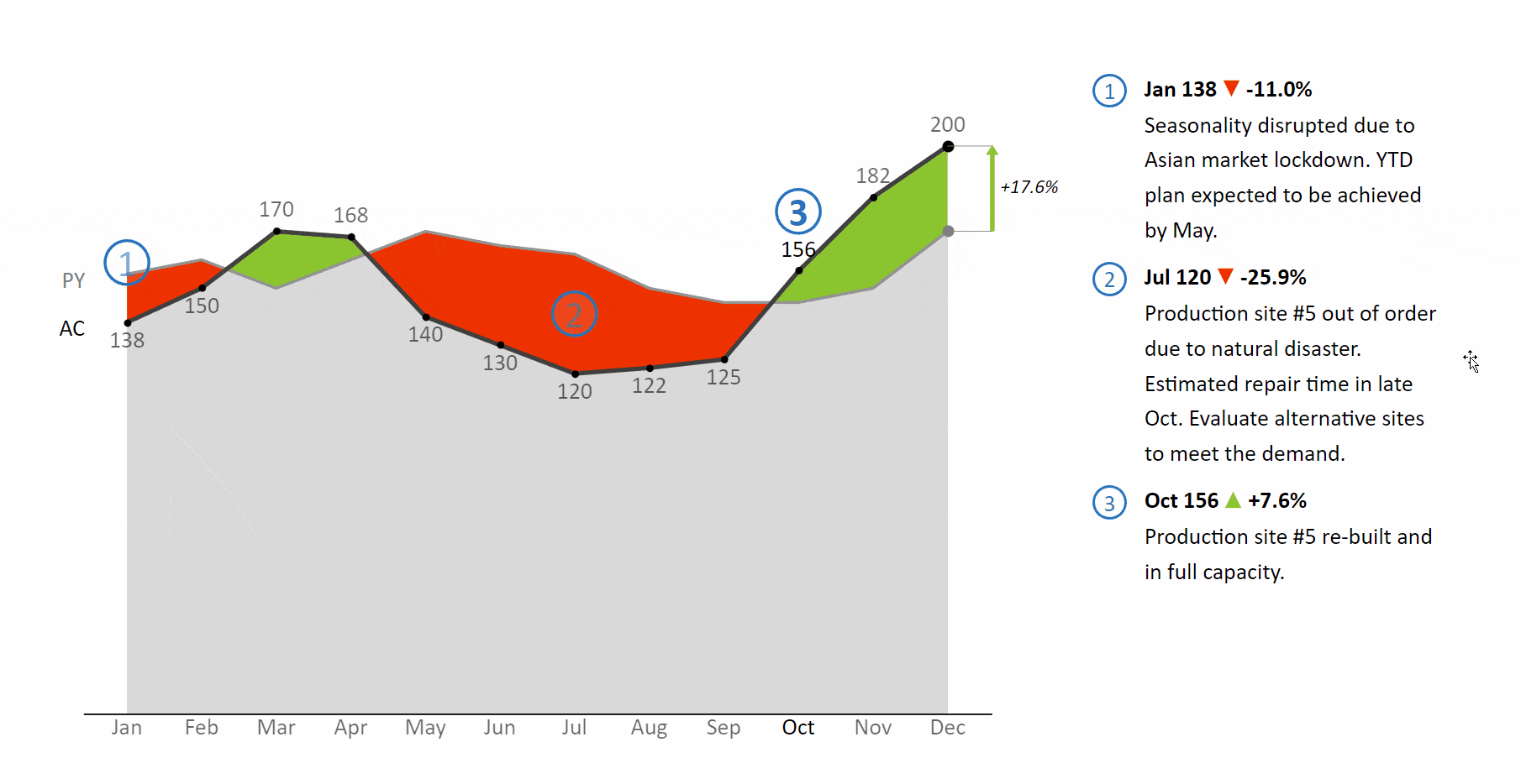
Automatic variance calculation
Regardless of the business setting, you always need to show variances to add context to your numbers. The great news is that Zebra BI does it for you, so you don't have to bother. For example, when you enter actual and previous year or plan numbers, the visual automatically calculates both absolute and relative variances and displays them.
Here's a chart featuring variances integrated into columns.
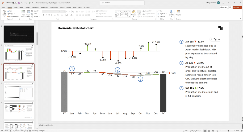
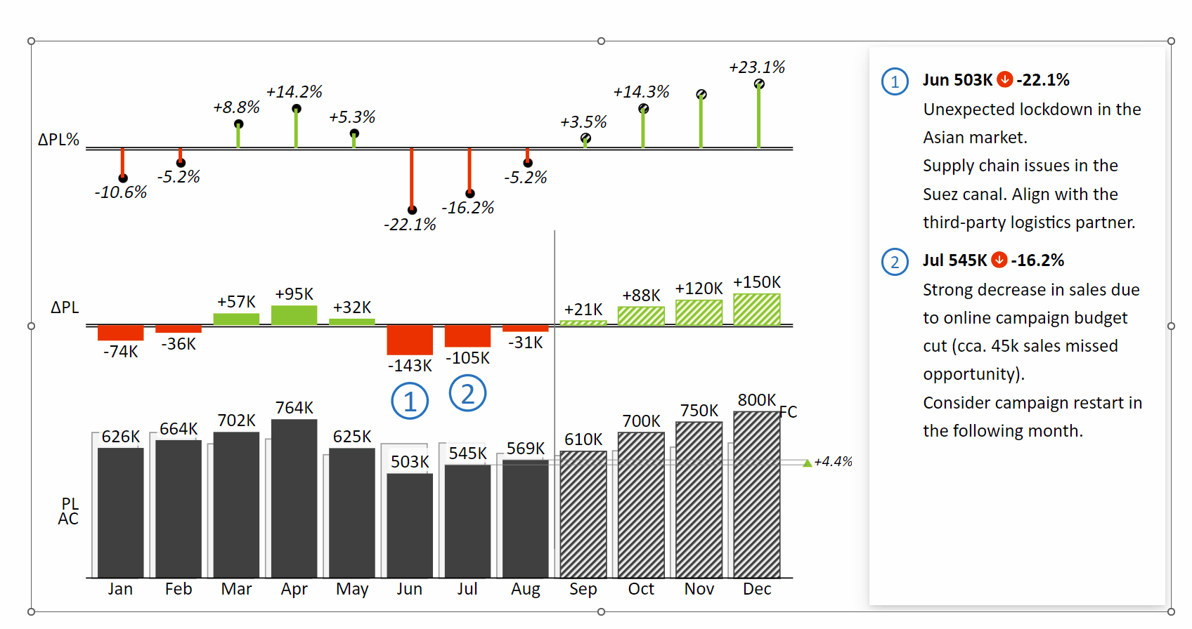
Waterfall charts
Waterfall charts are a great way for showing the contributions of individual categories to the change between the starting and ending balance. It can be hard to create good-looking and useful waterfall charts in vanilla PowerPoint, Zebra BI makes it a snap.
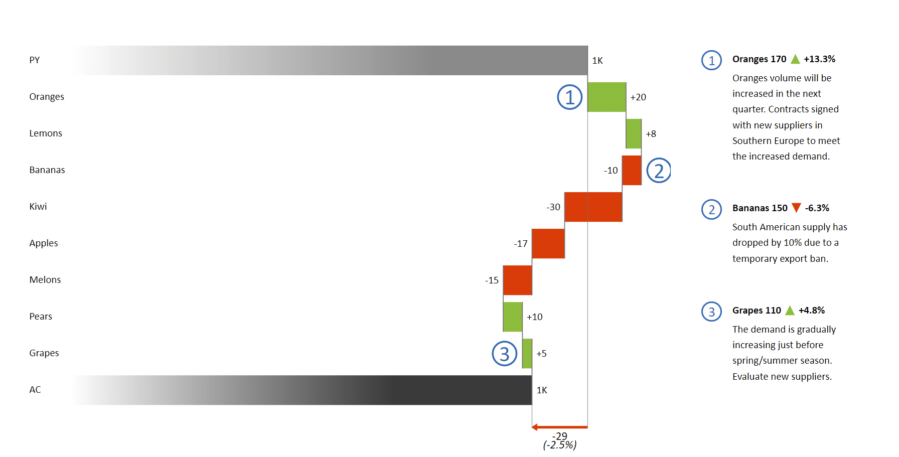
This chart shows how sales of individual products contributed to the final result.
Dynamic comments
Pictures do tell a story, but sometimes you need plain old words. That's where dynamic comments come in. You can use them to direct your audience's attention to the areas where it is needed. They allow you to explain the story behind the data and provide actionable insight.
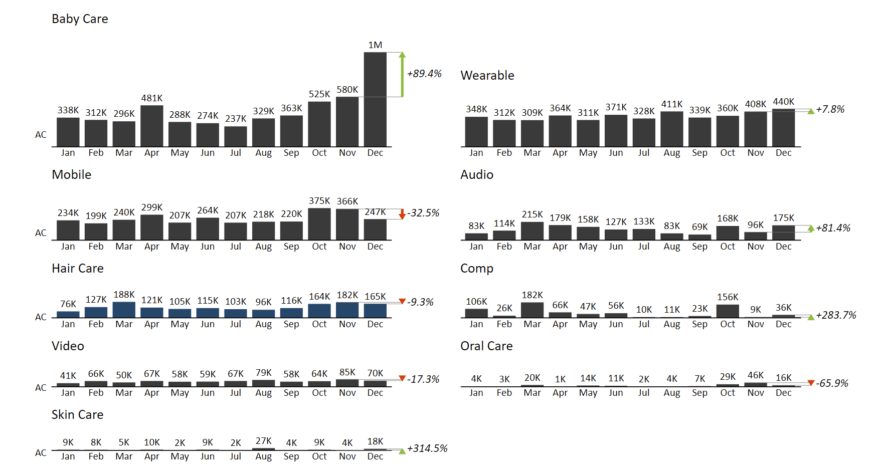
Small multiples
Small multiples are a great way to increase the density of information on a single slide. Let's say you want to show the performance of individual product groups over a year. The best way to do it is to create a series of charts that are scaled to the same maximum value to show their significance. A quick glance at the slide below is enough to reveal that the Baby Care product category is the most important and growing significantly.
An abundance of chart types
In Zebra BI for PowerPoint, you can easily switch between different chart types, depending on the story you want to tell.
Fully responsive visuals
When designing a sales presentation in PowerPoint, you need flexibility of design. Zebra BI visuals are fully responsive, which means that you can resize them without losing any important information.
6 steps for preparing an effective sales presentation
Some might say that giving great presentations is an art. No wonder. A well-crafted presentation requires creativity, communication skills, and an understanding of your audience. However, it is also a learned skill that can be achieved with practice, dedication, and experience.
Here's a short list of the key steps that can help you make your next presentation your best one yet.
Think about your audience: This is key. Think about who your presentation is for and what information they need to know. Are you presenting to top-level management, key account managers, the entire company, investors, or creditors? Consider the following:
- How familiar are they with the subject matter? Do you need to explain the basics or can jump into the nitty gritty right away?
- Tailor your presentation to their interests and needs. Think about what they are hoping to take away from your talk.
- Keep in mind the sensitivity of the presented data. Be aware of what information you are allowed to share.
- Adjust the tone of your presentation. If you are presenting to a group of executives, you should be more formal. If you're presenting to your team, you can go more casual.
Define your message and build your story: After defining your audience, think about what you want to say. Clearly define the purpose of your presentation and the message you want to communicate to your audience and focus on the key points or takeaways. The important thing here is that your stories answer their questions and concerns.
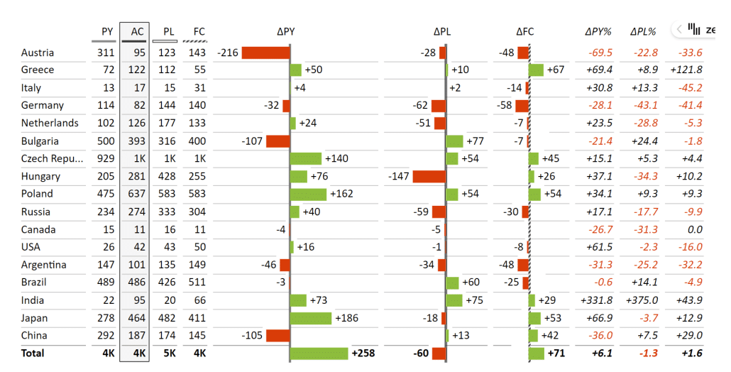
Here are some examples of slides to support your storytelling within your sales presentations: sales comparisons against the previous year, plan and forecasts broken down by customer, region, business unit, Key Account Managers (KAM), etc.
Here's an example of a table with comparisons to the plan and the previous year:
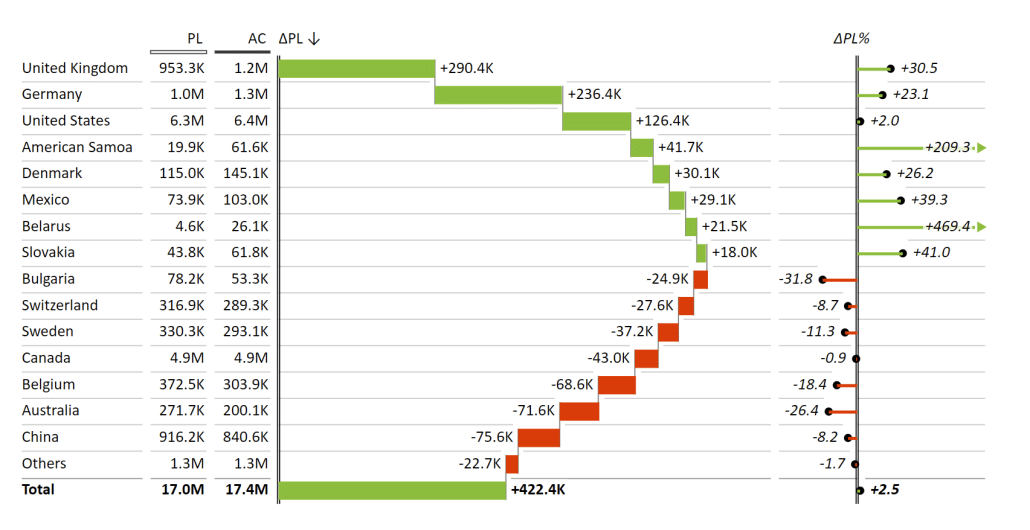
A waterfall chart showing how individual countries contribute to the total sales results.
Or maybe you want to show total sales over the year, compared to plan and forecast.
You have almost unlimited options when it comes to having your data tell a story.
Develop an outline and create your slides: The next step is to create an outline of your presentation. It should include the main points you want to cover, any supporting data or visuals you will use, and the order in which you will present the information.
There are some typical areas you should cover in your outline. Start with an introduction and brief background information. Then comes the meat of your presentation where you include the story you developed in the previous step. Don't forget to think about visuals and reserve some time for questions and answers.
Add visuals and give meaningful business insight: It's an awful cliche at this point, but a picture truly is worth a thousand words. Images, charts, and graphs will help illustrate your points and make your presentation more engaging.
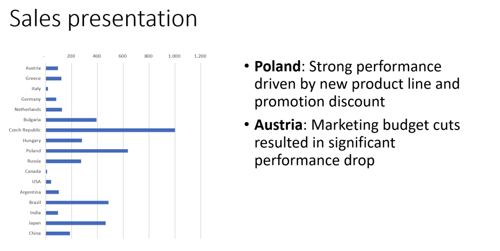
Here's a nice illustration of just how powerful a good chart can be. This is a simple chart showing only the actual results for individual countries.
Here's what happens when you use Zebra BI for PowerPoint for your chart and add previous year and plan data.
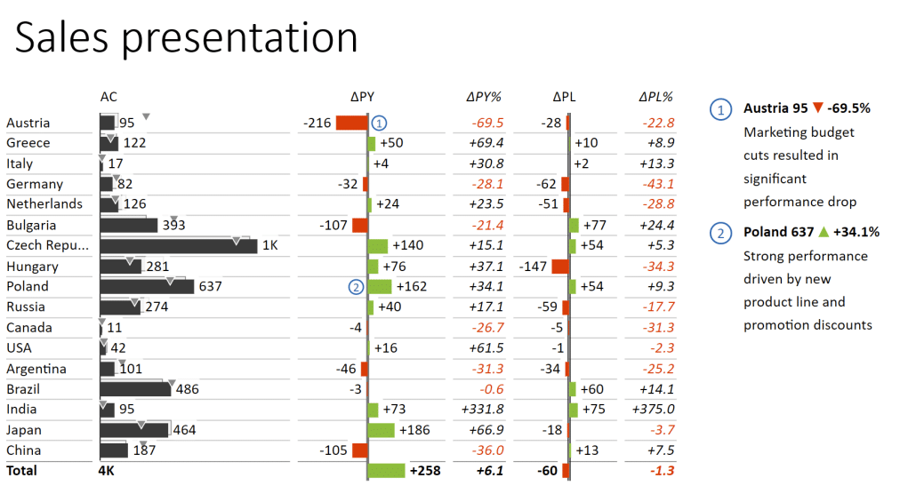
This chart provides useful context along with automatically generated variances. Just like the chart above, it uses up one slide but makes data much more actionable because it reveals how Austria and Poland are outliers.
Proofread and edit: Before presenting, proofread your presentation for spelling and grammar errors, and make any necessary edits. It might help if you read it out aloud or start from the back. Both of these approaches require you to pay more attention to your words.
Practice your delivery: Practice your presentation several times before you deliver it. Pay close attention to time, so you stay within the allotted time. You could also record yourself for later review. Don't forget about your body language and pacing but also make an effort to make the material relatable by using real-world examples and anecdotes.
Remember, it takes practice to deliver a polished presentation.
And, by the way, if you are looking for an effective way to create a Power BI sales dashboard, you can do that too. We have a guide we created especially for that, check it out using the link above!
Bringing it all together
When creating a sales presentation, always keep in mind that what matters is the story you are telling. You have an understanding of your material and it is up to you to choose the best tools to tell your story. In this guide, we recommend you use PowerPoint and Zebra BI for Office because they deliver a great combination of design and data visualization features that will certainly help you get your point across.
Ready to supercharge your sales presentations?
Try Zebra BI for Office for free. Don't miss the chance to create engaging sales presentations that drive results for free!