P&L in Power BI: How to Create an Income Statement Step by Step
Share this
Introduction
A profit and loss (P&L) statement is one of the most widely used financial reports across finance, FP&A, and management teams. Put quite simply, a profit and loss (P&L/PnL) statement, also known as an income statement, shows how a business turns revenue into profit over time.
Despite its popularity, creating a P&L in Power BI is rarely a straightforward exercise. While Power BI is excellent for analysis and dashboards, financial statements often bring structural requirements that don’t naturally exist in raw data models.
Below, this guide will explain how to build a proper Profit and Loss statement in Power BI using native visuals. You’ll learn what a P&L really represents, why it’s challenging to model, and how teams typically approach it step by step. After going over the basics, we’ll dive into the more advanced options you can implement with P&L statements.
Note: If you’d prefer to skip the manual setup (row order, subtotals, sign logic), you can jump directly to the ready-made Income Statement template below.
1. What Is a Profit and Loss Statement in Power BI?
Essentially, a Profit and Loss statement in Power BI follows the same financial logic as a traditional income statement. The main difference is that it presents the results dynamically across time, entities, or scenarios.
A typical profit and loss statement includes:
Revenue: The money earned from sales or services.
Costs / Costs of Goods Sold (COGS): The direct costs associated with generating revenue.
Gross profit: Business revenue minus COGS.
Operating expenses: All indirect and overhead costs.
Net profit (or loss): The final financial result.
What’s important to understand is that a profit and loss statement is not just a list of numbers. It’s a structured financial statement with a specific order, clearly defined subtotals, and accounting logic behind every line. It can be different for each business, which is what makes it difficult to create accurate or digestible visuals, especially in Power BI.
Let’s break down why building a profit and loss statement in Power BI causes so many issues.
Sound familiar? Skip the manual setup entirely.
The ready-made Income Statement template already includes row order, subtotals, sign logic, and variance calculations - no DAX required.
At first glance, creating a PnL in Power BI sounds simple: you have transactions, you sum them up, and you show the results. In practice, that approach breaks down very quickly.
The reason is that a profit and loss statement is not a flat report. It’s a structured financial statement with rules that don’t naturally exist in raw data. Native Power BI doesn’t handle those rules automatically, which is where the challenges arise.
Here are the most common difficulties finance teams run into.
1. Custom Row Order
P&L statements follow a strict financial layout: revenue first, then costs, then calculated profit lines. This order has nothing to do with account numbers or alphabetical sorting.
In native Power BI, visuals are designed to sort data dynamically, not to respect a fixed financial statement structure. As a result, teams must manually control row order, usually through additional tables or custom logic.
2. Subtotals don’t come from raw data
Key P&L lines, such as gross profit or net profit, are not stored in the source data. They are calculated results that sit between other rows.
Power BI doesn’t inherently understand these relationships. Subtotals have to be explicitly defined using measures, which increases model complexity and requires careful design to avoid errors. Gross and net profit are the heartbeat data of any business, so it pays to get it right.
3. Accounting signs (+/–)
Native Power BI visuals don’t apply accounting sign logic automatically. Finance teams must handle this manually through measures, sign flags, or structure tables to ensure the P&L reads correctly. Once again, this is a key risk area for errors or oversight.
4. Ragged hierarchies (headers vs detail rows)
A P&L statement mixes different types of rows:
Section headers (like Operating Expenses).
Detailed account lines.
Calculated subtotal rows.
These don’t form a clean hierarchy. Some rows have children, others don’t. This “ragged” structure is difficult to represent cleanly using standard Power BI hierarchies and visuals without additional modelling effort.
5. Maintenance complexity when the structure changes
P&L structures are not static. Accounts get added, categories change, and reporting requirements evolve.
In a native Power BI P&L, even small structural changes can require updates to:
Mapping logic
Measures
Row order definitions
Over time, this often leads to increased time spent on maintenance and increases the risk of mistakes across reports.
All of these challenges are normal, and they don’t mean Power BI is the wrong tool. However, they do show why building a P&L statement requires a deliberate, structured approach, rather than a simple table or chart.
Using a Profit and Loss Statement in Power BI means creating a dynamic statement that can change even on a daily basis. It pays to create clear, digestible data that can be updated quickly and easily.
Native Power BI doesn’t handle those rules automatically, which is where the challenges arise.
Note: If you want to avoid manually handling these structural rules, the ready-made Income Statement template below already includes them.
Don't build these rules from scratch
The Income Statement template handles row order, subtotals, sign logic, and variance calculations automatically.
3. How to Build a Profit and Loss Statement in Power BI Using Native Visuals
Most native Profit and Loss statements in Power BI implementations follow a similar modelling pattern. The tools themselves are flexible; the key is setting up the right structure before you start building visuals.
Rather than treating a P&L as a simple table, finance teams usually approach it as a structured financial model that Power BI can then render correctly.
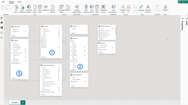
Required Tables for a P&L in Power BI
A solid native setup typically includes three core tables, each with a clear role.
1. Transaction or GL fact table
This is where the actual financial data lives. It contains:
Monetary amounts
General ledger accounts
Transaction dates
On its own, this table is not enough to create a proper P&L. Instead, it provides the raw numbers on which everything else is built.
2. Date table
A dedicated date table is essential for any serious financial reporting in Power BI.
It enables:
Monthly and quarterly views
Year-to-date calculations
Comparisons across periods
Without it, even a correctly structured P&L quickly becomes limiting. This is where you can dive into the growth (or decline) of your business profits.
3. P&L structure table (the most important piece)
The P&L structure table defines how the income statement should look, independently of the transactional data.
This table doesn’t store amounts. Instead, it stores financial logic and layout rules, such as:
P&L line names (Revenue, Gross Profit, Operating Expenses, etc.)
Row order
Subtotal indicators
Sign handling rules
This is what allows Power BI to display a financial statement instead of a generic aggregation.
Why a P&L Structure Table Is Essential
In short, the P&L Structure Table makes all the data easy to visualize. Power BI is designed to analyze data, not to understand financial statements. It doesn’t know that gross profit belongs between revenue and operating expenses, or that some rows should be calculated rather than summed.
That’s why many teams use a pre-structured P&L template that already defines these relationships and subtotal rules.
A P&L structure table bridges that gap by explicitly defining:
What each row represents.
Where it appears in the statement.
Whether it’s a detail row or a calculated subtotal.
How values should contribute to profit.
By separating presentation logic from transactional data, this approach makes the P&L more predictable, easier to debug, and easier to maintain over time.
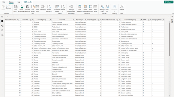
Mapping Accounts to P&L Lines
Once the structure is defined, each general ledger account is mapped to a specific P&L line (revenue, COGS, operating expenses, etc.).
This mapping step is critical because it shifts aggregation from:
“Sum by account number” to “Sum by financial meaning”
With proper mapping in place, Power BI can correctly group transactions into the correct sections of the profit and loss statement, regardless of how detailed the chart of accounts is.
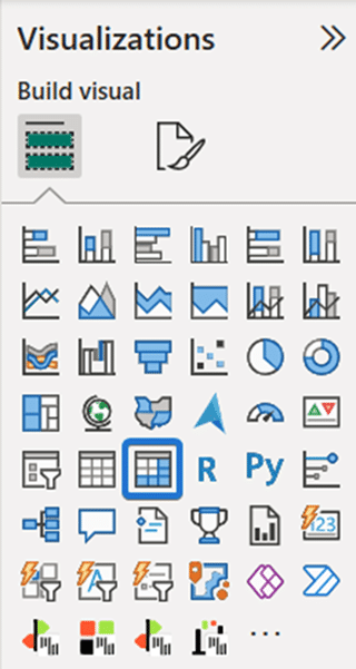
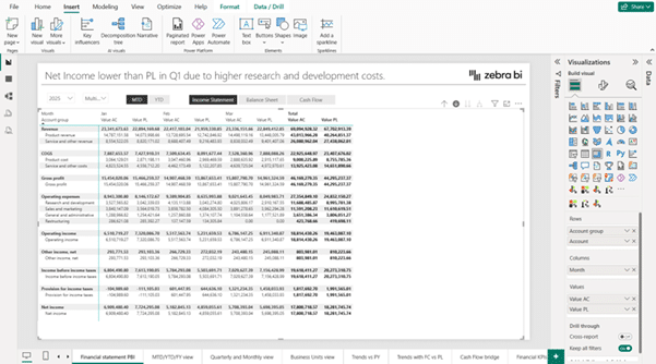
Using a Matrix Visual for the P&L report Layout
Native P&L reports in Power BI are almost always built using a Matrix Visual.
The matrix is used because it can:
Display rows based on the P&L structure.
Show periods (months, quarters, YTD) as columns.
Support hierarchical rows and subtotals.
When combined with the structure table, the matrix becomes a flexible container for the entire income statement layout.
Basic DAX Logic (High Level)
Data Analysis Expressions, or DAX, is used to bring everything together. At a high level, DAX handles:
Calculating totals for each P&L line.
Applying sign logic so revenues and costs behave correctly.
Computing subtotals like gross profit and net profit.
These calculations don’t need to be overly complex, but they do need to be intentionally designed. Poorly structured measures are one of the main reasons native P&L reports become difficult to maintain (and often incorrect).
Now that you know how to build a Profit and Loss statement in Power BI using native visuals, it’s important to understand where there can often be challenges or roadblocks in building out these reports.
4. Common Limitations of Native Power BI P&L Reports
Even when built correctly, native Power BI P&L dashboards tend to share some limitations:
Significant Manual Setup
Even for an experienced accountant, setting up a P&L dashboard in Power BI can take some time. Every business requires different data structures, matrices, and visualisations.
Increasingly Complex DAX as Requirements Grow
Businesses grow, and so do their product or service offerings. Adding these to existing P&L reports can often lead to implementing complex DAX within reports.
Limited Reusability Across Reports or Models
P&L reports in Power BI are not a one-size-fits-all approach. If you want to drill down on specific goods or services within your business, you’ll often have to create a new report.
Higher Risk of Errors When Structures Change
Power BI logic can get complex, fast. Adding a new row of data or adjusting a visualisation can often lead to hours of problem-solving.
Reduced Flexibility for Deeper Financial Analysis.
Want to drill down on the performance of a particular good or service? Keen to see the sales figures of the new hire? You may not be able to easily find the data.
Power BI is a generalised tool for businesses of all shapes and sizes. Although a helpful starting point for financial analysis, it does not offer the full suite of services needed for high-level, actionable analysis.
If you’re looking for a deeper analysis of your financial data, other platforms can help.
Let’s take a look at how it compares to Zebra BI.
⚡ Skip the manual setup. Use a pre-built Income Statement instead.
Pre-built layouts, automatic subtotals, variance calculations, and professional IBCS-compliant visuals - ready in 5 minutes, not 6-8 hours.
Once you understand how a P&L in Power BI is built using native visuals, it becomes easier to see both the strengths and the trade-offs of that approach.
Below, we dive into the differences between Power BI and Zebra BI. This comparison isn’t about which option is “better.” It’s about understanding what each approach is designed to do and where each platform may be more beneficial to you.
What Power BI Is Good At
Power BI excels at flexibility. It gives analysts and finance teams full control over:
Data modeling
Custom calculations
Time-based analysis
Interactive exploration
It offers the basic tools needed to understand financial performance. This level of control is also why many teams start with a native approach when creating a Power BI P&L dashboard.
Where Power BI Can Cause Complications
Financial statements have very specific requirements that go beyond general analytics. They require:
Fixed row structures
Consistent subtotal logic
Accounting sign handling
Standardised layouts across reports
These elements must be manually designed and maintained in native Power BI. As reports grow in number or complexity, this manual work can become time-consuming and harder to standardise across teams.
Where Zebra BI Can Help
Zebra BI, as a platform, is designed to build on the capabilities of Power BI. It’s typically used as:
A way to reduce manual setup for P&L and income statement visuals.
A way to standardise P&L logic across reports and users.
An option for teams that want consistent financial reporting without rebuilding the same structures each time.
In other words, Zebra BI doesn’t replace Power BI, it builds on it. If you or your team is starting to lose hours or resources due to Power Bi, this is where Zebra BI comes in.
Features such as automated P&L logic reduce the need to repeatedly define the same calculations, layouts, and sign rules across multiple reports. This is especially relevant for teams managing several income statements across departments, entities, or scenarios.
Seen enough? Build your first P&L statement in 30 seconds.
Start your free trial and get the Income Statement template - just connect your data and you're done.
As mentioned above, every business needs a unique Power BI P&L dashboard. All businesses are different, and their key metrics can vary widely.
Overall, a Power BI P&L dashboard can answer very different financial questions depending on how it’s designed. While the underlying income statement logic stays the same, the focus shifts based on who is using the report and what decisions they need to make.
Below are some of the most common Power BI profit and loss dashboard examples used by finance teams.
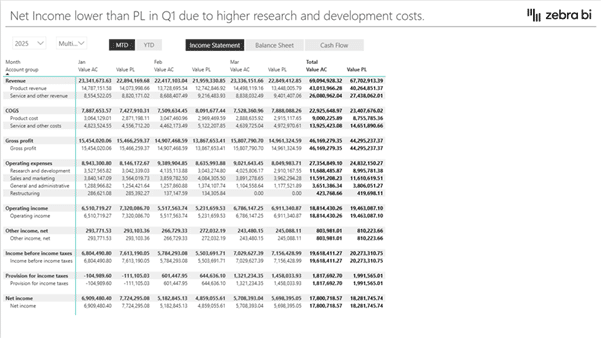
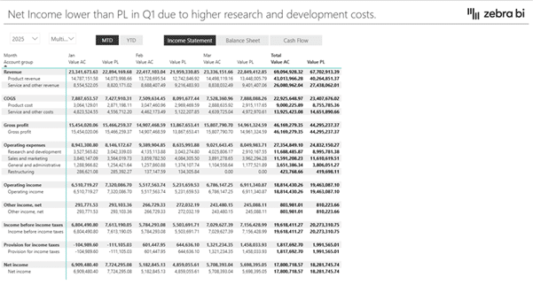
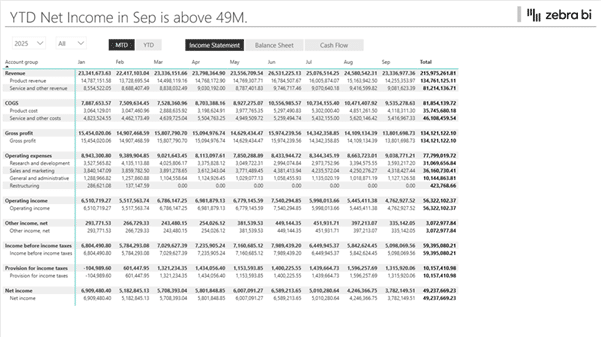
1. Monthly P&L with Actuals
This is the most straightforward and widely used P&L dashboard. It shows actual revenue, costs, and profit by month, often with year-to-date totals alongside.
A monthly P&L helps teams:
Monitor financial performance over time.
Spot trends and seasonality.
Quickly identify months where performance changed.
Because it’s based on actuals only, this view is often the starting point for deeper analysis. It’s commonly used by smaller businesses or self-employed individuals.
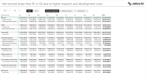
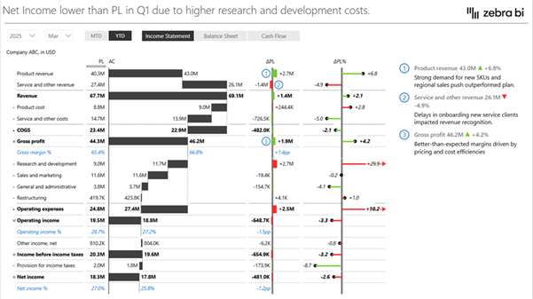
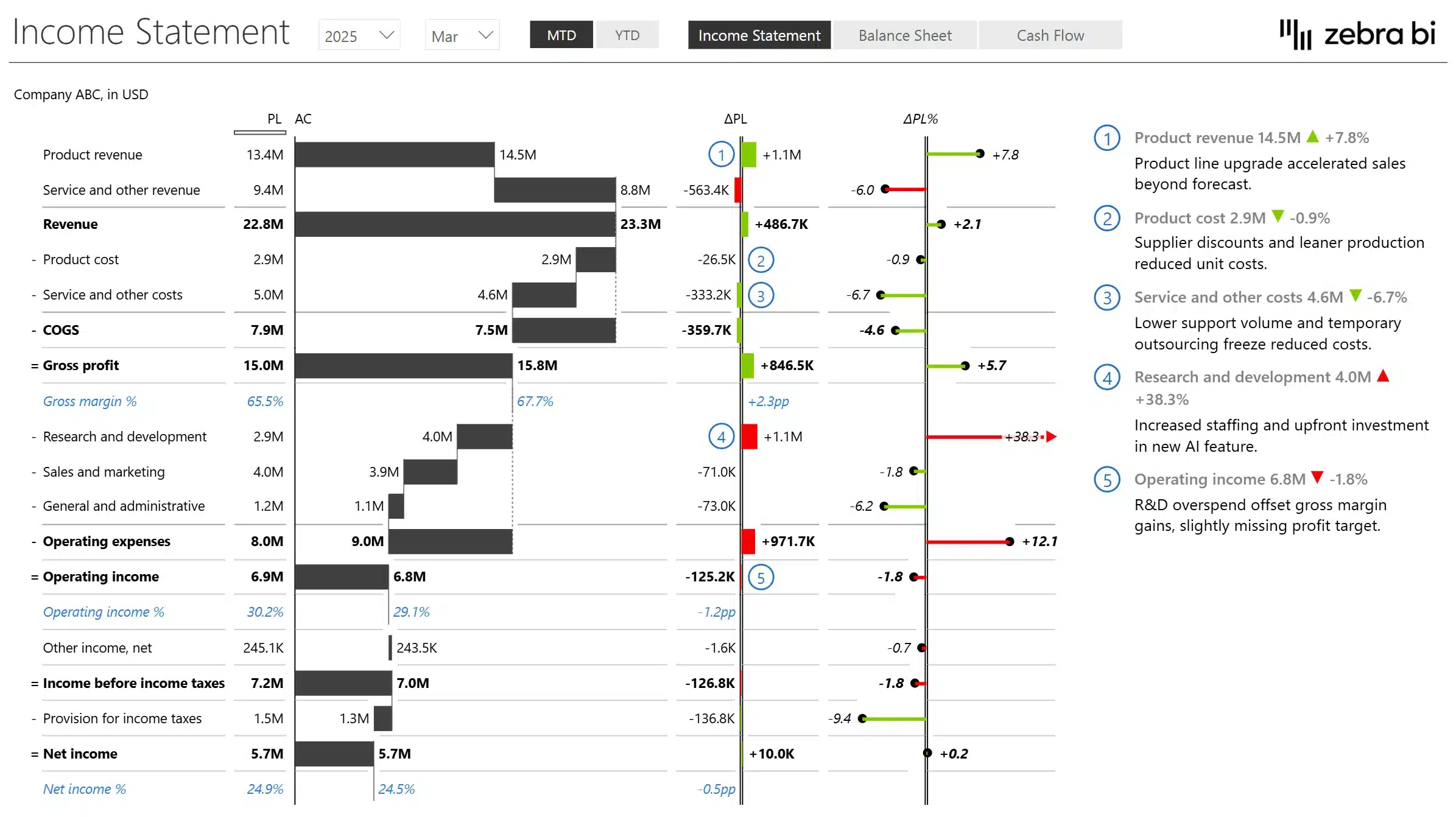
2. Actual vs Budget Income Statement
An actual vs budget P&L adds a second scenario to the income statement. In addition to actual results, it includes planned or budgeted values and often a variance column.
This type of Power BI profit and loss dashboard is used to:
Compare performance against plan.
Identify overspending or underperformance.
Focus discussions on gaps rather than totals.
It’s especially common in FP&A and management reporting, where understanding deviations matters more than raw numbers. If you’re a business looking to drill down on tracking performance and projecting sales/profits, this is the report for you.
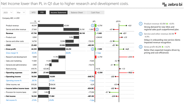
3. Management P&L with Variances
A management P&L goes one step further by emphasising variances, both absolute and percentage, directly within the statement.
Rather than just showing what happened, this view helps answer:
Where profits changed.
Which cost categories drove the variance.
Which deviations are structural or temporary.
This type of dashboard supports decision-making by directing attention to the most significant drivers of change.
Across all of these examples, the value of a Power BI P&L dashboard is the same: it turns a traditionally static financial statement into an interactive, analytical tool.
Want reports like these without building from scratch?
The Income Statement template includes all three dashboard layouts - monthly P&L, actual vs budget, and management P&L with variances.
7. Consider Using a structured P&L Template in Power BI
If you don’t want to build everything from scratch, a structured Income Statement template can dramatically simplify the process.
Instead of manually defining row order, subtotals, sign logic, and DAX measures, you can start from a financial layout that’s already built and ready to use.
This structured template includes:
✓ Multi-step and comparative P&L layouts ✓ Automatic subtotal and accounting sign logic ✓ Built-in variance calculations ✓ Professional financial formatting ✓ Interactive drill-down and analysis
If you’d like to explore the template structure in more detail, you can review the full template overview here.
However, if your goal is to actually use it inside Power BI, you can access the complete version below.
Additionally, for the more visual learners out there, you can watch our step-by-step guide below:
You’ve seen how complex native P&L modelling can become. Now try a structured approach instead.
🎯 Build a structured Income Statement in Power BI - without manual setup
Join 10,000+ finance professionals who standardize P&L reporting in Power BI with Zebra BI.
Your access includes:
✓ Pre-built Income Statement template
✓ Automatic subtotals and sign logic
✓ Variance calculations without manual DAX
✓ 30-day guided onboarding
✓ Video tutorials, guides, and implementation support
No credit card required · 30-day full access · Works inside Power BI
Additionally, we’ve also answered some common FAQs we’ve come across from our users when it comes to setting up a P&L Template for Power BI.
FAQ about Profit and Loss Statements in Power BI
What is a P&L in Power BI?
A P&L in Power BI is a profit and loss (income) statement built using Power BI data models and visuals. It shows revenue, costs, and profit over time using a structured financial layout rather than a simple table.
Can you create an income statement in Power BI?
Yes. An income statement can be created in Power BI using native visuals, most commonly a Matrix visual combined with a dedicated Profit & Loss (P&L) structure table.
How do you create a Profit and Loss statement in Power BI using native visuals?
Most native implementations use: - A transaction (GL) fact table - A date table for time analysis - A P&L structure table to control rows and subtotals
These are combined in a Matrix visual with measures that calculate totals and apply accounting logic. You can see a more in-depth explanation in section 4 above.
Why is a Matrix visual used for P&L reports in Power BI?
Simply put, it’s the best for clear visualisation. The Matrix visual supports hierarchical rows, subtotals, and period-based columns, which are essential for financial statements. It also allows Power BI to display a structured income statement across months or years in a single view.
What’s the best way to structure a Profit and Loss in Power BI?
The best practice is to separate transactional data from presentation logic for clear, digestible reports. Financial transactions remain in fact tables, while the income statement layout is defined in a dedicated PnL structure table.
Can Power BI handle budget vs actual PnL reporting?
Yes. Power BI can compare actuals, budgets, and variances when budgets are modelled as a separate table or scenario and aligned to the same PnL structure.
What is Zebra BI, and how does it work with Power BI PnL reports?
Zebra BI provides specialised financial reporting visuals that work inside Power BI. It helps standardise how P&L and income statement results are displayed once the native Power BI model is in place.
Does Zebra BI replace native Power BI modelling?
No. Zebra BI builds on top of existing Power BI models and measures. Data preparation, relationships, and calculations still live in Power BI. Zebra BI focuses on creating more standardised financial presentations.
When should you consider using Zebra BI for P&L reporting?
Zebra BI is typically considered when teams want to reduce manual P&L setup, apply consistent financial logic across reports, or scale management reporting without repeatedly rebuilding the same structures. You can learn more about Zebra BI here.
This is the definitive guide to income statements in Power BI. It includes tips and tricks and a couple of new features in Zebra BI visuals. I have been able to construct full financial statements that conform to predefined layouts.
Hi Asif, only the result is bolded by default, all the other things you need to bold manually. Right-click on the Row >> Format >> B. Hope this helps. 🙂 If you need more details check out this article.
 September 8th
 February 22nd

Excelentes gráficos
|Thats amaying what you do
This is the definitive guide to income statements in Power BI. It includes tips and tricks and a couple of new features in Zebra BI visuals. I have been able to construct full financial statements that conform to predefined layouts.
Thanks, Dan!
I tried keeping layout same with bold font, +-= signs but unable to do it myself. Is it the feature of paid version?
Hi Asif, only the result is bolded by default, all the other things you need to bold manually. Right-click on the Row >> Format >> B. Hope this helps. 🙂 If you need more details check out this article.
Excellent!
Superb!
Amazing!
Hi Gabriel. Thanks a lot for your feedback. We appreciate it. 🙂 Can we kindly ask you to give us your feedback here.