Struggling to visualize your data? Zebra BI's got you covered!
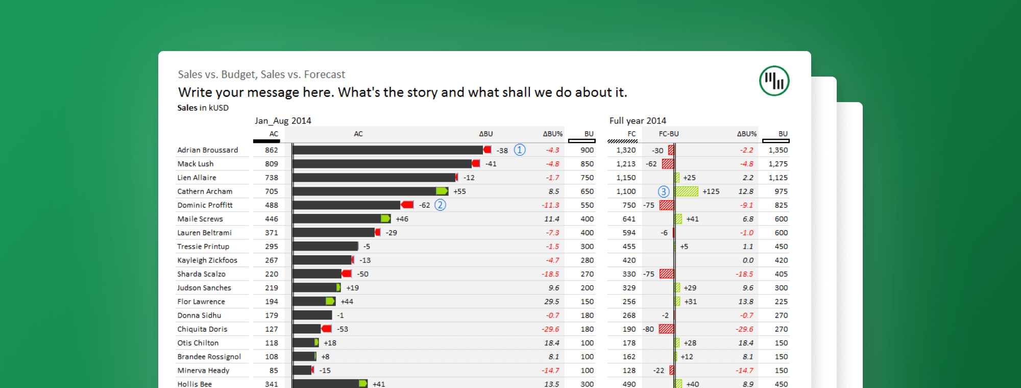
Whether it’s waterfall charts, variance charts, or lollipop charts, Zebra BI has everything you need to visualize your data for all to understand.
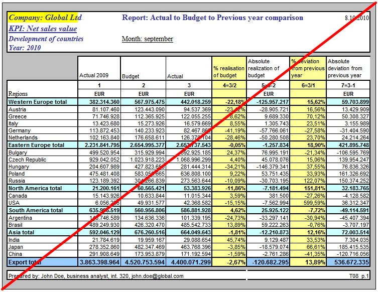
Picture this: you’re about to present your company’s quarterly earnings to its top executives. You’ve spent countless hours gathering the needed information and placing it into a chart in Excel. You’ve even tried your hardest to make the chart look as appealing as possible. (Unfortunately, you thought this entailed simply adding different colors to different columns.) Upon beginning your presentation, however, you notice that your report looks similar to the one shown below and might be difficult for people not familiar with the information to properly analyze or understand.
Because of this, it ends up taking you double the amount of time to explain the data, which ultimately makes you seem ill-prepared.
Download Zebra BI today!
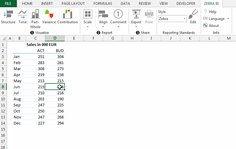
So, how can you prevent this from ever happening? First, you should install Zebra BI to your computer. Zebra BI is an Excel add-in that adds one simple tab to your Excel ribbon, which houses an array of clean and clear chart offerings, ranging from variance charts to waterfall charts.
Installing this innovative add-in takes just a few seconds, and once it’s installed, all you have to do is partake in a quick tutorial to understand how to enhance your data. After you finish the tutorial, you can begin improving your data visualizations right away!
Simplicity is key
One of the main benefits of working with Zebra BI is the program’s sheer simplicity, as it allows you to select a chart and insert your data into that chart in just two clicks.
Zebra BI lets you create these charts from Excel values and formulas, Pivot tables, PowerPivot tables, and even 3rd party add-ins like SAP Analysis for Office, and Jedox.
Another main benefit of working with Zebra BI is its range of capabilities and options. This can be exemplified by the fact that all of Zebra BI’s charts are completely dynamic, which means they automatically update to changes in your data. All you have to do is simply overwrite your values and refresh your Pivot table or filter your data.
This can also be exemplified by the option to embed charts into tables, which allows you to combine the exactness of a table and the insight of a chart. In fact, many best practices in business communication use this approach.
Let your information speak for itself!
The most powerful part of Zebra BI is that it allows your information to speak for itself. When you make use of over-complicated and visually unappealing charts, readers aren’t able to gain proper insight into what’s displayed. Zebra BI charts are officially certified with IBCS - International Business Communication Standards, proposed by Dr. Rolf Hichert, one of the world’s top gurus for information design. This means that all of Zebra BI’s charts improve business communications and help readers understand the main theme of a particular chart.
So, whether you insert your data into a waterfall chart, variance chart, or lollipop chart, your data will tell the story it’s meant to tell.
Click here for Zebra BI’s 30-day free trial: