5 Must-Know Tips for Using Pivot Tables in Excel for Financial Analysis
Pivot tables are like the Swiss Army knife of Excel – they're a powerful and versatile tool to slice, dice, and analyze your data. For anyone working with financial data, using pivot tables in Excel for financial analysis is a complete game-changer. But it's how you use them that can make or break your analysis.
In this guide, we'll dive into the world of pivot tables, explore their importance in financial reporting, and dive into the 5 must-know tips that will set you up for success. So, buckle up and get ready to “Pivot! Pivot! Pivot!*” your way to Excel excellence!
*Ideally without breaking your mouse.
Pivot tables & why they matter
Data is the lifeblood of financial analysis, but making sense of it all can be daunting. With their wide array of benefits, pivot tables make it easier than ever for you to organize, analyze, and visualize your financial data. Let's take a closer look at some of the benefits that make pivot tables such a game-changing tool in the world of Excel.
Flexibility
Pivot tables are the MVPs of data organization and display. Say goodbye to complex formulas and manual sorting! Pivot tables let you rearrange your data with just a few clicks, enabling you to easily find the perfect view to help you understand your financial data and make smart, informed decisions.
Speed
When it comes to large datasets, time is of the essence. Pivot tables give a turbo boost to your data analysis, allowing you to quickly summarize and examine huge amounts of information. The result? Faster insights, quicker decisions, and more time to focus on your other assignments.
Accuracy
Let's face it, there's no such thing as perfection. But with pivot tables, you can get pretty close. They help you spot trends, patterns, and outliers in your data, which leads to more accurate conclusions and predictions.
Customization
Each report is different. The good news is that pivot tables are customizable. They offer a wide array of formatting, filtering, and sorting options, which enables you to tailor them to your specific needs.
Integration
You can seamlessly integrate pivot tables with other Excel features, such as charts, to produce powerful and dynamic data visualizations. When it comes to this, Zebra BI for Office can help you a great deal. With just a few clicks, it enhances your Excel experience and takes your financial analysis to the next level.
Take your financial analyses to the next level with powerful visualizations
Try Zebra BI for Excel for free & automatically receive a free instructional file that will help you dive into the world of impactful, visually stunning and highly insightful visualizations.
Importance of pivot tables in financial reporting
In the fast-paced world of finance, efficiency, and accuracy are of the utmost importance. As a powerful tool for simplifying and optimizing data analysis, pivot tables play a crucial role in financial reporting. But what exactly is it that makes them indispensable? Let's have a quick look.
Quick and efficient analysis of large financial datasets
Large amounts of data can be overwhelming, but pivot tables enable rapid and efficient examination which can greatly lighten your load. Efficiency is key when it comes to making informed financial decisions and staying ahead of the curve in today's competitive landscape.
Easy organization and summarization of data
A well-structured financial report is essential for accurately reflecting an organization's financial health. Pivot tables make it a breeze to organize and summarize data, turning raw numbers into meaningful insights that stakeholders can easily understand.
Error detection and data consistency
Mistakes can be costly, especially in financial reporting. Pivot tables help identify errors or inconsistencies in financial data, ensuring the accuracy and reliability of financial reports. By spotting and correcting these issues, you can avoid potential pitfalls and maintain the credibility of your financial analysis.
Now that we've established how helpful and vital they are, let's take a look at what you came here for – the tips for making the most of them!
5 must-know tips for using pivot tables in Excel for financial analysis
Let's dive right in.
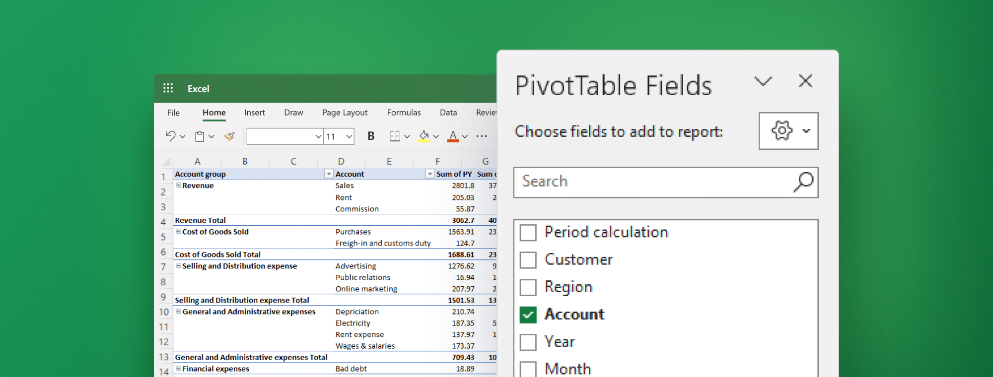
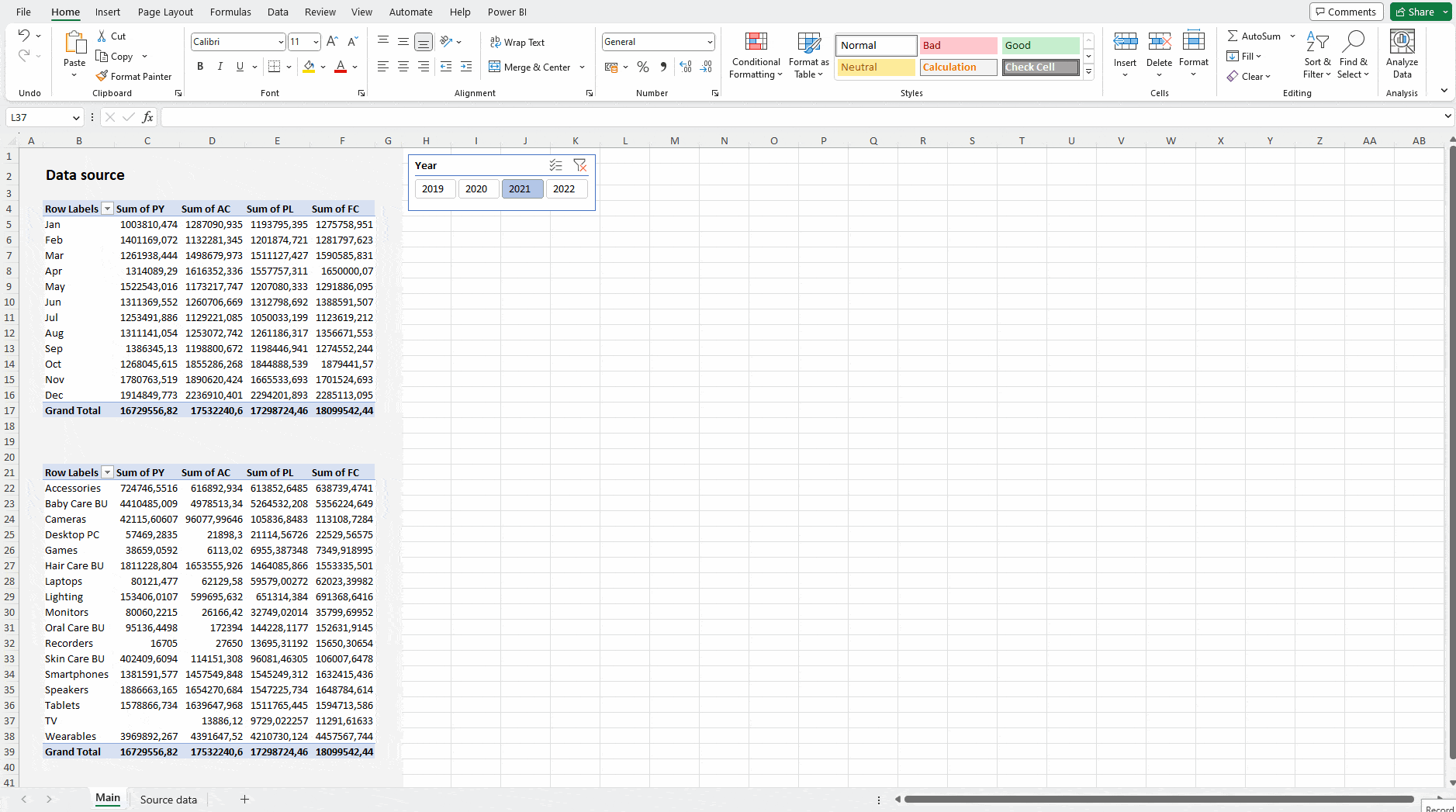
1. Organize your data properly
Before you dive into creating a pivot table, it's crucial to ensure your data is properly organized. Your data source should be in a tabular form, with each row representing a unique transaction and each column representing a different attribute of the transaction (e.g., date, account, account group). This will also make it easy for you to later visualize your data correctly.
When it comes to visualization, Zebra BI for Office is your best bet. It delivers actionable insights that are understandable at a single glance – regardless of how proficient your stakeholders are in BI.
2. Choose the right type of pivot table
Excel offers several different types of pivot tables, including tabular, compact, and outline. Choosing the right one is key for ensuring data accuracy and streamlining the process.
Zebra BI for Office works with all of them but if you’re looking to present your data in a hierarchy, it will work with a tabular layout only. Keep that in mind when designing your pivots.
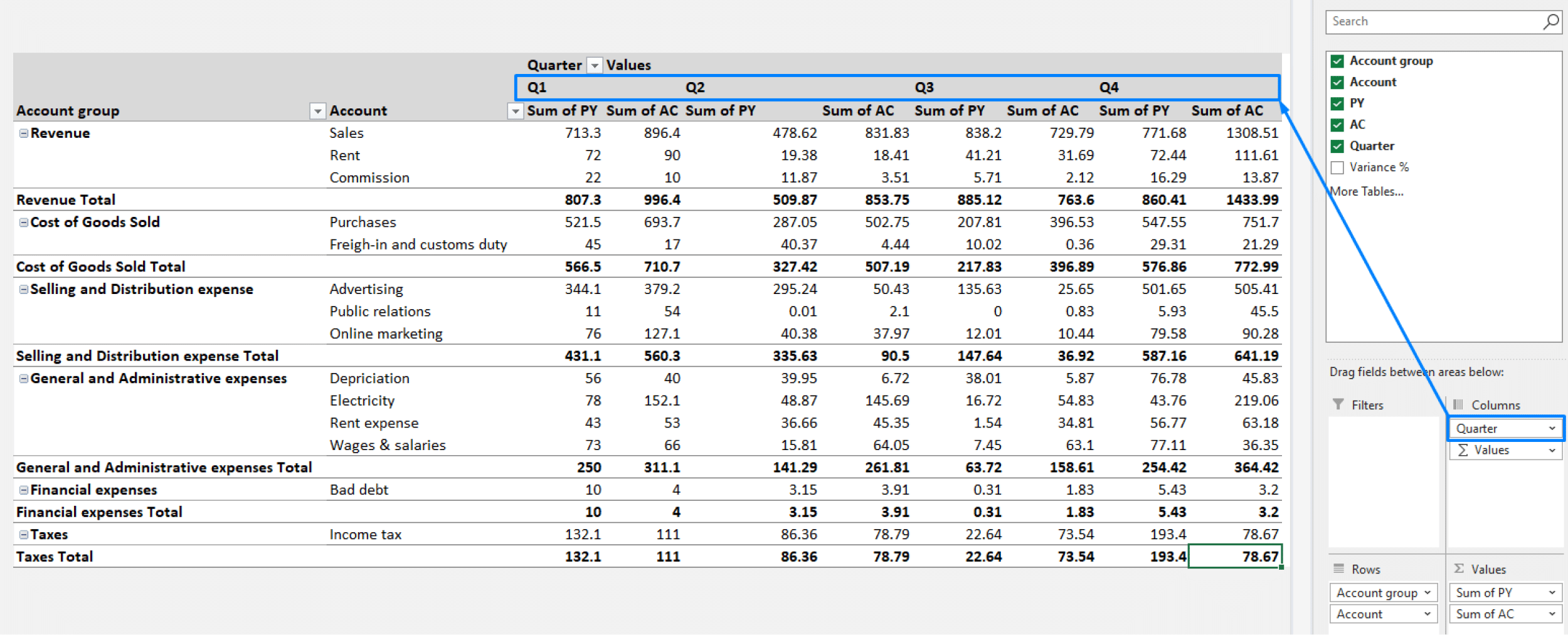
3. Group and filter your data
Grouping and filtering your data helps you zero in on specific subsets of your data, making it easier to identify trends and outliers. To analyze trends over time, you could group your data by month, quarter or year, for instance.
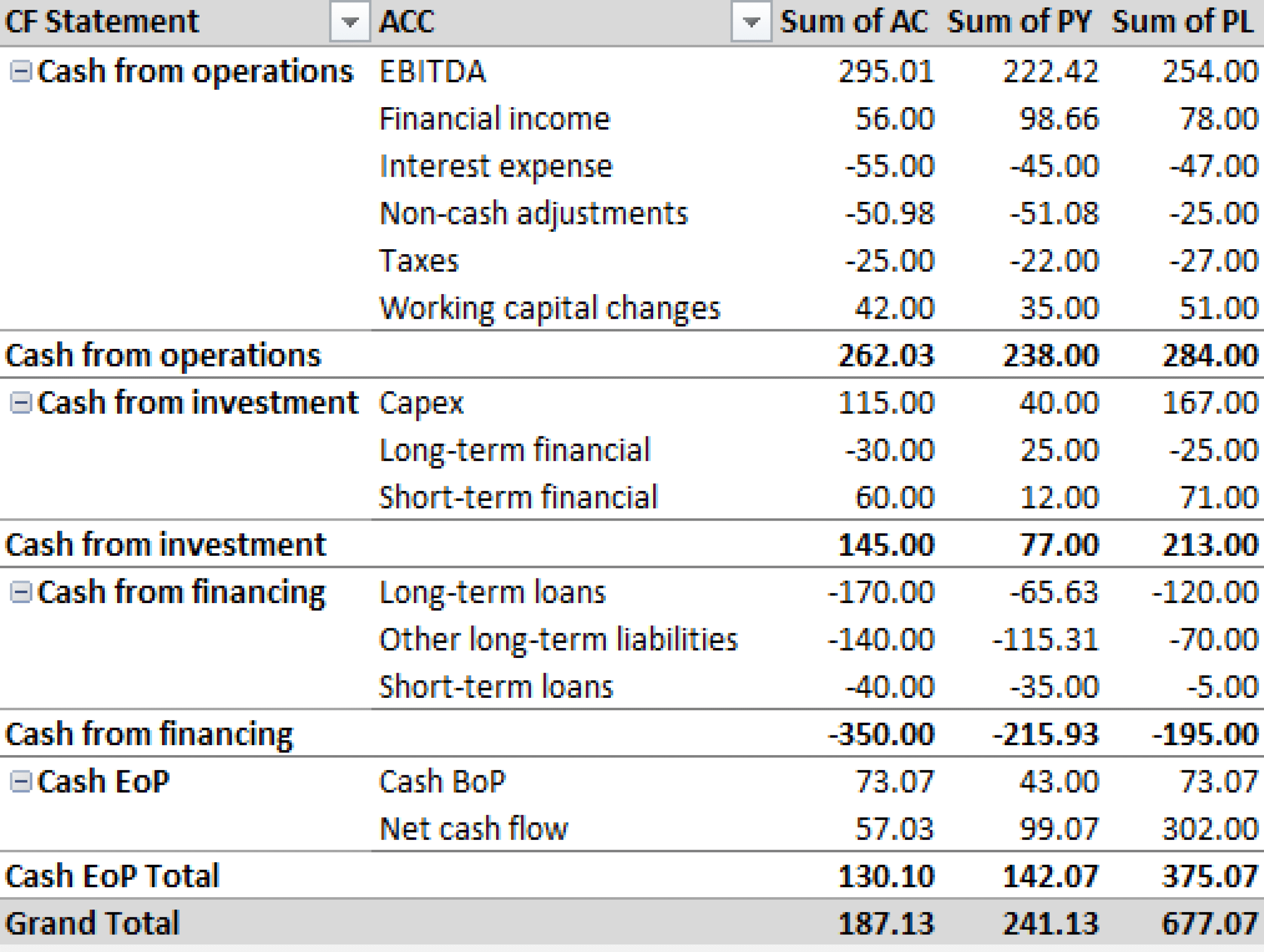
4. Refresh your data
Be careful not to let outdated data ruin your financial analysis. Regularly refreshing your pivot table data will ensure you're always working with the latest, most up-to-date information. To do this, just click the "Refresh" button in the pivot table toolbar. You also have the option to click "Refresh all" which updates all the pivot tables in the workbook.
5. Use slicers to filter your data
Slicers allow you to filter your pivot table data based on your selected criteria. You can use them to filter your data by year, month or region, for example, and get a more detailed view of your performance over a specific period of time or on a specific market. To create a slicer, just click any cell in a pivot table > "Insert" > "Slicer". This will display a list of fields, from which you can choose to create it.
Using pivot tables in Excel for financial analysis has never yielded such impactful results! Speaking of, let's have a look at why clear, insightful and actionable visualizations matter, shall we?
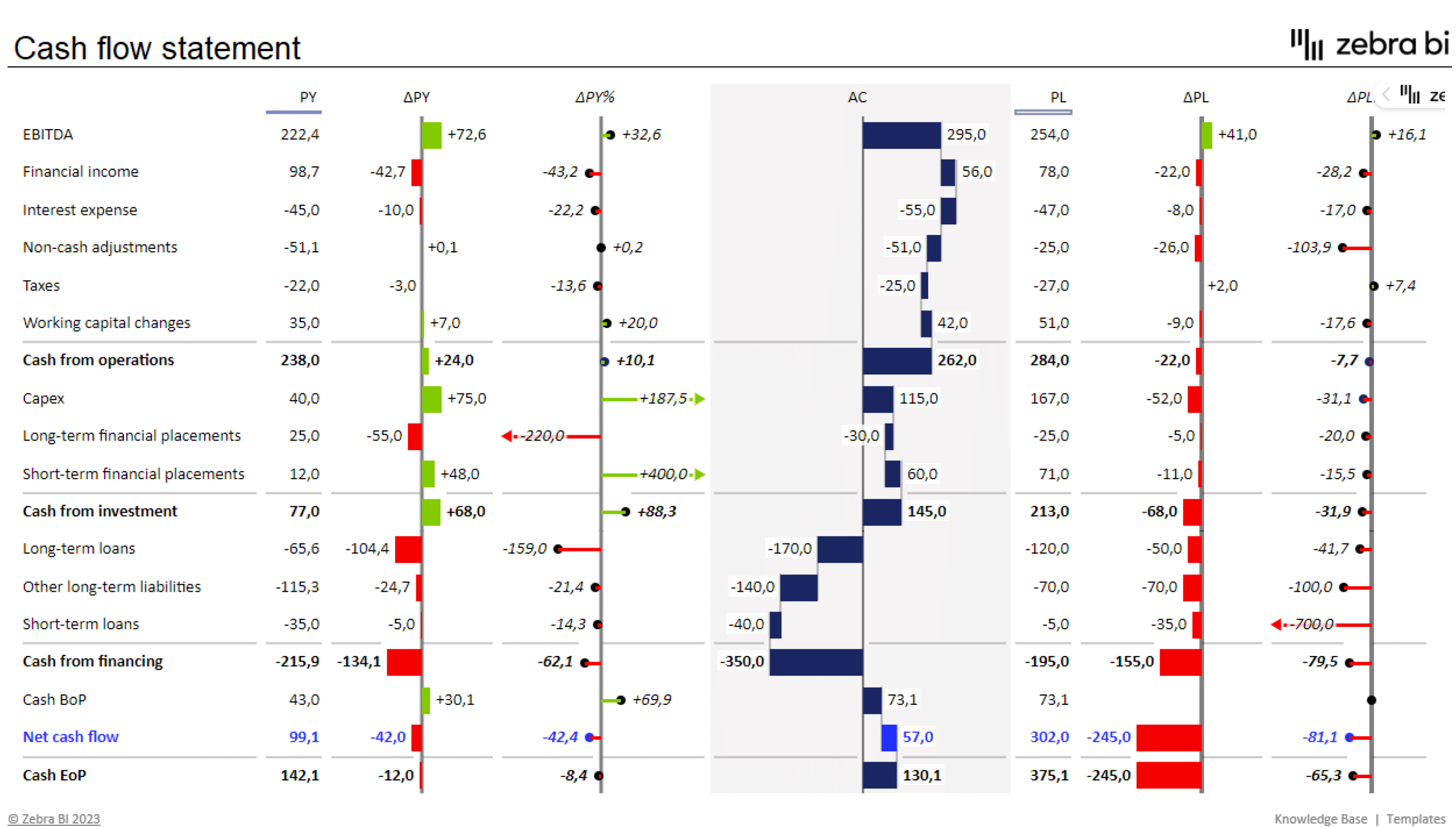
Visualizing your financial reports
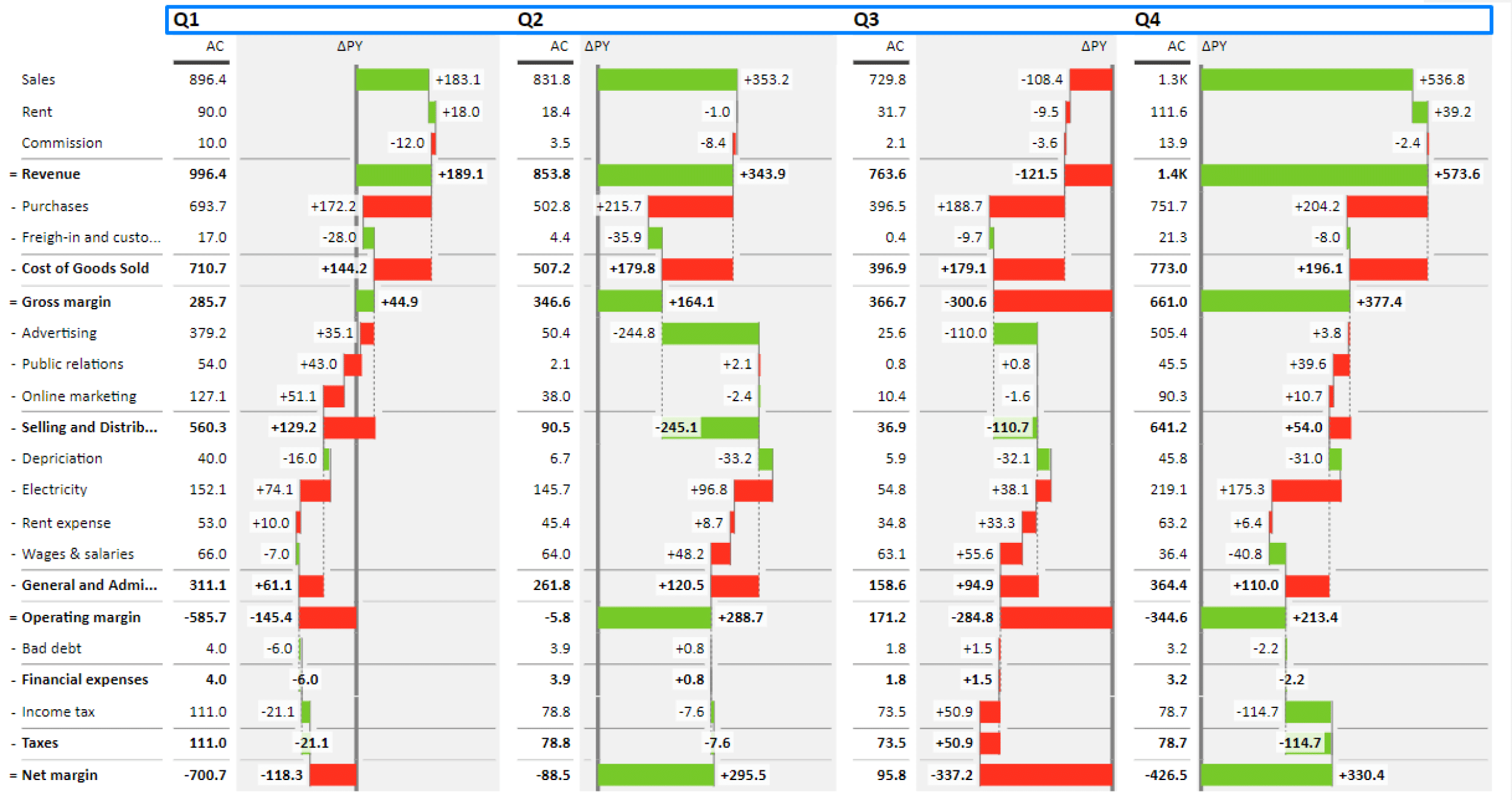
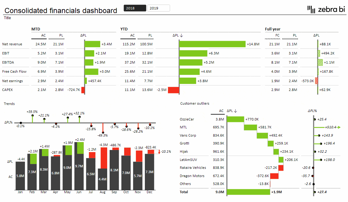
Effective visualizations turn raw data into actionable insights. This enables the decision-makers to quickly grasp the meaning behind the numbers. Accurate, clear and visually appealing charts and tables can help uncover trends, bring potential issues to light, and provide the necessary context for your data. In other words, they make complex information super easy to understand.
If you want to turn your financial data into a work of art that would make Michelangelo blush, you're going to need a tool that's as powerful as Zeus himself. And that's exactly where Zebra BI for Office comes in. With this powerhouse tool in your arsenal, you'll be creating visualizations so impressive, even your colleagues will be asking you for lessons. All in just a few clicks. Take a look at how easy it is.
Designed specifically for Excel (and PowerPoint!), Zebra BI for Office integrates seamlessly with pivot tables, allowing you to create dynamic and impactful data visualizations in just seconds of your time. And we're not just talking visually appealing but also accurate, highly informative and compliant with IBCS. To top it off, the tool comes with a super intuitive interface, a vast array of customization options and numerous advanced features like:
- automatically calculated variances,
- custom calculations (Invert, Result, Skip),
- subtotal difference highlights,
- comparisons of up to 4 measures (AC, PY, PL, FC),
- formula manager for calculating new data elements,
- advanced tables with integrated charts, and so, so much more!
Ready to explore Zebra BI hands-on?
Try Zebra BI for Excel for free & automatically receive a free instructional file. In it, you'll find everything you need to add the Zebra BI add-ins to your Excel. Start creating impactful, visually stunning reports and dashboards that inform and inspire today.