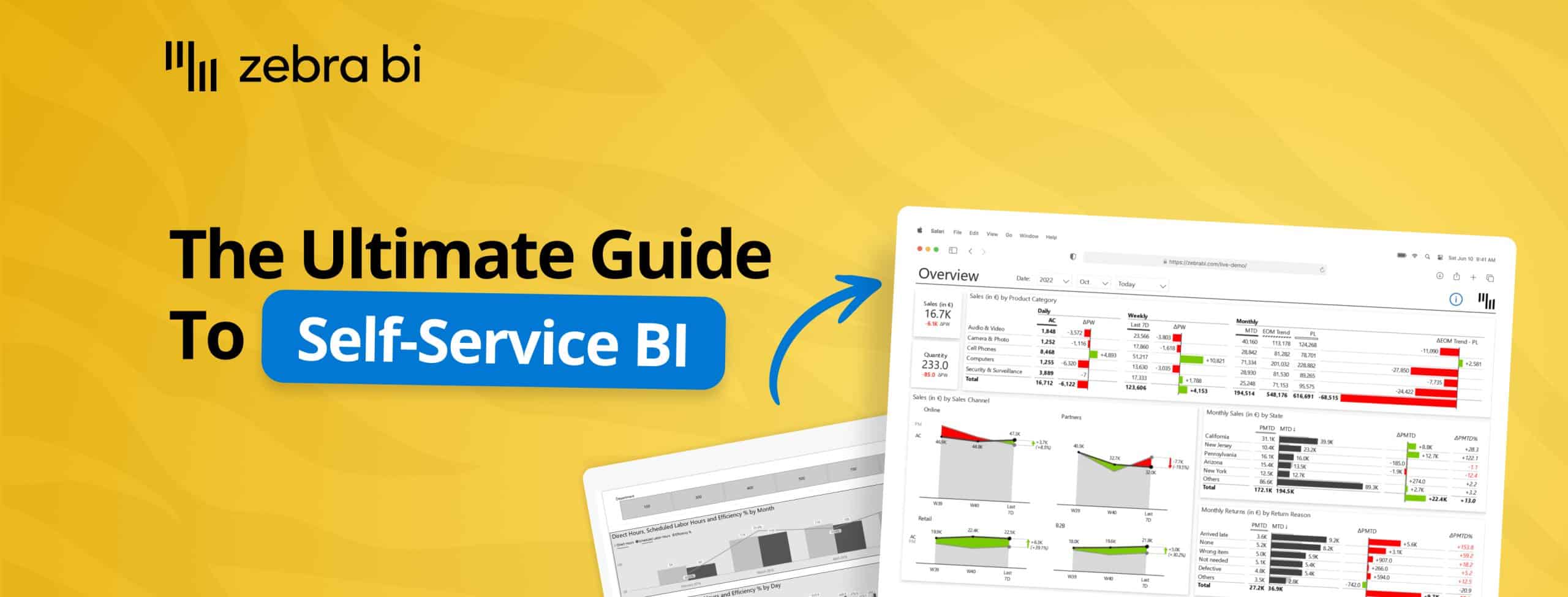
The Ultimate Guide to Self-Service BI in Power BI
PRO Trial
This post will explore the core ideas behind self-service BI, the different models companies can use, and practical ways to support them in Power BI. We’ll also shared hands-on examples, key steps for building a successful self-service strategy, and useful resources to help teams get started.
Self-service BI may sound a bit nebulous but at its core, self-service BI is about letting business users - not only data teams - explore, visualize, and analyze data on their own, using governed, user-friendly tools.
The goal is simple: give people across the organization the ability to answer their own data questions and make decisions faster.
But even in 2026, getting this right is still a challenge. While self-service BI is growing fast - almost 19% year over year - only about one-third of companies describe their initiatives as truly successful. And surprisingly, the main challenge isn’t technology at all - it’s governance.
According to BARC, 73% of companies claim the biggest obstacle is the lack of a solid semantic layer and inconsistent metrics. This means people can build dashboards, but they can’t always trust that “revenue” or “margin” means the same thing across departments.
The main challenge here is that there is no one simple answer to this issue. Self-service BI can mean different things in different companies and much depends on the company’s BI maturity and business user skills with BI tools.
In short, there is no one-size-fits-all model.
Self-Service BI: Great Vision, Messy Reality
A few years ago, self-service BI sounded like the perfect vision: give users access to data and powerful tools like Power BI, and they’d build the reports they need on their own. But once companies tried to apply that model, reality set in. True self-service - scaling from raw data all the way to complex analytics - requires skills many business users simply don’t have, from data processing and modeling to understanding the full data lifecycle.
That’s why the industry shifted toward more nuanced approaches. Instead of expecting users to start with raw data, organizations now look for the right “access point” based on user skills and maturity - whether that means offering fully managed dashboards with some flexibility on top, or finding a balanced middle ground. Different companies need different models, and choosing the right one is key.
Self-service BI doesn’t have a silver bullet. In practice, we are dealing with different tiers of users, and how you support them depends on who your end users are. They differ based on their skills, the flexibility you want to afford them and the level of governance you want to implement.
In this post, we are focusing mainly on Tier A and Tier B users—the typical business end users who mostly consume reports, do some cross-filtering, and maybe customize views using bookmarks to get the insights they need from Power BI.
To make this even more effective, we also incorporated Zebra BI, which is a benefit for both sides of the equation: on the one hand, developers can speed up the report creation process, while on the other hand, end users can quickly spot the key insights without getting lost in the details.
Enhancing Managed Reports with Flexibility
Let’s start with a typical managed experience - a structured report that already includes all the key calculations and visualizations but highlighted ways to make it more interactive and customizable.
The goal is to give the users the ability to use their own data and to support different needs of multiple business users.
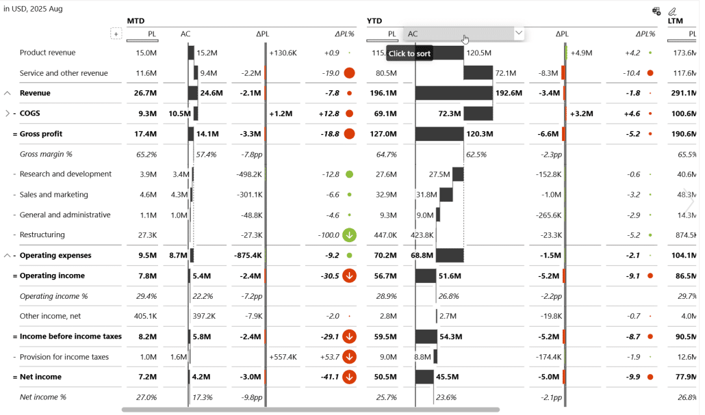
For example, in a financial benchmarking scenario, multiple statements like income statements, balance sheets, and cash flows can be combined into a single visualization. Using Zebra BI visuals, users can switch between chart types, rearrange displays, or focus on the metrics that matter most to them.
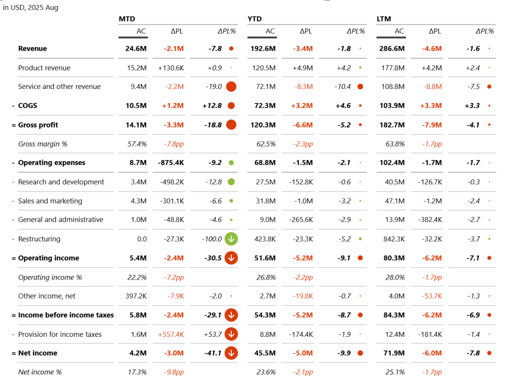
Ideally, it takes end users just a couple of clicks to go from a view like this …
… to a different view of the same data that highlights different points:
This is the setup for Tier A users that provides exploratory capabilities in a managed environment, where users can manipulate the display of individual elements.
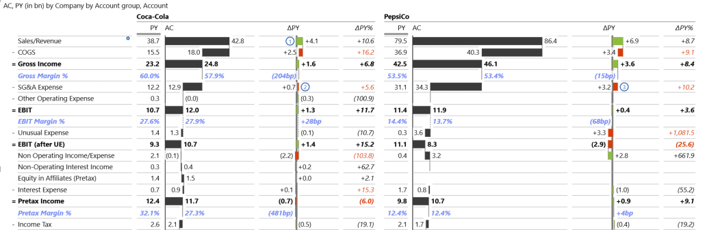
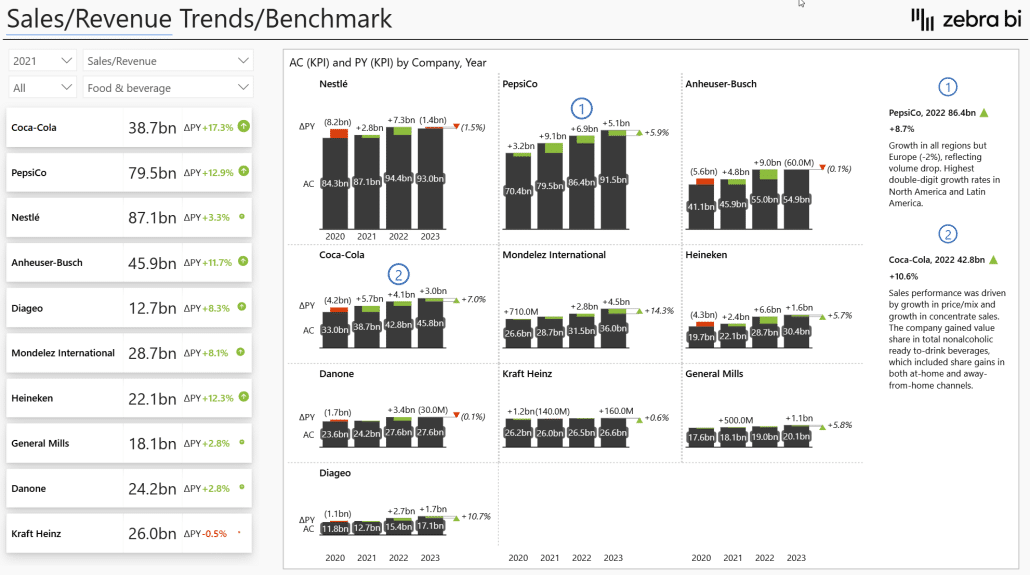
This doesn’t sacrifice power. Users can easily use this dashboard to benchmark their company against competitors. For example, here’s a view comparing PepsiCo with Coca Cola.
Beyond basic dashboards, you can layer in more flexibility and personalization for Tier 1 users. This includes exploring different KPIs within the same report, combining multiple comparisons, or adding storytelling elements like commentary, annotations, or visual cues such as CAGR arrows to highlight key trends.
The goal is to give users a richer self-service experience without requiring them to create their own calculations.
With the right tools - like Zebra BI - you can control interactions completely for Tier 1 users. In this case, what they see is what they get, without sliders, dynamic views, or other interactive elements. This keeps the experience simple and focused and users never get overwhelmed.
As users progress through higher tiers, more interaction options can be introduced, giving them greater freedom to explore and modify reports. This tiered approach helps organizations balance governance with self-service, letting users gradually take on more flexibility as they gain confidence and skills.
Balancing Governance and Freedom
When designing self-service experiences, the first big decision is how much freedom you want to offer. A more governed approach lets you lock down interactions so users see exactly what you intend—ideal when accuracy, consistency, or messaging is the priority.
As you move toward greater flexibility, you can gradually unlock more interactive features based on the user’s skills, confidence, and role. This tiered approach ensures people only get the level of control they’re ready for.
The next step is to decide whether a dashboard is meant to be explanatory or exploratory.
- Explanatory dashboards communicate a clear, predefined message or insight. Here, a managed, low-interaction design works best.
- Exploratory dashboards invite the user to dig into the data, test ideas, and uncover insights on their own—so richer interactions and more freedom can be extremely valuable.
In more exploratory scenarios, users may want to slice data across different dimensions, view it from multiple angles, apply cross-filtering to focus on patterns, and switch between different views such as tables (for structure) and charts (for trends).
Starting Out Building a Self-Service Experience
A typical starting point is the data model. We recommend a star schema with a fact table and several dimension tables, including a calendar table, which is essential for time-intelligence calculations. The model also uses disconnected tables combined with SWITCH statements - very useful in self-service reporting - as well as field parameters.
Here, we have two visuals on the page: a card and a Zebra BI Table. If you don’t have Zebra BI visuals installed, you can get them through Get more visuals in the AppSource marketplace. You can also try them with a free trial.
To illustrate the difference, if you use the native multi-card visual to show Actual Sales and add Plan, you’ll simply see the values.
But if you switch to the Zebra BI Card, you immediately get calculated variances between the metrics. You can also add Plan and Previous Year values, and the visual automatically calculates and displays both variances, giving you much richer context for insights.

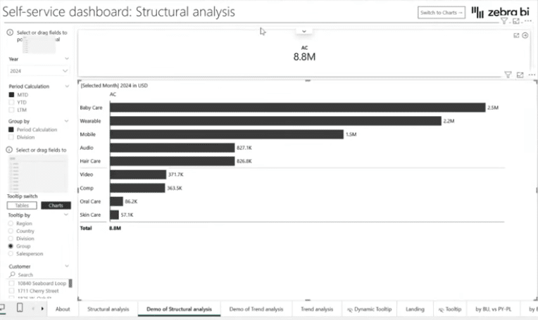
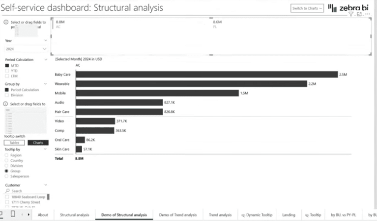
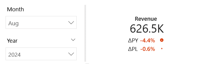
These are the sales for the full year 2024. But since the data model includes a calendar table, you can focus on the latest available results. To do that, you can create a slicer, add the Month field from the calendar table, and select August for the latest results. This is the simplest way to introduce basic interaction in Power BI: add a slicer and let it filter the data.
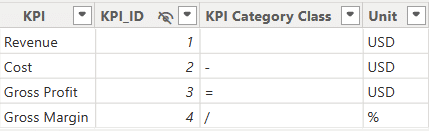
But often you don’t want to look at just a single KPI in isolation. This is where the first pillar I mentioned comes in: the disconnected KPI table. It’s just a simple table with KPI names and an ID, created through Home → Enter Data. It’s called a disconnected table because it has no relationship with the fact table.
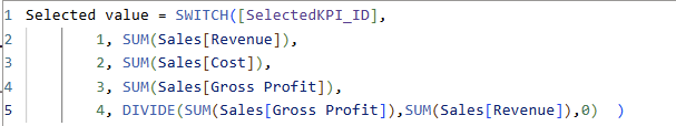
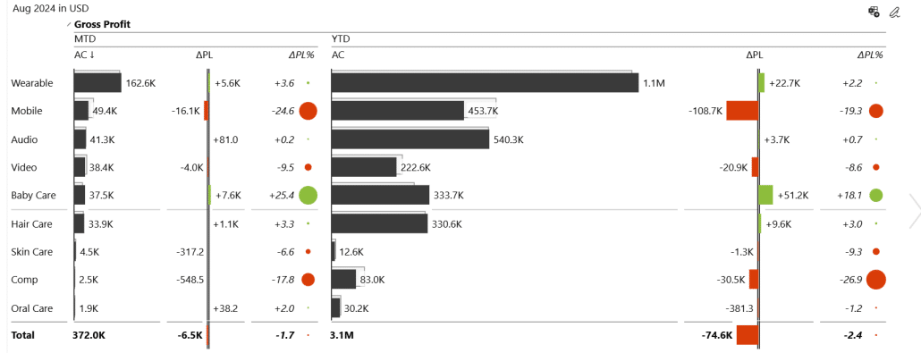
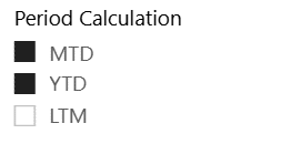
The benefit is that you can drive flexible KPI selection. For example, in this visual I’ve placed four KPIs, and the Zebra BI Card splits them into four views while keeping the variances. The key step is using a Selected value calculation as a measure. Based on the selected KPI - Revenue, Cost, Gross Profit, or Gross Margin - the measure returns the corresponding value. With no KPI selected, all four KPIs are displayed, which is exactly what I want.
With this in place, the KPI cards become true interactive filters. When the user clicks Revenue, the entire report updates accordingly.
Once they click Gross Profit, every visual changes again to reflect that selection. It’s a simple but powerful way to drive self-service exploration.
Using KPI cards as filters is an effective and elegant approach. Instead of relying on multiple slicers or a long list of separate measures - especially for time intelligence - you can consolidate the logic into a few reusable measures and let the visuals themselves drive the filtering.
While this approach may take up a bit more space than a slicer, it has the benefit of including information and insight from the get go.
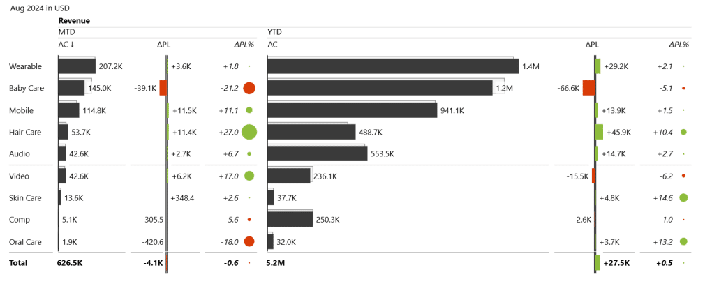
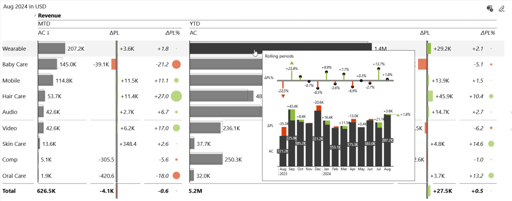
But this is only the starting point. Alongside the KPI selector, we also added a set of filters for the most common business time perspectives, such as month-to-date, year-to-date, and rolling 12 months.
These are driven by another disconnected table, this time containing period calculations. Just like with KPIs, the user chooses a period in a slicer, and the measures respond instantly. This allows viewers to switch between different timeframes on the fly and analyze performance trends with minimal effort.
The core principle behind creating a dashboard is to balance user freedom with clear, meaningful insights. Even if you allow users to explore and interact with the data, the dashboard should still guide them by presenting information in a visual, contextual way rather than relying on plain tables or raw numbers.
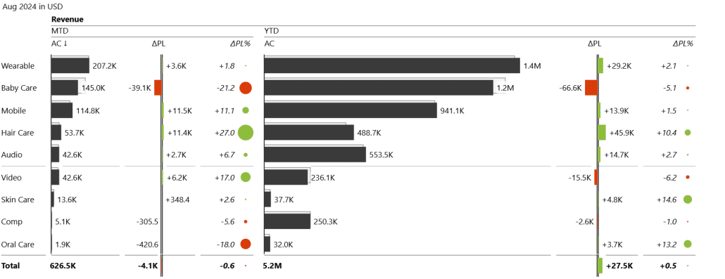
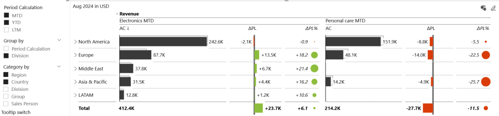
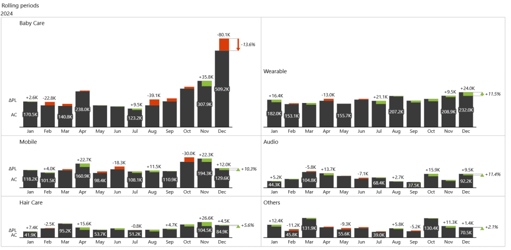
To expand upon this idea, we can add even a plan measure into the mix. By simply adding planned values to the visual, Zebra BI instantly calculates variances and highlights performance gaps. It’s a quick way to add context, accelerate insight detection, and help users spot issues - like the underperforming Baby Care segment - without any extra effort.
Unlocking Even More Flexibility With Field Parameters
Once you’ve mastered the basics of self-service controls, there’s no reason to stop at predefined views. If your goal is to offer true freedom and flexibility and move away from predefined views, field parameters are the next step. Instead of forcing users into fixed categories - like a table grouped by product groups - you can let them choose the dimension they want to analyze.
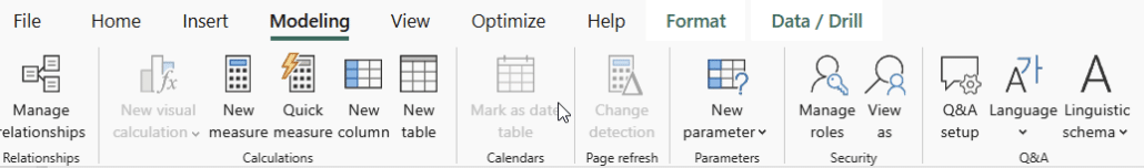
Field parameters make this possible. In Power BI, you simply open the Modeling tab, an Create a new parameter.
Here, you select the fields you want users to be able to switch between. Power BI then presents a parameter window where you define which dimensions should be available for slicing: product category, region, channel, salesperson - anything that makes sense for your scenario.
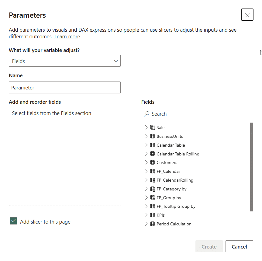
You can even keep the checkbox that automatically creates a slicer for the parameter, meaning you don’t need to build one manually. Just give the parameter a clear name so it’s easy to maintain, create it, and you’re ready to go. Once created, you simply drop this new field parameter into your Slicer visual to fully unlock dynamic, user-driven analysis.
Let’s look at a visual that shows results by a salesperson:
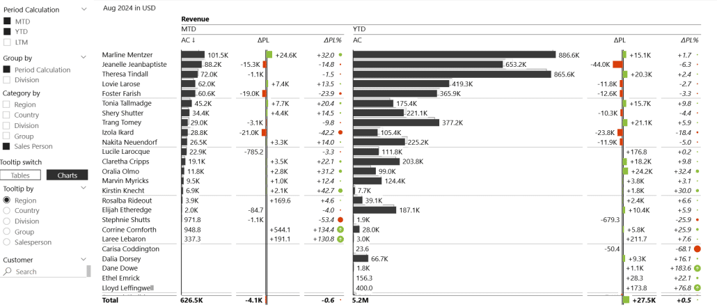
You can then sort and view this data to see the best and worst performers. You can even change visualization styles to extract new insights.
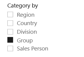
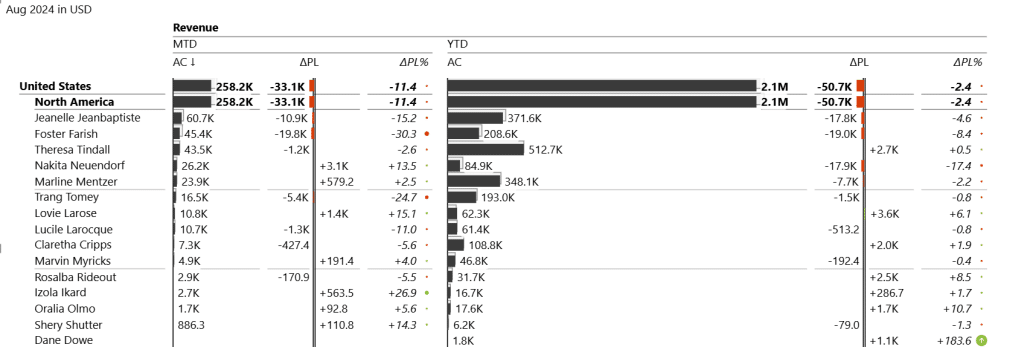
Field parameters don’t lock you into a single level of detail. With a parameter slicer, users can select multiple fields - such as Region and Country - to create a meaningful hierarchy they can drill into. This makes it easy to move between high-level overviews and detailed market insights with just a few clicks. You can even build additional layers of hierarchy simply by adjusting the slicer selection.
Here is an example of three categories selected at the same time:
You could even combine field parameters with bookmarks. This lets you predefine hierarchies - like Region → Country or Division → Group - and surface them as ready-made views. Instead of manually selecting fields every time, users can switch between preset structures with a single click.
When getting into predefined views and bookmarks, knowing your users and how they consume reports is crucial, particularly in self-service setups. By talking to users and understanding their typical scenarios - whether they focus on growth rates, variances, or specific hierarchies - you can design predefined views that match their needs.
Once you move beyond basic categories, field parameters open the door to much richer control. The same technique used for switching between regions, countries, or divisions can also be applied to groups giving users far more ways to slice their data without creating separate visuals.
Paired with a slicer, field parameters let users drive the view themselves. Want to focus on period calculations? Select month-to-date. Need broader context? Select year-to-date or simply choose both and compare them side by side. This multi-selection approach mirrors how analysts naturally work when evaluating performance.
Tooltips as a Useful Tool
Tooltips are a great way to add depth to a report without overwhelming users. By hovering over any value - like a column in a table or a data point in a chart - users can instantly access additional insights. In our case, we built the tooltip as a separate page that is enabled as a tooltip.
You can also use bookmarks to control exactly what appears inside the tooltip: a detailed table, a trend chart, or a breakdown of the last 13 months. This turns a simple hover interaction into a powerful mini-dashboard that surfaces the right insight at the right moment.
While tooltips are often overlooked or left off entirely, they’re a great option to provide additional breakdowns and trends without having to leave the page. They let you combine structural insights with time-based trends directly on hover, keeping the user in context. Plus, because report page tooltips trigger queries only on demand, they don’t slow down performance.
From a user experience perspective, tooltips are incredibly intuitive - even for those who aren’t skilled in Power BI or BI tools in general. Simply hovering over a value to reveal more context or trends is natural and easy to understand. This simplicity makes tooltips one of the most user-friendly ways to provide extra insights without adding complexity to the report.
Expanding Scope with Trend Analysis
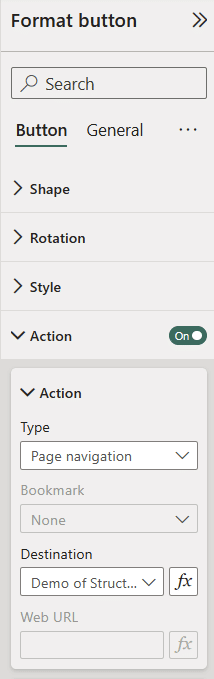
The next step is to help users navigate between different pages in the report. One way is to add a page navigation button that users can click to move to another report page that focuses on trends over time, without losing the context of the data they were analyzing. This approach keeps reports clean while giving users the freedom to explore deeper insights when they want.
Creating these buttons is straightforward in Power BI. Simply insert a blank button, customize the text and style, and enable Actions in the format pane. Set the action type to Page Navigation and choose the page you want the button to link to.
On the trend page, visuals can show the same KPIs over time, combining actual values, plans, and calculated variances for context.
This is what we start with - actual values over a time period.
For context and comparison, it’s helpful to bring in plan values alongside actuals. When you drop these into your chart, Zebra BI automatically calculates variances, giving an immediate view of performance. You can then break down the data by groups, such as product groups or business units, to see which areas are driving results.
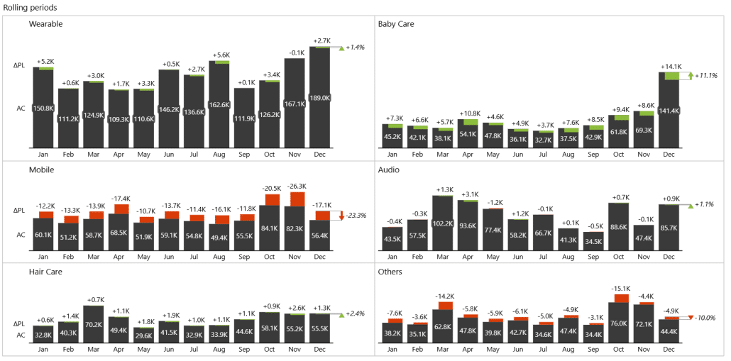
For example, in this case, Baby Care emerges as the top-selling product group, giving instant insight into priorities.
You can again use card visuals to let users control which KPI they want to focus on, keeping the report flexible.
Here’s a view of the Gross Profit KPI:
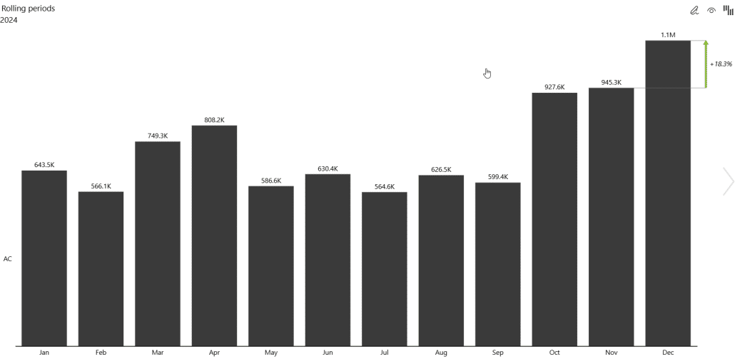
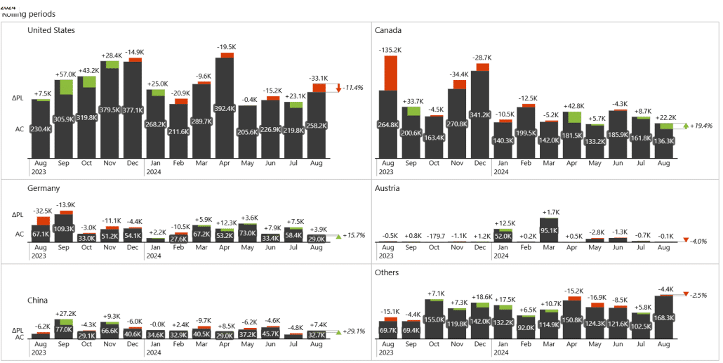
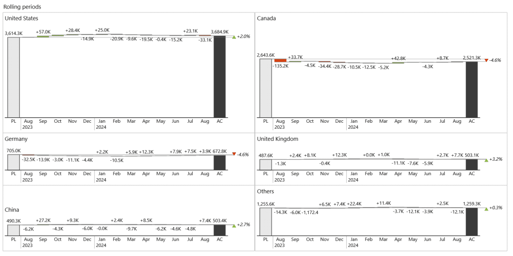
While a single month view can be useful, it’s often important to see trends over longer periods. This is where rolling periods come in—a simple switch statement calculates actual values for a selected period, whether it’s 12 months, 24 months, or even 30 months.
By replacing your standard AC values with AC rolling values and doing the same for plans, the visuals automatically update based on the selected period. For example, selecting August and a 30-month rolling period instantly shows performance trends for the past 30 months, providing a clear, time-based perspective on your KPIs.
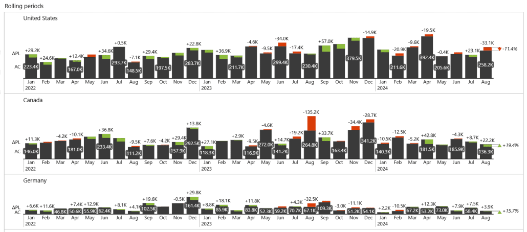
The rolling periods approach remains fully dynamic - selecting a different month, like July, automatically updates the trend while keeping the chosen period intact.
Users can view trends over 12 months, 24 months, 30 months, or even longer, depending on the historical data available. Here’s a 37-month rolling period display:
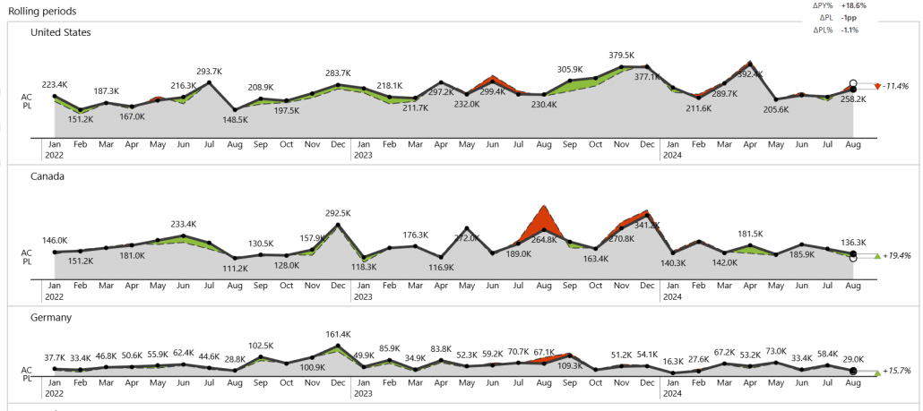
Since Zebra BI offers the flexibility of changing the chart style on the fly, users can choose the presentation that best communicates the data. For example, for short-term analysis, waterfall or column charts work well to highlight individual variances:
On the other hand, longer-term trends are better visualized with line or area charts.
This approach gives end users the freedom to explore the same data in different ways, selecting the view that provides the clearest insight for their analysis.
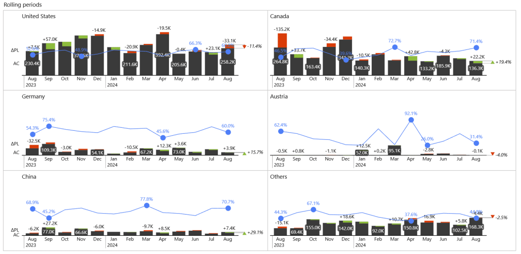
In some cases, it’s useful to analyze multiple metrics together, such as revenue and margin. Using combo charts, you can combine values in a single view to reveal new insights. Here, we have the revenues in combination with gross margins:
To make it easier on users, you can use bookmarks to give users control over which visuals they see - switching between combo charts, individual variance charts, or tables - all can be done with just a click. This approach keeps the report interactive and flexible, letting users explore the data in the way that makes the most sense for them.

Zebra BI visuals make it easy to showcase growth trends or absolute and relative variances. With a few simple settings, you can predefine multiple custom views, allowing users to switch between them with a single click. This flexibility not only simplifies analysis but also lets users explore different scenarios, focus areas, and plan comparisons.
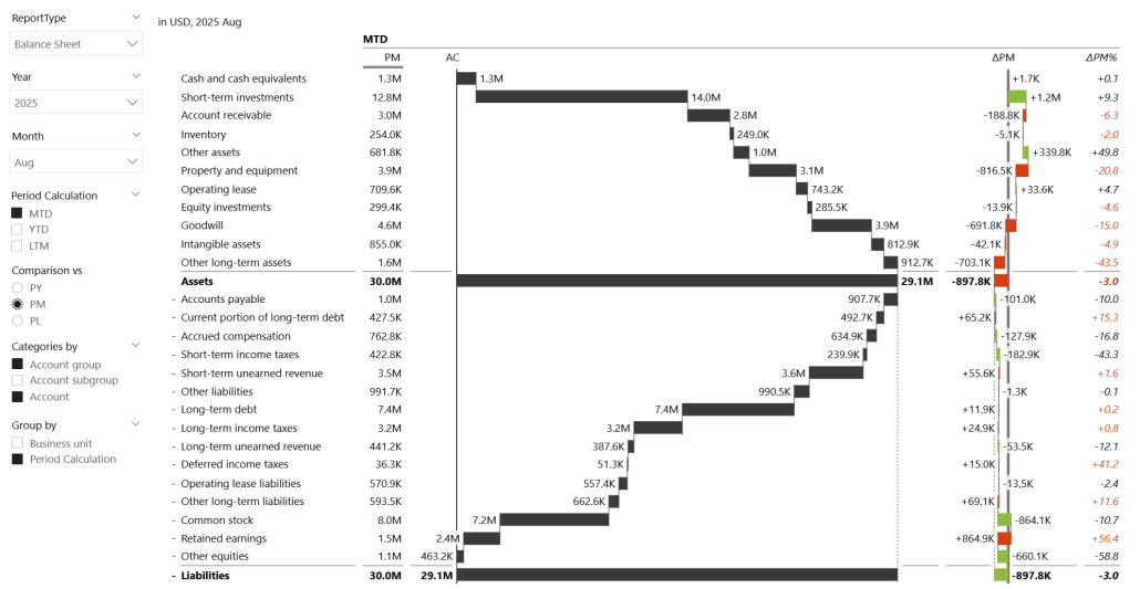
Slicers for Financial Reports
Slicers are also a good feature for financial reports, where you can use them to switch between different types of financial statements - income statement, balance sheet, or cash flow:
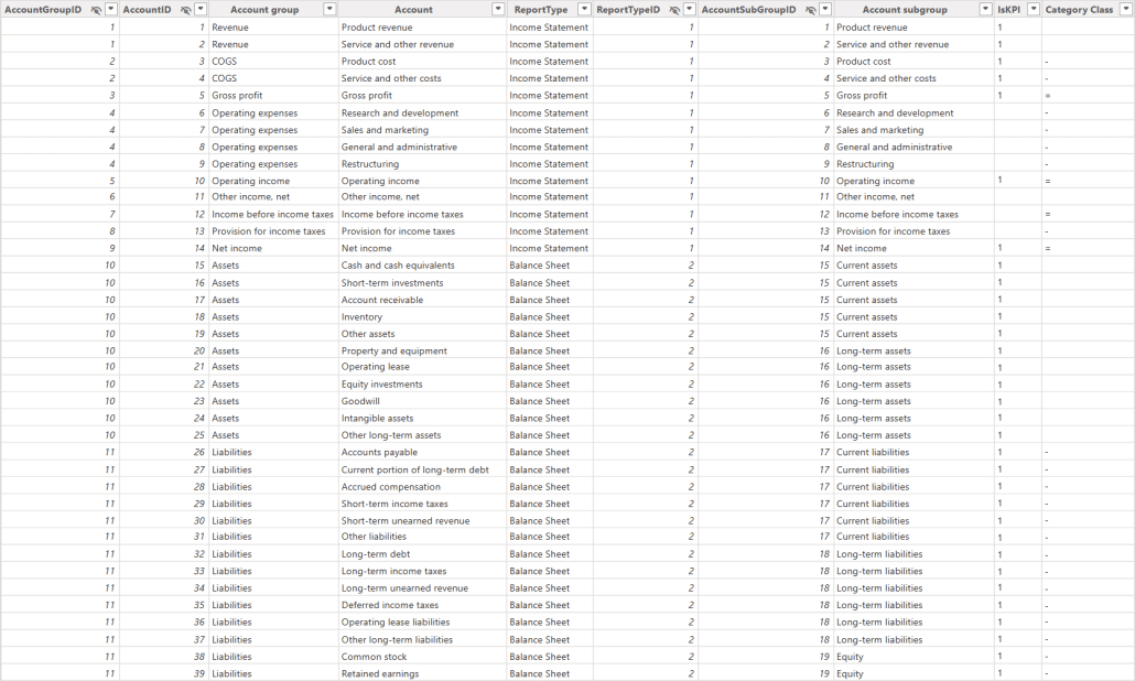
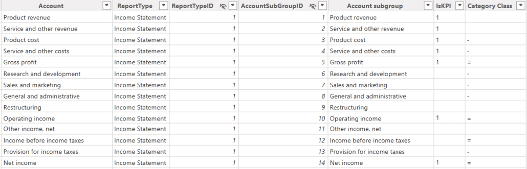
This is made possible by a well-structured data model, where each account in the fact table is linked to its corresponding report type.
Combined with Zebra BI visuals, this approach lets users explore multiple perspectives, quickly analyze year-to-date or month-to-date performance, and focus on the metrics that matter most, all while keeping the interface intuitive and self-service friendly.
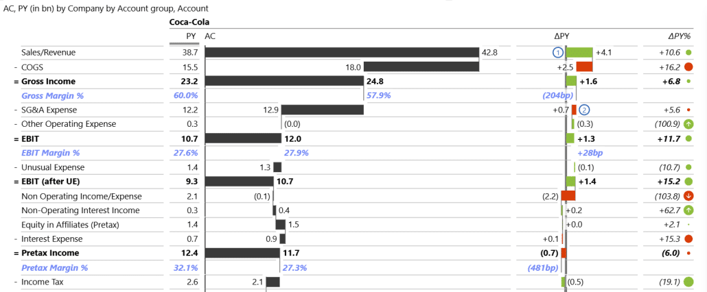
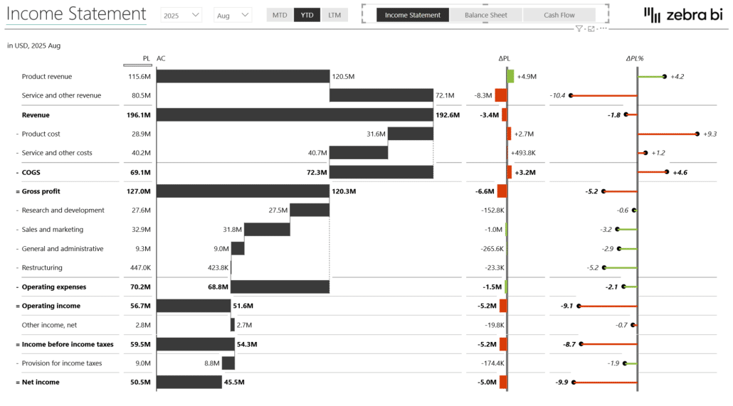
Building a P&L Statement
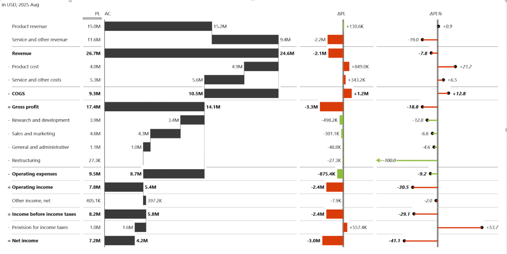
With Zebra BI visuals, creating a clear P&L visualization is straightforward. By bringing in account groups, individual accounts, and actual values, you can easily compare performance to the plan using a waterfall chart.
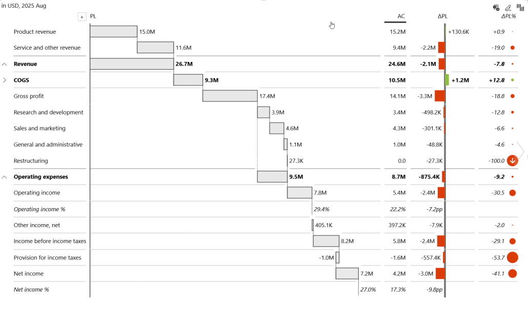
However, we also need to know which values add or take away from the profit. The key step here is defining the account categories - such as expenses, gross profit, operating income, and net income - using a dedicated category class field.
Once assigned, the visual automatically understands which accounts add or subtract from profit and calculates the P&L accordingly, giving a clear, intuitive view of what drives financial performance.
To keep financial statements flexible and truly self-service, you can also let users switch between different time-based calculations - such as month-to-date, year-to-date, or the last twelve months - using field parameters. You can also select multiple periods at the same time. Here are all three periods shown at once.
When multiple periods are shown at once, you can provide an alternate predefined layout to keep the table readable without overwhelming the user.
Sometimes users want to compare actuals not only against the plan but also against previous periods, and you can easily support this with a dynamic comparison setup. By creating a small disconnected table that defines comparison options - previous year, previous month, or plan - you can drive a SWITCH-based DAX measure that returns the appropriate value depending on the user’s selection.
When combined with Zebra BI’s ability to automatically suppress empty columns, the visual shows only the relevant comparisons without clutter. This approach is especially useful in financial statements, where previous-year comparison is standard, but month-over-month insights may also be valuable depending on the context.
For balance sheets, however, the most meaningful comparison is usually against the previous month, since this reveals where the largest changes occurred. Here is an example of a visual showing balance sheet changes compared to previous month.
By combining this logic with field parameters, users can easily switch between different hierarchies or angles of analysis.
Alongside dynamic titles and dynamic column headers, the report continuously updates to reflect the selected period and comparison, so users always know exactly what they’re looking at, at every step of their analysis.
7 Key steps to successful power BI self-service
1. Define clear goals and expectations
Before building anything, gather real inputs from users. Talk to them, understand what they actually need, and clarify which insights and visualizations will help them most. Defining expectations early ensures the final dashboards align with real business questions.
2. Assess the data landscape
Evaluate the structure, availability, and quality of your data. Understand where the data comes from, how it’s organized, and what transformations are needed. A clear understanding of the data landscape determines what is technically feasible and how reliable the outputs will be.
3. Identify and involve power users
Bring in experienced users or developers early in the process. Teach them the techniques and capabilities available in Power BI so they can support the wider business. Their early involvement ensures smoother adoption and better solution design.
4. Select appropriate tools
Choose the right tools and features within Power BI to deliver the best experience.
5. Establish strong data governance
Users must be able to trust the data. Ensure that all data sources are clean, validated, prepared, and managed through governed pipelines. When users know the data is accurate, they gain confidence in the insights and use the dashboards more effectively.
6. Provide comprehensive training and support
Support adoption through documentation, tooltips, bookmarks, intro pages, or walkthroughs. If possible, organize workshops to demonstrate how dashboards should be used. Offer feedback channels so users can ask questions and request enhancements.
7. Monitor, refine and adapt
Track how dashboards are used and whether they provide value. If usage is low or key metrics are missing, loop back, collect feedback, and improve the design. Treat the solution as a living product - continuously refined based on user needs and new best practices.
Want to Learn More?
Watch our webinar on self-service BI, where our BI consultant shares a proven framework for scaling self-service analytics, ensuring that every report stays consistent, trusted, and decision ready.
This session is for all data leaders, data architects, model builders, Power BI admin, and business analysts.