
 September 8th
 February 22nd
Small Multiples: When a Grid of Charts Beats One Combined Chart
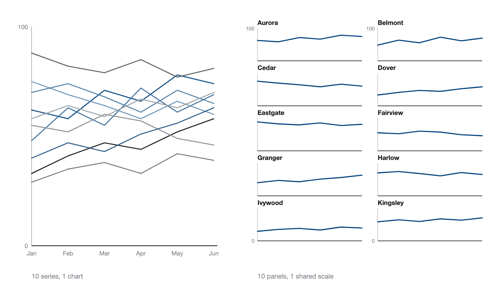
You’re looking at a report with 12 business units on one line chart, and you can’t tell which one is falling behind. Splitting that chart into 12 smaller ones sounds like more work for your readers, but it’s the fastest way to understand it.
A small multiples graph (or a trellis chart) is a grid of small charts, one for each category, all drawn using the same style and on the same scale. Your readers learn the layout from the first panel, then read the other panels without stopping to work out what they're looking at.
However, there’s one drawback to using a small multiples graph, as you give up precision on any single comparison. Two values sitting in separate panels are harder to compare than two lines crossing on the same plot.
So, when should you use small multiples to make your report easier to read?
In this guide, we'll explain how small multiples work, when to use them in your reports, how many panels are too many, and the mistakes to avoid when creating them.
What is a small multiples chart?
A small multiples chart is a visualization tool that repeats a single chart type across a grid of panels, with each panel showing a different slice of the data on the same axes and scale.
The shared scale is what makes it work. Every panel measures against the same axis, so a low panel means a low number rather than a differently scaled one, and your eye picks out the odd one without checking a single label.
Small multiples are also known as trellis charts, panel charts, lattice charts, or grid charts, but they all describe the same graph.
PRO Trial AVAILABLE FOR FREE!
A grid of panels is a setting in Zebra BI Charts, not 12 visuals you keep in step by hand. Put 1 field in the Group placeholder and every category comes back as its own panel on 1 shared scale.
Small multiples cheat sheet
Everything the rest of this page argues, in one panel.
Small multiples details
3 grids worth building
3 cases when you should use small multiples
A grid earns its place in 3 situations, and they share a shape. Every category matters and no pair matters more than the rest.
1. You have more than 4 series in one chart
Ten regions on one line chart is a tangle, and the standards agree on roughly where the tangle starts. The IBCS Association puts the number at 3 or 4. Past that, it says, a chart "can be more confusing than several smaller charts with one line each placed next to one another (small multiples)". The CDC's data visualization guidance puts the threshold at more than 5 data series for line charts. Anywhere in that band, splitting is the safer call.
2. You need every category on the same footing
A slicer shows 1 unit at a time, so the reader holds the last one in their head while looking at the next. Put all 12 regions on screen together and the comparison happens in the eye instead. This is the case for a monthly business review where nobody has agreed in advance which unit is the problem.
"When we're looking at trend analysis, a really, really powerful technique is to use small multiples. [...] When I want to understand how am I doing on overall my business units, I can just use the Zebra BI chart and drop the business units into the group placeholder."
Mark Leskovsek, BI Specialist, Zebra BI, in the February 2026 live demo
3. You need a variance per category
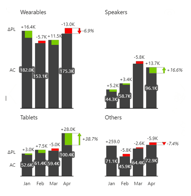
Actual against plan is 2 series, so across 12 units that's 24, and no single chart holds them. Give each unit a panel and it carries its own gap and its own percentage. A sales director scanning that grid finds the 3 units to ask about before reading a number.
3 cases when you shouldn't use small multiples
A grid is the wrong answer more often than its fans admit, and each of the 3 cases below points somewhere better.
1. You need the exact gap between 2 series
Panels share no baseline, so reading panel 3 against panel 9 means measuring by eye, and eyes are bad at it. Keep both series in 1 chart. Zebra BI Charts can draw the comparison as overlapped columns, which puts actual and plan on 1 baseline so the difference is a length rather than an estimate.
2. Your categories don't share a unit
Revenue beside headcount can't share 1 scale, and forcing it gives you a grid that looks consistent and says nothing. Use a table with in-cell charts instead. Zebra BI Tables draws a bar, a waterfall or a dot chart inside the cell, so every row keeps its own unit. There's no line sparkline on offer, so those are what you get.
3. You want per-panel formatting more than comparability
A grid is 1 visual with 1 format pane. That is the point of it when you want consistency and the cost of it when you don't. Some teams keep separate charts on purpose, because coloring each KPI its own way is easier than agreeing 1 shared set of settings. If that's the trade you want, separate visuals are the honest way to get it, and the grid was never going to give it to you.
Small multiples vs 1 combined chart
Both charts are defensible. The question is which comparison you're protecting.
| Small multiples | 1 combined chart | |
|---|---|---|
| Series you can read | All of them | 3 to 4 before it tangles |
| Exact gap between 2 series | Hard, separate baselines | Easy, shared baseline |
| Sorting | Sort the panels and the ranking is visible in the layout | Legend order, which few readers use |
| Room per series | A small panel, so fine detail goes | Full width for every line |
You trade the exact comparison for the complete one. Past 4 or 5 series that trade stops being close, because a line nobody can trace is not carrying information at all. Choosing the right chart type covers everything else.
A grid or 1 chart? Try the question on your own numbers. The Chart Selector is a Power BI Desktop file that puts the combined chart and the small multiples version of it side by side, on real numbers. It draws through Zebra BI, so you need the visuals installed to open it. Download the Chart Selector
Shared scale vs different scales
Not every grid of charts is small multiples. A grid is easy to build in any tool; the shared scale is the part that gets skipped. Everything that follows from that rule sits under this heading too: how many panels a shared scale can carry, and what happens when you group by 2 fields instead of 1.
Let each panel fit its own data and every panel fills its frame, which looks tidy and destroys the comparison you built the grid for. The IBCS Association is direct about it: if you present more than 1 chart of the same unit on a page, use the identical scale for all of them. Its one escape is a scaling indicator that marks the difference, never a panel rescaled on its own. The EU data visualisation guide says the same in plainer words, that the y axis on small multiples should be kept constant.
"The small multiples itself means that we have proper scaling between all those charts, right? And we can have some different layouts."
Mark Leskovsek, BI Specialist, Zebra BI, in How Teams Cross the Last Mile, part 2, March 2026
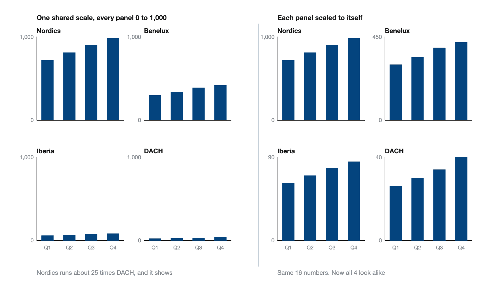
So can you give the panels different scales? In Zebra BI Charts, no, and that is deliberate: the y axis is synchronized across the grid and there is no setting to unsynchronize it. Native Power BI synchronizes its small multiples too. If a panel really does need its own axis, you have left small multiples and want separate visuals, and you should expect to lose the comparison that sent you here. The defensible middle is to keep the scale and change the panel size, which is what the standards recommend anyway.
How many panels before a grid stops working
More than most people expect. The IBCS chart template for small multiples puts the count at up to 25 or more. What decides it is how many columns each panel carries and how big the font is. The real limit is your pixel budget, not a rule. Our own advice past that point is to sort descending and pool the tail into 1 named remainder panel, which in Zebra BI Charts is Top N. Cap it by a number of panels or by a percentage of the total. It keeps the total honest, which a filter that drops the tail does not.

2 dimensions at once, categories across and groups down
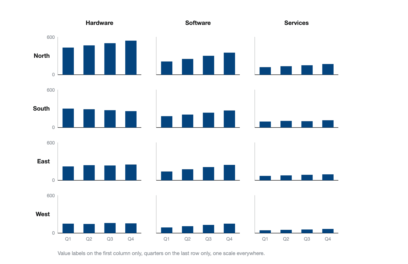
Group by 1 field and you get a row of panels. Add a second field beside it and that row becomes a matrix. The first field lays out the rows, the second lays out the columns. Rows and columns sort independently, so you can rank the columns by size and leave the rows in the order the business already uses. The scale has to hold across the whole matrix, not just along each row.
Types of small multiples
Any chart that reads at a small size can be a multiple. Line panels are the common case, because a trend survives shrinking better than anything else. Column and bar panels work when the categories inside each panel are few. Area panels suit a single accumulating series. Thematic maps follow the same principle, 1 small map per period or per segment, though the native Power BI well doesn't cover maps and neither does Zebra BI Charts.
Two more are worth knowing because finance asks for them. A waterfall panel bridges plan to actual inside each unit, and a variance panel carries the gap and the percentage next to the bar. Neither is on the standard list, and both answer the question a monthly business review opens with.
The thing small multiples are not is a page of related charts. IBCS separates the two: related charts cover different measures on one page and mostly use different scales, and a grid that mixes measures is that, not this.

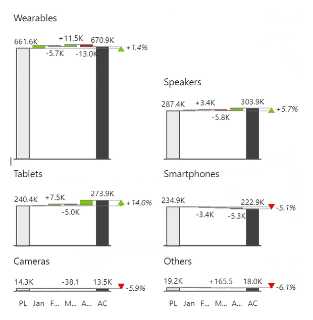
Small multiples layouts in Zebra BI
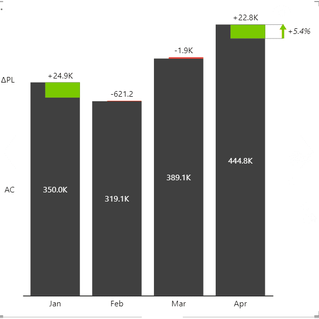

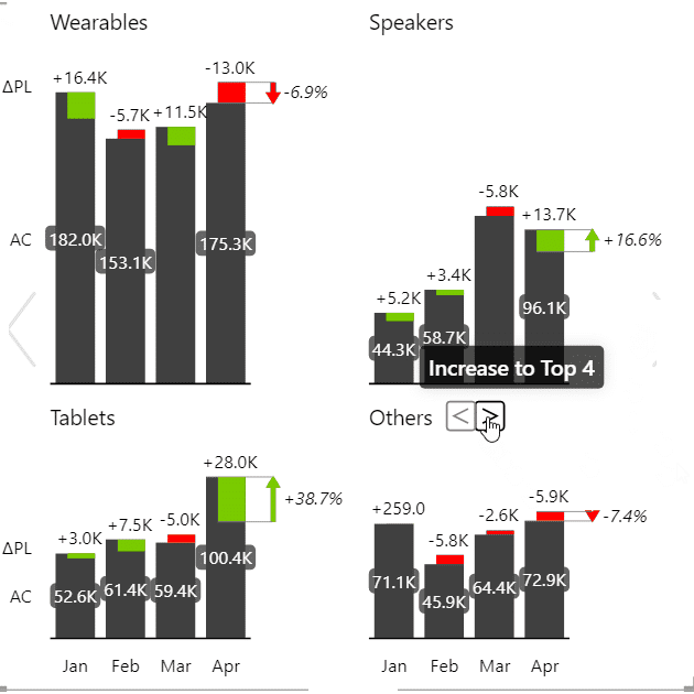
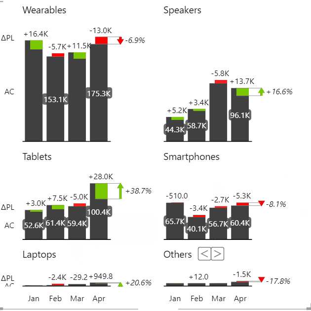

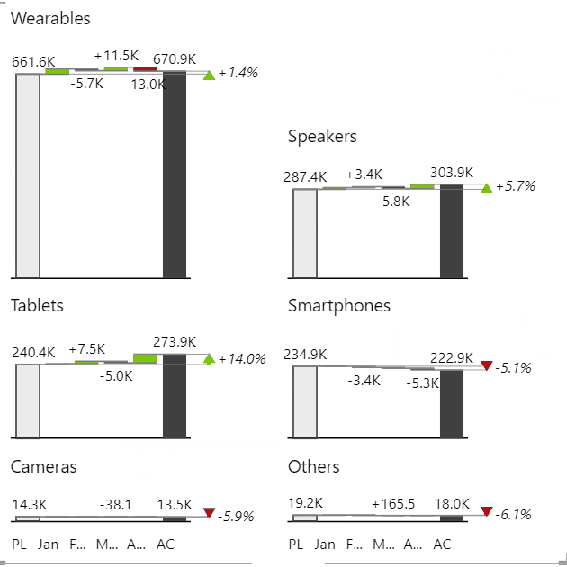
1 field in the Group placeholder is the whole build, and a grid is what you get by default. The stacked chart is the thing you switch to, not the other way round. The panels come back sorted descending unless you say otherwise. Sort also runs ascending or original order. Original order is how you get an alphabetical or geographic sequence, once you set a Sort by column on that field in the model. There are 3 layouts: Auto, Smart rows and Largest first. The knowledge base's advice is that Auto or Largest first handle a grid where some panels dwarf the others.
Two settings do more than they look like. Axis labels have 5 placements, down to the first chart and last row only, which is what buys back space on a crowded grid. And because the grid is 1 visual rather than 12, a setting changed on any panel is applied to all of them at once.
A reader in a published report isn't stuck with what you shipped either. Clicking a panel title zooms that panel into a pop-up. A switch icon flips the whole grid to a stacked chart and back, which viewers can use without editing the report. The analytical settings carry in rather than switching off. Top N pools the tail, Invert flips a cost group's colors, and the axis break stops 1 giant category flattening the rest.
6 SCREENSHOTS, 1 VISUAL
1 field. Every grid above came out of the same visual.
Every screenshot in the grid above is real Zebra BI output, not a mockup. Put your own business units through the same visual.
Small multiples in Power BI
Native Power BI has a Small multiples well. Microsoft's documentation opens by calling the feature "small multiples, or trellising". Drop a field into that well and the visual splits into a grid you can size up to 6 rows by 6 columns, with the axes synchronized across it. For a trend per store, that's enough. Microsoft also lists what turns off inside a small multiples visual, and 2 of those matter: trend lines and forecasting.
Where it stops is the chart list. Microsoft states the support plainly: "currently, you can create small multiples on bar, column, line, and area charts". So a plan-to-actual waterfall per business unit, or a variance panel with its own arrow, is not available. Zebra BI Charts renders small multiples of any of its chart types, waterfall and variance included. It also adds Top N with a pooled Others panel, so a long tail stays readable. The trade is a license and an installed custom visual, where the native well is already in the box.
Our Power BI small multiples guide has the build steps.
Small multiples for Office
Zebra BI for Office is 2 add-ins, Zebra BI Charts and Zebra BI Tables, and the charts one renders small multiples in both Excel and PowerPoint. What changes between the surfaces is mostly how you get there. This is what the knowledge base documents on each, and a blank cell means the article doesn't cover it rather than that the button is missing.
| Power BI | Excel | PowerPoint | |
|---|---|---|---|
| How you build it | A field in the Group well | Pivot table columns | A chart selector category |
| Shared scale | Synchronized | Synchronized | Synchronized |
| Zoom into 1 panel | Click the title | Click the title | Not documented |
| Top N and Others | Yes | Not documented | Not documented |
| Layout and sort options | Yes | Not documented | Not documented |
What doesn't change across the 3 surfaces is the rule itself. 1 chart type, 1 scale, 1 panel per category. A spreadsheet grid that rescales each panel on its own is wrong in exactly the way a BI one would be. Nobody looking at it can tell.
Small multiples in Excel
Excel has no small multiples feature. You build 1 chart, copy it, repoint the copy at the next category and repeat, and nothing in that loop enforces the shared scale. Each copy inherits whatever axis Excel picked when it was made. The axes drift apart the first time the numbers change, and the grid starts overstating whatever's small.
Copying the chart takes a minute. A grid of 9 charts is 9 value axes that all have to be pinned to the same maximum by hand, and pinned again after every refresh. That's a standing maintenance job rather than a one-off build.
Zebra BI Charts for Office draws the same grid as 1 object, and the knowledge base calls the support extensive. It reads a pivot table. The grouping field goes into Columns, the trend field into Rows, and the actual, previous year and plan measures into Values. The add-in recognizes that shape and synchronizes the y axis across every panel. A setting changed on 1 panel applies to all of them. Click a panel title to zoom it and close the pop-up with its X. That pivot table is a real data-shaping step, which is why the Excel walkthrough starts there.
Small multiples in PowerPoint
Slides suit a grid. Panels get read from a distance, and a small chart carrying 1 line survives that better than a chart carrying 10.
The mistake here is a different one from Excel's. Don't paste 12 chart images onto a slide. An image holds no scale and no link back to the data. The next version of the numbers arrives and nobody can say which panels moved.
In PowerPoint, Zebra BI Charts for Office files stacked charts and small multiples in the same chart selector category. The stacked chart appears first, and 1 click switches it to the grid. The slide links to an Excel file on OneDrive or SharePoint. Auto-Refresh then updates every linked visual when the file opens, so panel order and scale survive the next version of the numbers. The honest limit belongs to Microsoft, and the knowledge base says so. On PowerPoint Desktop a visual updates only while its slide is on screen, so someone has to click through the deck. PowerPoint Online has no such problem.
Small multiples design best practices
Guidance from the IBCS Association covers most of a grid, in plain words:
- 1 chart type and 1 identical scale across the whole grid.
- Start every value axis at zero. IBCS hedges this one, saying cut axes aren't wrong in themselves but that value axes should generally start at zero.
- Where values sit orders of magnitude apart, size the panels to the data instead of rescaling them. Where an identical scale is out of reach, mark the difference with a scaling indicator.
- When 1 panel carries an outlier nobody will act on, mark it instead of rescaling the grid around it. Zebra BI Charts has an axis break and custom outlier limits for that.
Two more are ours rather than the standard's. Sort the panels descending and put the remainder last, so the ranking is readable before any number is. And take the repeated axis off every panel: on a grid of 12, an axis on all 12 is 11 copies of the same thing. Put the value labels where the reader finds them once, usually the 1st column, and the category labels on the last row. In Zebra BI Charts that is an axis-label placement, not a manual cleanup job.
Compare every business unit with small multiples
Use a small multiples graph when you have more than 4 series and every category matters equally. If you need the exact gap between two named series, use a different chart, because separate panels have no shared baseline to measure against.
With Zebra BI, you can do both. Use small multiples for the monthly review, where nobody has agreed which unit is the problem. If you notice that two panels need a closer comparison, switch to overlapped columns or any of the other chart types on the slider. Try it on your own business units with the 14-day free trial.

Join over 1.5 million Zebra BI users
12 business units should not mean 12 visuals and 12 value axes to keep in step. In Zebra BI, a grid is 1 field in the Group placeholder, in Power BI, Excel and PowerPoint.

Frequently asked questions
The questions people ask most about small multiples, answered in a sentence or two.
What are small multiples in Power BI?
Small multiples split 1 Power BI visual into a grid of smaller copies, 1 per category. Microsoft calls it trellising and supports it on bar, column, line and area charts, in a grid of up to 6 rows by 6 columns. Trend lines and forecasting switch off inside that visual.
Is a trellis chart the same as a small multiples chart?
Yes. The 2 words name the same picture, and the choice between them is regional to the tool: Microsoft's documentation uses both in a single sentence. Panel chart, lattice chart and grid chart also refer to it.
Do all panels in a small multiples chart need the same scale?
If the panels carry the same unit and you want the comparison to hold, yes. IBCS ties the shared scale to the definition rather than treating it as a preference. Where values differ by orders of magnitude, change the panel's size and leave the scale alone. Letting a panel scale itself makes a small category look big.
How many panels should a small multiples chart have?
More than the number people expect. The IBCS small multiples template puts it at up to 25 or more, and the real constraint is how many columns each panel carries and how big the font is. Native Power BI caps its grid at 6 rows by 6 columns. Zebra BI Charts has a Top N setting that keeps a fixed count or a percentage of the total and pools the rest.
What chart types work as small multiples?
Anything that stays readable when it shrinks. Line panels are the common case, then column, bar and area. Native Power BI covers those 4. Zebra BI Charts adds the 2 finance asks for, waterfall and variance panels.
What graph should I use for multiple variables?
If the variables share a unit and you're comparing shapes over time, small multiples beat 1 chart carrying 5 or more series. If you need the exact height difference between 2 named series, keep them in 1 chart, because separate panels have no shared baseline to measure against.
Weighing the split on your own report? The quickest test is to build both and look. A grid that reads at a glance was the right call, and a grid where you find yourself squinting between 2 panels was not.
Related links
- Small multiples in Power BI
- Making small multiples in Excel
- Zebra BI for Office
- Zebra BI Charts
- How to choose the right chart
