September 8th
 February 22nd
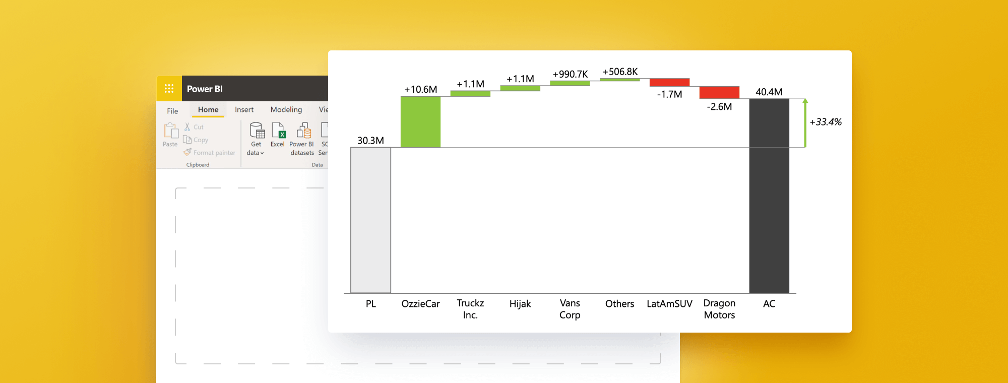
How to create a Horizontal Waterfall Chart in Power BI: Ultimate 2023 Guide
Ready to explore the world of the Horizontal Waterfall Chart in Power BI? You're in the right place if you're seeking a fresh, impactful alternative to traditional column and bar charts. This guide is designed to walk you through creating a horizontal waterfall chart, transforming your data visualization dynamically and compellingly. Dive in as we outline the steps to bring this innovative charting technique to Power BI reports.
What is a Horizontal Waterfall Chart?
Offering a fresh take on the conventional vertical waterfall chart, the horizontal waterfall chart, as its name implies, presents data horizontally rather than vertically. This unique orientation is particularly beneficial when visualizing extensive data sequences, such as time series, providing a distinct perspective on data trends.
Moreover, the horizontal waterfall chart captivates with its aesthetic appeal. The horizontal orientation affords more space for data display, enhancing readability and comprehension. With the added option to customize colors and styles, your chart can be visually engaging, making your data informative and appealing to your audience.
Create advanced waterfall charts in Power BI with just a few clicks
Experience the ease and efficiency of Zebra BI for Power BI. Start your free trial now and transform your data visualization with advanced waterfall charts.
Benefits of Using a Horizontal Waterfall Chart in Power BI
The horizontal waterfall chart in Power BI has many advantages, making it a robust tool for data visualization. First, its horizontal layout effectively presents data progression over time or across categories. This chart type highlights changes in data, supporting data-driven decision-making.
Moreover, a horizontal waterfall chart can display extended data sequences in a compact, easy-to-read format, making it an excellent choice for dashboard design. It also facilitates straightforward comparisons between different data points. The layout allows immediate visualization of how one category or period stacks up against another. This attribute is particularly useful when analyzing trends or spotting patterns in data. This allows users to make informed decisions based on chart insights.
Lastly, the horizontal waterfall chart in Power BI is a visually appealing data presentation. The clean, modern design aids chart comprehensibility and interpretability. This is particularly vital when presenting data to stakeholders or clients without a background in data analysis, as the chart's simplicity and clarity can effectively convey complex information in an easy-to-digest manner.
Step-by-Step Guide: Creating a Horizontal Waterfall Chart in Power BI
Now that we understand the basics of waterfall charts, let's explore the steps to create one in Power BI. The process involves several steps.
- Open Power BI and connect to your data source.
- Add a waterfall chart visual to the page.
- Choose the data you'd like to display in the chart.
- Customize the chart as per your requirements.
Let's dive deeper into each step.
Step 1: Open Power BI and connect to your data source
The first step involves opening Power BI and connecting to your data source. You can do this by selecting the "Get Data" option from the Home tab and choosing the appropriate data source.
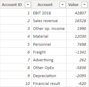
Ensure that your data contains the necessary values for the waterfall chart, including starting values, positive and negative changes, and ending values.
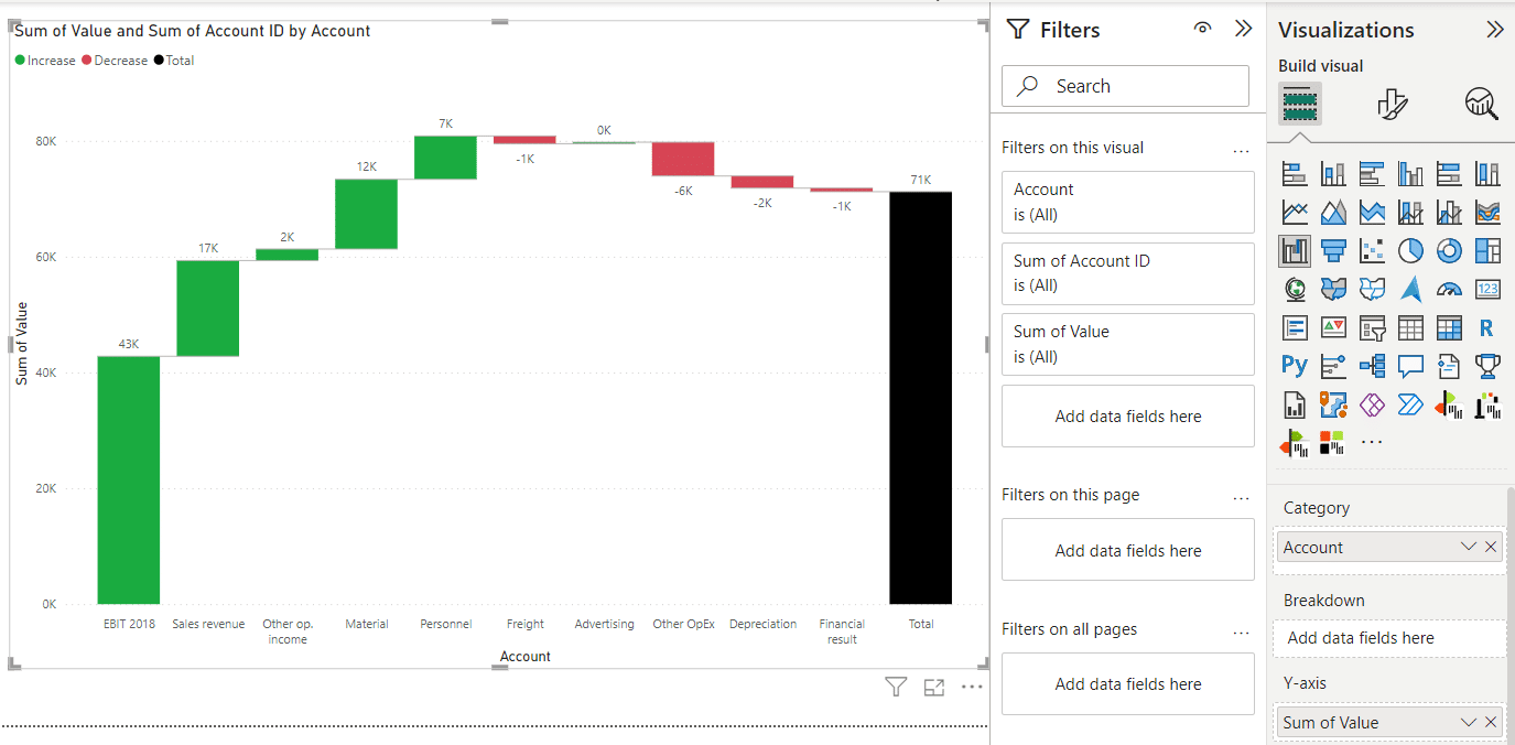
If you want custom sorting, add another column, “Account ID,” which can be used in sort by column function.
Step 2: Add a waterfall chart visual to the page
Click on the "Visualizations" pane on the right-hand side of the Power BI interface. Select the "Waterfall Chart" visualization from the list of available visualizations.
Step 3: Choose the data you'd like to display in the chart
Drag and drop the required fields from your data onto the appropriate sections of the visual. Typically, you will need to map your categories to the "Categories" field well and your values to the "Y-axis" field well (as shown in the photo).
Step 4: Customize the chart to your liking
Lastly, you can customize the chart based on your preferences. You can use the Visualizations pane formatting options to do so. This could include changing the chart's colors, labels, and other visual elements.
Choosing the Right Data for Your Chart
The initial step in creating a horizontal waterfall chart in Power BI involves selecting the data you intend to display. Typically, this data should represent changes in value over time or across different categories. For instance, you can display monthly revenue figures for your business or fluctuations in average temperatures throughout the year.
However, choosing the right data is not enough. It's crucial to ensure that the selected data is in a format compatible with Power BI. This means your data should be structured so that Power BI can interpret and use it to create visualizations. It's also critical to clean and prepare your data before importing it into Power BI. This can involve removing duplicates, filling in missing values, and converting data types.
Remember, the quality of your data directly impacts your visualizations' effectiveness. The more accurate and well-prepared your data, the more valuable insights you can extract from your waterfall chart.
Once you've selected and prepared your data, you can create your horizontal waterfall chart in Power BI. As discussed earlier, the steps include adding a waterfall chart visual to your report page and selecting the appropriate fields to display in the chart.
Optimizing Your Waterfall Chart in Power BI for Maximum Impact
It's time to customize after populating the waterfall chart visual with your data. Power BI offers many options to refine your chart, enhancing its visual appeal and effectiveness. Key customization areas include:
1. Color Scheme Customization: The colors used in your chart can significantly impact its readability and aesthetic appeal. You can change the color scheme to match your company branding or to differentiate between increases, decreases, and total values.
2. Addition of Visual Elements: Elements like arrows, labels, and annotations can provide additional context to your chart, making it easier for your audience to interpret. For instance, labels can provide precise values for each segment of your chart, and annotations can highlight specific points of interest. Also, dynamic comments allow for presenting information not shown in the data.
3. Number Format Adjustment: How numbers are displayed on your chart can be customized according to your preferences. For example, you might display values in the thousands or millions or include decimal places.
4. Spacing Between Visual Elements: Adjusting the spacing between bars or segments in your chart can impact its readability. Depending on your data and chart size, you may increase or decrease this spacing.
Customization is about enhancing your chart's interpretability and visual appeal. Experiment with different settings until you find a layout that effectively represents your data and resonates with your intended audience.
Remember the principles of efficient data visualization - simplicity, clarity, and consistency - when customizing your chart.
Incorporating Visual Elements into Your Waterfall Chart in Power BI
As you construct your waterfall chart, it is crucial to consider the visual components that can enhance its effectiveness. Some common visual elements that can be employed are:
1. Labels for Each Bar or Column: Labels can provide precise values for each chart segment, making it easier for your audience to understand the exact changes over time or between categories.
2. Arrows to Indicate Changes in Value: Arrows or pointers can highlight significant increases or decreases. They can guide the viewer to the most critical parts of your data.
3. Annotations for Additional Context: Annotations are like footnotes for your visualization. They can provide extra information or insight about specific data points, help explain outliers, or add context to enrich the viewer's understanding of the data.
Incorporating these elements into your chart can enhance its interpretability, aiding your audience in better comprehending the data and enabling them to make more informed decisions based on your visualization. However, remember to use these elements sparingly and consistently for the best results. Overusing or inconsistently applying these features can lead to a cluttered and confusing chart.
Addressing Common Challenges When Creating a Waterfall Chart in Power BI
Creating visualizations with any data tool can occasionally lead to complications, including constructing a waterfall chart in Power BI. Here are some common challenges you might encounter.
1. Data Not Displaying Accurately: If your data isn't showing up as expected, double-check your data source to ensure it's properly formatted and cleaned. Additionally, make sure the fields are correctly linked in Power BI.
2. Difficulties Customizing the Chart: If you're having trouble customizing your chart's appearance, refer to the "Visualizations" pane in Power BI. You can adjust various chart aspects, such as color, labels, and axes, from this section.
3. Issues with Formatting or Labeling: If your labels aren't appearing correctly, check the "Format" pane. You can modify text size, color, and other properties here. If the labels still aren't displaying properly, your data may need reformatting.
The Power BI documentation is an excellent place to start when faced with these or any other issues. It provides comprehensive guides and tutorials on the different functions and features of Power BI. Additionally, the Power BI community forums are a valuable resource where you can ask questions and find solutions from other users. Consulting with a Power BI or data visualization specialist can also be immensely helpful.
And, of course, Zebra BI has a Knowledge base, Power BI Academy, and guides to support you on your journey to becoming a data visualization pro.
Comparing Horizontal Waterfall Chart with Other Power BI Charts
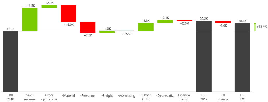
A horizontal waterfall chart in Power BI allows the visualization of the cumulative effect of sequentially introduced positive or negative values. These visuals often display how an initial value is affected by a series of intermediate positive or negative values. They can quickly highlight the largest contributors to changes over time and provide more detailed information when you hover over specific data points.
Not sure which chart to choose? Try our interactive chart selector.
Comparing this to other chart types:
- Column chart: Column charts are useful for comparing different categories of data side-by-side, where the categories are displayed on the x-axis and the values are shown on the y-axis. They are not as effective in displaying changes over time as waterfall charts, which give a clear visual representation of the cumulative effect.
- Bar chart: Similar to column charts but rotated 90 degrees. These charts are often used when category names are long or there are many categories. Bar charts may not provide the same clear picture of cumulative change over time as a waterfall chart.
- Line chart: Line charts are excellent for displaying trends over time, with time usually shown on the x-axis and the metric of interest on the y-axis. They show the change in value and can display the trend of a single category or compare trends among different categories. However, they don't show the cumulative effect of changes like waterfall charts.
While each chart type has its strengths, the horizontal waterfall chart stands out for its ability to display the cumulative effect of sequential changes over time. This makes it a valuable tool for many business scenarios, such as understanding a financial metric's progression over time.
Using Your Chart for Data-Driven Decision-Making
Data visualization tools are designed to assist you in making data-driven decisions. By employing a horizontal waterfall chart in Power BI, you can gain a more comprehensive understanding of changes in your data. This will lead to more informed decisions.
Whether you're monitoring revenue shifts over time or analyzing fluctuations in average temperatures, a horizontal waterfall chart can help illustrate these data trends clearly and meaningfully. This visualization can provide valuable insights into your data by effectively displaying the cumulative effects of sequentially introduced positive or negative values.
Understanding these dynamics could be instrumental in various contexts. For instance, business managers could use it to track revenue and cost progression over a fiscal period. It would help evaluate financial performance. Environmental scientists could employ this chart type to analyze changes in temperature or sea levels over time, helping to model and understand climate change.
So, regardless of the field, a horizontal waterfall chart in Power BI is a powerful tool in your data analysis arsenal. As a result, you can make more confident, data-driven decisions.
Best Practices for Chart Creation and Presentation
In the final part of our guide, we'll examine some best practices for creating and presenting a horizontal waterfall chart in Power BI. By adhering to these principles; you can ensure your chart is visually compelling and informative. It is presented in a way that is easy for your audience to comprehend.
- Choose the right data for your chart: This type best suits data demonstrating a start and end point with changes in between. Financial data, project timelines, or inventory tracking are some examples. The data should tell a coherent story when visualized this way.
- Keep the chart simple and uncluttered: Simplicity is the key to data visualization. Avoid overcomplicating your chart with too many categories or time periods. Remember, the goal is to convey a clear picture of changes in your data, not to confuse or overwhelm your audience.
- Use color and visual elements sparingly: While color can help differentiate between increases, decreases, and totals in a horizontal waterfall chart, it's crucial not to overdo it. Stick to a consistent color scheme that complements your data and enhances readability. Also, use visual elements like labels and legends judiciously to aid understanding without clutter.
- Provide context and explanations for your audience: Any data visualization is only as good as the insights it provides. Therefore, contextualize your chart by including captions, notes, or verbal explanations. Define what each element represents and explain any anomalies or notable trends in the data.
Our best advice is to follow IBCS standards. The International Business Communication Standards (IBCS) are practical proposals for business communication design. IBCS provides a set of rules and guidelines on how to design and present information in a way that is easy to understand and interpret. It helps to create a unified language between different organizations and departments, enabling better communication and collaboration.
Following those guidelines, you can ensure your data visualization is clear and concise — something you get out-of-the-box with Zebra BI for Power BI.
These best practices will help you create a horizontal waterfall chart in Power BI. This chart lets you communicate your data insights and make data-driven decisions.
Create a Waterfall Chart (Bridge) From A Single Measure With Zebra BI
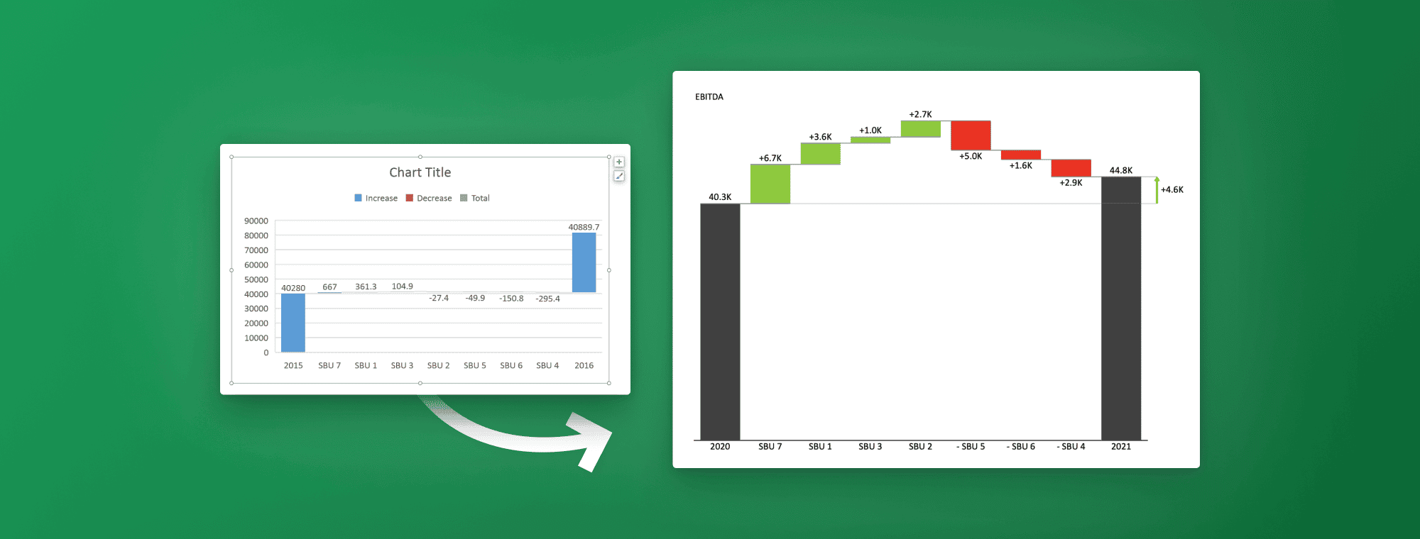
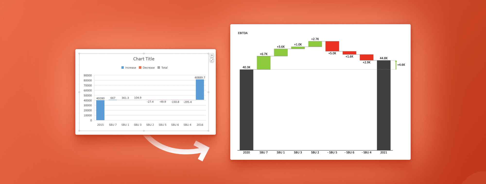
Creating an actionable and insightful waterfall chart in Power BI like the one below is usually tricky, yet a piece of cake when working with Zebra BI.
Key features of Zebra BI for Power BI:
- Advanced reports in a single visual (you can add multiple Subtotal/Result columns, while in native Power BI, only one, beginning and ending total),
- Invert, Result, and Highlight features,
- Adding variances and difference highlights,
- Responsive layouts,
- IBCS complaint.
Conclusion: The Art of Making Horizontal Waterfall Charts in Power BI
Creating a horizontal waterfall chart in Power BI might initially appear challenging. However, with the correct dataset and some tailored adjustments, you can produce an effective visualization that narrates a data story and assists in informed decision-making.
It's crucial to follow the steps outlined in this guide. You should experiment with various customizations and consult the Power BI documentation or community forums for assistance if you encounter any problems. Mastering creating a horizontal waterfall chart can elevate your data visualization abilities to the next tier.
Remember, the power of a horizontal waterfall chart in Power BI lies in its capacity to reveal the cumulative effect of sequential data. As a result, it is an excellent tool for showing the progression from a starting point to a final value over time. It's an innovative chart type that can add significant value to your data analysis and presentation. When used correctly and in the right context, this is especially true.
So, step ahead and experiment with the horizontal waterfall chart in Power BI. In this way, this versatile tool can be fully used. You can use it effectively with practice and patience to derive and communicate valuable insights from your data.
Your Turn to Elevate Power BI Reports with Zebra BI's Advanced Waterfall Charts
Now it's your chance to redefine data visualization. Get your free Zebra BI trial for Power BI and start creating stunning waterfall charts today.
Related Resources
Excel Waterfall Chart 101: How To Create One That Doesn't Suck
The Ultimate 2024 Bar Chart Guide
PowerPoint Waterfall Charts: How To Create One That Doesn't Suck