Explore
Products
Zebra BI for Power BI
Zebra BI for Excel
Zebra BI for PowerPoint
Live Demo PBI
May 16, 2024
Live Demo Office
April 25, 2024
On-demand Product Tour
Resources
Zebra BI Academy
Resource Hub
Customer Stories
Templates
Webinars
Guides
Help
Help Center
Knowledge Base
Beginner's Guide
101 Crash Course
Chart Selector
Support
Why Zebra BI?
Our customers
Actionable reporting
Supercharge your Power BI
Calculate return on investment
Pricing
Search for:
Login
Try Zebra BI for free
Products
Zebra BI for Power BI
Zebra BI for Excel
Zebra BI for PowerPoint
Live Demo PBI
May 16, 2024
Live Demo Office
April 25, 2024
On-demand Product Tour
Pricing
Resources
Zebra BI Academy
Resource Hub
Customer Stories
Templates
Webinars
Guides
Help
Help Center
Knowledge Base
Beginner's Guide
101 Crash Course
Chart Selector
Support
Why Zebra BI
Our customers
Actionable reporting
Supercharge your Power BI
Calculate return on investment
Log In
Try For Free
Close
Upcoming webinar:
How to make your Power BI reports run up to 10x faster
September 8th
Register
Zebra BI Live Product Demo:
Start creating truly insightful Power BI reports and dashboards
February 22nd
Save the spot
Home
Resources
Category:
Redesign
Category:
Redesign
Excel
Guide
January 7, 2016
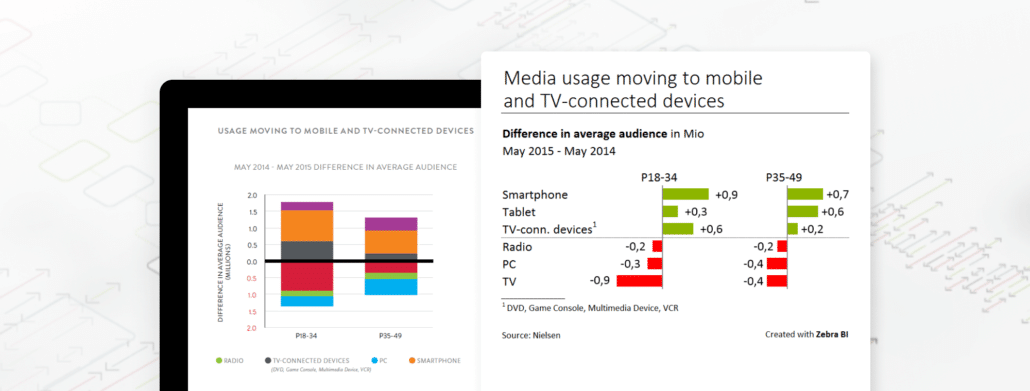
Why are some charts difficult to understand?
Charts should provide a clear and practically immediate insight into the underlying dataset. Learn how you can take control of the complexity of big data.
Read more
Excel
Guide
October 8, 2015
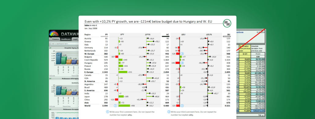
Designing financial reports, dashboards and business presentations
Design your reporting tools more clearly ans consistently throughout your company. Get to know the importance of IBCS standards in reporting.
Read more
Excel
Guide
March 26, 2014
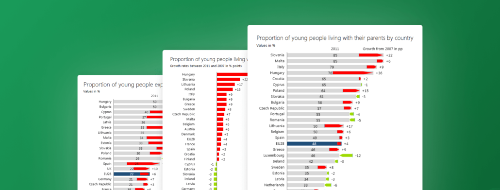
Young adults' living conditions getting worse - a redesign of The Guardian Datablog's visuals
The article is based on Eurofound’s European Quality of Life Survey (EQLS), a representative survey of those aged 18 and over in Europe.
Read more
Excel
Guide
February 14, 2014
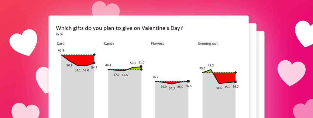
Happy Valentine's Day! But hey, where is the romance?
We created a quick analysis with our Zebra BI to see if data on Valentine's Day spending and gifts conveys any important messages.
Read more
Pagination
1
2
»
Product
Zebra BI for Power BI
Zebra BI for Excel
Zebra BI for PowerPoint
Latest Releases
Changelog
Zebra BI for Power BI Pricing
Zebra BI for Office Pricing
Resources
Webinars
Templates
Guides
Zebra BI Academy
Blog
Community Events
Legal documentation
Help
On-demand product tour
Live product demo
Knowledge base
Beginner’s Guide
Zebra BI 101 Crash Course
Chart Selector
Company
About
Careers
Customers
Become an Affiliate
Find a Partner
Terms of Website Use
Contact Sales
Technical Support
© 2021 – 2024 Copyright Zebra BI d.d. All rights reserved. Various trademarks held by their respective owners.
Privacy Policy
Legal documentation
Try it in your Excel. For free.
angle-up
angle-down
youtube-play
question-circle-o
dropdown-down
TimelineArrow
arrow
download
facebook
ln
logo-black
menu
no
search
twitter
 September 8th
 February 22nd