
 September 8th
 February 22nd
What Is a KPI Card? Giving a Number Enough Context to Act On
A KPI card is a small visual that shows one metric together with a benchmark and the gap between them, so you can judge performance without opening anything else. That is the definition, and most cards on most reports do not clear it.
Your report opens with a number in large type. EBITDA, 91.7M.
Now answer the only question anybody actually has: is that good?
You can't, and neither can your reader. So they open the source file to find out, which is precisely the work the report was supposed to save them. The number is correct, prominent, and useless. Give it a reference and it reads as up 16% against plan, at a glance, with no digging and no mental arithmetic.
A number on its own is trivia. A number with a comparison is a decision. This guide covers when a card earns its place and which of Power BI's three card options to reach for. Then how many is too many, and the numeric mistakes that show up on cards more than anywhere else.

What is a KPI card?
A KPI card carries one metric and enough context to judge it. In practice that means four things. The value, what you're comparing it against, the size and direction of the gap, and a label saying what the metric is.
The card earns its place by being the first thing a reader sees. If the opening number says you're behind plan, your reader works through the rest of the report differently than if you're ahead. That's a lot of influence for the visual that usually gets the least design attention, and it isn't a decorative extra. Asked what a reporting practice actually runs on, one BI lead put the card in the core set:
"The standard visuals should be reduced to the basic set of visuals: table, matrix, slicer, card. Spice them up with some magical and cool additional visuals. This covers 80% of all requests."
Mario Mühllechner, Team Lead Business Intelligence, Liebherr Earthmoving (customer story)
This page is written for people who already use cards daily. In a recent review of hundreds of conversations with report builders across various companies, "KPI" and "card" came up more than any other chart type. Users aren't asking for basic definitions. They want to know which metrics actually belong on a card, how many is too many, and what to do when native visuals fall short.
PRO Trial AVAILABLE FOR FREE!
Bind a field of KPI names and every card arrives with its variance, its notation and its trend already drawn.
KPI card cheat sheet
KPI card details
Doing its job
Time to switch
Broken most often
KPI visual vs the new Card visual
This is the live question, and Microsoft's own naming created it. Power BI now ships two things you could reasonably call a KPI card, plus a third from the visual marketplace.
| KPI visual | New Card visual | Certified custom visual | |
|---|---|---|---|
| Status | long-standing core visual | generally available since November 2025 | AppSource |
| Value plus target | yes | yes, via reference labels | yes |
| Trend or sparkline | yes, the trend axis is required | no native support | depends, Zebra BI Cards has four in-card chart types |
| Several KPIs in one visual | no, one per visual | yes, multi-card layouts | yes, driven by a grouping field |
| Conditional color | limited | yes, filter-context based | yes, plus non-color cues |
| Setup effort | low | high, Tabular Editor calls it a "click tax" of dozens to hundreds of clicks | low, the comparison arrives with the data |
The missing sparkline decides most cases. Tabular Editor's 2026 guide to KPI visuals is blunt about it: the new card visual has no native sparkline or trend line. Microsoft now documents the way around it, and the length of that walkthrough is the argument. You write a reusable DAX function that returns a line chart as an SVG image. Then you bind it to the card as a picture, and repeat the whole setup for a hover version. That is a documented path rather than a hack, and it is still about 25 formatting steps to put one trend line on one card. If your card needs a target and a gap and nothing else, the new card visual is fine. If it needs direction over time, the other two cost you less.
Verdict. Use the built-in KPI visual for one metric with a target and a trend. Use the new Card visual for a compact row of plain values with reference labels, and budget the formatting time. Use a certified custom visual when you need several KPIs, a trend inside each one, and variance notation you're not going to hand-build.
Not sure which card your report needs? The Chart Selector is a Power BI Desktop file that walks you from the question you are answering to the visual that answers it, with the card layouts rendered on real numbers. It draws through Zebra BI, so you need the visuals installed to open it. Download the Chart Selector
When you should use a KPI card
The headline metric
One number that frames the page. Revenue, EBITDA, MRR, on-time delivery. Put it top left, where the eye lands first.
Actual against target
The card's native question. A value, the plan, and the gap between them, resolved before your reader has finished the first sentence of the report.
A dashboard header row
Four or five cards across the top, all on one design, acting as the summary layer for everything below. It is also the shape most report templates start from.
An executive cockpit
For a reader who won't open a second page, the card row is the report. It has to carry the verdict, not the raw figure.
"As a business unit manager with a broad and heterogeneous product portfolio in various markets, the cockpit provides me with an efficient and targeted tool to focus on relevant action areas and make well-founded decisions."
Oliver Hausmann, Head BU Food, Delica AG (customer story)
When a KPI card is the wrong choice
You're comparing many things
Ten cards isn't a comparison, it's ten separate readings your reader has to hold at once. Comparing many things against one measure is a job for a bar chart, which ranks them down the page. Or for small multiples, which give each one its own little chart on a shared scale.
The detail is the point
If your reader's next question is "which region, which product, which month", a card can't answer it and a table can. Use the card as the entry point and route the detail to a table underneath.
The trend is the point
If the shape over time matters more than today's value, use a line chart. It draws the whole series at a size you can read, instead of squeezing a sparkline into a tile.
You reached for a gauge
A gauge is a dashboard's way of looking busy while saying very little. Three needles, three green arcs, everyone nods. But what's the actual number? Up or down? By how much? The dial can't say, so the figure that runs the business gets rounded off to "looks fine".
The IBCS reporting standards tell you to prefer columns, bars and lines to pies and gauges, on the grounds that they do the same job better. Put the same metrics on cards and the story lands: MRR 520M, up 46% on last year, and the same for ARR, customers and MRR per company. Exact figure, direction and size, one line each.

Anatomy of a KPI card
Power BI's built-in KPI visual asks for three fields, and its vocabulary is worth knowing because everything else borrows it:
- Value, the number you're reporting
- Trend axis, the time dimension that draws the direction
- Target, the benchmark
Three fields get you a card. They don't get you a good one. Two more things make the difference.
The first is the gap, stated twice. Show the absolute gap and the relative one, because readers don't share a feel for scale. The absolute tells you how big the miss is. The percentage tells you whether that size matters against the base. "ΔPY +46% | +165M" says more than either half does alone.
The second is a verdict the eye catches without reading. Direction needs a cue that survives without color, which we come back to below.
How many KPI cards is too many?
The published advice clusters tightly. Tabular Editor calls five a practical ceiling, and puts the reason plainly. Working memory holds roughly three to four chunks at a time, so four is the number that fits without effort. Data Goblins says three to four in a typical report, and explicitly carves out scorecards as a different case. Nobody says eight.
They're right, and incomplete, because plenty of businesses really do have twenty KPIs that someone is accountable for. One customer described building twenty to twenty-five separate boxes by hand, because that's how many metrics the business runs on.
The way out is to see that the ceiling applies to a glance rather than to a report. Three to five is what a reader can hold at once, which says nothing about what the business measures. Two things close that gap.
- Group them. A grid of cards under two or three headings reads as two or three chunks rather than as twenty. Your reader scans the heading, not every tile.
- Sort them by variance, not alphabetically. Order the grid by gap to plan and the KPIs in trouble float to the top, while the rest settle into background you can skim past. In Zebra BI Cards this is the Sort cards by setting. It offers Relative variance and Absolute variance alongside Value and Title, and a second setting picks whether the gap runs against Previous Year, Plan or Forecast. Leave them in the order someone happened to add them and your reader has to read all twenty to find the two that matter. That was the grid's job, not theirs.
Choosing what goes on a card
Tabular Editor proposes a useful test: for each KPI on the page, ask whether someone should do something differently if this number moved 20%. If the answer is no, the metric may be interesting but it's inert, and it's taking a slot from one that isn't.
Two cases the test doesn't cover, and that come up constantly:
- Inverted KPIs. Cost, churn, days sales outstanding, defect count. Lower is better, so the coloring has to be flipped or the card will congratulate you for a bad month. That's a setting rather than a workaround, and it's worth checking on every card that measures something you want less of.
- Neutral KPIs. Headcount, inventory, average order value in some businesses. Neither direction is inherently good, and a card that paints the movement green or red asserts a judgment nobody made. Show the movement without the verdict coloring. In Zebra BI Cards the Show variance setting has a Number option that does exactly this. You get the change with no good or bad attached. If your tool can't do that, the metric is better served by a plain figure and a comment than by a card pretending to have an opinion.
Getting the numbers right on a card
The card has the least room and the most exposure of any visual on the page, so numeric sloppiness shows up here first. Three rules, all of them set out in the IBCS reporting standards.
At most three digits
Scale with unit prefixes so no displayed number runs past three digits in a chart or four in a table. "91.7M" is readable at a glance. "91,704,338" defeats the entire purpose of putting it in large type.
Percentage points, not percent
If your metric is itself a rate, the absolute variance between two values of it belongs in percentage points. Gross margin moving from 58.4% to 56.4% is -2pp. Writing "-2%" says something different and wrong: it claims a relative change of two percent, which would be a move to 57.2%. On a card showing a rate against a target, this isn't a rounding quibble. It's a different number.
A title that says who, what and when
Line one is the reporting unit, line two the measure and its unit, line three the period or scenario. Strip filler like "Sum of", "Total" and "Analysis" while you're there.
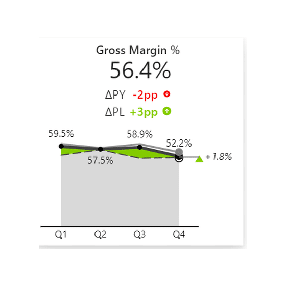
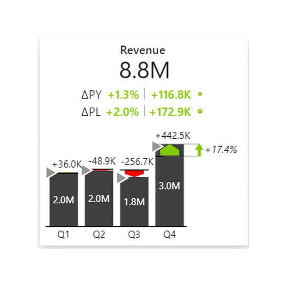
Types of KPI card
Four shapes cover almost everything people build. Pick by what the reader has to do with the number, not by how the tile looks.
| Type | What it carries | Reach for it when |
|---|---|---|
| Single KPI card | One metric, one comparison, sized to read from across a room | One number frames the whole report |
| Card with a trend | The same, plus a small chart inside the tile | Today's value means nothing without the direction it came from. This is the shape the new Card visual can't draw natively |
| Card grid | A row or block of cards on one shared design, driven by a field of KPI names | Several KPIs have to be read together and stay visually comparable |
| Card with variance to target | Any of the above, with plan as the comparison instead of a prior period | The gap matters more than the value |
The last one is a scenario choice rather than a fourth design. Any card becomes it the moment you bind plan instead of last year.
KPI card layouts in Zebra BI

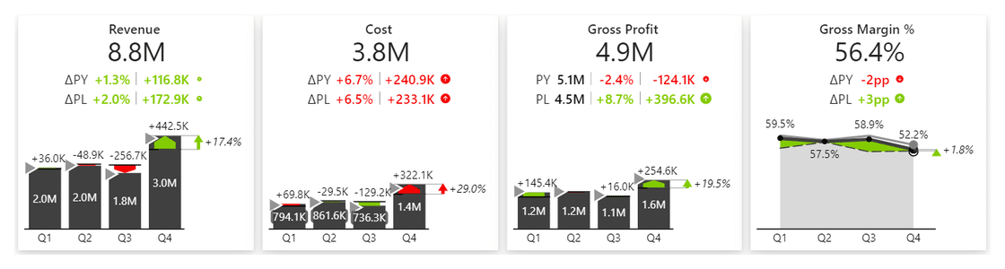
Those three are card designs rather than a setting. The setting that arranges them is Quick layout, and it carries 3 values: Custom, Rows and Uniform. Uniform gives every card the same size, Rows groups them under row titles, and Custom lets you place each one.
What all three share is that the comparison isn't something you add afterwards. Bind a prior period or a plan, and the variance, its notation, the direction icon and the in-card chart arrive together. That is why a card built this way stays consistent. Build one from a value, a text box and some conditional formatting, and it drifts the moment someone edits it.
THREE CARDS, ONE DESIGN
Read the value. Then the gap, the direction and the trend, without moving your eyes.
Every card on this page is a real Zebra BI render, not a mockup. Put your own KPIs through the same treatment.
How to build a KPI card in Power BI
The built-in KPI visual
Drop it on the canvas, put your measure in Value, a date field in Trend axis and your benchmark in Target. Two things to know before you start. Sort the visual by your date field before you convert it to a KPI. Microsoft is blunt about it: once you convert, there is no option to sort. Then set Direction to match the metric. A card measuring wait time, churn or cost needs Low is good, and the visual will not work that out from the data.
A multi-card visual
When you want a row rather than a tile, the shape of the build changes. In Zebra BI Cards you bind a field of KPI names to Group, and you get one card per member of that field. Your measure goes to Values, and the comparison scenarios go to their own roles: Previous Year, Plan, Forecast. If you also want a trend inside each card, bind your date field to Category, which is the trend role.
The most common mistake here is binding the date to Category and leaving Group empty. That gives you one enormous card stretched across the page instead of a row of them. Group makes the cards; Category makes the chart inside them.
"When we use a KPI card visual, which is a multi-card visual, it allows us to do many things. First of all, we can scale the individual KPIs when necessary properly. We can also use the cards themselves as a filter for the rest of the dashboard."
Mark Leskovsek, BI Solutions Director, Zebra BI
Scaling is the decision people make by accident. Scale each card to its own values and every card stays readable. Put them all on one scale and their relative size becomes honest. Both are right answers to different questions, and the default isn't always the one you want.


A card should also be a starting point rather than a dead end. Drill through from an individual card to a detail page and your reader goes from "this is off plan" to "here is why" without leaving the report.
KPI cards for Office
This is the one place where the answer changes. Zebra BI for Office ships two visuals, Charts and Tables. There is no Cards visual for Excel or PowerPoint, so the card you build in Power BI has no direct equivalent on either surface.
KPI cards in Excel
Excel has no KPI card visual, so you build the parts. Put the value in a merged, large-font cell. Put the comparison in the cell beneath it with a custom number format that adds a sign and a unit. Use conditional formatting with an icon set rather than a fill color, so the direction shows up in print and for color-blind readers. Drop a sparkline in the next cell for the trend. It's more assembly than Power BI asks for, and the result is a card in every respect that matters to the reader.
Zebra BI does not close this gap for you. Zebra BI for Office ships Charts and Tables, and Cards is a Power BI visual only, so the assembly above is the Excel answer. A Zebra BI Table with in-cell charts is the nearest thing if you want the KPI list and its comparisons in one object.
KPI cards in PowerPoint
Same answer, one step further. There is no Cards visual for PowerPoint either. A KPI card on a slide is either a picture of one, or a set of text boxes you update by hand. If the numbers have to be current when you present, rebuild nothing in shapes. Use a Zebra BI Table in PowerPoint, linked to an Excel workbook on SharePoint or OneDrive. Know the refresh rule before you rely on it in a meeting. In PowerPoint on the web, every visual on every slide updates when the file opens. In the desktop app, a visual updates only once its slide is on screen, so click through the deck before you present. That split is a Microsoft interface limit, not a Zebra BI setting.
KPI card design best practices
Size hierarchy should run value, then gap, then context. The value tells you how big the thing is; the gap is the part that tells you whether to worry. If the gap is smaller than the label, the card is decorating rather than reporting.
Never let color carry the meaning alone. Red and green on a small tile is where accessibility fails without anyone noticing. WCAG's Use of Color rule, 1.4.1 at Level A, needs a second cue. Pair the color with a signed number and an arrow or a triangle. The field doesn't agree on which colors. Tabular Editor recommends blue and orange. Data Goblins recommends a neutral when you are on target and a deep red when you are off it. Both work for color-blind readers, so either is fine. Use blue and orange if your report already spends red on something else, and neutral plus red if it doesn't. Then apply that one choice to every card in the report, because the cost of mixing them is that your reader has to relearn the code on each tile. What both agree on is the part that matters: color must never be the only signal. Zebra BI Cards ships a Colorblind-friendly style if you would rather have the decision made for you.
Keep the scenario notation consistent while you're at it. Actual is solid and dark, a prior period a lighter solid, plan outlined rather than filled, forecast hatched. Once a reader learns the convention on one card they read every card in the report for free.
Drop the decoration too. Frames, drop shadows, pseudo-3D and colored backgrounds convey nothing, and on a tile this small they cost you the space the gap should be using.
Then test the page at five seconds. Show it to someone who hasn't seen the report and ask what they noticed first. If it isn't the thing you wanted them to notice, the design is wrong, not the reader.
Make every KPI card say whether to act
A KPI card earns its place when it carries a value, a comparison and the gap between them. Without the comparison, your readers see a correct number and still can't tell whether it's good news.
Keep it to 3 to 5 cards per glance. If the business runs on more KPIs than that, group them under headings and sort them by variance, so the ones off plan come first. Write rate variances in percentage points, flip the colors on KPIs where lower is better, and never let color carry the verdict alone.
With Zebra BI Cards, you bind 1 field of KPI names and every card arrives with its comparison, variance and trend on 1 consistent design. Try it on your own KPIs in Power BI with Zebra BI's 14-day free trial.
Frequently asked questions
What is a KPI card in Power BI?
A small visual that shows one metric together with a benchmark and the gap between them, so a reader can judge performance without opening anything else. Power BI ships a built-in KPI visual, a newer Card visual, and custom visuals from AppSource.
Should I use the KPI visual or the new Card visual?
Use the built-in KPI visual when the metric needs a trend, because the new Card visual has no native sparkline or trend line. Use the new Card visual for a compact row of plain values with reference labels. Use a custom visual when you need several KPIs, a trend in each, and variance notation without hand-building it.
What fields does the Power BI KPI visual need?
Three: Value, the number; Trend axis, a date or time field; and Target, the benchmark. Sort by the date field before converting the visual to a KPI, because a KPI cannot be sorted afterwards.
How many KPI cards should a report page have?
Three to five per glance. If the business has more than that, group them under headings and sort the grid by variance so the KPIs that need attention appear first. The ceiling is on what a reader can hold at once, not on what the business measures.
Can a KPI card show a sparkline?
The built-in KPI visual draws a trend axis. Microsoft's new Card visual does not support one natively. Custom visuals vary: Zebra BI Cards, for example, draws a waterfall, column, area or line chart inside each card from a date field bound to its trend role.
What is the difference between +10% and +10pp?
If the metric is itself a percentage, the two mean different things. A margin going from 40% to 50% has risen by 10 percentage points (+10pp) and by 25 percent in relative terms. On a card showing a rate against a target, always label the absolute variance in pp.

Join over 1.5 million Zebra BI users
Do you need a KPI card that says whether to act? Zebra BI Cards builds the row for you, so every card carries its comparison, its variance and its trend on one consistent design.

