
 September 8th
 February 22nd
What Is a Waterfall Charts? How it Works and When to Use One
Your report says revenue went up by 52%, but the more interesting question is what drove it. This is when you should add a waterfall chart to your report.
A waterfall chart (or bridge chart) is a visual that shows how a starting value becomes an ending value, with each increase and decrease shown as a separate floating bar in between. A waterfall chart's bars form a staircase, so you can see the results and the reasons behind them.
The catch is that a waterfall only works when each step builds on the last. Use one to rank categories, and your readers compare heights that were set by the running total, not by the numbers.
In this guide, we'll explain how a waterfall chart works, when to use one in your reports, the 3 types of waterfall charts, and the mistakes to avoid when creating one.
What is a waterfall chart?
A waterfall chart is a visualization tool that explains how a total changed, with each bar starting where the previous one ended. That chain of increases and decreases shows your readers how the opening value became the closing one, so every step that moved the number is visible.
Waterfall charts are also known as bridge charts, cascade charts, or walk charts, but they all describe the same chart.
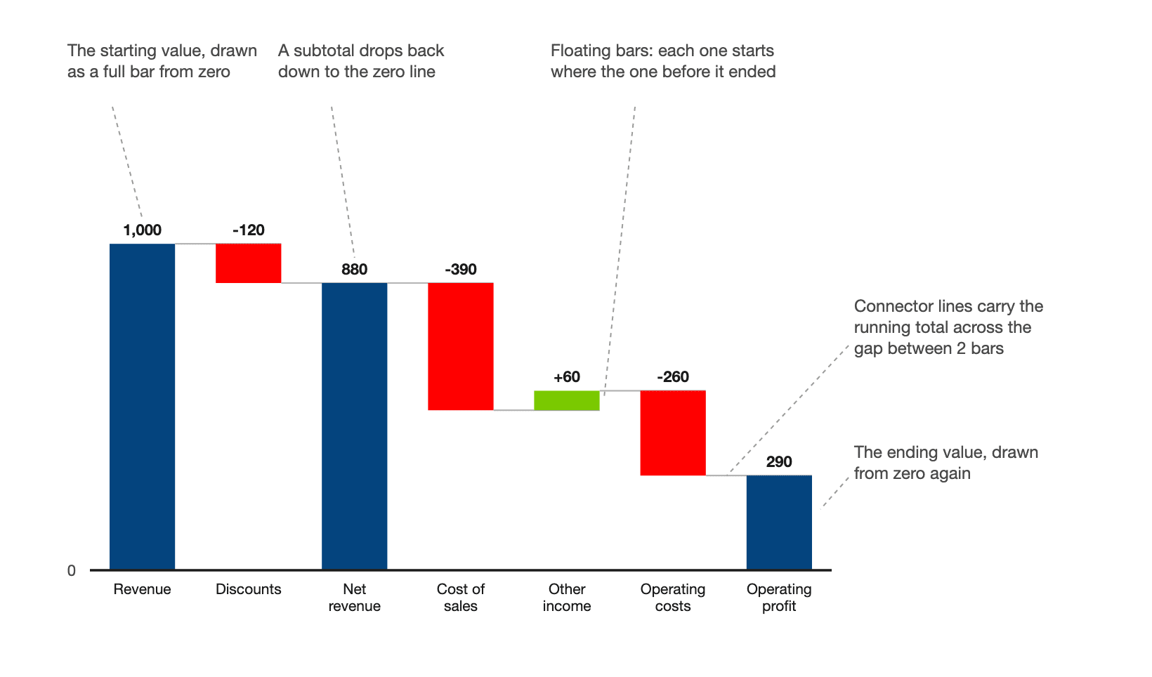
Keep in mind that only 3 bars touch the axis: the opening value, any subtotals, and the closing value. Everything between floats at whatever height the running total left it, which is why a waterfall can't be used to rank categories.
PRO Trial AVAILABLE FOR FREE!
Waterfalls are a chart type here, not a stacked bar with an invisible series. Subtotals and the sign convention are settings on the row, set by right click.
Waterfall chart cheat sheet
A waterfall answers how a total got from one value to another. The panel below is the short version, and the rest of the page is the argument behind it.
Waterfall chart details
Doing its job
Time to switch
Broken most often
3 cases when you should use a waterfall chart
A waterfall earns its place when the number people are arguing about is the difference between 2 totals.
1. Both endpoints are already agreed
Your board has the opening balance and the closing balance and wants the middle. A waterfall draws that middle as arithmetic. Last year to this year, every movement between them sized and signed, so nobody reconciles 2 numbers in their head.

2. You are walking from plan to actual
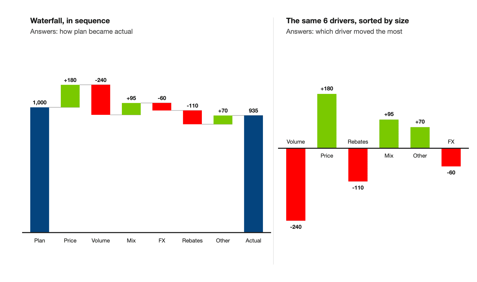
Split the gap between plan and actual into price, volume, mix and currency, and a controller has somewhere to start on Monday morning. As 4 ordinary columns, the same numbers never show they sum to the gap.
Andrej Lapajne makes the point in a Zebra BI price volume mix walkthrough:
"The only chart where this analysis makes sense is actually the waterfall chart."
Andrej Lapajne, Founder, Zebra BI
3. You are showing a calculation such as a profit and loss
You can show a board where revenue of 1,000 turned into operating profit of 290 without anyone reading a row of the statement. A profit and loss statement is a calculation, and the waterfall is the only common chart that draws it as one. Revenue at full height, cost lines stepping down, the result at the end.
3 cases when you shouldn't use a waterfall chart
A waterfall is a contribution chart, and comparison is the one job it can't do. Every bar sits wherever the running total left it. So 2 bars of identical size land at different heights, and the eye reads the heights first.
1. The question is which category is biggest
Use a sorted bar chart, where every bar starts on the same baseline so length is the only thing that varies. Choosing the right chart type covers the rest.
2. Nothing accumulates
The steps have to sum to the difference between the 2 endpoints. Compare plan against actual across a list of regions and nothing accumulates, because region 3 doesn't start where region 2 ended, so use a variance chart instead.
3. There are more than 10 steps
Past 10 bars the staircase turns into a wall. Past that point the reader is counting bars rather than following a story. Group the small movers into a single Other step, or hand the ranking to a sorted bar chart and keep 1 summary waterfall above it.
Waterfall chart vs bar chart
A waterfall answers how a total changed, and a bar chart answers which category is biggest. Both draw rectangles, which is why people swap them. The swap goes one way: someone picks a waterfall because the data has a total in it.
| Waterfall chart | Bar chart | |
|---|---|---|
| Question it answers | How did we get from A to B | Which one is biggest |
| Baseline | The running total, so it moves per bar | Shared, at zero |
| Sorting | Breaks it, the sequence is the meaning | Improves it, sort by value |
| Comparing 2 bars by eye | Unreliable, they start at different heights | Reliable |
Pick on the sentence you'd say out loud. "We went from 2.3 million to 2.2 million and here is why" is a waterfall, and "Germany is our biggest market" is a bar chart.
Not sure whether your question wants a waterfall or a variance chart? The Chart Selector is a Power BI Desktop file that walks you from the question you are answering to the chart that answers it, waterfall and variance side by side on real numbers. It draws through Zebra BI, so you need the visuals installed to open it. Download the Chart Selector
How to read a waterfall chart
Read it left to right as a running total, in 4 moves.
- The opening bar runs full height from the axis.
- Every bar after it is 1 change, hanging where the running total sat.
- A bar marked as a subtotal drops back to the axis, so it reads as a level.
- The closing bar runs from the axis again, so the 2 ends are comparable.
Connector lines are the part people skip
The connector is the only mark carrying the running total from one column to the next. Without it you have rectangles at unexplained heights.

Costs have to point down
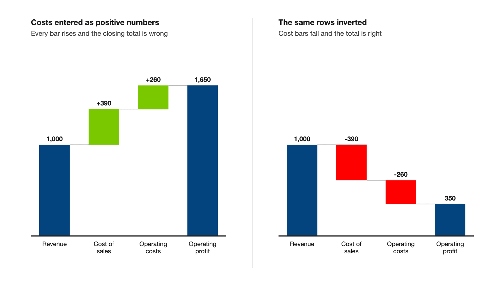
A waterfall only totals correctly if cost rows point down, and costs usually arrive from the ledger as positive numbers. Leave them that way and every bar rises, so the total comes out wrong.
Andrej Lapajne shows how to mark the rows in a Zebra BI walkthrough:
"A normal waterfall chart would just stack all the elements one on top of another, but in Zebra BI I can actually right click and do this for each row. I marked this one as a subtotal and I can also invert certain rows, like expenses or costs."
Andrej Lapajne, Founder, Zebra BI
Types of waterfall charts
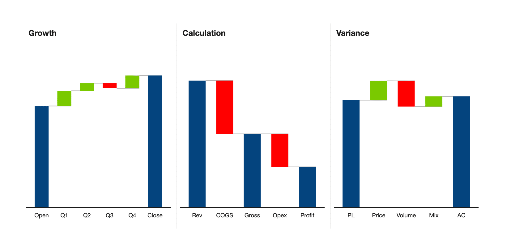
There are 3 kinds of waterfall chart: growth, calculation and variance. The IBCS Association publishes the business communication standards. It sorts waterfalls first by which way the category axis runs, then by what each chart explains. A stacked waterfall is a variation any of the 3 can take rather than a 4th kind. In Zebra BI Charts you get one from the Group field. Put a second dimension there, then click the stacked chart icon on the visual.
Growth waterfall
A growth waterfall follows 1 measure through time, a cash balance quarter by quarter for instance. Its category axis is a calendar, so the order is decided for you. IBCS recognizes no vertical form of it. In their notation this one runs as columns across the page, never as bars down it.
Calculation waterfall
Here the chart draws a calculation scheme instead of a timeline. Most teams meet this one as a profit and loss statement. Intermediate results are the point, so subtotals do the work.
Variance waterfall
A variance waterfall takes 1 difference, actual against plan, and splits it into the drivers behind it. This is the form a controller reaches for when the meeting has stopped asking what the gap is and started asking what caused it.
Waterfall chart layouts in Zebra BI


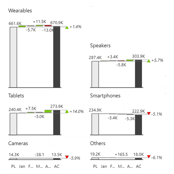

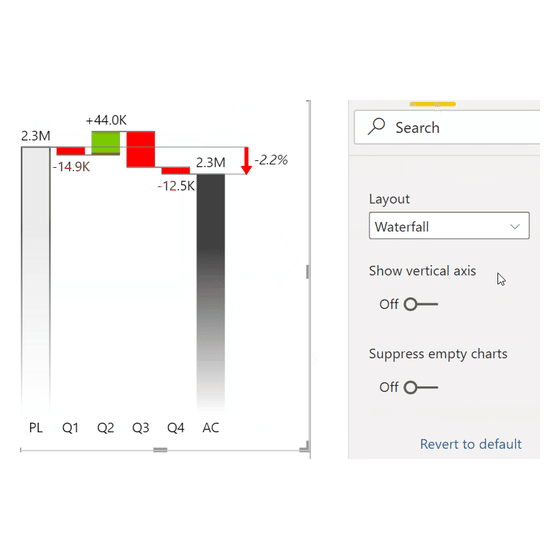
Waterfall is 1 of the 6 chart types in Zebra BI Charts, and it is also one of the 9 values in the layout list. That is why a chart you already built switches into a waterfall from the Layout dropdown instead of being rebuilt. The list that dropdown offers depends on how the visual is set up. Turn the vertical axis on and the same chart runs as horizontal bars down the page. Small multiples repeat it once per category. A second measure can run across the same waterfall as a line, so a build and the rate behind it share one chart.
Outside Charts, Zebra BI Tables draws waterfalls inside a table cell. There is a plain form and a side by side form for values, plus a calculation waterfall for variances. Zebra BI Cards carries the waterfall as 1 of its 4 in-card chart types.
Because waterfall charts are so versatile across these formats, they are some of our most widely used visuals, turning up in 6 of our 18 published customer stories, including Raiffeisen Bank International.
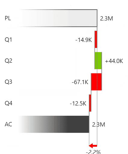
6 LAYOUTS, 1 VISUAL
Mark the row. The subtotal drops to the axis and the cost bar turns around.
Every waterfall in the grid above is a real Zebra BI render, not a mockup. Put your own profit and loss through the same visual.
Waterfall chart in Power BI
Power BI ships a native Waterfall chart visual, and for a plain run of increases and decreases it does the job. Drop a category and a measure in, and the bars float in the order the data arrives. A Breakdown field splits the movement into contributors. Builders reach its edge at the next request. A bar has to be pinned as a fixed start, or marked as a result, and Microsoft documents no per-row property for either.
Zebra BI Charts is a licensed set of custom visuals you add to Power BI, and it makes those per-row properties. Right click a category to mark it as a Result or to Invert it. Cost rows then point down and subtotals sit on the axis. The Layout dropdown moves the same visual between Waterfall and the variance layouts without touching the query. The knowledge base walks the whole build from a single measure, sort order included. One thing it does not give you is a connector switch. Connectors are drawn for you and there is nothing to turn off.
"Building waterfalls manually in Power BI was a nightmare. Zebra BI solved that in minutes."
Almir Mulahasanovic, Head of Business Intelligence and Financial Controlling, Raiffeisen Bank Bosnia, in the Raiffeisen Bank International customer story
The walkthrough is in Power BI waterfall charts explained, with the harder cases in advanced Power BI waterfall charts.
Waterfall chart for Office
Zebra BI for Office is 1 suite covering Excel and PowerPoint. Zebra BI Charts for Office is the add-in inside it that draws the charts. Both applications also draw a waterfall on their own, so each section below starts there.
Waterfall chart in Excel
Excel has drawn waterfalls natively since the 2016 release, and the basic path is quick: select a column of values and insert the chart. Excel makes 1 of the 2 hard parts easy. Connector lines are a single Show connector lines checkbox on the whole series. Subtotals are the other part, and they are not detected: each total bar is marked by hand with Set as total, one point at a time. That bites the moment you add a row.
Zebra BI Charts for Office sits inside the workbook rather than adding a chart type. It draws the waterfall from a range, an Excel table or a pivot table the sheet already holds. Totals and cost rows become properties of the row. Right click the category label to mark it as a Result or to Invert it, which is the same move as in Power BI. Adding a line to the statement no longer sends you back through the chart. The knowledge base states the limits plainly. Office 2016 cannot use a pivot table as the source, and on the mobile apps the chart renders as a static image. Excel waterfall chart covers the native build.
Waterfall chart in PowerPoint
Microsoft documents Excel and PowerPoint on the same support page, so the same behavior comes with it: connectors on one checkbox, totals still marked point by point. Drawing the chart takes a minute. The cost lands later, because the slide gets rebuilt by hand every close and the numbers on it drift away from the model behind them.
That drift is what the add-in is for. Zebra BI Charts for Office links a slide to an Excel file on OneDrive or SharePoint and refreshes the waterfall from it. Result and Invert sit on the same right click as on the other 2 surfaces. The same article carries the caveat. In the PowerPoint desktop app a visual only updates while its slide is on screen, so you click through the deck to refresh them all. Only PowerPoint Online updates every slide when the file opens. Zebra BI names that a Microsoft API limit rather than a design choice. PowerPoint waterfall chart covers the build on a slide.
Waterfall chart design best practices
5 things make a waterfall readable.
- Invert the cost rows so they point down, or the total comes out wrong.
- Mark every subtotal as a total so it sits back on the axis.
- Keep the connector lines wherever your tool lets you switch them off.
- Start the value axis at zero. Bar length is what the reader measures. Research on truncated axes found that a cropped axis makes the gaps look bigger than they are.
- Use 2 colors, plus a cue that isn't color, which is what the use of color criterion asks for. Red against green alone is hard for readers with a red-green color deficiency.
Guidance from the IBCS Association puts a time sequence on a horizontal category axis, which draws as upright columns. A structural breakdown goes on a vertical one, which draws as bars running down the page.
Make sure your waterfall chart adds up
Building a waterfall chart shouldn't take a few days, and it shouldn't fall apart the moment you add another line to the statement.
Before you publish your report, add up the bars on your waterfall graph. If the closing total doesn't match your statement, your cost rows are still pointing up.
Zebra BI Charts makes the subtotal and the sign convention properties of the row, so a new line in the P&L doesn't send you back through the chart. You can test the waterfall charts and more chart types through Zebra BI’s 14-day free trial.
Frequently asked questions
The questions people ask most often about waterfall charts, answered in a sentence or two.
What is another name for a waterfall chart?
Bridge chart. Microsoft's own documentation calls waterfalls bridge charts too, and the name shows up most in finance. Cascade chart and walk chart turn up occasionally for the same picture: a chart that starts at one value, shows the steps that changed it, and ends at another.
What should a waterfall chart look like?
The opening and closing bars sit on the axis at full height. Every bar between them floats, and each one starts where the last one ended. Rises and falls use 2 colors, connectors join the columns, and subtotals are marked as totals.
What should I use instead of a waterfall chart?
If the question is which category is biggest, use a sorted bar chart. If you are comparing plan against actual across categories, and nothing accumulates, use a variance chart. And for a plain trend, use a line chart.
Can a waterfall chart be horizontal?
Yes. The same waterfall runs as vertical columns across the page or as horizontal bars down it. In Zebra BI Charts that is a single setting, Show vertical axis. IBCS reserves the sideways version for structural breakdowns and keeps anything running through time as upright columns.
Can you build a stacked waterfall chart?
Yes, in Power BI. Put a second dimension in the Group field, then click the stacked chart icon on the visual, and each step breaks into its own components. Use it carefully, because a plain waterfall already asks the reader to track a running total.
Have a look at your own waterfall and check 2 things: that the cost rows point down, and that every subtotal is marked as a total. Those are what make the number at the end add up. If you want to see it behave that way on your own data, the trial takes a few minutes to set up.

Join over 1.5 million Zebra BI users
Building a waterfall that adds up should not take a morning. Zebra BI makes the subtotal and the sign convention properties of the row, so a new line in the statement does not send you back through the chart, in Power BI, Excel and PowerPoint.

Related links
- Column chart, for when the question is which category is biggest
- Chart Selector, the free Power BI file that picks the chart for a question
- Stacked waterfall charts, for splitting each step by a second dimension
- Bridge waterfall charts in Excel, the single column build
