
 September 8th
 February 22nd
What Is a Column Chart? When It Works and When a Bar Chart Takes Over
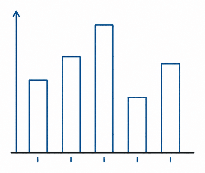
A column chart turns each category into an upright bar on a shared baseline, one bar per category. The reader compares heights instead of guessing at numbers. That makes it the right tool when your categories run in order over time, like months or quarters, and there aren't too many of them.
But what happens when the default choice isn't the best solution anymore? Add more than 8 categories, or give it labels longer than a word or two, and the same chart starts working against you. What you need at that point is the same data laid out as a bar chart instead, with the categories running down the side rather than across the bottom.
This guide covers both charts: what each one is for, and the point where a column chart stops working and a bar chart takes over.
What is a column chart?
A column chart is a chart with vertical bars, where each bar's height shows the value for one category. Categories sit along the horizontal axis and values run up the vertical axis. Some people call it a column graph, and Excel calls it a column chart to distinguish it from a bar chart, which is the same idea rotated 90 degrees.
Height is why it works. Every column starts from the same baseline, so comparing 2 columns is the simplest comparison you can ask a reader to make. That's why you should use column charts instead of pie charts.
PRO Trial AVAILABLE FOR FREE!
Drop a dimension and a measure and the column chart arrives sorted, labeled and formatted to IBCS conventions. No cleanup list.
Column chart cheat sheet
Column chart details
Doing its job
Revenue by month for one year. 12 columns, plan as a reference marker, variance labeled on the last one. One measure, one timeline, something to judge it against.
Time to switch
30 cost centers with names like "Professional Services EMEA". Same numbers, wrong chart. Rotate to a horizontal bar chart and sort by size.
Broken most often
A value axis that does not start at zero. Height is the encoding, so a cropped axis exaggerates every gap on the chart. Usually a default nobody checked.
When you should use a column chart
A column chart is the right pick in 3 situations, and most business reports hit at least one of them.
One measure across time
There's one thing column charts do better than any other chart: track a number over time.
Revenue by month, headcount by quarter, cash by week. Time reads left to right in the languages your report is written in, so a horizontal time axis matches how people already scan a page. Put 12 months of sales in a column chart and nobody needs the axis explained.

Use 6 or 7 categories
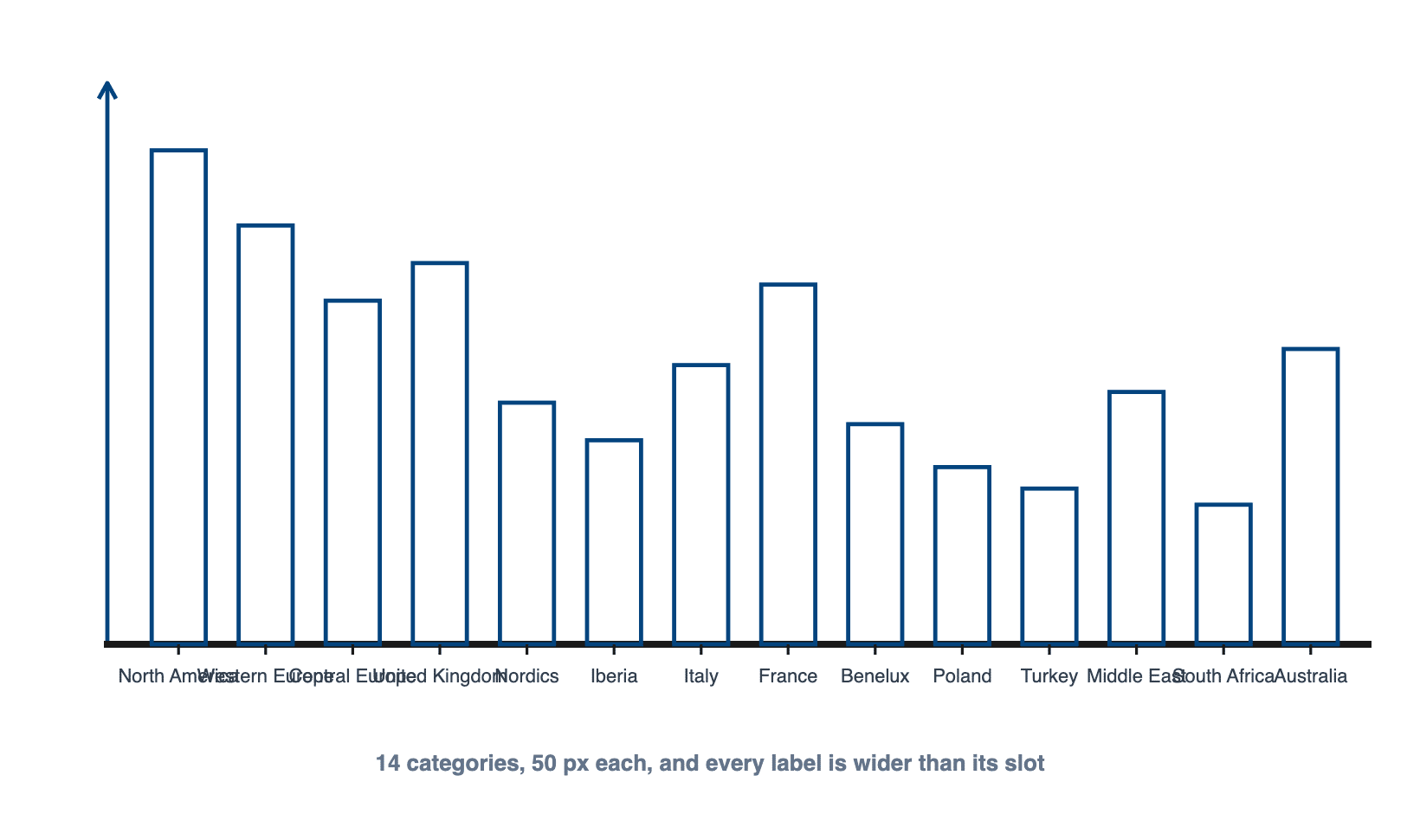
Columns need horizontal room. Each one carries a label underneath, and once you pass 8 bars those labels start fighting each other. If you're showing 4 product groups or 5 regions, columns are fine. If you're showing 30 cost centers, they're not.
One category set and one number
A column chart works best with one measure and one category, like actual sales by month. The moment you add a 2nd and 3rd measure you are into clustered columns, and clustered columns get busy fast.
When you shouldn't use a column chart
There are 4 situations where a column chart quietly works against you, and here's the fix for each.
When your labels are too long
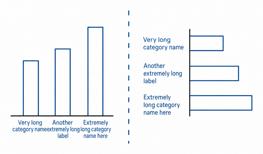
"Professional Services EMEA" doesn't fit under a column. Power BI and Excel both solve this by rotating the label 45 degrees, which is the clearest sign you picked the wrong orientation. Rotated text is slower to read and it eats vertical space that should belong to the chart. Switch to a horizontal bar chart and the labels sit flat to the left of each bar where they belong.
You have more than 8 categories
Long category lists work better running down the page, not across it, since a page scrolls vertically. Horizontal bars handle 20 or 30 rows without complaint. A pin chart, sometimes called a lollipop chart, handles even more, since a thin stem and a dot use far less ink than a full bar at that density.

You are showing parts of a whole
If the question is "what makes up this total", a plain column chart can't answer it. Every bar shows a value, but none of them show composition. You want a stacked chart, which splits each bar into its parts, or, for a walk from one total to another, a waterfall.
The number alone doesn't say if it's good
This is the failure nobody catches in review, because the chart looks finished. Marnix Jansen, an independent BI developer and consultant, uses a medical analogy to explain it:
If your doctor tells you, "I tested your blood and your XYZ score equals 120", is that good or bad? We don't know. So what I can do is make a chart. I would do a column chart, and then I would do a column for every month. And you just show the XYZ scores. But you don't know, is that good or bad? So do I have to do something about it? We need the doctor to also tell you, "Yeah, but we were trying to reach 180."
Marnix Jansen, independent BI developer and consultant
12 columns of a monthly number are just 12 numbers until you add the target. Keep the column chart and give it a reference: a plan, last year, or a forecast.
Column chart vs bar chart
This is the question people search for, and orientation is not a style preference. It changes what the chart is good at.
| Column chart | Bar chart | |
|---|---|---|
| Orientation | Vertical bars | Horizontal bars |
| Best for | A value over time | Ranking named categories |
| Category labels | Short only | Long labels fit |
| Comfortable category count | Up to 8 | 20 or more |
| Natural reading order | Chronological, left to right | Ranked, largest at the top |
| Falls apart when | Labels rotate 45 degrees | The axis is a timeline |
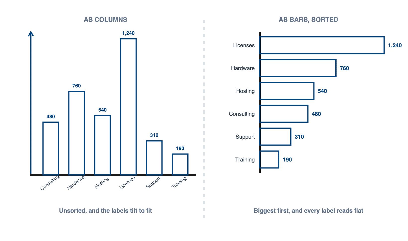
If you're reporting on time, always do that on the horizontal axis, so these will be line charts or column charts. Reporting on structure, cities, clients, employees, departments, will always be done on the vertical axis, and therefore that will be a bar chart.
Marnix Jansen, independent BI developer and consultant

The standard says the same thing. IBCS asks you to visualize data series over time with horizontal axes and to display structures on vertical category axes, which is another way of saying regions, products and customers belong in horizontal bars.
If your horizontal axis is time, use a column chart. If your categories are products, regions or cost centers, use a horizontal bar chart, sort them by size, and let the labels sit flat. That one rule settles most bar vs column chart arguments before they start.
Still deciding between columns and bars for your own data? The free Chart Selector is a .pbix that walks you from the question you are answering to the chart that answers it, with every layout rendered on real numbers. Download the Chart Selector
Clustered vs stacked column charts
A clustered column chart puts 2 or 3 columns side by side inside each category, which is how you compare actual against plan for every month of the year. Keep it to 2 or 3 series. 4 is already hard to read and 5 is a table pretending to be a chart.
A stacked column divides each single column into segments that add up to the total. The catch is the moving baseline: only the bottom segment starts from zero, so every segment above it is genuinely hard to compare across categories. Use stacking when the total is the message and the split is context.
One hard limit on stacking: every value in the stack has to share the same sign. According to IBCS rules, stacked columns should only be used if all the chart values are either positive or negative. Mix them and the segments start canceling each other out, and the total you are pointing at stops being readable.

Types of column charts
There are 4 variants that cover almost everything you will build. A basic column chart shows one measure per category. A clustered column chart sets 2 or 3 measures side by side. A stacked column splits each column into components. A 100% stacked column forces every column to the same height so you compare shares instead of totals, which is useful for mix analysis and misleading if the reader expects volume.
Column chart layouts in Zebra BI
Zebra BI Charts renders a set of column layouts from one visual, and the chart slider moves between them on the same data without rebuilding anything. All 6 below sit under the column chart type in Zebra's own chart selector, and each can be drawn with time on a horizontal axis.
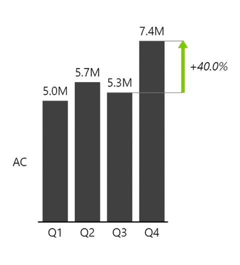
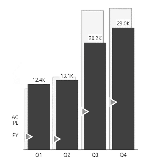
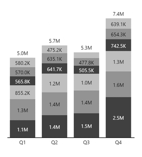
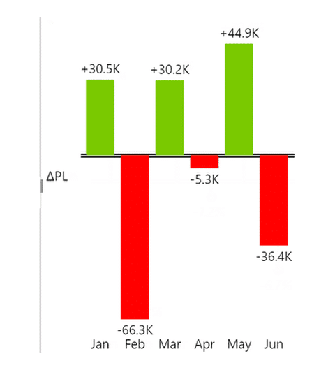
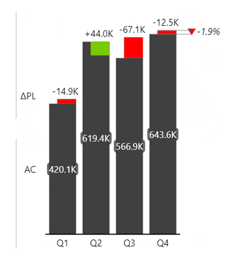
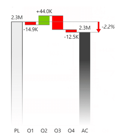
Series comparison is what most people mean by a clustered column chart, and stacked comes in both a plain and a 100% version. Integrated variance is the one to reach for when a plain column chart stops being enough, because the value and the gap to plan arrive in the same column.
Contribution of variance is worth a second look, because both labels fit. The chart type is a column chart and the selector files it that way. The layout you almost always want for a contribution analysis is a waterfall, with connectors and a running total from plan to actual. Its full treatment lives with waterfall charts in Power BI. The other easy miscount is orientation: the structure versions of comparison and variance put categories on a vertical axis, which makes them bar charts. Zebra names those layouts by their axis rather than by their bars, so a layout labeled horizontal is the one that gives you vertical columns.
SAME NUMBERS, TWO REPORTS
Same 6 regions. One of these you can actually read.

Every chart on this page is a real Zebra BI render, not a mockup. Put your own numbers through the same treatment.
How to build a column chart in Power BI
The native route takes about 10 seconds and then you spend 20 minutes on cleanup. Pick the stacked column chart from the visualizations pane, drop your dimension into the X axis and your measure into Y. Then the cleanup starts. Fix the number format. Turn off the axis title Power BI added. Sort the categories. Switch on data labels. And pick a color that is not the default blue. Microsoft's own documentation for column charts in Power BI covers that native build in full, including the limits you cannot format your way out of, such as the axis intervals Power BI decides for itself.
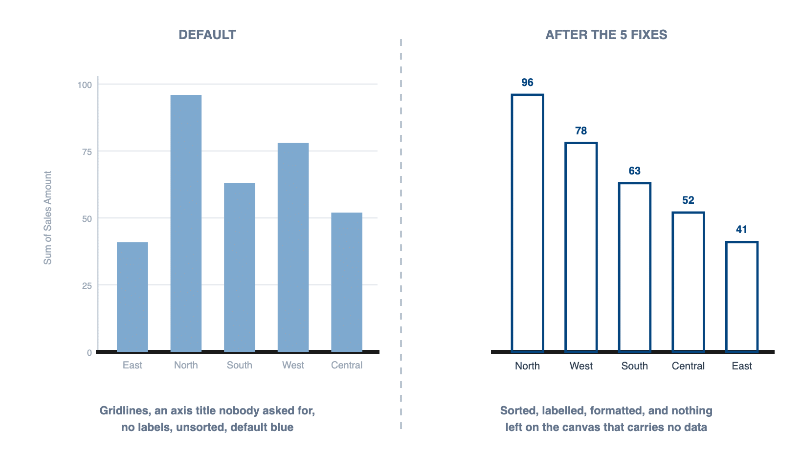
You can skip the cleanup part with Zebra BI Charts. Drop your dimension into Category and your measure into Value, and the column chart arrives sorted, labeled and formatted to IBCS conventions. 3 things are worth knowing after that:


- The chart-layout slider on the right of the visual switches the same data between column, bar, area, line, pin and waterfall layouts, so you can try an orientation instead of rebuilding the chart.
- Add a Plan, Previous Year or Forecast measure to the comparison placeholder and the visual calculates absolute and relative variance for you, in the standard green and red.
- Add a 2nd dimension to the Group placeholder and you get small multiples, one column chart per region or product on a shared scale.
A chart such as this will provide much, much more information and impact on how you were doing against your previous year or plan or forecast targets than maybe just a clustered column chart, which would be a native chart.
Mark Leskovsek, BI Solutions Director at Zebra BI

Column charts for Office
Zebra BI Charts ships as an Office add-in as well, so the same column chart is available on two more surfaces.
Column charts in Excel
Excel draws one natively. Select your data, then Insert, Charts, Clustered Column, and you land on the same starting point Power BI gives you, with the same cleanup list waiting: number format, axis title, sort order, data labels, color.
Column charts are one of the types Zebra BI Charts for Office renders in Excel. You point the visual at a range or a pivot table and the chart arrives sorted, labeled and formatted the way it is in Power BI, with the comparison and variance placeholders in the same place. The free version is free forever for personal use, and team use needs a license.
Column charts in PowerPoint
A column chart on a slide is usually an Excel chart someone pasted there, which means it is correct on the day it was pasted and quietly out of date by the time you present it.
Zebra BI Charts for Office renders column charts in PowerPoint too, and it treats the staleness as the actual problem. Use Link data to Excel to point the visual at a workbook on SharePoint or OneDrive, and the chart refreshes when the deck opens. One caveat worth knowing before you rely on it in a meeting: in PowerPoint desktop, visuals refresh only on slides you actually view, so click through the deck first. In PowerPoint Online every visual on every slide updates when the file opens.
Column chart design best practices
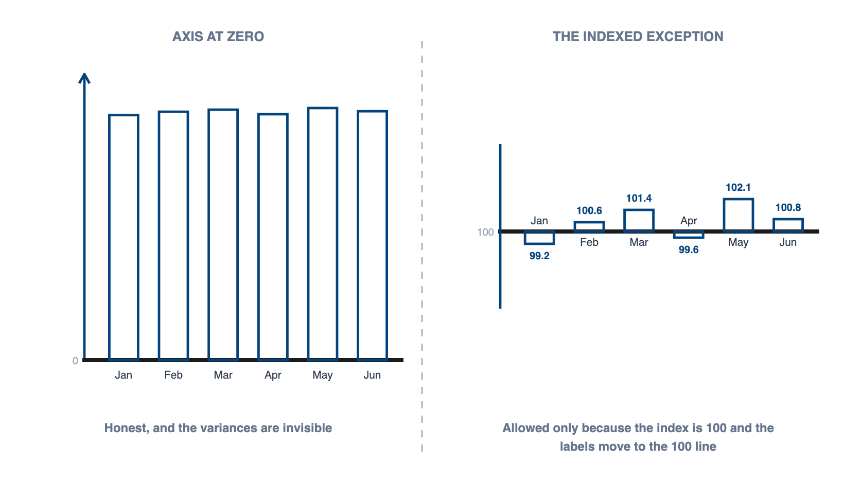
Start the value axis at zero. Column charts encode value as height, so a truncated axis exaggerates every difference on the chart, and it is the most common way a column chart misleads without anyone intending it to. Research on truncated axes found the distortion survives even when the chart carries an explicit cue that the axis has been cut, so flagging the break does not undo it. IBCS rules are direct about this: value axes should generally start at zero.
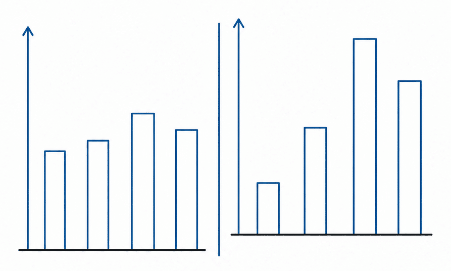
IBCS names one exception itself. Indexed data, where the index is 100% and the variances around it are small, can be zoomed in on, and then the category labels move to the 100% line. That's the exception, not a license to crop any axis that looks flat.
Never clip or break a column to make an outlier fit. Adapt the scale or the size of the chart instead, because clipped elements like broken columns make visual comparison impossible. If one value genuinely dwarfs the rest and is not the point of the chart, mark it with an outlier indicator and keep the rest readable.
Sort with intent. Time goes in chronological order, always. Named categories go largest to smallest unless there is a reason to keep them in a fixed order, like an income statement. When you do rank them, add an arrow to the axis label so the reader can see the sort order right away.
Hold the scale steady across charts. 2 column charts of the same unit on one page need an identical value-axis scale. When the values differ by orders of magnitude, keep the scale identical and change the physical size of each chart instead. Rescaling one panel to make it look fuller is how small multiples end up lying to people.
Make the gaps narrower than the columns. A gap of roughly half a column width groups the bars into one shape your eye can read. Power BI's default gap is far too wide and it makes 4 columns look like 4 separate charts.
Label the columns directly and then delete the value axis. If every column carries its number, the axis is repeating information and taking up room. Scale those numbers with unit prefixes so nothing on the chart runs past 3 digits, and on a monthly axis use a compact form like "MMM YYYY" rather than a long date.
Use one color. A 2nd color should mean something specific, like a forecast period or a variance, and if it does not mean anything then it is decoration competing with your data.
Keep it flat. Encode value with linear elements, which is what columns and bars are, rather than with areas or a tilted 3rd dimension. A 3D column chart puts every bar on its own perspective plane, so the back ones hide behind the front ones and you cannot tell whether March beat April.
The rules in this section are adapted from the IBCS Standards v1.2, published by the IBCS Association under CC BY-SA 4.0.

Join over 1.5 million Zebra BI users
Do you need a column chart for your next meeting? Zebra BI users produce striking reports every time, in Power BI, Excel and PowerPoint, with the same layouts and the same notation month after month.

Track your numbers over time with a column chart
Use a column chart when the horizontal axis is time, you have 8 categories or fewer, and the labels are short. Once the labels start rotating or the list runs past 8, switch to a horizontal bar chart and sort it by size. And whichever you pick, start the value axis at zero, because height is the whole encoding.
With Zebra BI Charts, the column chart arrives sorted, labeled and formatted, and adding a plan or previous year calculates the variance for you. If the data turns out to need bars instead, it's a switch on the chart slider, not a rebuild. Try it on your own numbers with the 14-day free trial.
Frequently Asked Questions
Column chart vs bar chart: when should I use which?
Use a column chart when the horizontal axis is time, such as months or quarters. Use a bar chart when you are ranking named categories, when the labels are long, or when you have more than 8 of them.
How does a clustered column chart work?
A clustered column chart places 2 or more columns side by side within each category so you can compare series, for example actual against plan for each month. Keep it to 2 or 3 series before it becomes unreadable.
How do I make a column chart in Excel?
Select the category column and the value column, go to Insert, then Charts, then Clustered Column. Then set the number format, sort the categories, add data labels, and remove the chart title Excel generates if your report already has a heading.
Is a column chart the same as a histogram?
No. A column chart compares separate categories and the columns have gaps between them. A histogram shows the distribution of one continuous variable split into bins, and its bars touch because the bins are adjacent ranges.
Does Power BI have a column chart?
Yes. Power BI ships clustered, stacked and 100% stacked column charts natively. What it does not ship is a column chart formatted to reporting standards out of the box, which is the gap Zebra BI Charts fills.
Related reading: bar chart guide, stacked charts, small multiples in Power BI, and how to choose the right chart.
