Best practices for creating Excel charts for financial reporting
This guide provides a brief overview of financial reports and explains how to use Excel charts for financial reporting along with best practices you can use to communicate your information quickly, accurately and persuasively.
Let's start by explaining which financial reports you can use.
All companies, regardless of their size or industry, need financial reporting. While publicly traded companies need to deal with extensive reporting requirements, private companies also rely on financial reports to manage their financial performance, maintain compliance and obtain financing or investments.
Financial reporting may comprise a range of reports, including:
- Executive summary: A short summary with key data about the company's performance.
- Profit and loss statement: Also known as income statement, it shows a company's revenues and expenses over a specific period of time.
- Balance sheet: It displays a company's assets, liabilities, and equity to provide a snapshot of a company's financial position at a specific point in time.
- Cash flow statement: Shows the inflows and outflows of cash within the reporting period.
- Performance reports: This category of reports provides detailed insights into key parts of the business. They may include sales and customer reports, a price-volume-mix analysis, operating cost analysis and others.
Why use Excel charts for financial reporting
While there is no lack of reporting and BI software on the market, Excel remains the workhorse of financial reporting in many companies – and with good reason. It is a flexible and widely accessible tool, which means that any reports you create with it can be widely and easily shared. It is efficient and provides a wealth of automation and visualization options that become truly powerful in the right hands.
Excel is also highly customizable and expandable. If you want to save yourself some time & effort, you can download data visualization add-ins such as Zebra BI for Office Charts and Tables. They make it really easy for you to create actionable & interactive reports that drive smart data-based decisions.
Let's start by taking a closer look at individual financial reports and the best practices you should focus on. We will start with ...
Executive Summary
The key goal of an executive summary dashboard is to consolidate data from multiple sources and provide a single view of key company data.
A typical dashboard will include a short profit and loss statement, industry/company specific KPIs, monthly sales trends, an overview of working capital, etc. To make a dashboard truly useful, make sure you include comparisons to the previous year and planned data. Forecasts are also a good addition.
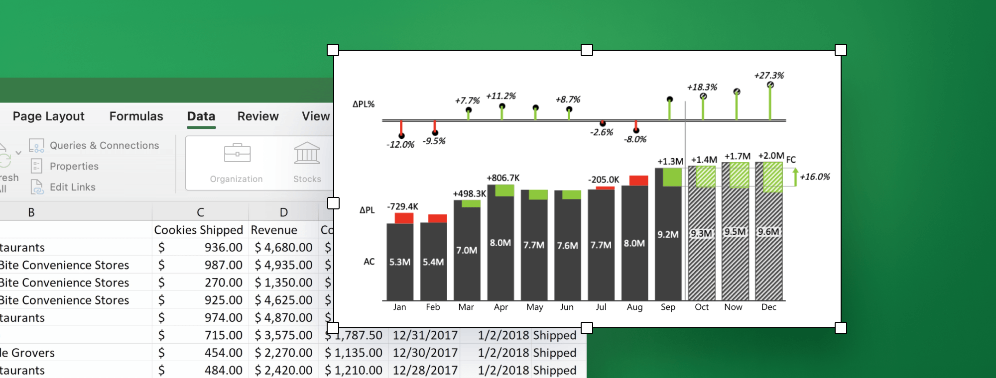
Let's take a look at an example Excel chart created with Zebra BI for Office.
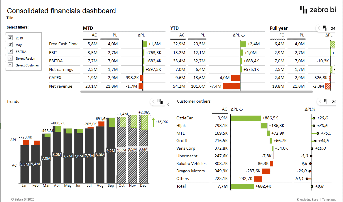
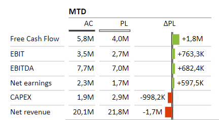
This example shows several key KPIs, including free cash flow, EBIT, EBITDA, net earnings, CAPEX and revenue. The data is shown in a table form with included variances. These comparisons put your actual data into context and drive action instead of existing in a vacuum. Also, note how simple colors (red and green) are used to highlight comparisons to the plan.
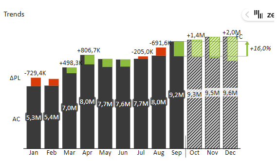
Our sample dashboard shows two additional visuals. The first one is Trends which shows how actual (dark grey) and forecasted (hatched) EBITDA compare to the plan (red denotes underperforming KPIs, while green means better than plan) during the year. This visual makes great use of integrated variances which integrate the variances directly into the chart.
The second company-specific visual is Customer outliers which shows sales by customer and indicates where results either exceeded expectations or fell short. It integrates a waterfall chart and a relative variance lollipop chart.
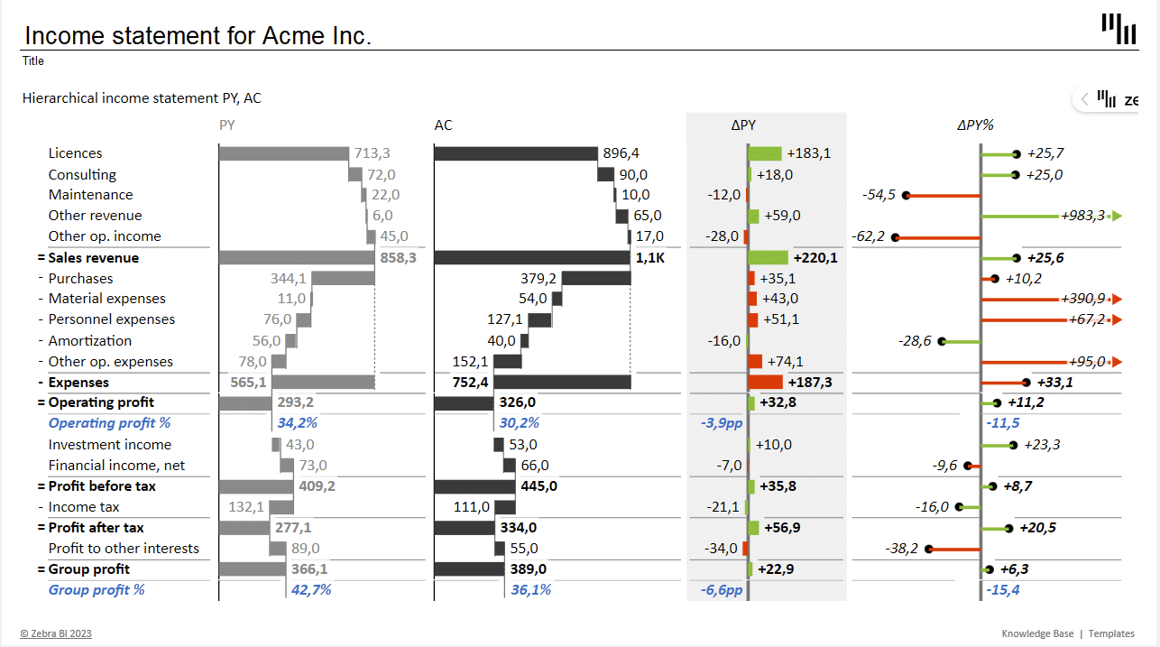
Profit & Loss Statement
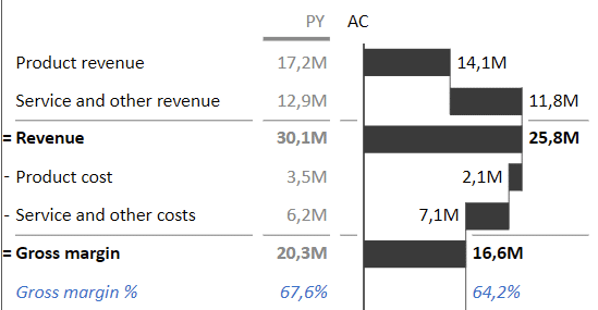
A profit and loss statement is also known as an income statement and shows a company's revenues and expenses during a specific period of time, most often a year or a quarter. It provides an overview of a company's profitability, which makes it a key tool in the management's toolbelt.
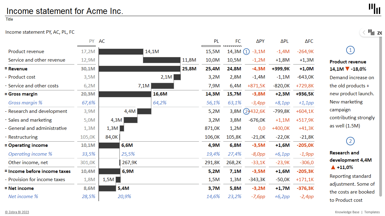
Best practices
To make sure your data is readable and attractive without sacrificing information density, the best approach to visualization is a table. It allows you to clearly show actual, previous year, planned and forecasted values as well as key variances.
If you're using Zebra BI to create your Excel charts for financial reporting you can also take advantage of interactivity. If you have more space available, for example, you could visualize your variances graphically:
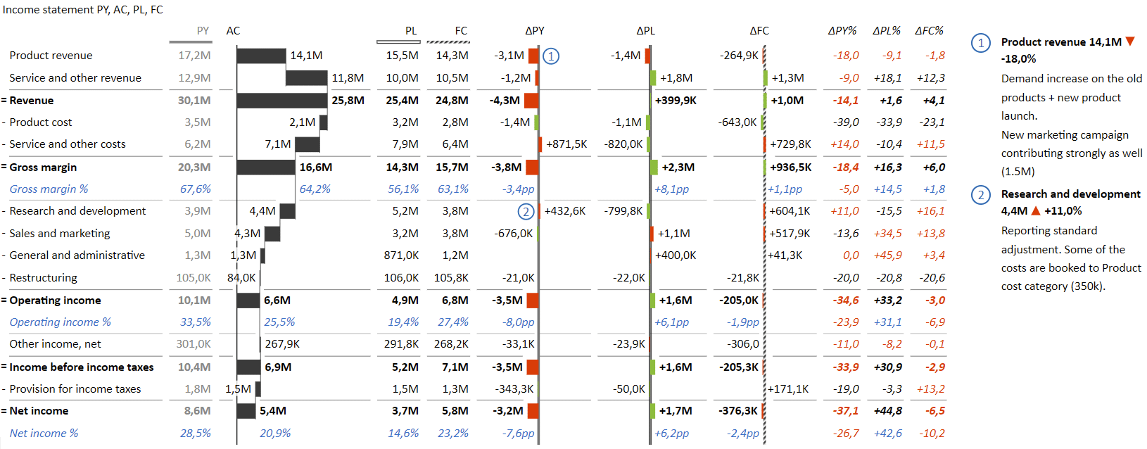
You should present the Actuals (AC) columns using a waterfall chart. This gives the reader an instant feel of the main items driving your financial performance.
To give the reader even more actionable information, you should also include calculations of profitability ratios (COGS ratio, gross margin as %, operating income margin and net profit margin). These are particularly important because they clearly demonstrate a company's ability to generate profit.
Comments are another cool tool you can use to make sure your data is easier to understand. Our recommendation is to use comments to explain the largest deviations compared to the previous year or plan data.
Balance sheet
A balance sheet is the second report in the "holy trinity" of financial reports. It shows the company's assets and provides information on how these items are financed. Together, these data points provide investors, creditors and other stakeholders with a view of the company's financial health and its ability to meet financial obligations.
Here is an example of a balance sheet created with Zebra BI for Office.
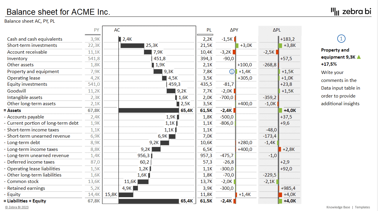
Your first goal when creating a balance sheet report should be to give a snapshot of the current state of your assets and liabilities while also using visuals to highlight the importance of individual balance sheet items that influence the liquidity of your business.
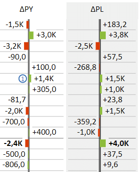
The best approach is to use a table with comparisons of actual results against the previous year and plan data. Use "plus-minus" variance charts to draw attention to deviations from targets or plans and growth rates from previous.
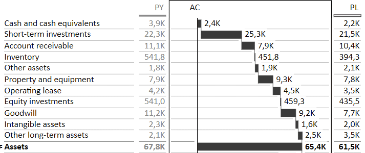
Use a waterfall chart to clearly present how individual assets and liabilities contribute to the final balance sheet result. The best approach to ordering columns here is to place the actuals column between the previous year and plan data, so the user can quickly look at the most relevant data.
Again, don't forget to use comments to explain the most significant deviations. While figures often speak for themselves, you can use comments to quickly provide information about anomalies, such as sudden spikes or dips in individual items.
When designing a balance sheet, use inverted values and subtotals to showcase how assets are in balance (credit vs. debit) with equity and liabilities. All liabilities should be inverted values, which means that increases in inverted items are considered to be negative and their variances are marked in red.

Choosing Zebra BI for Excel charts for financial reporting also allows you to include calculations in your chart. This way, you can add some top-level KPIs, such as current ratio, quick ratio, working capital, debt-to-equity ratio and debt-to-assets ratio.
Cash flow statement
The most basic goal of an Excel cash flow statement is to show whether a company is generating enough cash to meet its operating expenses and invest in new growth opportunities. It highlights how a company's cash and cash equivalents change over a period of time by showing cash flows from operating, investing, and financing activities.
Here is an example.
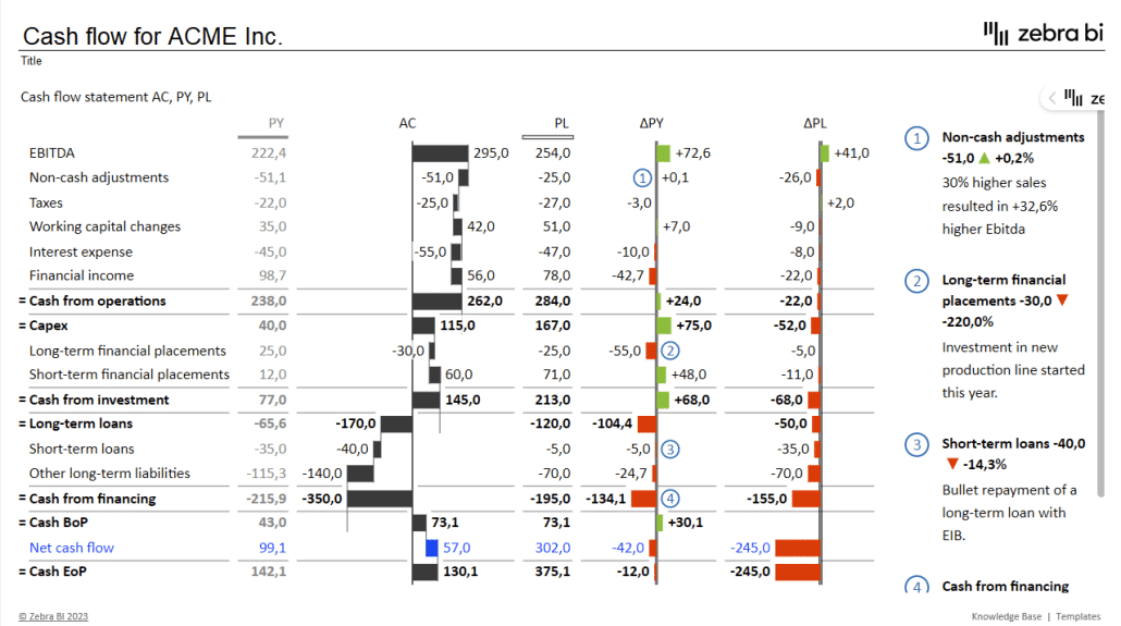
So, what should you pay attention to when designing a cash flow statement? First of all, use a table visual, like Zebra BI Tables for Office. Second, in addition to the previous year and plan data, include variances to compare data.
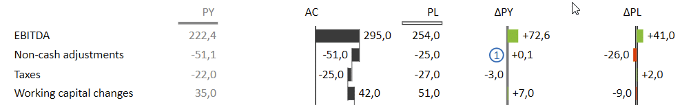
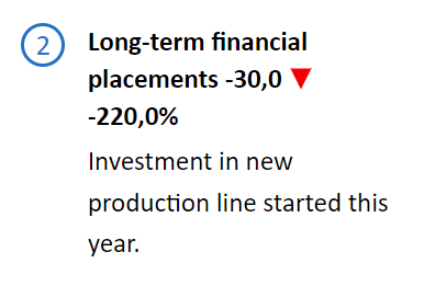
Third, use comments to explain the most notable increases or decreases. For example, a sudden increase in long-term financial placement can be explained with a comment describing an investment in a new production line.
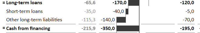
To make a cash flow report more actionable, include top-level categories: cash from operations, cash from investing and cash from financing. These are simply sums of individual items that can be visualized as a waterfall chart to show their contributions to each category. Look at how a waterfall chart shows how the Cash from financing category is made up of long-term and short-term loans and other liabilities and the impact of each item.
Last but not least, include the beginning of the period (BoP) and end of period (EoP) cash positions. We've also included the Net cash flow item in this table.

Specific reporting
When you use Excel charts for financial reporting, there is virtually no limit to what you can do. You can use them to give detailed insights into different parts of your business with sales and customer reports, price-volume and profitability analyses and project performance reports.
Let's look at some examples of different reports and dashboards.
Sales variance
Sales managers and senior management will appreciate an insight into sales performance compared to past and future values, such as the previous year's results, planned sales, and forecasts.
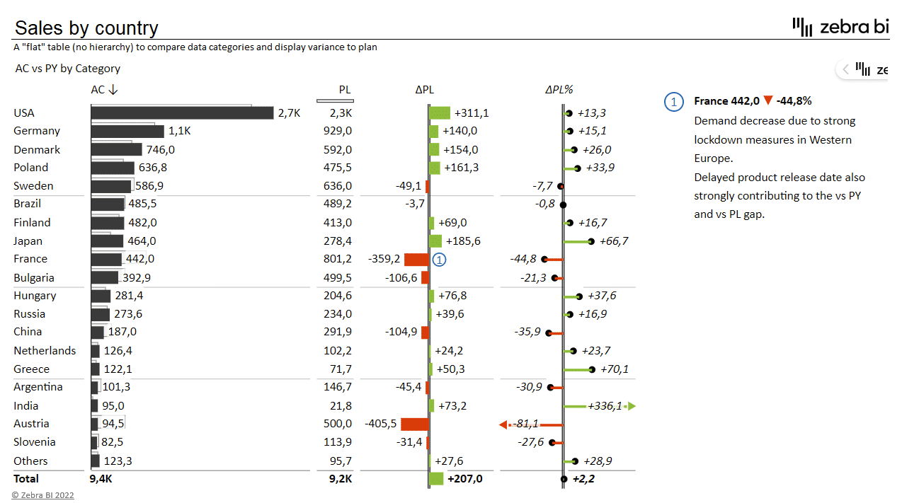
This table provides an insight into sales performance compared to planned sales for individual countries. The chart utilizes darker and lighter bars to show both values at the same time. The variance is then explicitly shown with absolute and relative variance bars on the right.
Price Volume Mix Analysis
Price Volume Mix (PVM) analysis is a method used to see which of the three factors is driving revenue growth or decline. It is used to separate the effects of price, volume, and product mix on the overall revenue.
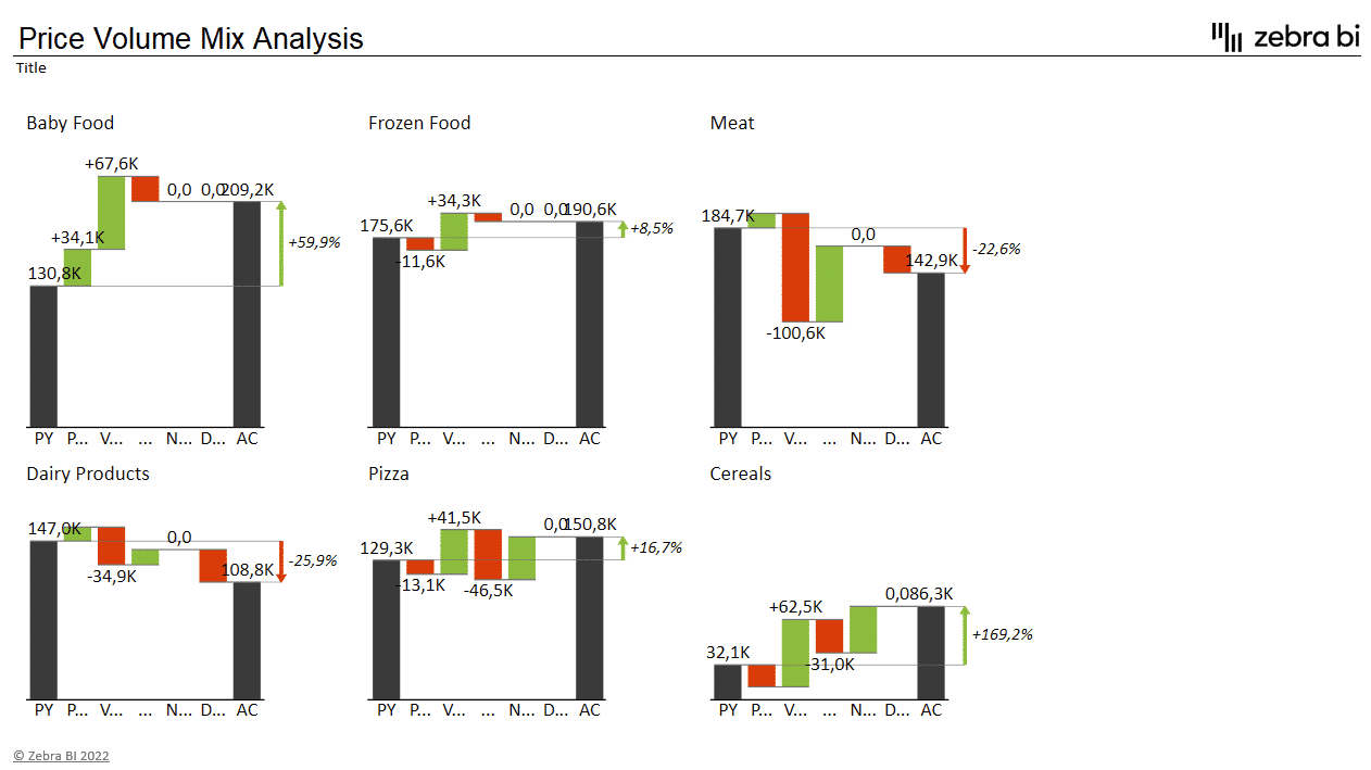
This type of analysis is particularly valuable to CFOs and product managers who can then make decisions on the changes to the product portfolio to optimize their sales strategies.
One of the most effective things you can do in a PVM analysis is to use small multiples. Small multiples is a way to use multiple charts or graphs to show variations of the same data set across different categories. All charts need to be rendered to the same scale to make sure your attention is focused to the right areas.
EBIT Contribution Analysis
EBIT contribution analysis is a financial analysis that helps readers understand how individual products or business segments contribute to a company's profitability. It allows CFOs and the management to identify the areas that might be less than profitable and need to be optimized.
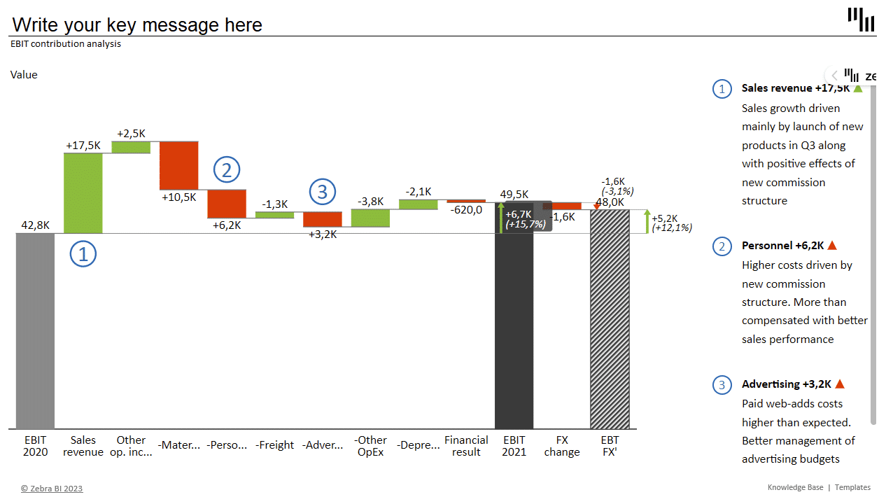
In this instance, a bridge chart is a useful tool for analyzing the drivers of a change in a particular metric. In our example, we see that EBIT growth was driven by rapid sales growth which offset increased personnel and advertising costs.
This bridge chart also features a subtotal, which is useful when you need to show an intermediate result within your chart before the final result. In our case, we're showing a forecasted EBIT adjusted for foreign exchange fluctuations.
Working capital analysis
Working capital analysis is a financial analysis method that examines a company's ability to meet its short-term obligations and manage its current assets and liabilities. Let's look at a dashboard that allows you to look into your working capital.
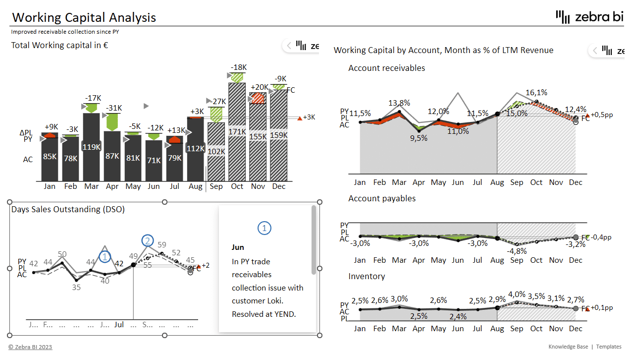
This dashboard focuses on trends with comparisons between actual data, plans and the previous year. It makes use of integrated variances on the upper left bar chart, while the rest of the dashboard leverages area and line charts.
Inventory availability report
When using Excel charts for financial reporting there is no need to stop at straightforward financial reports. You can analyze different aspects and areas of your operations, such as inventory. Let's look at an inventory availability analysis.
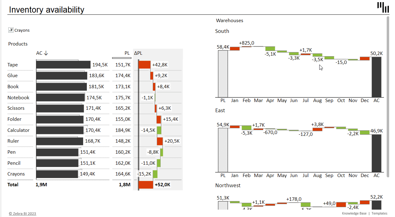
An inventory availability report is a document that provides information on the quantity of inventory that is available for sale or use at a given point in time. The report typically includes details on the available stock levels of various items or products, as well as planned inventory, allowing you to plan procurement activities.
This dashboard also uses waterfall charts in combination with filters to display product inventory levels for individual warehouses.
The right tools for creating Excel charts for financial reporting
Financial reports provide critical information about a company's financial health, performance, and prospects. Without accurate and transparent financial reporting, it is impossible to evaluate a company's financial position, assess its risks, or make well-informed investment or lending decisions.
In short, financial reporting is too important to just wing it. But to get the right results, you need the tools that can help you create impactful and actionable reports. When using Excel charts for financial reporting you should definitely consider Zebra BI for Office. It comes with 2 Excel add-ins, Zebra BI Charts and Zebra BI Tables for Office, which are fast and efficient, comply with IBCS standards and help you create appealing visuals that drive action.
All of the visuals in this guide are created with Zebra BI for Office and take just seconds to create. And by the way, if you want to learn how to create Power BI financial dashboards, we have a guide for that as well--just click on the link and learn more!
Are you ready to get started?
Download our instructional Excel file and follow the steps to create such actionable and insightful visualizations fast. They're guaranteed to impress your colleagues and C-levels alike.