How to visualize trends for multiple markets, products, etc.
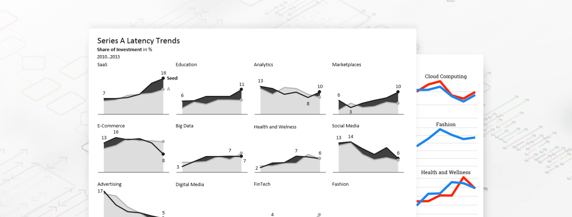
Recently, my attention was drawn to an interesting analysis of The Hottest Startup Sectors In 2016, written by Tomasz Tunguz. It shows the trend of investments into 16 major startup markets and tries to expose the gap between seed and Series A investment dollars.
The arrangement of charts into a "small multiples" chart matrix is an excellent idea. However, when you start drawing conclusions from the visual representation, you may arrive at some seriously false conclusions. Let's take a closer look:

Nice, isn't it? 16 markets are presented on one single page, so you can compare them all at once and spot similarities and differences. I love small multiples.
But wait, is this correct?
For example, the seed investments in Digital Media and SaaS somehow look related and similar:
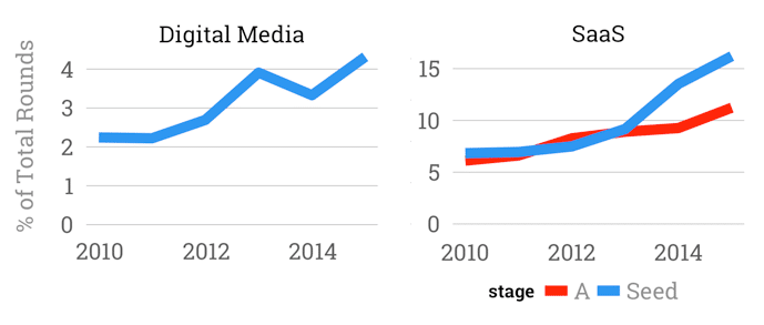
A careful reader will soon discover that these visuals are misleading. The SaaS market is almost 4x bigger than Digital media in terms of seed investment, a fact completely obscured by the picture. There's in fact a dramatic growth in the Saas category but Digital media is much smaller and the situation there is not as dramatic as it seems.
You can make similar observations by comparing Advertising and Games or other categories.
The problem is the scaling.
Scaling, scaling... most probably the hardest problem in data visualization.
Let's show the proper data visualization first and then we'll continue our discussion:
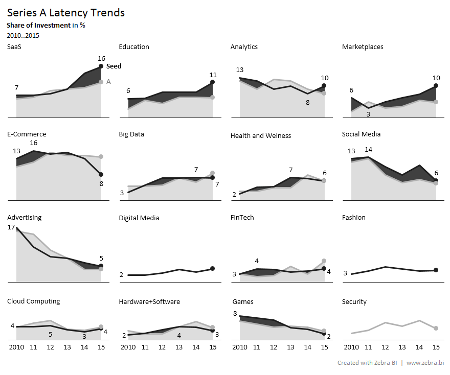
All charts are now properly scaled and organized into a more meaningful order (by the size of investment in 2015). We've accomplished this with just a few clicks using the Zebra BI Add-In for Excel.
In our information design solution, you can clearly see the growth of SaaS, the downfall of Advertising, and you can make other observations without making a mistake in judgement.
Additionally, you can immediately spot the gap between seed and series A investments, which is the main point of the original article. We used black areas on our visualization to highlight this gap, so you can clearly see that in SaaS, Education, and Marketplaces the seed rounds are much greater than the A rounds. The opposite is true for E-Commerce, where seed investments are decreasing, while people keep investing A rounds for some reason (I'm not a venture capitalist, just a dataviz guy...).
How do you like this visual analysis? Don't the findings make more sense now?
Why do we want to see the differences where there are none?
It appears as if humans have a certain cognitive bias that drives us towards enlarging (exaggerating) small differences - 'But if I scale the charts, then I don't see the small values'. I've heard that so many times. Even well-known data visualization authors, like Stephen Few from Perceptual Edge, seem to agree with that.
Well, if the values are small then the message is that the market is small. That's it. It's a perfectly legitimate message.
For example, the proper comparison of the share of investment in % between the Saas and Digital media markets is like this:

If we really wanted to compare just the relative growth rates, then we would not invent a custom scale for each chart, but rather try to find a better KPI, such as growth rates in % or something similar. Or, if only one market is much bigger than the others, you can simply apply a trick to make this particular chart bigger (and still keep the scaling). But that's a whole different topic. It's certainly not needed in the above example.
To conclude: in small multiples, just make sure you use the same scale in all charts (synchronize the Y axis) and your potentially great visual analyses will become truly excellent.