Visualize your sales performance with these easy-to-use templates for Excel. Compare your actuals with up to 3 measures (PY, PL and FC) and take advantage of advanced visualization features to show business insights in the clearest way possible.
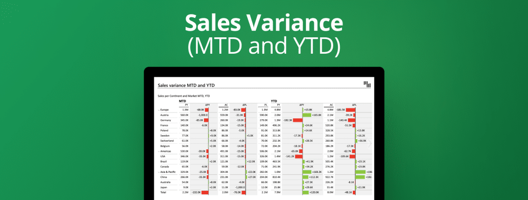
Use this template to visualize your sales performance with multiple levels in Excel. By using expand and collapse get an overview of data per continent or country. Get more understanding by comparing the actual to the plan and the previous year.
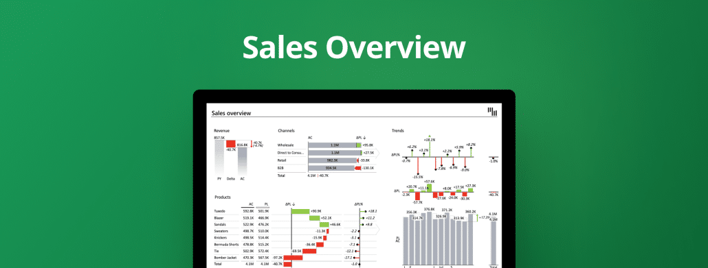
This template gives a top-level overview of sales KPIs split by products and channels. For better understanding check the comparisons and trends. Align the look and feel with your company branding.
Use this interactive template for a complete overview of your sales performance with comparisons, trends, and slicers for tracking the month-to-date & year-to-date changes.
This Excel template explains the reasons behind the revenue growth and presents top contributors for each category with a bridge chart, dynamic comments, and automatic variances.
The most advanced template for monthly sales variance report featuring 3 comparisons in the same waterfall or column chart: previous year, forecast, and plan compared to the actual value.
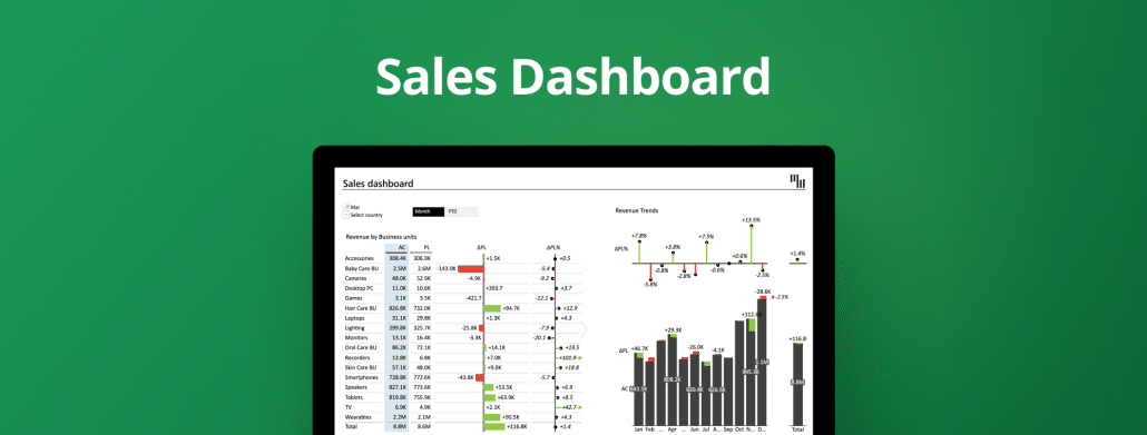
On one page you can compare the actual (AC) sales performance over months to the plan (PL) and forecast (FC) with Zebra BI Charts. Automatically calculated variances are also visualized together with dynamic comments for more insights.
 September 8th
 February 22nd
 16 Dec 2025