
 September 8th
 February 22nd
What Is a Variance Chart and When You Should Use One
Every close meeting starts with the same question: how far off plan did we land? This is when you should move on to the variance chart slide.
A variance chart (or variance graph) is a visual that plots the difference between an actual figure and a reference, drawn off a zero line. The reference is usually the plan, budget, forecast, or last year, and each bar represents the gap itself, so nobody in the room has to subtract two numbers in their head.
When it comes to variance charts, the same gap has 2 different readings, and they don’t always rank your months the same. For example, a $400K miss is the biggest in money terms and barely anything in percent terms, or the other way around.
In this guide, we'll explain how a variance chart works, when to use one in your reports, the types of variance charts, and how to create one that everybody understands.
What is a variance chart?
A variance chart is a visualization tool that draws differences instead of values. It subtracts a reference from an actual and plots the result off a zero line, with the two directions in different colors, so your readers see direction before they read anything.
Variance charts are also known as variance graphs, deviation charts, or plan vs. actual charts, but they all refer to the same chart.

Keep in mind that business variance isn't the same as statistical variance. That one measures the spread around the average and shows up in control charts, not in your monthly report.
The term is ours more than the reader's. Buyers rarely ask for a variance chart by name. They ask to see how far off plan they are, and then how bad that is. Buyers put the job differently. The combination of Power BI and Zebra BI "improves how we report deviations vs. the plan," says Thomas Andersen, CFO at Tellu (customer story).
PRO Trial AVAILABLE FOR FREE!
Variance is what these visuals were built for. Add a plan or a previous year and the absolute and relative variance charts arrive together, calculated and colored, with a plus sign on every gap above the reference.
Variance chart cheat sheet
What the chart plots, what it needs, and when another chart answers better.
Variance chart details
Doing its job
Time to switch
Broken most often
Absolute variance vs relative variance
Every variance has 2 readings that rank the same 6 months differently, and reading one without the other is where variance reports go wrong.
Absolute variance
Actual minus reference, in the unit the measure already uses: currency, units, headcount. It answers "how much".
Relative variance
The same gap divided by the reference. It answers "how badly": a gap of +33 against a plan of 95 is +34.7%, while +32 against a plan of 582 is only +5.5%.
Why you usually need both
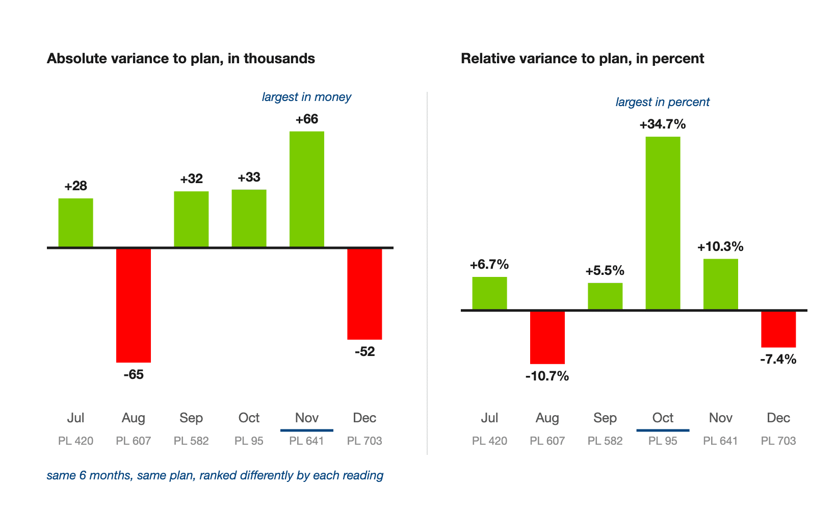
Read the absolute panel alone and October is unremarkable, 4th of 6 by size, but on the relative panel it looks like the crisis of the half year. Both are correct, which is why good layouts put the gap in the bar and the percentage in a label beside it.
People learned how to read visuals correctly. They now understand what a variance means.
Oliver Schaerer, Manager Business Intelligence & Analytics, Delica AG (customer story)
3 cases when you should use a variance chart
Use one when the argument is about distance from a target. The 3 comparisons below are the ones a monthly reporting pack actually has to answer for.
1. Actual vs plan, the monthly close
You agreed a number in November and now you have to say how close you came. A variance chart is the whole close meeting in one row: February missed by 66.3K, May beat by 44.9K, and nobody subtracts anything.
2. Actual vs previous year, growth reporting
The reference moves with the calendar, so the chart reads as momentum rather than as progress against a promise. Beating last October is a different argument from beating the plan you set for October, and the same bar cannot make both.
3. Actual vs forecast, late in the period
By November the plan is 11 months old and the forecast is the live reference. Zebra BI Charts takes actual, previous year, plan and forecast into separate fields, so switching the comparison swaps a field rather than a formula.
When you shouldn't use a variance chart
4 cases where another chart answers better.
When nobody signed off the plan, use a column chart
There is no agreed reference, so the difference is arbitrary. Plot the values and let the reader see the level.
When the question is why, not how far, add a waterfall
A variance chart tells you February missed plan by 66.3K. It cannot say how much of that was price, volume or mix. Keep the variance chart to find the month, then put a waterfall beside it to break that month down.
When you need to show what a total is made of, use a stacked column
Variance columns cannot carry composition. Use a stacked column, or small multiples if each part deserves its own panel.
When the reference crosses zero, print n.a. instead
A relative variance off a base that changes sign cannot be interpreted, so "n.a." beats a number that only looks like one.
Variance chart vs waterfall chart
Both are variance visuals, and they answer different halves of the same question.
| Variance chart | Waterfall chart | |
|---|---|---|
| What one bar means | The gap for one period | One driver's share of the change |
| The question | How far off are we, and where | What made up the gap |
| Reads best | Across time, or down a category list | As one left to right story |
| Baseline | A zero line | A running total |
Use the variance chart to find the month that broke, then the waterfall to explain it. In that order.
Variance chart vs clustered columns
The clustered pair, actual next to plan, is the most common alternative and the weakest. It shows both values and leaves the reader to do the subtraction.
Not sure whether you want a variance chart or a waterfall? The Chart Selector is a Power BI Desktop file. It walks you from the question you are answering to the chart that answers it, with every variance layout drawn on real numbers. It draws through Zebra BI, so you need the visuals installed to open it. Download the Chart Selector
Integrated variance charts
The usual follow-up: does the actual disappear to make room for the gap? It doesn't, because integrated variance is the layout that keeps both.
How an integrated variance chart is built

The variance rides on the actual column: green from plan up to actual when you're ahead, red sitting above the actual and reaching up to plan when you're behind. A relative arrow can sit beside any period you choose, and its From/To setting decides which 2 points it spans.
Integrated variance and bullet charts
If you arrived looking for a bullet chart, Zebra BI doesn't have one. No chart type, no layout, no cell in the chart selector. Integrated variance is the nearest equivalent.

A bullet chart sets a measure against a target inside graded bands. Integrated variance draws the signed gap to scale and in color. Set Variance display type to Arrow and 2 things change: the variance overlay becomes a chevron, and the layout draws a line across the category band at the comparison value, dashed when that comparison is a forecast. What it has no equivalent for is the grading: nothing in Zebra BI draws qualitative range bands. And the target is not a number you type, it's whichever scenario field sits in Plan, Previous Year or Forecast.
Types of variance charts
Same subtraction, several shapes, all rendered by Zebra BI.
- Vertical columns are the default, right for months and quarters.
- Horizontal bars: switch on "Show vertical axis" and the categories list down the side.
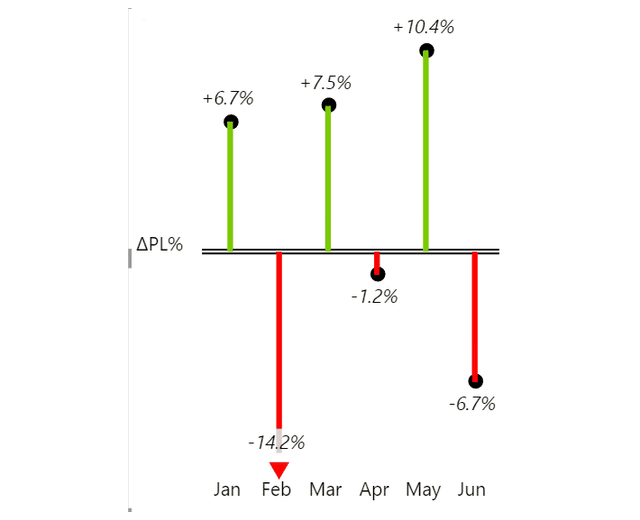
- Dots come from the Relative variance layout: a stem off the zero line with a dot at the end, labeled ΔPL%. The separate Pin chart type draws the same lollipop shape for plain values.
- Lines and areas plot actual and plan as 2 series, and on the area chart the gap between them fills green above and red below.
- Zebra BI Tables does it inside the row, as bars and plus-minus dots.
- Small multiples give 1 variance chart per category on a shared scale.

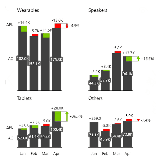
Variance chart layouts in Zebra BI


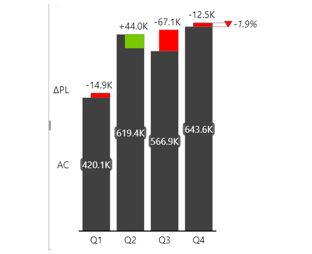

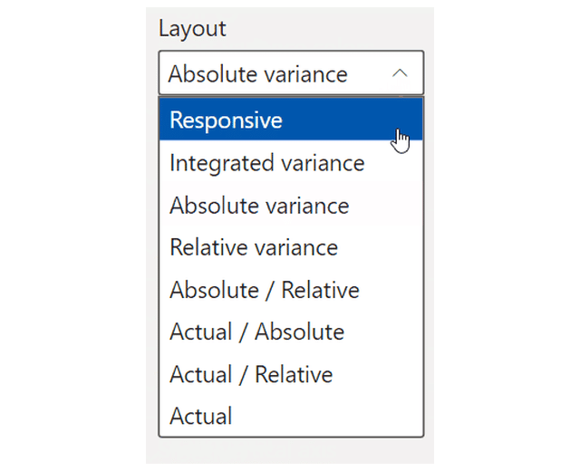
Layout is a separate setting from chart type, and it does most of the variance work. Zebra BI Charts has 9: Responsive, Integrated variance, Absolute variance, Relative variance, Absolute / Relative, Actual / Absolute, Actual / Relative, Actual, and Waterfall.
They sit in a dropdown, so one visual goes from actual only to actual plus both variances without touching the model. Responsive picks for you, dropping variance bands as the space shrinks. The dropdown is filtered, and by 2 things. Only the Waterfall, Variance and Area chart types get a Layout list at all. On the Variance type in the default vertical orientation it holds 8 of the 9, everything but Waterfall. Switch Show vertical axis on and it drops to 2, Integrated variance and Actual.
Users don't have to click through slicers to see what makes up the variance - it's highlighted for them.
Rachel Guthrie, Customer Success at Microsoft (customer story)
EIGHT LAYOUTS, ONE VISUAL
Bind a plan. The absolute and relative variance arrive with it.
Layout is a dropdown, not a rebuild. Move from actual only to actual plus both variances without touching the model.
Variance chart in Power BI
Power BI's built-in visuals will get you a variance chart, but never in one step, because no native visual puts an absolute and a relative variance in the same chart. Check that against Microsoft's overview of Power BI visuals: the read is our assessment, not Microsoft's.
The hand-built route takes a DAX measure for the difference and a 2nd for the percentage. Then conditional formatting for the colors, and a stacked column faking the integrated form.
Teams buy a custom visual to stop maintaining a variance measure for every comparison. Zebra BI Charts is 1 visual of 3, alongside Tables and Cards. It takes the plan or the previous year as its own field and does the subtraction and the percentage itself. So you don't create separate measures for absolute and relative variance in the model, and nothing needs rewriting when the comparison moves to forecast. Then the Layout dropdown decides which variance appears, and the From/To setting picks the 2 periods the difference label spans.
For the hand-built route, see the full Power BI variance analysis guide and Power BI variance reports.
Variance charts for Office
Zebra BI for Office is an add-in suite for Excel and PowerPoint, and it ships as 2 visuals, Charts and Tables. Excel and PowerPoint each reach a variance chart a different way, so the 2 sections below take them in turn.
Variance chart in Excel
Excel has no variance chart type, and nothing in the chart gallery subtracts anything, so a variance chart in Excel is something you assemble. The usual route starts with a helper column for actual minus plan. Split that into positive and negative series so each takes its own color, then stack the columns with the padding series hidden. The build is quick once. Then you rebuild it when the reference moves from plan to forecast, and again when someone adds a month. Our walkthrough is in variance analysis in Excel.
Zebra BI Charts for Office is an add-in that runs inside Excel and PowerPoint, and variance is 1 of the chart types it renders. Give it a category column and 2 value columns and it calculates the variances itself, with no helper column. Plan and previous year each get their own placeholder. Visual settings then Layout switches between integrated, absolute and relative variance. The knowledge base states 2 limits. On insert it can put your columns in the wrong placeholder, so check the mapping. And a plain range will not take new rows, so use an Excel table.
Variance chart in PowerPoint
A variance chart in a deck is usually 1 of 2 things: an Excel chart embedded in the slide, or a picture of one. Either way it was built somewhere else, so the variance question is really a question about the workbook behind the slide. The embedded chart keeps a link to that workbook and breaks when the workbook moves. The picture never breaks, and it goes stale as soon as the workbook behind it changes.
Zebra BI Charts for Office is the same add-in inside PowerPoint, and variance is 1 of its chart categories. Pick the responsive variance column chart and it calculates the variances between your scenarios. You then link the visual to an Excel file on OneDrive or SharePoint, and Auto-refresh updates it every time the file opens. The documented limit is worth knowing: in PowerPoint desktop the visuals only update when a slide is actively viewed, so you click through the deck. The knowledge base calls that a Microsoft API limitation, and says it does not apply to PowerPoint Online.
Variance chart design best practices
Variance notation isn't a matter of taste. These rules come from IBCS, the notation standard for business reporting, and they carry into the current ISO report-design standard too.
- Label an absolute variance with a delta prefix and the scenario you subtracted: ΔPL is variance to plan.
- Add a percent sign for the relative: ΔPL%.
- Write "n.a." when a relative variance cannot be interpreted.
- Express the difference between 2 percentages in percentage points, not percent.
- Give a positive variance a leading plus sign. Without one it's a value, not a variance.
Rules adapted from the IBCS Association, CC BY-SA 4.0.
Color follows the measure, not the arithmetic sign, so the same -60 reads red on a revenue line and green on a cost line.

Sorting follows the axis. A time series keeps calendar order, and a category list has none, so rank by the variance, or by the actual when the reader needs the list in size order.
Then there's scale. A gap under a percent of the base leaves actual and plan lying on each other. So the variance needs a chart of its own, not a second axis on the one already carrying the base. And when a small base blows one percentage out, cap the axis and mark that point as an outlier instead of rescaling the chart around it. Zebra BI Charts caps the relative-variance axis for you, and "Custom outlier limits" lets you set the Max and Min outlier limit in percent by hand.

Report the gap with a variance chart
Use a variance chart when you want to show the gap from a target: actual against the plan, against last year for growth, or against forecast late in the period. If the question turns into why the gap happened, you need a waterfall chart to explain it.
When working with a variance graph, remember that the largest monetary gap is rarely the largest percentage gap. So, put the absolute variance in the bar and the relative one in a label next to it.
You can build your next variance chart (and more) with Zebra BI's 14-day free trial.
Frequently asked questions
What is the difference between a variance chart and a standard bar chart?
A bar chart plots values and leaves you to estimate the gap by eye, once per category. A variance chart plots the gap itself, off a zero line, subtracted and colored for you.
How do you show variance in a graph?
Put the reference in its own field, then plot actual minus reference against a zero line and give the 2 directions different colors. Add the percentage as a label where the base moves between categories, because a small base turns a small gap into a large one.
Is a variance chart the same as statistical variance?
No, and a search for 'variance' in a statistics context will not find this chart. That variance is a measure of spread used in control charts. This one is a reporting chart, and the only arithmetic in it is a subtraction.
How do you create a variance chart in Excel?
By hand, because there is no variance chart type in the gallery. Add a helper column of actual minus plan, split it into a positive and a negative series so each takes its own color, then stack them with a hidden padding series. Our Excel walkthrough has the steps.
How do you handle cost lines where being under plan is good news?
Invert the convention for that measure. On revenue a negative variance reads red, while on a cost line under plan is a win, so the same number reads green. The setting is Invert variance colors, and it belongs on the measure rather than on the bars.
Can a variance chart show the actual value and the variance at the same time?
Yes, and that layout is integrated variance. The column is the actual and the colored block is the gap to plan. It's not a bullet chart. In Arrow mode you get a line at the plan value, but you don't get qualitative range bands, because nothing in Zebra BI draws them.

Join over 1.5 million Zebra BI users
Do you report a gap to plan every month? Zebra BI draws the variance from the fields you bind, in the same notation every time, so nobody has to subtract anything by eye.

Related links
- Power BI waterfall charts explained
- Variance analysis in Excel
- Power BI variance reports
- How to choose the right chart
