Category: Data Visualization

June 3, 2015
Exclusive interview with Dr. Rolf Hichert, part 2 of 3
Learn some practical tips to successfully implement IBCS in your company, as well as why Mozart didn't add a little 3D effect to notes in his sheet music.
May 18, 2015
On using Butterfly (aka Tornado) charts
Find out what data could be presented with butterfly charts and how to get the most out of this type of data presentation.
May 12, 2015
Exclusive interview with Dr. Rolf Hichert, part 1 of 3
Learn why it's important to introduce standardization in reporting, some examples, and what are the most important concepts in IBCS.
May 8, 2015
The 3 steps to implementing management reports in a pharmaceutical company
The project made in collaboration with a Serbian pharmaceutical company aimed to make management reports more transparent, visual and automated.
April 22, 2015
Infographic: How to Choose the Right Chart
This infographic will teach you everything you need to know to always select the perfect chart. Link to free whitepaper with more information included.
November 12, 2013
Small Multiples – 16 are better than one
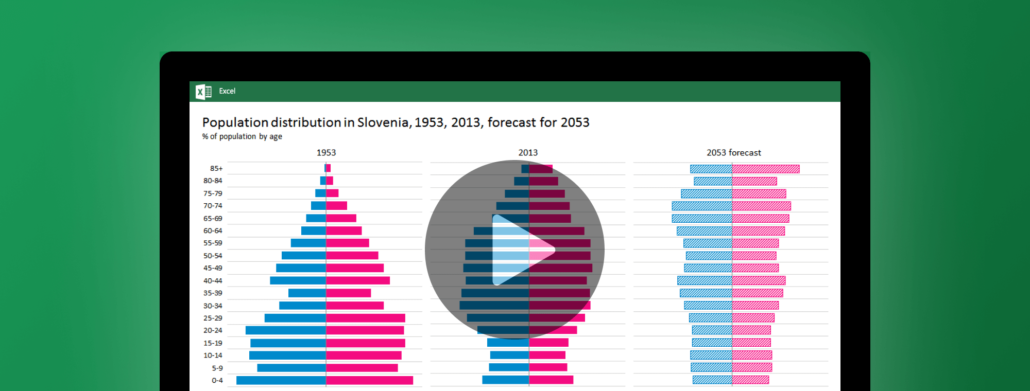
Small multiples are the best design solution for a lot of problems in data presentation. Learn how to produce them in less than one minute with Zebra BI.

Pagination