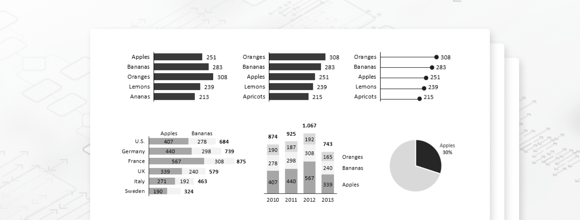
Infographic: How to Choose the Right Chart
This infographic will teach you everything you need to know to always select the perfect chart.
You can also make sure you're using the right chart with Zebra BI Chart Selector. It's a completely interactive tool and follows the latest best practices and IBCS guidelines. Just click & play with it to find explanations and instructions for the most suitable chart for your data.
Your "perfect" chart has two key tasks to perform. It has to:
- optimally display the message you want to deliver and
- shorten the time it takes your audience to understand that message.
Luckily, here are the 3 fundamental rules that you should always follow when deciding which chart to use. If you learn these 3 rules, there is a good chance that you will get it right no matter what the context of your data is.

Embed this infographic on your site:
<a href="https://zebrabi.com/blog/2015/04/22/infographic-choose-right-chart/" target="_blank"><img src="https://zebrabi.com/wp-content/uploads/2015/04/How-to-choose-the-right-chart-Zebra-BI-Infographic.png" alt="How to Choose the Right Chart"></a><br /><a href="https://zebrabi.com/blog/2015/04/22/infographic-choose-right-chart/" target="_blank"><strong>How to Choose the Right Chart</strong></a> - Learn the 3 fundamental rules to always select the perfect chart for your data

 September 8th
 February 22nd