Can AI-driven business analysis really help your organization? Opinions may differ in the industry, but here's what you need to know to make the right choice for your business.
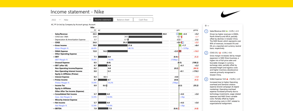
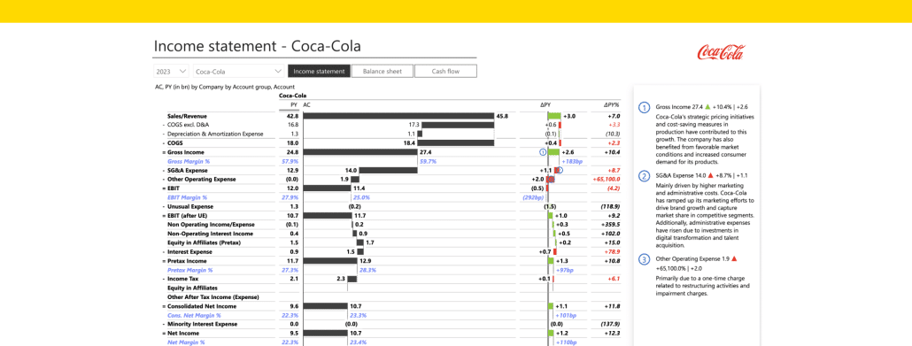
Optimize your Food & Beverage business with our Financial Analysis and Benchmarking Report Dashboard Template. Perfect for executives and financial analysts, it evaluates KPIs such as Inventory Turnover and Return on Assets to drive strategic growth, operational efficiency, and market competitiveness.
Optimize your Food & Beverage business with our Financial Analysis and Benchmarking Report Dashboard Template. Perfect for executives and financial analysts, it evaluates KPIs such as Inventory Turnover and Return on Assets to drive strategic growth, operational efficiency, and market competitiveness.
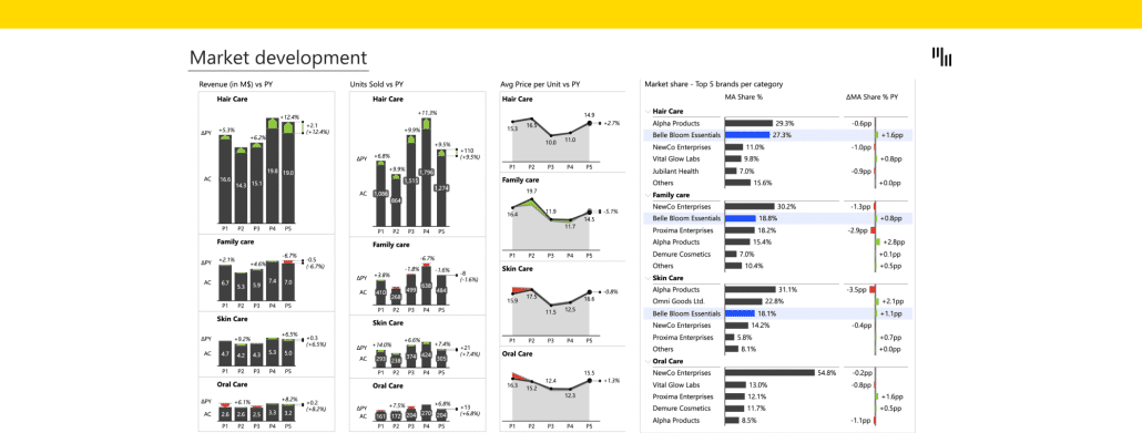
Optimize your FMCG brand's performance with our Brand and Product Portfolio Analysis Dashboard. Perfect for executives and planners, it assesses revenue, market share, and units sold to drive strategic growth and market competitiveness.
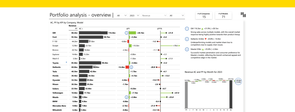
Optimize your automotive brand's performance with our Brand and Product Portfolio Analysis Dashboard. Perfect for executives and strategic planners, it evaluates key metrics like revenue, market share, and sales volume to drive growth.
Learn to organize and analyze time-based data in Power BI with the date hierarchy feature. This guide covers the benefits and provides a step-by-step process to create a date hierarchy, enhancing your data analysis from years to minutes.
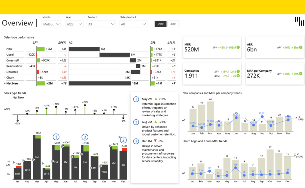
Quickly understand your sales trends with the Zebra BI SaaS Sales Power BI Dashboard. This dashboard provides instant insights into MRR, sales by type, and manager performance, helping you make informed decisions fast.
 September 8th
 February 22nd